“Self Identity and expression is something that individualizes us from everyone else. Growing up, I always explored my own form of identity and exploration – noting the things about myself that I loved, hated, changed and never changed over time. Who I am and was is personal to me and it is only through my eyes that I see the world we live in.” This is how I opened the first progress post of my chosen design, Post 7: Main Project Aesthetics: Plans and Alternatives. This is the foundation of my project’s meaning.
Starting this project, I had many ideas and considerations, making it difficult to choose exactly what I wanted to do. The primary guidance I gave myself was that I wanted to make a product that could move without anyone interacting with it. Through many ideas and talks with friends/family, I settled on a clock – which I did not doubt for a moment was the right choice. From then on, it was a lot of aesthetic explorations and ideating on different clock ideas.
My design process often starts all over the place with lots of thinking, sketches and inspiration imagery searching. I can be quite sporadic when it comes to initial design stages, so it is much like a brain dump. To start: I knew my project was going to be a clock and I knew I wanted it to have a certain feeling associated with it. This feeling was focused around this “awe” factor that would leave someone wanting to stare and examine how an object is able to look the way that it does, and the feeling of personal connection and identity to myself. Additionally, I knew I wanted it to somehow be connected to the natural world, and that I wanted to laser cut the clock as the primary fabrication process.
AESTHETIC
Wanting to somehow incorporate the natural environment, I considered the different aesthetics associated with it, ultimately choosing the Art Nouveau aesthetic. Rather than directly imitating its features and characteristics visually, I decided to take its philosophies and founding principles to incorporate into my design.


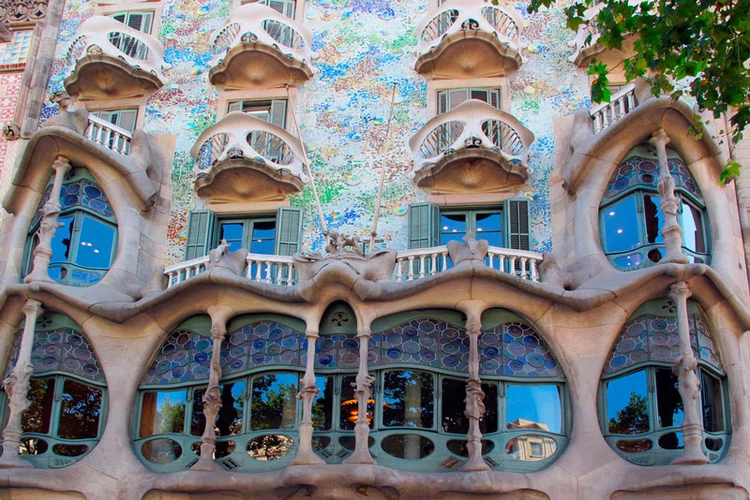
Popularized by Antoni Gaudi, the Art Nouveau aesthetic is not just representative of organic shapes and pastel colors, but is based around the structural systems present in nature. An example of this would be in Casa Batllo by Antoni Gaudi which is representative of sea creatures by utilizing the structures of seashells and turtle skeletons to create ribbing, as seen in the figures above.
INSPIRATION + IDEATION
Taking these principles into account and these feelings of “awe” and personal identity, I found this connection to the human eye or iris. This became the key reference in my design. The inner workings of the iris is composed of these mesmerizing fractals and entanglements of color that weave in and out of each other. There are different colors, patterns and shapes within each one that makes them unique and personal. Because of this connection to identity and the general circle shape of the eye, it becomes the perfect focal point for my clock design.

Through understanding of all of these ideas and considerations, I began iterating through sketching. Much of these sketches occurred during different phases of my research as I was discovering the nature inspired element.

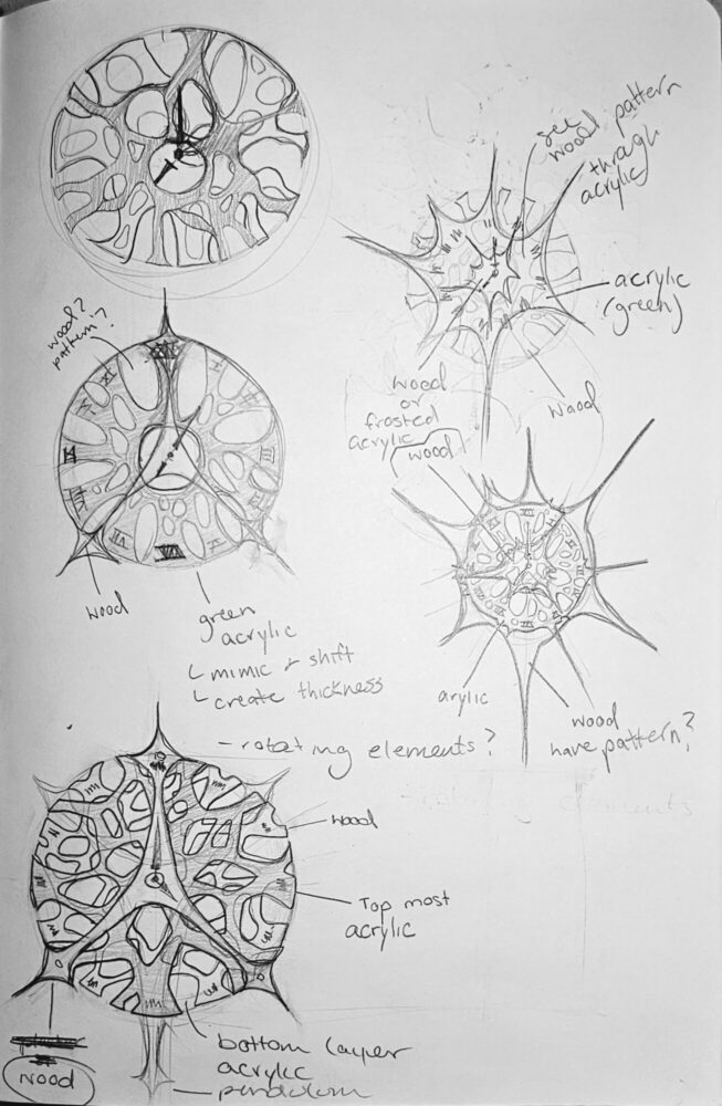
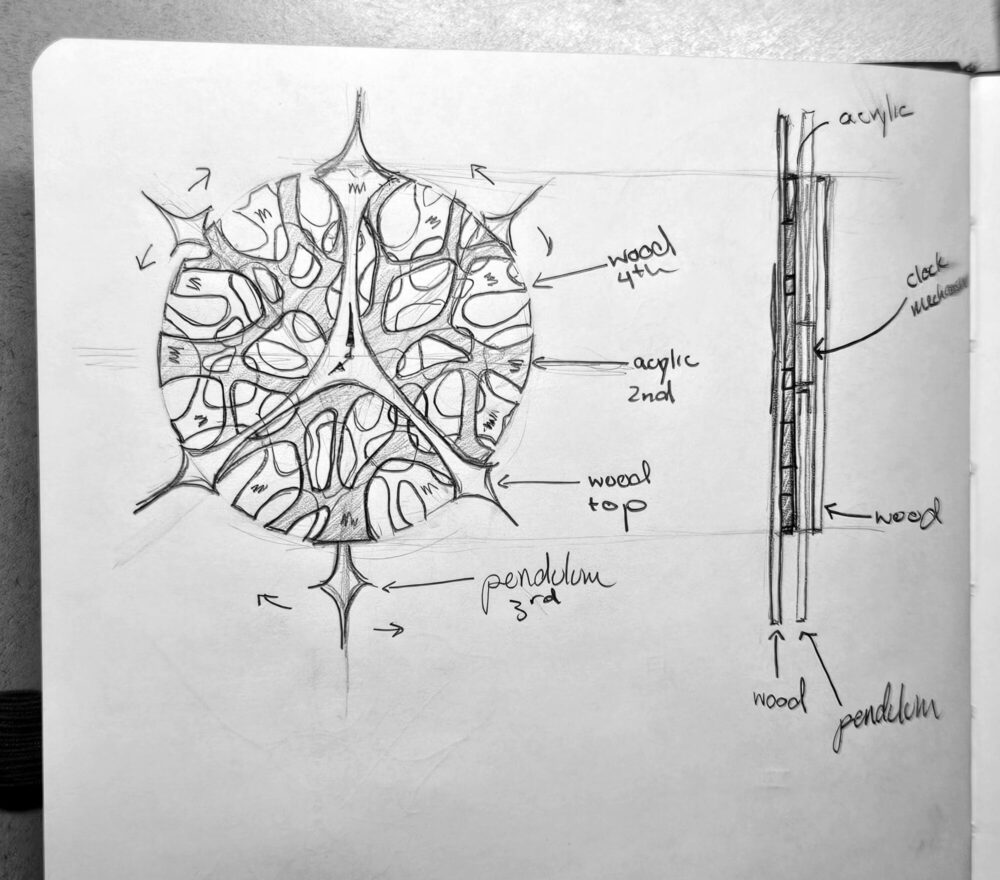
The final design was what I settled on making as the final. It is separated into layers and contains the intricacies of the human eye while staying true to the laser cutting parameters. Instead of intertwining fragments like the eye has, this drawing utilizes layers of varying transparencies to create the illusion of overlapping elements. From here, I brought the image into Rhino (a CAD software) and began modeling.
MODELING
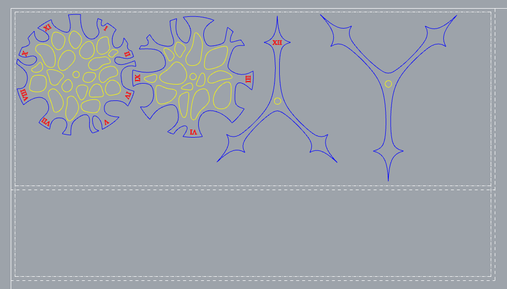
The CAD file was very crucial to this project as it would be the foundation for the laser cutting template that would determine the final outcome. Luckily, I am quite familiar with laser cutting and the Rhino software, so I was able to simply trace over the initial sketch and make further design edits from there. During this process, I decided that the final clock would be 14 inches in diameter.
MATERIALS
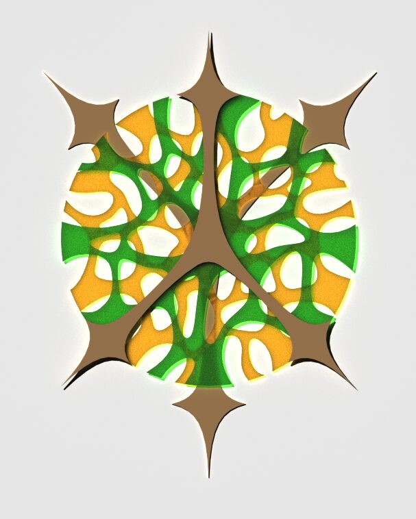
Beyond the model, I researched materials for the clock as seen in the rendering above and the image below.
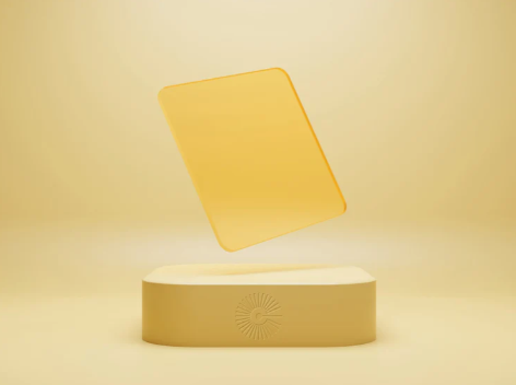
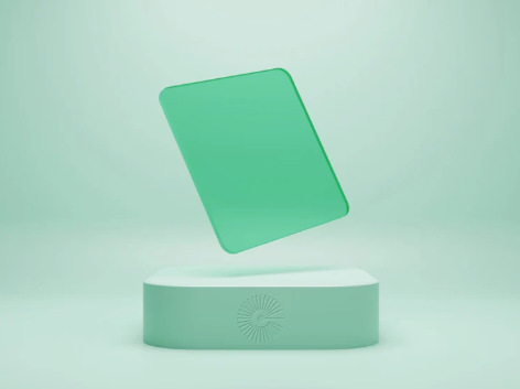
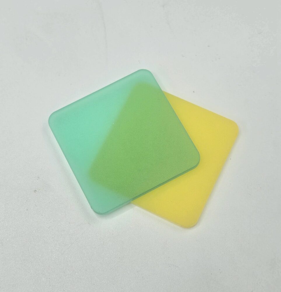
Since the clock needed to have different layers of transparency, I decided to make the main clock layers out of acrylic and the spoke pieces out of MDF – mostly for affordability. With the acrylic, I researched and ordered the colors above. This process included ordering swatches to be sure they combined to make the color combination I envisioned. After deciding on the colors, I ordered 18 x 24” sheets of the frosted yellow and frosted green.
UPCOMING
This was a very tedious process that I spent a lot of time contemplating and receiving opinions on. Although I was very excited for my final product to be out of these carefully curated materials, the shipment was lost and I had to improvise for the final product – I will go over this challenge in pt 2 of the report where I reflect on the fabrication process.
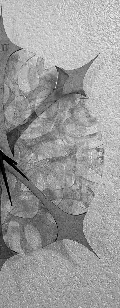
In addition to material challenges and final fabrication being discussed in Part 2 of the final report, I will also discuss the stage of prototyping which occurred to ensure the clock mechanism fit the dimensions of the clock design and assembly was smooth. Outside of this, I will be sure to showcase and reflect on the successes of the final product, so stay tuned to see the final images (the feature image is a sneak peak into the final product).
Sources:
https://barcelonaexclusiveprivatetours.com/blog/discover-the-hidden-secrets-of-casa-batllo
https://pinterest.com
https://www.cohnacrylics.com/
1 Comment. Leave new
Hi Mia! I know I have a bit of a spoiler as to how your product came out, but I wanted to read your post purely to give appreciation to your project!! You truly did an amazing job with this project and I am beyond impressed by how you chose to approach the entire thing- from going beyond just an aesthetic to truly trying to capture what the aesthetic was actually about. I think your desire to achieve something so personal and meaningful to you is commendable, and I believe you completely achieved what you were going for! Love the attention to detail and time you put into every decision you made! From the shapes, to the colors, everything came out beautifully!