
Exploring the Opposite Aesthetic
If my upcycling skiing painting is defined by a minimalist, textured, and nature-inspired aesthetic, its opposite would be a flat, maximalist, and artificial-themed artwork. Rather than relying on subtle texture and natural tones to convey depth and realism, this version would use bold colors, sharp lines, and high-contrast, synthetic shapes to create a visually intense picture.
Instead of a sculpted plaster miming the gentle flow of snowy slopes, an alternative aesthetic would reject texture altogether. The canvas would remain smooth and flat, maybe even glossed over to exaggerate its artificial quality. Rather than sculpted terrain, the movement would be suggested only through graphic, exaggerated lines or arrows, almost like a video game UI or stylized map rather than a real-world landscape.
The color palette would be the opposite of minimalist white and earth tones—neon pinks, electric blues, and highlighter yellows. Skiers would be rendered not as small, carefully placed figures but as large, cartoonish, or abstracted forms, filling the frame with exaggerated poses. If included, the trees would lose their natural greens and become geometric, symmetrical patterns or even pixelated forms in fluorescent colors, more of an arcade graphic than a real forest.
Where my original project evokes quiet contemplation and appreciation of subtle movement, this would be busy, high-energy, and intentionally overwhelming. The composition would focus on symmetry and balance through chaos, with every part of the canvas demanding attention instead of guiding the viewer toward a central focal point.
This aesthetic can be seen in the Pop art movement with artists like Andy Warhol in his iconic Marilyn Monroe prints: flat, bright, repetitive, and synthetic.

[1] Andy Warhol “Marilyn Monroe”
Materials & Function
Even though the aesthetic is flipped, I could still use the materials I already have—canvas, plaster, and paint—just in a completely different way:
Plaster: Instead of using it sculpturally, I’d apply it thinly and sand it down to a perfectly smooth surface, maybe even seal it with a glossy finish to eliminate texture altogether. Alternatively, I could use the plaster to create flat, uniform shapes like raised circles or stripes to form a graphic pattern.
Paint: I’d use neon acrylics or possibly even reflective or glow-in-the-dark paints to amplify the synthetic, hyper-digital feel. Instead of natural blending, I’d use hard-edged color blocking and stencils for a sharp, clean finish.
Function: The final piece could still serve as a wall art installation with a different vibe. Rather than blending into a cozy or calm space, this would dominate a room—maybe fit for a game room, dorm wall, or creative studio. It becomes less about subtle appreciation and more about making a bold visual statement.
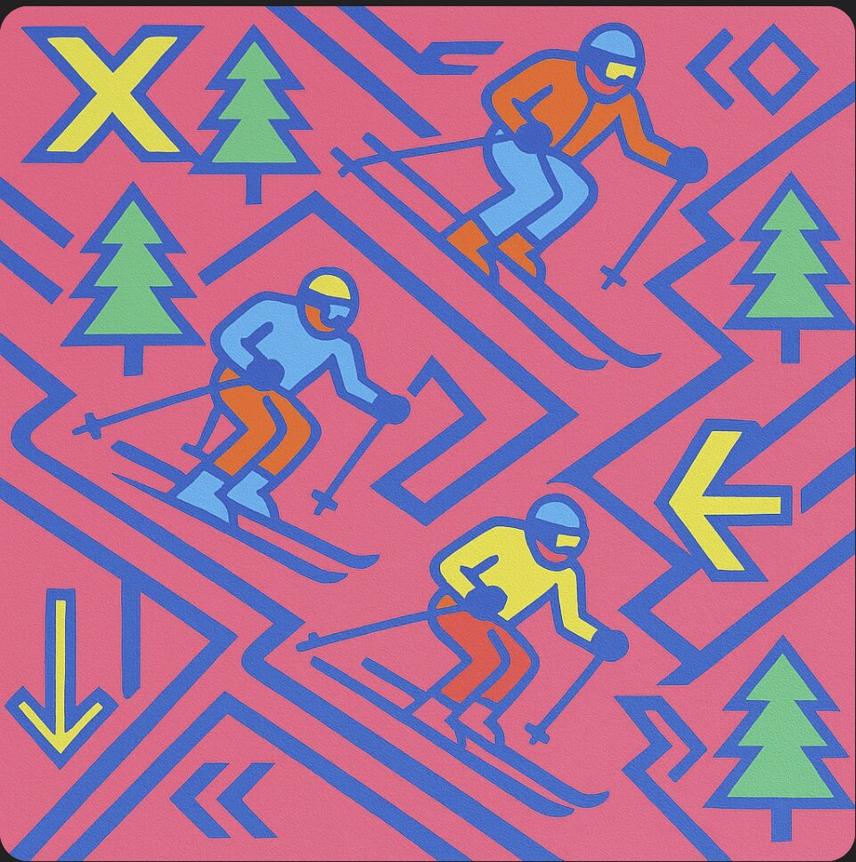
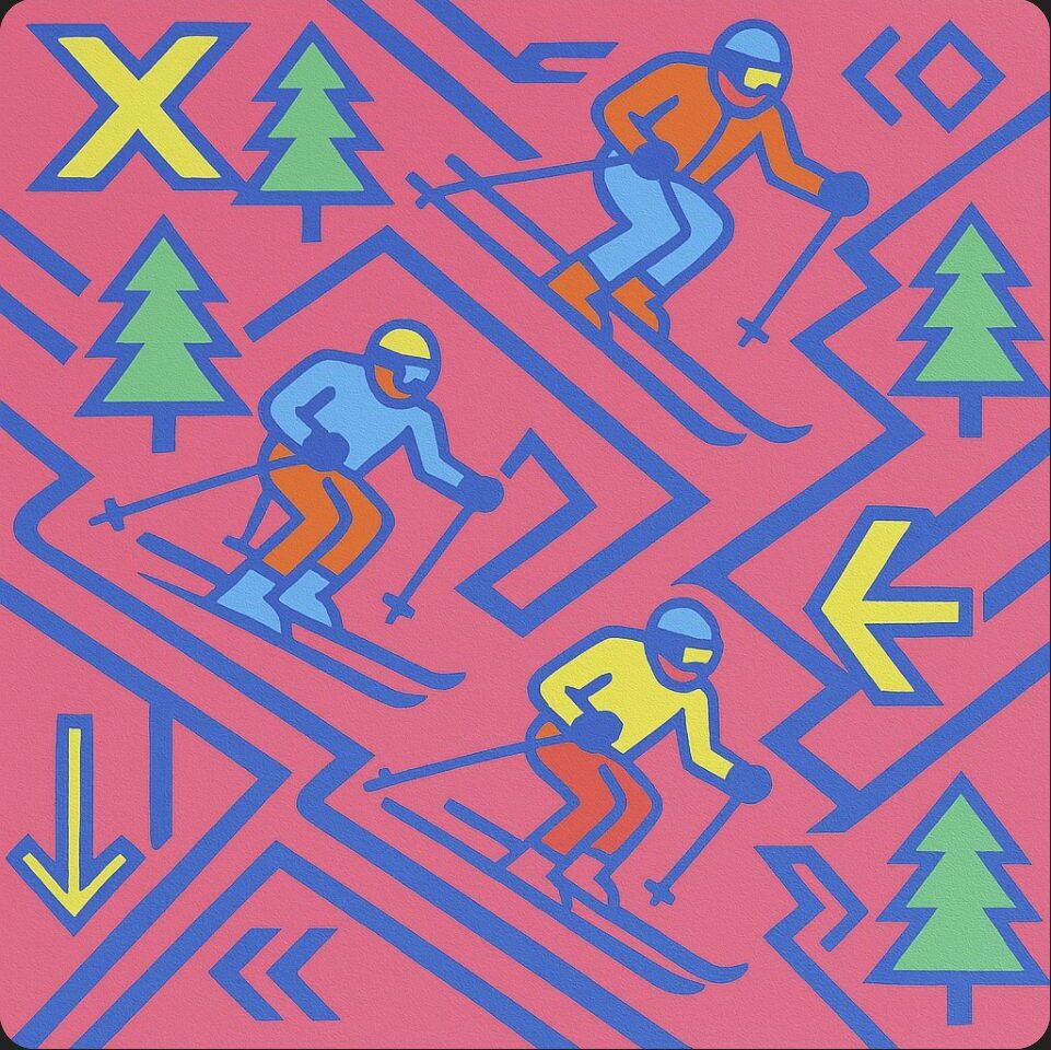
[2] Generated Image of Opposite Aesthetic
Here is what I imagine my piece would look like if I tried to approach it from an opposite aesthetic. The visuals are bright, sharp, and impactful. The scene is cluttered, with no real direction, the skiers are as large as the trees and motion is implied by the arrows. Despite it not going for a naturally mimicked nature aesthetic, it still achieves a similar goal of creating a ski slope portrait.
2 Comments. Leave new
This was a really creative take. I liked how clearly you broke down each element of your original aesthetic and reimagined it in an opposite way. The idea of using arrows and bold colors to show motion is especially effective.
One question I had was whether the opposite version would still feel like a ski slope or become more abstract. Also, how do you think neon or glow-in-the-dark paint might change how the piece is viewed in different lighting?
Great job exploring such a bold contrast in style.
I like how you flipped the aesthetic! The neon colors and graphic lines create a totally different vibe from your original project. It’s cool how you can use the same materials but make them feel so different. Definitely a bold, in your face piece!