
Top 5 Things I Want the Chocolate Packaging to Look Like, Feel Like, and Do
When it comes to designing chocolate packaging, I want to create something that goes far beyond just wrapping a bar. I want it to tell a story, to feel meaningful, to stand out and most importantly, to feel worth it. So here are the top five things I want the packaging to do, to look like, and to feel like.
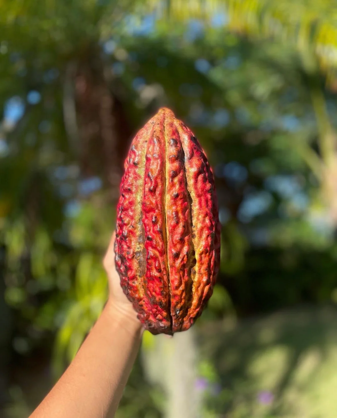
- It should be inspired by the cacao pod.
There’s something beautiful and raw about the cacao pod it’s earthy, colorful, textured, and totally natural. I want the packaging to take that as its starting point. Maybe it echoes the shape, or maybe it plays off the rough texture and bold, natural color palette. Either way, this packaging should remind people where chocolate actually comes from: nature.
 It should represent Mexican culture in a modern way.
All Mexican chocolate brands focus on the mesoamerican cultures when branding their products. In my opinion this feels lazy and obvious. Yes the Olmecas, Mayans, and Aztecas all had a deep connection to cacao, but the fact is that chocolate didn’t exist in mesoamerica and chocolate was discovered in the combination of the Spanish and indigenous cultures. This mestizaje of cultures is what created Mexico and created chocolate. Thus, the design should reflect modern Mexico and represent its cultural richness, its culinary diversity and expert artisanal art.
- It should reflect craftsmanship and high quality.
This chocolate is going to be something special, and the packaging has to match. It needs to feel like someone cares about every detail. Whether it’s handcrafted wooden elements (even if I’m still learning woodworking), or subtle textures and finishes, the packaging should feel intentional and premium.
- It should stand out on the shelf.
This is non-negotiable. If it’s sitting on a shelf next to dozens of other chocolate bars, it needs to stop people in their tracks. Whether it’s through unique form, bold design, or a tactile experience, I want it to be unmissable. It should feel like an object you want to pick up and explore.
- It should be an experience.
Opening this chocolate should feel like unboxing a small treasure. The smell, the feel, the weight, the look; it should all build up to that first bite. And ideally, it’s something people want to keep. If someone collects or reuses the packaging, that’s the ultimate win. That means the design resonated.
 What Would Make the Packaging Successful?
At the end of the day, the most important feedback will come from the consumer. If they love it, if they come back for more, if they share it or reuse it—then it’s working. It’s not about creating something that’s totally unique, but rather something designed around a real, competitive advantage: a great product experience.
Priorities and Constraints
Priority number one? Quality. Making the best possible chocolate for the consumer before thinking about scaling or margins. And doing it sustainably, with zero waste packaging, wherever possible. Challenges? Oh, there are a few. I’m still learning woodworking. Graphic design will take time. And time in general is tight between other classes and projects. I know the biggest risk is time management where the final version doesn’t match the original vision because I had to rush.
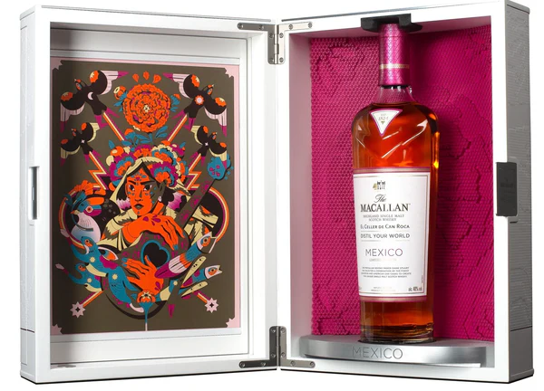
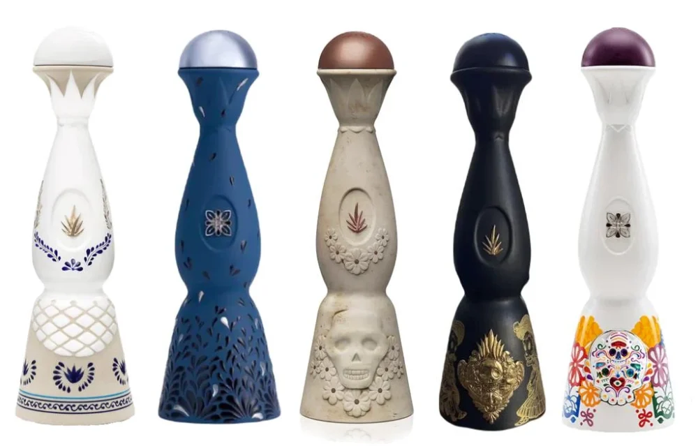
Citations:
https://www.melandrose.com/clase-azul/the-clase-azul-collection-1063319
Macallan Distil your World – Mexico City Edition Single Malt Scotch Whisky
1 Comment. Leave new
I think you have an excellent vision for your project! I really enjoyed reading your notes about the experience you want the packaging to give the user. I think that this is such an underappreciated facet of design, and I am very excited to see how you complete that requirement.