
A quick overview of my project – I am making an art nouveau inspired clock based around the philosophies of natural systems and organic forms/structures.
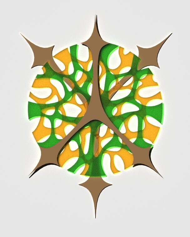
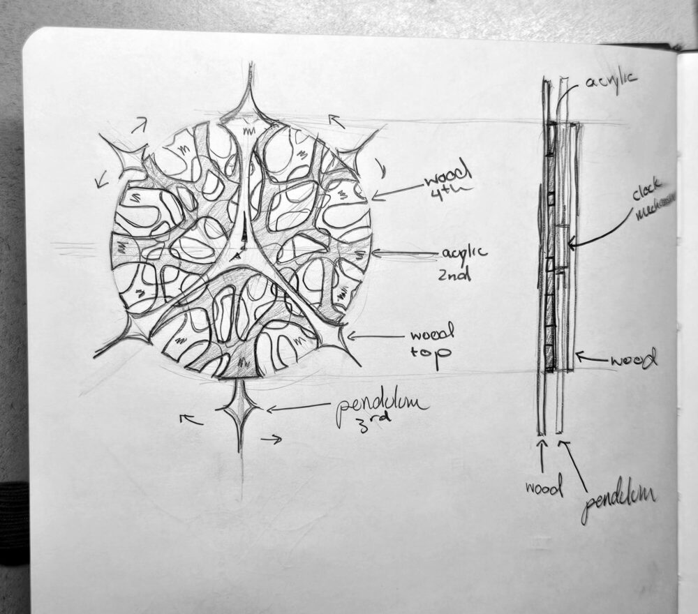
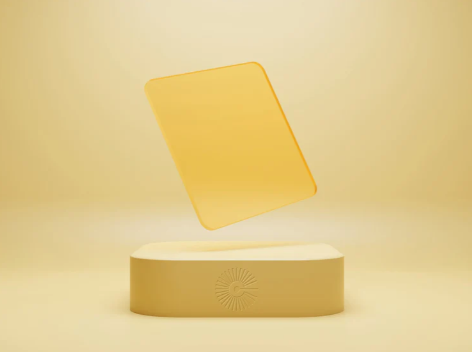
The primary design is shown below:
In this post, I will be discussing the top 5 specifications and top 5 constraints of this project.
Specifications:
1. Concept Depiction – Time and identity.
When ideating for this project, I knew I wanted to make a clock, but wanted it to represent something more than just an aesthetic. With this, I became deeply interested in how I could represent personal identity through a clock, especially how it may change or not change over time – connecting back to the purpose of a clock.
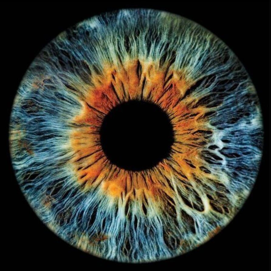
I decided that the human iris, in its intricacy and consistency for every person over time, would be a great way to interpret the concept of time and identity.


Every person has their own unique colors, pattern and shape to their eyes, setting them apart from everyone. They are very mesmerizing to me.
2. Illusion Effect – The use of layering acrylic.
Through the human eye as my inspiration, there are intertwining, intricate and layering effects within the iris fractals. This is what I chose to emphasize in my design – relating to the natural systems of art nouveau. To show the intertwining of the iris, instead of using flexible elements that might be more difficult to work with, I decided to use colored, translucent acrylic that could be layered. Additionally, this offers color changing opportunities and elements of opaqueness to transparency within the design – giving an illusion of intertwinement.
3. Movement – Clock mechanism with pendulum exploration.
Since a moving element is an assignment requirement, this is of course going to be a top specification for my design. This is the purpose of choosing a clock – I wanted an object that did not need direct interaction to move on its own. This specification will be within the clock mechanism of the hands and telling time. Additionally, I am experimenting with a pendulum system to create more movement and emphasize the alluring aspect of the human eye.
4. Color – Utilizing thoughtful color to enhance aesthetic and intention.
To me, color has been a very significant part of this project and I have spent much time on choosing the right color and combination of colors. Connecting back to my concept of identity and the human eye, I thought it would be personal to make the clock using my eye color – green. This became a very intense process of looking through colored acrylic to find the right color combination that would combine to show the multiple color shifts involved in making green, this being blue and yellow.
5. Shape Language – The use of dramatic shapes to showcase my design style.
Through all of my specifications, shape language has been a consistent and significant element. As a designer, I typically gravitate towards dramatic and flowing shapes – this could be why I am so fascinated with the human iris. Because of this, I have made it a specification of my clock design to have a very strong indication of shape language and the overall flow of the layering shapes.
Constraints:
1. Time
With all of my other classes and commitments, managing all of the projects and assignments that need to be completed by the end of the year will be a challenge for me. Because of this, I need to manage expectations and how far I want to push the assignment for now. I envision that I will make adjustments and alterations in the future but, for the moment, I am prioritizing the key components of what makes a clock.
2. Pendulum mechanism
Relating to time, making a very specific style pendulum has been quite difficult and may be something to consider exploring at a different time beyond this class. Since the clock will still function and have a moving element without the pendulum system, it has become low on my priority list.
3. Materials
Since I am being very particular about the materials that I want to use and how I am going to fabricate the clock, this becomes a constraint because of my desire to laser cut. Additionally, The illusion specification requires translucent materials, limiting my options for materiality in the final product – This being acrylic.
4. Money
For this project, I am not wanting to spend over $200, which is still generous with my budget. Because of this, I have had to change some of the materiality, colors and amount of layers that I want to include in the clock design to not overwhelm myself with the amount of money spent.
5. Colors
As the ultimate goal still stands of representing my personal identity, my colors are constrained to green and yellow as those are the colors of my eyes. Because of this, I have chosen very specific frosted acrylic that combines to create the color most representational of my eyes. This was my biggest challenge and required that I order small testing acrylic pieces to ensure the color accurately represented my identity.
1 Comment. Leave new
Mia, I love your idea of creating a potent sense of identity using layers, transparency, color, and the personality of an iris shape. Tying this to a custom depiction of time will be fantastic, and I appreciate your recognition that it is worth taking beyond what is feasible within this class – I hope you continue with the pendulum!
One question your post leaves me with (perhaps I should look at previous ones); what constraints or design features come with interfacing with what I imagine must be a pre-existing clock mechanism? Does this affect, say, your number of layers or how you might customize clock hands?
Great idea and I look forward to seeing it!
-Cole