
For my main project, I decided to design my own neon signs using a 3D printer and LED lights. My primary aesthetic for these signs is pop art, which will add character to my office, where I plan to display them. The main inspiration for this project comes from comic book-style fonts, reminiscent of classic DC and Marvel comics. Additionally, I will take inspiration from a YouTube video, where I plan to recreate a similar project: link. [13]
The vision for this project is to mimic comic book-style fonts using LED lights. I want to capture the essence of neon lighting, as it evokes an old-school vibe that aligns with my project’s aesthetic. In my post about neon lighting, I stated: “The aesthetic of a neon sign is a mix of retro-futurism, urban vibrancy, and nostalgic allure” [1]. I aim to incorporate these elements into my design by creating signs that showcase vibrant colors, brightness, and energy. The pop art style is an iconic way to express nostalgia for classic comic books. Since I enjoy the comic book movies that have been released over the past two decades, I want to bring that aesthetic into my design.
To execute this design, I researched the pop art aesthetic and its defining characteristics. The Pop Art movement emerged in the mid-1950s in Britain and matured in the 1960s in the United States. It is characterized by themes and techniques drawn from popular mass culture, such as advertising, comic books, and everyday objects. The movement is widely seen as a reaction to the dominant ideas of abstract expressionism [2]. Artists like Andy Warhol and Roy Lichtenstein were key figures in this movement. Warhol’s works often featured consumer goods and celebrities, highlighting mass production and societal consumption [3].
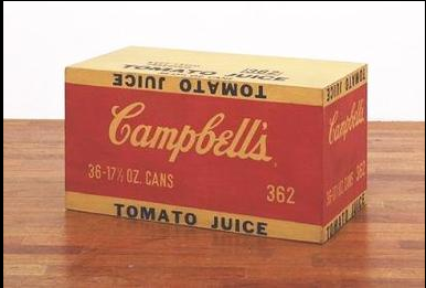
Andy Warhol, Campbell’s Tomato Juice Box, 1964. [2]
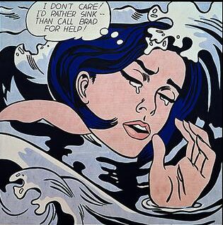
Roy Lichtenstein, Drowning Girl, 1963. [2]
Comic book fonts are designed to emulate the hand-lettered style found in traditional comic books. They often feature bold, uppercase letters with thick strokes and minimal serifs to convey action and excitement [4]. A well-known example is the “Comic Sans” font, created by Vincent Connare in 1994, which mimics the informal lettering style common in comic books [5]. The video below provides an interesting perspective on how comic book fonts became so recognizable and unique.
Here is a video talking more about the comic book style and the history behind it: link [14]
I find it fascinating how the choice of font can be visually striking and influence the perception of lettering. The comic book font is a classic, and I plan to incorporate that into my designs. In my last post, I explored an aesthetic that contrasts with the comic book font style. I concluded that the complete opposite aesthetic is the wabi-sabi art style and Japanese calligraphy. Here is an excerpt from my previous post:
“The aesthetics of Japanese calligraphy and comic book-style pop art fonts differ not just visually but in philosophy, execution, and intent. Japanese calligraphy is rooted in Zen Buddhism, focusing on impermanence and the expression of the artist’s inner state. It celebrates imperfection and spontaneity, with strokes reflecting natural flow and organic beauty. In contrast, comic book fonts—often characterized by bright colors, thick outlines, and dramatic shadows—prioritize readability and impact.” [6]
In response to my previous post, someone commented, suggesting that I incorporate the wabi-sabi style into my neon-inspired pop art. This idea intrigued me, and I started considering ways to blend the two aesthetics. The comment also mentioned Japan’s Showa era (1926–1989) [7], a transformative period marked by technological advancements and a shift in Japan’s political landscape. This era also saw the rise of manga and anime, which began gaining international recognition. [7].
The modern form of manga, characterized by narrative storytelling through sequential art, developed significantly during the late 19th and early 20th centuries. Western comic strips introduced during this period influenced the use of speech balloons and panel layouts. After World War II, manga experienced a creative boom, with artists like Osamu Tezuka (creator of Astro Boy) pioneering new storytelling techniques that laid the foundation for contemporary manga [8].
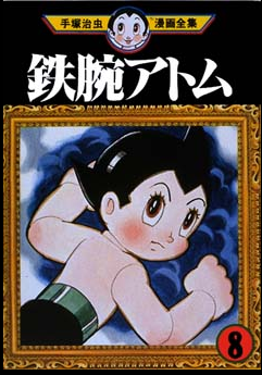
Osamu Tezuka, Astro boy. [9]
If I were to blend the traditional Japanese wabi-sabi style with vintage Americana, I would likely draw inspiration from manga and anime aesthetics. While I am not personally a fan of the genre, I genuinely admire its artistry and stylistic approach.

Example of manga pop art. [10]
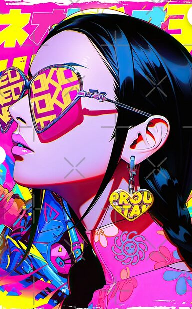
Art design from RedBubble, Designed and sold by Neotokio3 [11]
For the final design, I need to experiment with a few different concepts while keeping in mind the size limitations of my 3D printer. I have a Voron 0.2 3D printer, which provides a build volume of 120mm³. This is not large enough to print a full neon-inspired sign in one piece, so I will need to get creative with my approach. To gather ideas, I explored Thingiverse and found prints similar to my vision. This “NASA” print, for example, aligns with my idea, as each letter is printed individually [12].
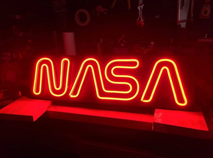
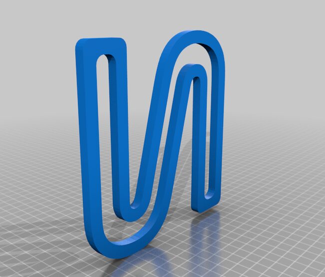
“NASA” neon-inspired 3D Print and CAD models. [12]
To begin, I will start with a prototype—creating a small-scale version of the sign that fits within my printer’s constraints. This will serve as a foundation for refining the final product and determining how to break the design into coherent pieces. I am still brainstorming what I would like my signs to look like, so I will update this post once I figure out what I would like to create first.
References
[1] AESDES. (2025, February 26). Main project plans and inspirations. Retrieved from https://www.aesdes.org/2025/02/26/main-project-plans-and-inspirations-22/
[2] Wikipedia contributors. (n.d.). Pop Art. Wikipedia, The Free Encyclopedia. Retrieved from https://en.wikipedia.org/wiki/Pop_art
[3] Le Monde. (2024, October 21). At the Louis Vuitton Foundation: Pop Art or the art of a new realism. Retrieved from https://www.lemonde.fr/en/culture/article/2024/10/21/at-the-louis-vuitton-foundation-pop-art-or-the-art-of-a-new-realism_6730047_30.html
[4] Hamilton Selway. (n.d.). Comic & Cartoon Pop Art Artists. Retrieved from https://hamiltonselway.com/comic-cartoon-pop-art-artists/
[5] Font Foundry Hub. (n.d.). Comic Fonts. Retrieved from https://fontfoundryhub.com/comic-fonts/
[6] AESDES. (2025, March 5). Aesthetic alternatives: Wabi-Sabi and Japanese calligraphy. Retrieved from https://www.aesdes.org/2025/03/05/aesthetic-alternatives-wabi-sabi-and-japanese-calligraphy/
[7] Wikipedia contributors. (n.d.). Shōwa era. Wikipedia, The Free Encyclopedia. Retrieved from https://en.wikipedia.org/wiki/Sh%C5%8Dwa_era
[8] Wikipedia contributors. (n.d.). History of Manga. Wikipedia, The Free Encyclopedia. Retrieved from https://en.wikipedia.org/wiki/History_of_manga
[9] Wikipedia contributors. (n.d.). Astro Boy. Wikipedia, The Free Encyclopedia. Retrieved from https://en.wikipedia.org/wiki/Astro_Boy
[10] Adobe Stock. (n.d.). Pop Art Kawaii idol girl with big shiny eyes smiling with Japanese Hiragana characters text meaning “lovely.” Retrieved from https://stock.adobe.com/images/pop-art-kawaii-idol-girl-with-big-shiny-eyes-smiling-with-japanese-hiragana-characters-text-meaning-lovely
[11] Redbubble. (n.d.). BOA HANCOCK HIGH FASHION – One Piece Anime Manga Pop Art Design by Neotokio3. Retrieved from https://www.redbubble.com/i/art-board-print/BOA-HANCOCK-HIGH-FASHION-One-Piece-Anime-Manga-Pop-Art-Design-BY-NEOTOKIO3-by-Neotokio3/148269338.TR477
[12] Thingiverse. (n.d.). Thing #5546252. Retrieved from https://www.thingiverse.com/thing:5546252
2 Comments. Leave new
Hi Jamie, it’s great to know that you can create neon-looking signs using 3D prints! I also have always liked the retro-futurism look of neon lights, so I’ll definitely check in on your project to see if it’s something I want to try in the future. Is there a specific type of print material you need to use for the light to be able to shine through (or does standard PLA work as long as it’s translucent)? I’m very curious what design you’re going to end up going with. Good luck with your project!
Hi Eric,
Thanks for your feedback! I plan to print the signs completely out of PLA. For the light to shine through, I plan on using a white PLA filament. I will need to play around with how thick I print this as I want it to be translucent. This is definitely part of the prototype stage for sure!