
For my project, I plan to 3D print neon-inspired signs and incorporate them into a pop art comic book aesthetic. Considering what the opposite aesthetic might be, I found that wabi-sabi contrasts sharply with the ultra-colorful and playful style of pop art. Unlike comic book pop art—which is bold, high-contrast, and often exaggerated—wabi-sabi is more subdued, organic, and minimalistic.
Wabi-sabi is a Japanese aesthetic philosophy that finds beauty in imperfection, impermanence, and the natural cycle of growth and decay [3]. It is deeply rooted in Zen Buddhism and traditional Japanese culture, embracing simplicity, asymmetry, and the passage of time [3].
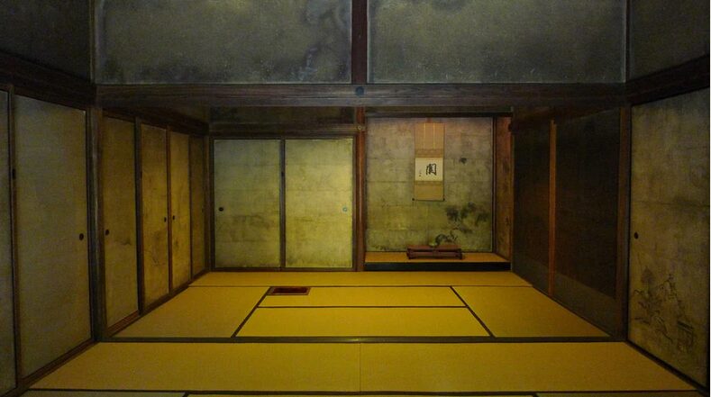
Tea room. Photo source [2]
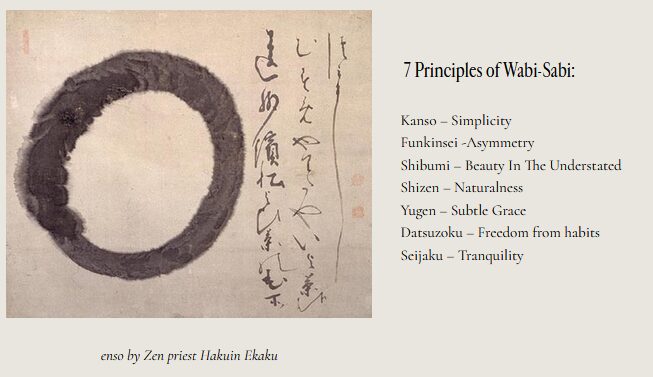 Japanese Calligraphy. Photo source [2]
Within the wabi-sabi aesthetic, I specifically explored Japanese calligraphy, as it is fundamentally different from the bold, blocky, and exaggerated typography used in comic books. Japanese calligraphy embodies wabi-sabi principles through its natural brushstrokes and emphasis on imperfection. It is deeply influenced by Zen thought, emphasizing mindfulness and presence [4]. Each brushstroke is unique and irreversible, reflecting the calligrapher’s state of mind at that moment [4]. Mastery requires a clear mind, allowing the characters to flow naturally without excessive effort.
The aesthetics of Japanese calligraphy and comic book-style pop art fonts differ not just visually but in philosophy, execution, and intent. Japanese calligraphy is rooted in Zen Buddhism, focusing on impermanence and the expression of the artist’s inner state [4]. It also celebrates imperfection and spontaneity, with strokes reflecting natural flow and organic beauty. In contrast, comic book fonts—often characterized by bright colors, thick outlines, and dramatic shadows—prioritize readability and impact [1]. Japanese calligraphy embodies simplicity, nature, and the passage of time, rooted in thousands of years of tradition. While Japanese calligraphy embodies simplicity, nature, and tradition, comic book pop art reflects modern consumer culture, energy, and immediacy, influenced by mid-20th-century American commercial art (e.g., Roy Lichtenstein, superhero comics) [5].
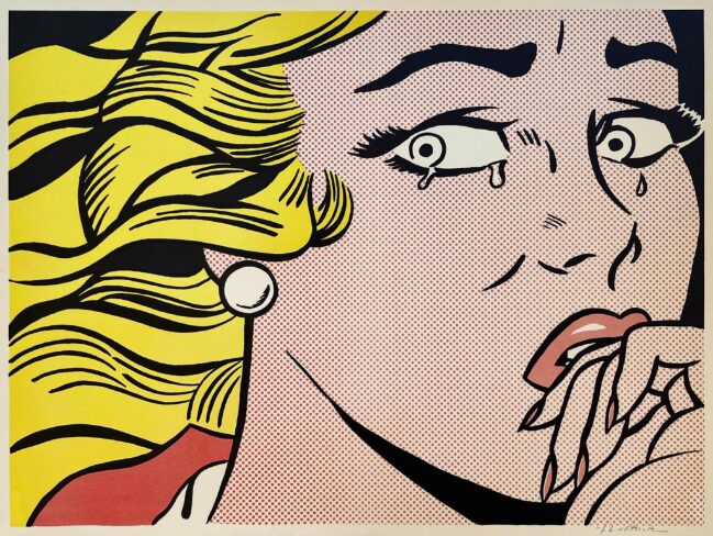
Cartoon pop art. Photo source [5]
While Japanese calligraphy embraces the imperfections of human touch and the natural flow of ink, comic book fonts are designed for boldness, clarity, and high-energy storytelling. One is introspective and spiritual; the other is dynamic and expressive.
References
[1] Font Foundry Hub. (n.d.). What are comic fonts?. Retrieved from https://fontfoundryhub.com/comic-fonts/
[2] Les Collection. (2023). Wabi-Sabi 101: A Beginner’s Guide to Embracing Imperfection. Retrieved from https://lescollection.com/blogs/journal/wabi-sabi-101?srsltid=AfmBOopHWFEZOGma93cVESNskcQ1XjAj9eF_40caccQ23GPtrDERF48v
[3] Omar Itani. (2023). 5 Teachings From The Japanese Wabi-Sabi Philosophy That Can Drastically Improve Your Life. Retrieved from https://www.omaritani.com/blog/wabi-sabi-philosophy-teachings
[4] Wabi Sabi Japan Living. (n.d.). The Art of Japanese Calligraphy: A Wabi-Sabi Perspective. Retrieved from https://www.wabisabijapanliving.com/calligraphy
[5] Hamilton-Selway Fine Art. (n.d.). Comic, Cartoon & Pop Art Artists. Retrieved from https://hamiltonselway.com/comic-cartoon-pop-art-artists/
2 Comments. Leave new
Great comparison! The contrast between comic book typography and wabi-sabi calligraphy is striking, not just visually but philosophically. Comic fonts are bold, structured, and high-energy, designed for clarity and impact, while Japanese calligraphy embraces imperfection, fluidity, and mindfulness. One is fast and mass-produced; the other is slow and intentional.
This mash-up reminds me of Showa-era Japan, where traditional aesthetics coexisted with the rise of bright, Western-influenced commercial art. Neon signs, manga, and pop art clashed with Japan’s deep-rooted wabi-sabi sensibilities, creating a unique visual culture. If you were to integrate wabi-sabi elements into your neon-inspired pop art, how might that look? Would you experiment with distressed textures or organic brushstrokes to contrast with the structured typography? Looking forward to seeing your approach!
Jamie, I really appreciate the depth of contrast you explored between pop art and wabi-sabi—especially in how their philosophies shape their aesthetics. Your breakdown of Japanese calligraphy as an extension of wabi-sabi is particularly insightful. The idea that each brushstroke is a reflection of the artist’s state of mind is such a striking contrast to the calculated, high-energy precision of comic book fonts.
It’s fascinating to think about how these two styles could interact. Have you considered incorporating wabi-sabi elements into your neon sign project in subtle ways? Maybe an intentionally imperfect or asymmetrical stroke in the lettering, or even distressing the neon to suggest impermanence? It could be interesting to blend the philosophies in a way that still honors your main vision. Looking forward to seeing how your project evolves!