
Main Project Aesthetics: Plans and Alternatives
Personal Aesthetic and Design Inspirations
My personal aesthetic is a blend of sleek modernism with a touch of nostalgic whimsy. I gravitate toward clean lines, bold typography, and high-contrast color schemes, often infused with a sense of playfulness or surrealism. My design choices lean heavily on the juxtaposition of structure and spontaneity—precisely aligned grids interrupted by unexpected elements that create visual intrigue.
Major 20th Century Design Movement Influences
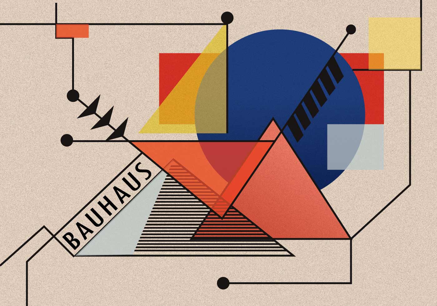
- Bauhaus (1919-1933) – The Bauhaus movement’s emphasis on function and simplicity resonates with my preference for clean, structured design. The interplay of typography, geometry, and minimalism aligns with my approach to layouts and composition.
- Swiss Design (1950s-1970s) – I admire the Swiss Style’s focus on clarity, readability, and asymmetrical layouts. Helvetica, a staple of Swiss design, has influenced my typographic choices in past projects, including my Helvetica project where I explored the word “Target.”
- Retro Futurism (1960s-Present) – There’s something fascinating about the way past generations envisioned the future. The neon-soaked, digital aesthetic of this movement often inspires my more experimental projects, especially those involving digital environments.
- Postmodernism (1970s-1990s) – While I generally lean toward modernist principles, I appreciate the way postmodernism broke design conventions. The use of irony, unexpected elements, and bold visuals sometimes finds its way into my work.
Personal Experiences that Shaped My Aesthetic
Several experiences have shaped my design sensibilities:
- Growing up in suburban New Jersey, I was surrounded by a mix of traditional architecture and urban elements, which made me appreciate both structure and spontaneity in design.
- Music and concerts, especially alternative rock and synthwave performances, have influenced my love for dynamic color palettes and immersive visual storytelling.
- Video games, particularly those with stylized art directions like Persona 5 and Mirror’s Edge, have inspired my use of strong typography and high-contrast visuals.
- Film, which I deeply love, plays a role in how I think about composition, lighting, and atmosphere in my designs.
Main Project Aesthetic
For my main project, I am considering whether to stay within my established aesthetic or push beyond my comfort zone. My recent work has focused on structured layouts and modernist principles, but I am intrigued by the idea of incorporating more experimental elements. Perhaps integrating elements of surrealism or interactive media could add depth to my work.
Alternative Aesthetic Explorations
As part of this exploration, I sketched out two wildly different aesthetics for my project:
1. Organic & Hand-Drawn
Instead of clean, geometric precision, this approach embraces imperfections, textures, and hand-drawn elements. Inspired by Art Nouveau and contemporary illustrative design, this version of my project would feature:
- Flowing, nature-inspired typography
- Soft, watercolor textures
- Sketch-like elements that introduce warmth and a human touch
2. Brutalist & Grunge
The complete opposite of my usual aesthetic, this version would draw from Brutalism and the raw, gritty aesthetic of grunge design. Key characteristics would include:
- Stark, heavy typography with a blocky, industrial feel
- High-contrast, desaturated imagery
- Rough textures, digital noise, and distorted elements for an unfinished, rebellious look
Next Steps
Over the next week, I will:
- Finalize my project’s theme and visual direction.
- Gather references and inspirations that align with my vision.
- Create initial sketches and wireframes to test different design approaches.

- Citations: Help from ChatGPT


2 Comments. Leave new
Hey Andrew I love the aesthetics you’ve picked out! You definitely have the bold lines nailed down with these and I appreciate how you related them both to minimalism. These aesthetics are not inherently minimalist but I can recognize how the aesthetics can have a simplicity with the protruding lines and bold shapes. I am interested to see how the art nouveau contrasts with the brutalism.
Hey! Thanks so much—I’m glad you like the aesthetics I picked! I definitely agree that while these styles aren’t inherently minimalist, their use of bold lines and strong forms can create a sense of simplicity in their own way. The contrast between Art Nouveau’s flowing, organic shapes and Brutalism’s rigid, geometric forms is something I’m really excited to explore further. I’m hoping to find a balance where they complement each other rather than clash. Can’t wait to see how it all comes together!