
When trying to decide what to make for an upcycle design project I first thought about what I could use as a material for my work and found that I had 13 wooden bed slats that I was no longer using. Knowing that I had plenty of material for something of medium to large size, I explored the types of aesthetics I could form my material into. I was then introduced to a wood-burning technique called Shou Sugi Ban and felt that I wanted to incorporate this into my project. The Shou Sugi Ban technique is an ancient Japanese exterior siding technique that aids in preserving wood by burning it. The process involves charring wood, cooling it, cleaning it, and finishing it with paint or oil. This style, though ancient, has been used in modern architecture and can be interpreted as a more chic style. Because of its versatile nature, I decided to incorporate it into this project to add a bit more uniqueness and contrast to my existing wood. However because this is a technique and not necessarily an aesthetic, I aimed to narrow down what I wanted to achieve for this project. I ended up incorporating the Japanese Wabi-Sabi aesthetic. Wabi-Sabi is the Japanese art of impermanence. “Wabi,” meaning less is more, and “Sabi” meaning attentive melancholy, describes an emphasis on nature and the awareness of pleasure in things that are not permanent. In other words, it is the embrace of imperfections and the natural tendencies that things have. With this, I aimed to create something that embraced imperfection and thought that wood-burning was a way to capture this.
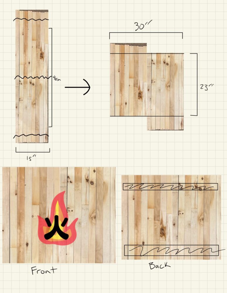
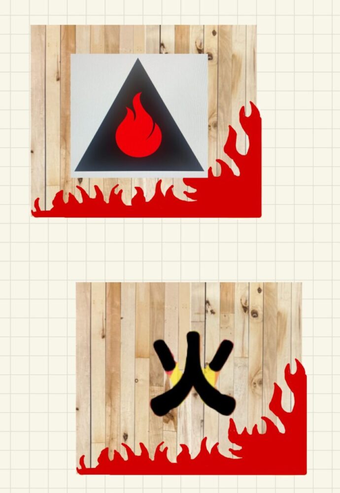
As far as the actual medium I would use to portray this aesthetic, a simple wall decor piece came to mind. I could cut up the 13 wooden slats and fasten them together to create a single piece. From this, I debated how I could arrange the wood to fit the aesthetic, but decided that anything too complicated would directly oppose what I was hoping to achieve which led me to a simplistic arrangement of the wooden boards to create a rectangle. Even though the Wabi-Sabi aesthetic embraces imperfection, I still thought my design as it was was too simple so I decided to add a simple graphic to the piece. For this graphic I wanted to nod to the two Japanese elements I was using to create this piece, Shou Sugi Ban and Wabi-Sabi. I went through multiple iterations but decided upon a simple Japanese kanji and flame artwork, though even this concept would also go through multiple iterations.
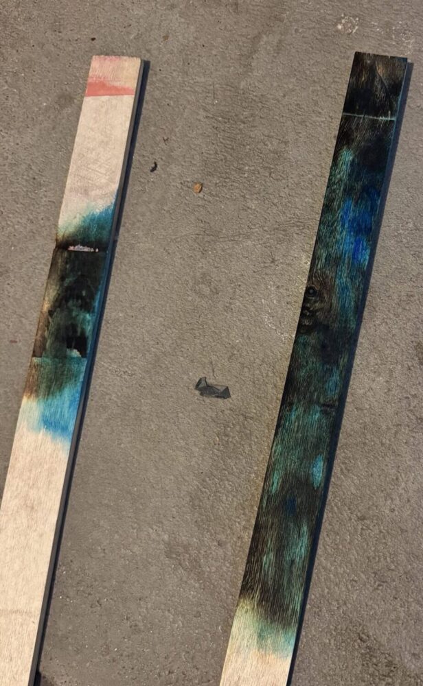
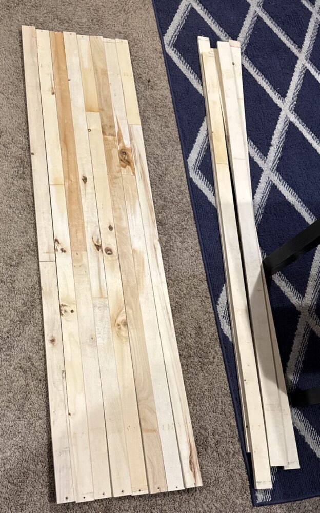
Stuck in decision paralysis for the actual graphic that I wanted to incorporate I decided to just start the process of actually creating the piece. To begin, I removed the staples and straps keeping all of the wooden slats together and gathered basic dimensions. I then brought everything to the Makerspace in the Idea Forge located on campus at CU Boulder. There I cut off all of the end pieces of wood that had been marked by the staples previously embedded in them. I then cut these remaining larger pieces in half and they became the bulk of the wall art. I gathered the remaining materials I needed to complete this project including a propane blowtorch for burning, a steel wire drill brush for sanding, and paint for the graphic. From here I set up the wood in my garage and burnt and sanded everything as seen in the two timelapse videos linked below:
https://drive.google.com/file/d/1MP72bgF8funhM4WQqIyjWo3-luMwKzwb/view?usp=sharing
https://drive.google.com/file/d/1s-rGb7SNQXPIMsPO9kaP4hSx6NPAjh12/view?usp=sharing
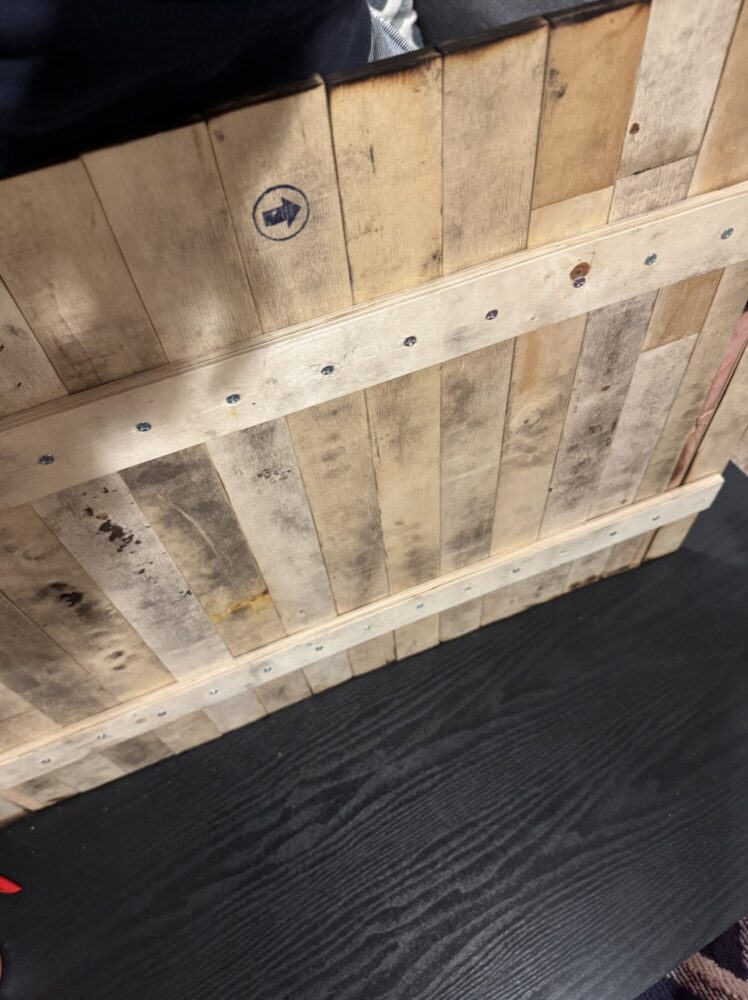
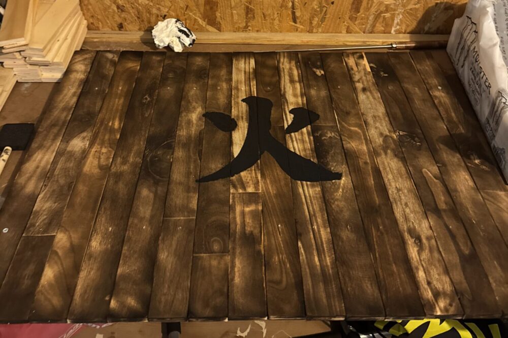
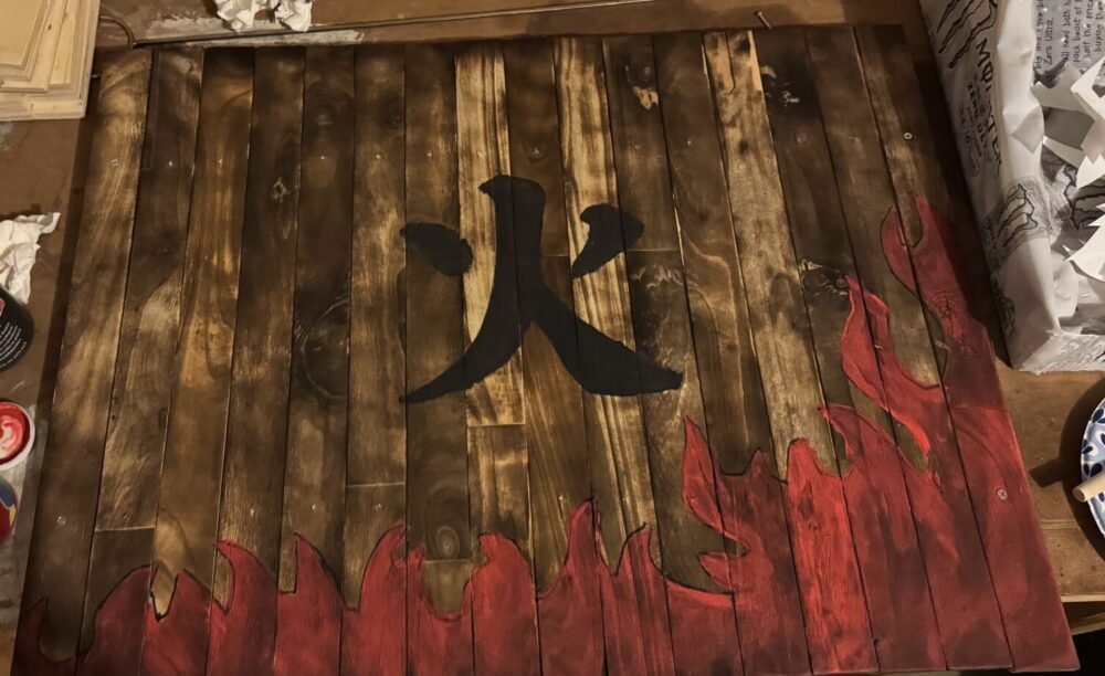
I then set up backing boards and fastened everything together. At this point, I needed to add paint, which meant I needed to decide what to actually use for my graphic. After some deliberation, I chose a design and recreated it in SolidWorks with the aim of making a stencil that I could 3-D print. After splitting the stencils into parts as they were too large for one print, I traced them onto the boards. This is where, in my opinion, I made a mistake. Since I started with one stencil, the fire kanji, which was to be colored black I used a Sharpie to outline it since pencil markings weren’t showing up well enough on the burnt wood. This worked well as seen in the image below. However when I used this same technique for the fire graphic, I mistakenly thought that the Sharpie would be able to get painted over, but this was not the case. Because of this, the final product has some leftover artifacts that I personally am not a fan of, but might ironically add to the aesthetic.
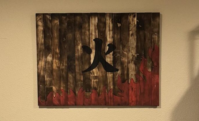
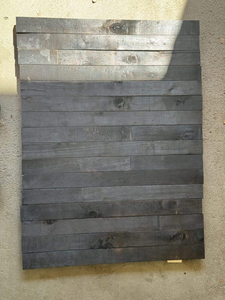
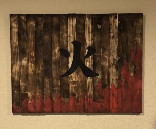
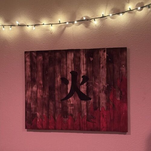
The end product can be seen below. It is a collection of burnt and sanded pieces of wooden bed slats that have been fastened together in a simple rectangular shape. This piece features the Japanese kanji for ‘fire’ which is centered with some literal flames bordering the bottom and one of the sides of the piece. I have mounted this piece to my wall using some leftover bed slats and some nails.
Functionally, I wanted this to be a piece of art that hung up on my wall and I think I achieved this with my design. Since this design doesn’t have to be inherently interactable, I decided to try and flex my artistic skills since I am not usually prone to doing this. Artistically, I think I achieved my goals. I utilized the Shou Sugi ban wood burning technique and I think this along with my subtle mistakes in painting demonstrated the Wabi-Sabi aesthetic. The variance in the wood because I used bed slats, which are usually not meant to be seen, created some contrast in the piece. Some of the boards burnt differently, some taking longer and some burning very easily. Likewise, they also finished differently through sanding with some boards looking much brighter than others. The Shou Sugi Ban technique added contrast and highlighted the variance and natural imperfections in the wood grains. I tried to further emphasize this through the use of acrylic paint on the wood. Obviously, black won’t add much contrast as it’s a similar color to the charring that occurred, but any other bright color emphasizes the grain and adds to the aesthetic. I debated which colors I wanted to paint on the design and chose between white and black for the kanji symbol and a variety of colors for the flames. I evidently chose black and red respectively but I had to paint some test pieces to become confident in my decision.
Moving forward, there are a couple of things I still want to do for this project. I want to experiment with adding more paint on top of existing paint to see if a gradient effect can be achieved in the fire design. I might also add some smaller details with this and try to fix the sharpie lines that are currently on the piece by either sanding them down or doubling down and emphasizing them. I also want to add some sort of finish to the piece to make it a bit more ‘glossy’ and more ‘wet’ looking because I think it will add to the contrast. This will likely involve some sort of oil that, through my research, Shou Sugi Ban works best with linseed oil. I plan to keep this project because there is not much reason to get rid of it once it is on my wall. Maybe in the future, I will sell it if it becomes too much of a hassle but I don’t think that is likely.
2 Comments. Leave new
Hi Garrett, this project is awesome! I love that you took some old bed slats and made use of them. I didn’t know much about Shou Sugi Ban technique and it was really interesting learning about it in your post and seeing how it can transform a basic piece of wood. I’m curious to how burning the wood actually preserves it. You did a really nice job with this technique while burning and sanding the wood and I really like how the pieces of wood came out. I might try this at some point in my future as well because it seemed pretty fun. I like your idea of using some sort of oil on the piece to give it a finishing look and maybe bring out a little more contrast. Nice job!
Hi Garrett, your project turned out really well! I really like the artistic choices you made for your fire and kanji. I like that the kanji really pop’s with the dark, rich black, and I think that it’s very cool that the paint for the fire is slightly transparent (seeming more realistic as opposed to cartoony). You did a great job showcasing the Wabi-Sabi aesthetic, and it’s super cool you experimented with the Shou Sugi Ban technique. The dilemma of trying to get rid of the sharpie marks or adding it as an outline around the whole fire pattern is definitely tricky. I think I personally would be in favor of adding the sharpie all along the fire to make it pop, but you’ll probably have to play around with it to figure out what you’ll like best. All in all, you had a really creative idea and your final design turned out really well! Great job!