
For my upcycle project, I originally sought to use 3D printed scraps to create a pixel art image within a wooden frame. My initial vision was to take discarded 3D prints, shred them into small, uniform pieces, and arrange them into a pixelated design. However, as I started working on this concept, I quickly realized that the equipment and materials I had access to presented several challenges that made it impossible to execute pixel art. Below, I outline the main obstacles I encountered and how they led me to pivot to a new aesthetic.
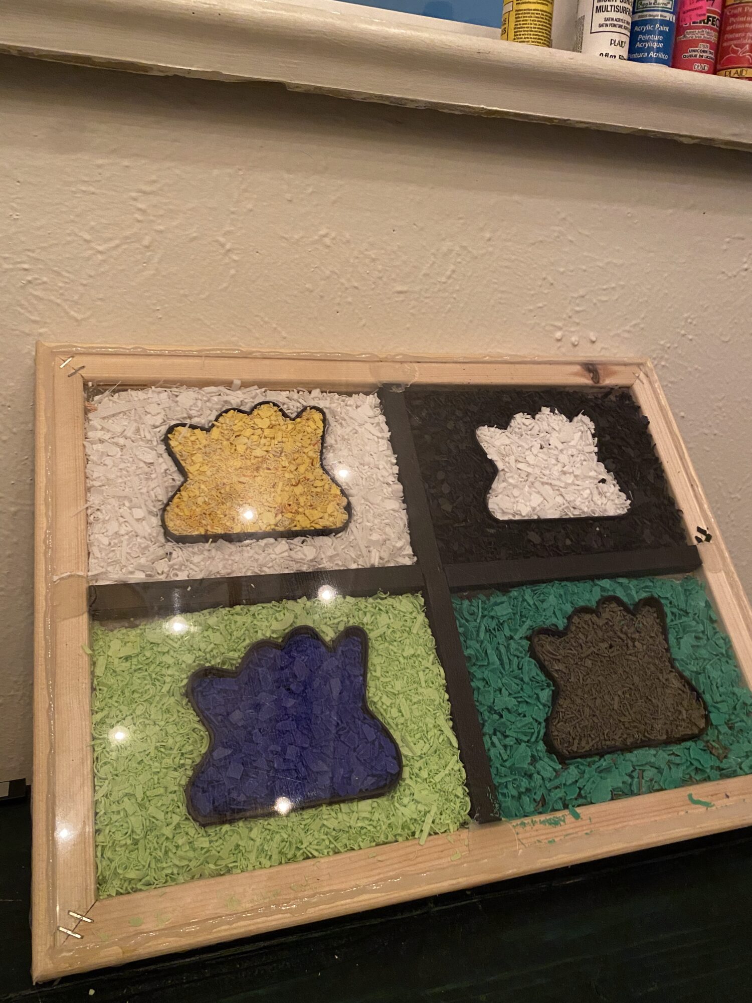
Image 1: My Original Concept for the Upcycle Project
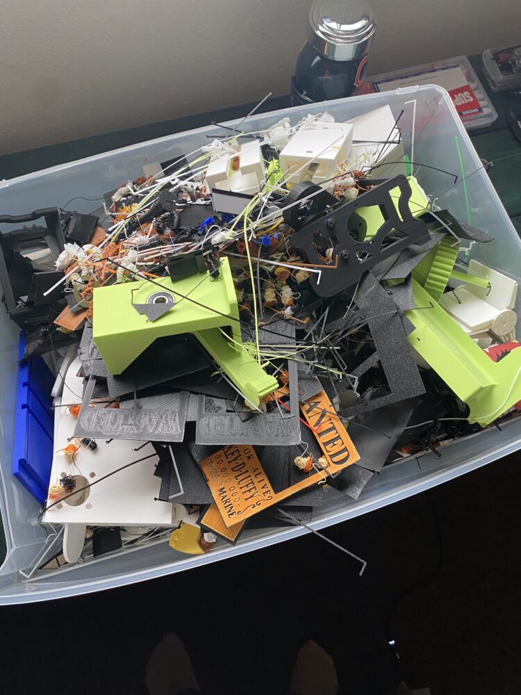
Image 2: Small 3D print scraps
Image 3: Large 3D print scraps
Challenges with the Original Concept
- Wall Thickness Issues After designing a grid system to hold the shredded prints in place, I realized that the walls of the grid were too thick. This resulted in an issue where spacing between pixels was too large, making it difficult to see the intended design. Because pixel art relies on small, distinct squares to create a recognizable picture..
- Resolution Limitations To prepare my 3D printed scraps for use, I attempted to shred them using a blender. Unfortunately, the resulting pieces were too large and inconsistent in size, preventing me from achieving the resolution needed for a clear pixel art image.
- Limited Color Palette Another major issue was the lack of color variety in my 3D printed scraps. Since pixel art relies heavily on color contrast and shading to form images, my limited volume of filament colors meant that I could not accurately recreate my chosen design.
Switching to a Pop Art Aesthetic
After encountering these challenges, I decided to shift my approach and switch to an aesthetic I had initially considered: Pop Art. This transition not only allowed me to continue working with my available material.
Pop Art emerged in the mid-1950s in Britain and the United States. It is characterized by its use of imagery from popular culture, mass production techniques, and vibrant, contrasting colors. The movement was a reaction against the abstract expressionism that dominated the art world at the time, seeking to make art more accessible by incorporating elements from everyday life, such as advertisements, comic strips, celebrities, and consumer products.
British art critic Lawrence Alloway coined the term “Pop Art” in 1955, and artists such as Andy Warhol, Roy Lichtenstein, Jasper Johns, and Robert Rauschenberg became central figures in the movement. Warhol famously transformed mass-produced items like Campbell’s Soup cans and celebrity portraits into art, while Lichtenstein used comic book techniques to create large-scale paintings. Pop Art blurred the boundaries between high and low culture, often serving as both a critique and celebration of mass media and consumerism.
The movement reflected the booming post-WWII consumer society, highlighting the rise of advertising and media saturation. Even today, the bold, colorful, and often ironic aesthetic of Pop Art remains widely recognized and influential in various creative fields, including painting, sculpture, design, and fashion.

Image 4: Andy Warhol’s Marylin Monroe Portrait
Adapting My Project to the Pop Art Aesthetic
For inspiration, I looked to Andy Warhol’s iconic Marilyn Monroe series, which features repeated images of Monroe in different color schemes. I decided to maintain the subject of my original pixel art concept, a Pokémon image, but reinterpret it through a Pop Art lens. I chose Ditto, a very recognizable Pokémon and easy to contrast, and repeated its image four times in different color variations to mimic Warhol’s style.
Given my limited color palette, I had to experiment with combining colors in a way that would create a vibrant, eye-catching effect. The goal was to ensure that the contrast between colors allowed each Ditto to stand out while still maintaining the overall Pop Art aesthetic.
The Process of Creating the Artwork
To execute my new vision, I followed these steps:
- Sorting Materials
- I began by sorting out the larger scraps from my pile of discarded 3D prints. These were pieces that were too big to be used effectively without further processing, so I set them aside for later refinement.
- Then, I categorized the smaller pieces by color to maximize the available variety. This helped me plan how to distribute different shades across my design, ensuring a visually appealing final product..
- Processing the Scraps
- I broke down larger pieces into smaller chunks so they could fit into my blender. This step was crucial because the blender could only handle small, manageable fragments, preventing damage to the blades.
- Once blended, I sorted the shredded plastic into separate containers by color. This organization allowed me to efficiently select and apply the correct colors during the assembly phase of the project.
- Preparing the Frame
- I laser-cut both the front and back of the frame using the laser cutters at the ITLL.
- I found a free 3D print for a Ditto cookie cutter on Bambu Labs Maker World. I used it as a mold to shape each individual Ditto within the frame, giving my design a recognizable and structured appearance.
- I designed and 3D printed separators using SolidWorks. These barriers helped keep the different colors from blending together, preserving the distinct sections of the artwork.
- Assembling the Artwork
- With all components ready, I arranged the colors to create contrast. This step was essential to capture the bold, graphic quality associated with Pop Art and make the design visually striking.
- I attached the acrylic back panel to the frame using hot glue. This created a back that would hold the plastic pieces securely in place.
- I used a spoon to fill each section with its respective color of shredded plastic. By layering the plastic, I tried to ensure that each section had an even distribution of color.
- Once the frame was filled, I secured the front panel with hot glue. This final step sealed everything in place, preventing any movement or shifting of the plastic pieces.
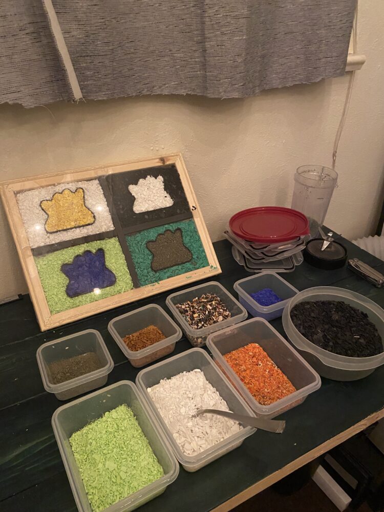
Image 5: Sorted 3D print scraps by color
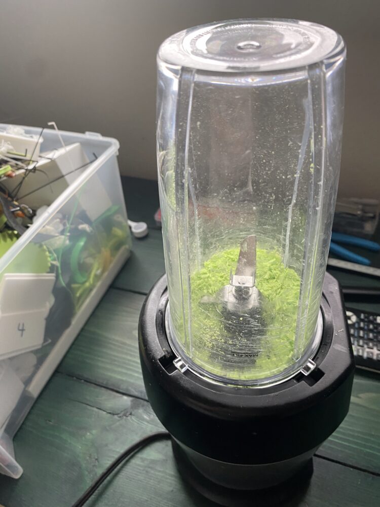
Image 6: The blender I used to shred my 3D print scraps
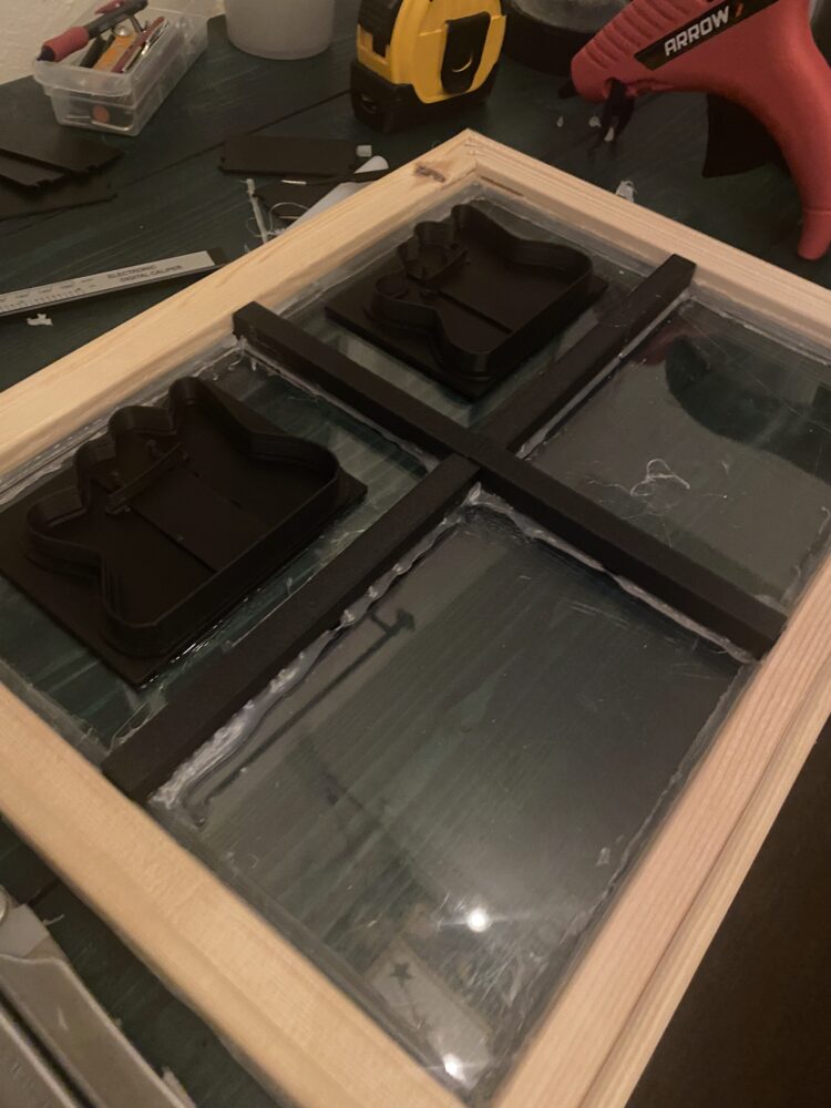
Image 7: Assembling the frame for my project
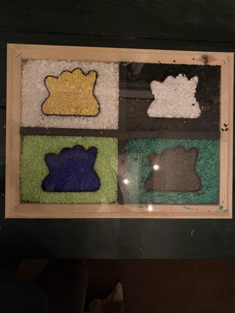
Image 8: Final product after putting to cover on
Final Touches and Areas for Improvement
I am not completely finished with the project, as I realized that sealing the frame with hot glue alone may not be the best approach. To give the piece a more polished, professional look, I plan to cover the frame with a thin plywood or craft wood layer.
Reflecting on my process, there are several things I would do differently if I were to recreate this project:
- Integrate the Divider and Dittos into a Single Part
- If the dividers and Ditto cutouts were part of a single structure, it would eliminate height differences and prevent plastic from spilling over between sections.
- Laser-Cut Holes for Fasteners
- Instead of relying entirely on glue, I could design slots for mechanical fasteners, allowing for a cleaner and more durable assembly.
- Expand the Color Palette
- Gathering more filament colors would improve contrast between each Ditto, making the Pop Art aesthetic more pronounced.
- Densely Pack the Plastic Fill
- I underestimated how much shredded plastic was needed to completely fill each section. As a result, small gaps are visible when the piece is viewed vertically. Compressing the plastic more densely would prevent this issue.
Conclusion
Overall, I thoroughly enjoyed working on this project. Not only did it allow me to experiment with a new artistic style, but it also helped me repurpose excess 3D printing material in a creative and sustainable way. Several other students in my class also recycled their 3D prints, and I am considering incorporating some of their methods into future upcycling projects to make use of my remaining scraps.
2 Comments. Leave new
This is a great project, turning old printed projects into something new and exciting that you can decorate your home with is amazing, plus the final result turned out super well. I really enjoyed reading about your struggles with the design process and how you were able to change your design while incorporating a different but still very cool aesthetic. You mentioned a lot of good ideas to improve your design going forward, does that mean that your planning on trying again with something else or do you still want to improve what you’ve already made?
This is such a cool pivot! Turning 3D print scraps into Pop Art is honestly genius.The Ditto design is so fun, and the bold colors really capture the aesthetic. Also, blending 3D prints? That’s some next-level commitment. Great job making the most out of the materials!Also how did you decide on the final color combinations to keep that bold, high-contrast look?