
Vision
My goal for this product was to create a a tech product that isn’t focused on sleek, hyper-modern design: an intuitive weather monitor that represents the Mediterranean revisal aesthetic.

Credit: Inkbird 8-in-1 Indoor Hygrometer Thermometer
What Is The Product
While I don’t think that tech products such as the weather monitor above are ugly necessarily, I do find that a vast majority of electrical devices aim for this very sleek, minimalist aesthetic. This is very limiting as if your home is not themed in a sleek, modern design style the tech products will stick out like a sore thumb. I wanted to create a tech product that provides the same functionality as a typical weather monitor but without feeling like just another screen. My primary objectives were that the device feel homemade, colorful, intuitive, and hopefully beautiful. Finally I wanted to provide a connection to the outside word for people in cold climates. While giant stained glass windows and ornate carved archways between the beach and home may not be possible in Colorado a natural connection to the outside certainly is.
This device indicates the outside temp using color on a ring of smart LEDs. I used a variety of temp ranges each with a preset color and the OpenWeatherMap API that has great open source weather data for a variety of locations. Definitely check out OpenWeatherMap because their free to use API can be super helpful for a variety of projects! I wanted to take advantage of our synesthetic connection between color and temperature as humans to create the color codes. So although it may take a couple days for it to become second nature using the device, it will not be a steep learning curve. Colder colors represent colder temps (blues and greens) while moderate temps are yellow and orange, and hot temps are red. I also received a great suggestion during my pod! Because there are many smart LED libraries with prebuilt twinkle and swirl functions, I’ve used twinkling blue for rain and swirling grey for wind. It was quite a fun exercise to attempt to evaluate what temperatures evoke what colors for people.
My ultimate goal was to mimic the emotional impact of a Mediterranean stained glass window or hand-painted tile such as the one shown below.
Credit: JollySienda
In order to achieve the imperfect human element that is inherent to the design style I upcycled old exam papers, colored them with marker ink and used a paper slicer to evenly cut them into strips. I then quilled (rolled tightly) the papers and shaped them into a petal-like. My goal was to make a simple floral pattern and then branch out into a more intricate design from there.
The Process
Above you can see the first iteration I made of the floral design. I liked it, but there were a couple of imperfections I wanted to smooth over for the final product. First, the paper strip height was super uneven, I cut it with an x-acto knife but a helpful classmate suggested I use a paper slicer and that was a much better route. I also realized that my original plan to paint the paper wouldn’t work as the acrylic started flaking and cracking as I bent the paper to quill.
For the next iteration I stepped up my game. I used a paper slicer, quilling tool, tweezers, and a sizer to spread out the quilled rolls to an even size. I used markers to color the paper (quickly destroyed my markers, but they died for a good cause) as well as hot glue to attach them to a milky white acrylic sheet that I purchased on amazon. This sheet is translucent but not transparent and I was initially planning to put the lights behind it, allowing a soft glow.
I learned that the hot glue was a mistake. Stringy adhesive everywhere. So I used acetone as a solvent to remove the hot glue and it worked pretty well. This was a good think to learn early on as I ended up gluing a lot of elements down and then changing my mind. For example, the paper frame seen below ended up getting traded out for the tiles I found for 10 cents at art parts seen in the next photo. I feel that the actual tile helps convey the the quilled element is intended to feel like a painted tile.
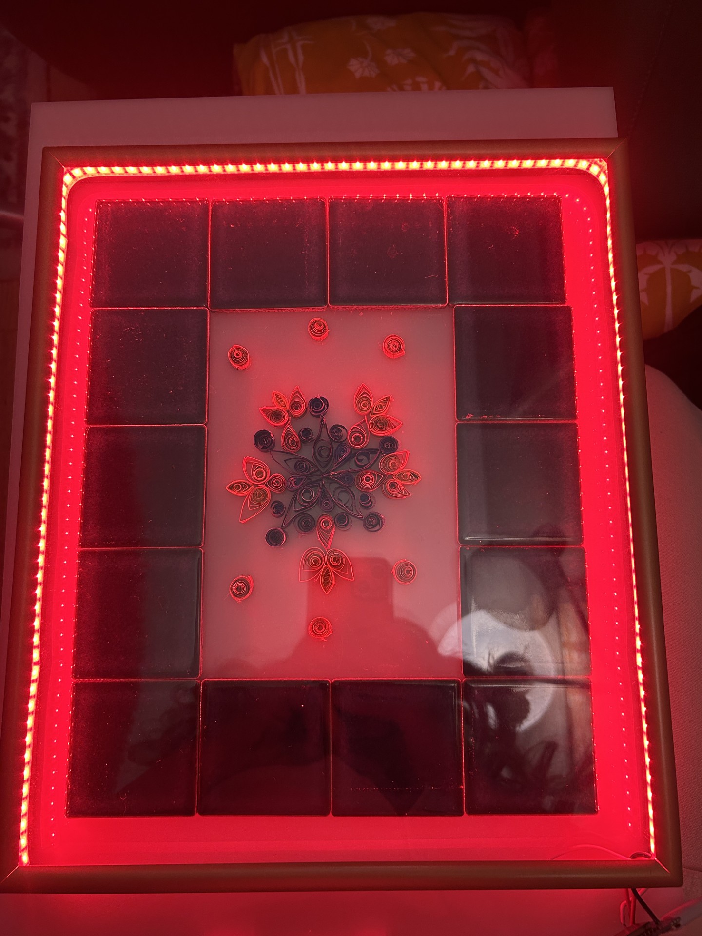
At Art Parts I also found a picture frame in great condition that had a recession big enough to fit the LED strip. The size ended up being 8×10″ so I had to remove some of the design elements from my quilling design to make it fit. As well as laser-cut the acrylic sheet ti make it fit in the frame.
Electrical Elements:
Thankfully, as an EE student, I had 95% of the electrical components on hand, meaning that I could upcycle some e-waste for the project as well. The smart LED strip was from a previous class, jumper cables, and microcontroller were all already in my personal collection. I had more problems uploading to the ESP8266 than I anticipated. Two different micro-USBs that I used turned out to be power only and didn’t have any data pins, but the board connection worked perfectly as soon as I was able to bum a cable off a friend. The ESP8266 has a simple pinout and IoT capabilities making it perfect for this project. The pinout of my smart LEDs also did not comply with standard IEEE insulation color indicators which confused me at first. The green wire was data while white was GND and Din pin was only available for connection on one end of the strip. Smart LEDs has great visual effects possible through the data pins which made representing a variety of weather conditions a breeze. The whole circuit is powered off 5V from a USB into a standard brick AC to DC adaptor.
Although I was initially planning on the light coming from behind the acrylic sheet as shown below to mimic a stained glass window, I ultimately felt that the perimeter of LEDs being placed forward created a sunnier visual cue. Feel free to give me feedback in the comments though, the acrylic sheet could be placed forward or backward in the frame easily now that its cut.
Final Form:
After lots of rubbing with acetone I was able to remove my tracings for placement as well as the hot glue remnants and attached the rest, including the tile perimeter with superglue.
Did I Achieve My Aesthetic Goals?
I love that the Mediterranean aesthetic focuses on items that feel human. Fabric is sun-worn, wood is scratched, and artwork is somewhat uneven because it was made by a person rather than a machine. I believe this makes Mediterranean spaces feel lived in and gives them their magic. I find that this style manages to be so beautiful and cohesive while not aiming for perfection, which frankly is a great philosophy in life. I’m not the best crafter, but I did enjoy that choosing this aesthetic offered me the freedom to give myself permission to make mistakes. I didn’t want the finished product to look like it was printed or machined and I know that you can tell that this was made by hand. Although I’m not anywhere close to the generations of skilled craftspeople making gorgeous hand-crafted goods in Morocco, Spain and Turkey. My quilling mimics the simple florals with branching designs common in Mediterranean tilework. The color pallet was also based on the coastal tones present in this design style: oranges, yellows, and blues to mimic sun and sea. My overall intention with the device was to create a connection between indoors and outdoors for cold climates, which I believe incorporates the critical indoor-outdoor component of the Mediterranean aesthetic.
Functional Goals
The product works as intended. Different colors are programmed to indicate different temperature ranges and weather conditions, these are implemented simply using if-statements thanks to the ease of use of the OpenWeatherMap API. The visual effects suggested by my classmate have also been an excellent addition.
What’s Next?
Presently the project is hanging by my bed and that’s where it will stay. I designed the item for a need of my own, forgetting to check the weather app while getting ready and I’ve found that the device integrates seamlessly into my life. Since it’s the first thing I see when i wake up, I quickly glean the general weather conditions. The device also automatically turns off at from 10pm-6am because its programmed to my time-zone and this was quite easy to implement. This saves power and my eyes. Overall I’m quite happy with the results, I believe the device is beautiful and useful.
2 Comments. Leave new
Hi Claire,
Your project does a great job of blending technology with a handmade Mediterranean aesthetic. The use of quilled paper and repurposed tiles adds a personal and upcycled touch that makes the device unique. How did you decide on the specific color mappings, and did you test different variations before settling on the final design? Overall, your project seems to be a great success!
I really enjoyed this concept! There are so many appliances or gadgets that I think miss the mark on my own personal style. I really enjoyed reading through your process! I really enjoyed your Mediterranean aesthetic, I don’t know what it is about the weather forecasting device that feels uniquely fitting to this aesthetic, but I think it’s great! When you mention that it is programmed to your timezone, do you mean that it turns on and off based on dusk and dawn? Regardless I think that is a very cool feature!