
For my upcycling project, I am repurposing old skateboard decks into colorful plywood to make a jewelry set. This project draws inspiration from Bauhaus and De Stijl aesthetics, emphasizing geometric patterns, sharp lines, and bold color contrasts.
Defining the Opposite Aesthetic
The aesthetic I chose for my upcycle project is a blend of Bauhaus and De Stijl, which are characterized by clean geometric forms, strong lines, minimalism, and primary colors. These styles emphasize structure, order, and intentionality in design.
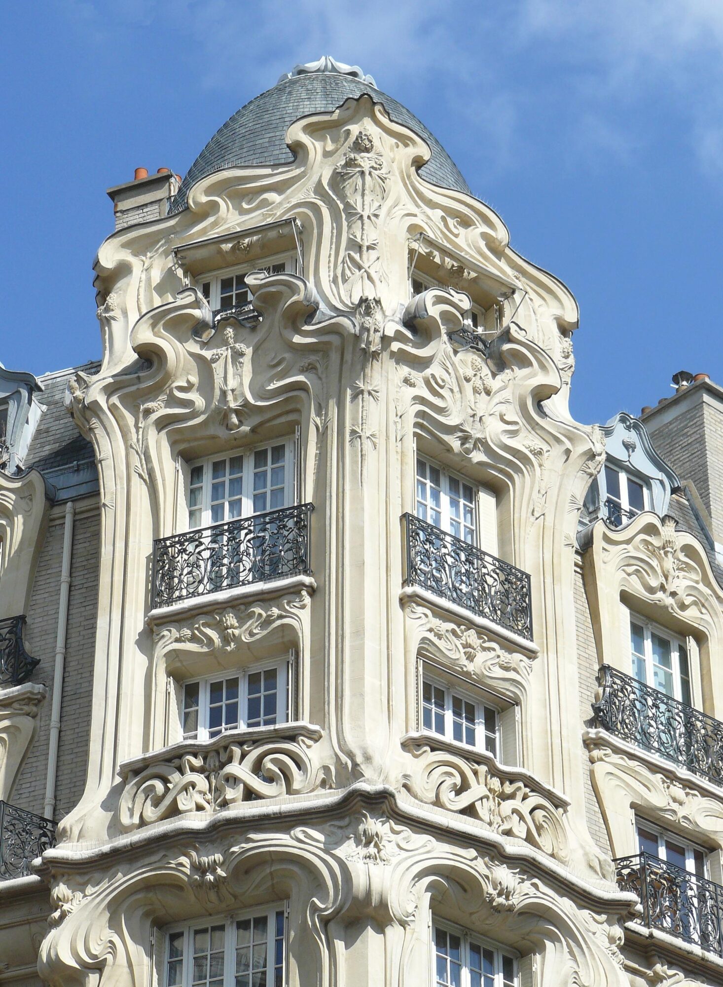
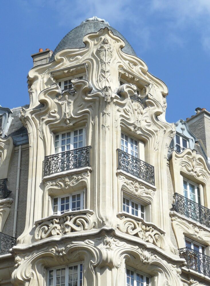
The opposite of this aesthetic would be something organic, chaotic, and unstructured—in my opinion, an Art Nouveau or Wabi-Sabi approach.
- Art Nouveau embraces curvilinear forms inspired by nature, asymmetry, and intricate ornamentation.
- Wabi-Sabi is rooted in Japanese philosophy, celebrating imperfection, irregularity, and the natural aging of materials.
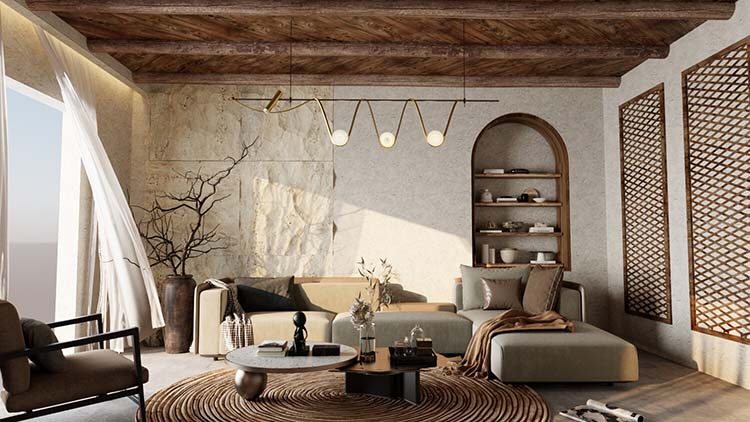
Both styles contrast sharply with the rigid structure of Bauhaus and De Stijl, replacing precise geometry with free-flowing, imperfect, and nature-inspired aesthetics.
What Would This Look Like?
If I were to transform my upcycled project into an Art Nouveau or Wabi-Sabi aesthetic, I would emphasize:
- Flowing, organic shapes instead of straight, geometric lines.
- Natural curves in the jewelry, following the wood grain rather than forcing strict angles.
- A more raw, unfinished texture rather than polished, industrial-looking surfaces.
- Earthy, muted colors instead of the bright, high-contrast primary colors of De Stijl.
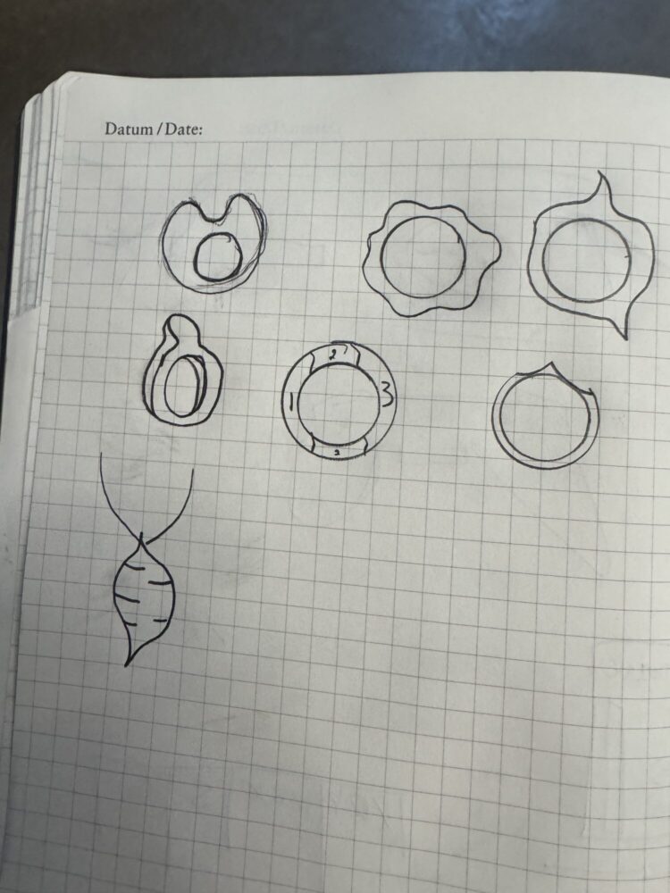
Here are some sketches illustrating what this could look like…
To swap the aesthetic of my project while still using recycled skateboard decks, I could do the following
- Let the wood guide the form rather than cutting it into rigid geometric shapes. Instead of sharp angles, I’d carve organic, flowing designs that follow the contours of the layered plywood.
- Introduce natural imperfections by embracing cracks, chips, and irregular edges rather than sanding everything to a smooth, uniform finish.
- Use staining or burning techniques to highlight the raw texture of the wood, giving it a more aged, natural appearance instead of bright, high-contrast colors.
- Avoid symmetry in composition—for example, making earrings that don’t perfectly match, or a bowl with an uneven, natural-looking rim.
(Ideas partially from ChatGPT)
Exploring the opposite aesthetic of my project is an interesting exercise in design flexibility. While my original intention was to create structured, geometric jewelry in line with Bauhaus and De Stijl, an Art Nouveau or Wabi-Sabi approach would lean into the natural beauty of the materials, embracing imperfection and organic form.
This contrast highlights how design choices significantly impact the perception and emotional response to an object—whether it feels precise and modern or natural and timeless. If I were to keep working on the jewelry side of this project, I’d love to explore this alternative aesthetic!
- Reddit – r/Architecture. “Art Nouveau Facade in Paris, France.” Reddit, 2017, https://www.reddit.com/r/architecture/comments/7fmmwf/art_nouveau_facade_in_paris_france/.
- Ro Wabi. “What is Wabi-Sabi?” Ro Wabi Blog, 2023, https://www.rowabi.com/blogs/lab-of-wabi-sabi-blogs/what-is-wabi-sabi.
4 Comments. Leave new
I really liked how you explored how this aesthetic would change your project and liked the ways you came up with. I also enjoyed how you chose an opposite aesthetic and from how you described it I could see how they are opposite. Would using worn out skateboards for your project fit this aesthetic as well?
I think technically the more worn skateboards could fit the aesthetic a bit better. I’m not 100% sure which aesthetic you are referring to, but for the Wabi Sabi, more worn would definitely fit.
Your exploration of the Art Nouveau and Wabi-Sabi aesthetics as opposites to your original Bauhaus and De Stijl approach is really interesting. The contrast between geometric precision and organic imperfection is a great way to highlight how design choices shape the final product. I love the idea of letting the natural grain of the wood guide the form instead of enforcing strict lines, as it would create a unique, free-flowing look; one question i have is, do you think embracing imperfections in the material would change how the jewelry is worn or perceived? Really cool concept!
I think letting the wood guide the design is a great way of putting that! I did my best to remove just about any and all imperfections from the material, but if I had left some divots and dings, I think it would change the way the jewelry is perceived or the outfits it is worn with.