

Inspiration
For this upcycle project, my inspiration was to combine my love of multi-media art with thoughtful design to conform to a desired aesthetic. I noticed I had a lot of paper scraps, paper bags, magazines, and various art utensils laying around my house that I wanted to put to good use! I also knew that I wanted to make something somewhat practical, more than just decor. I decided to make collage cards (be it thank you cards, happy birthday cards, valentines cards, etc) so that I can give them to friends and family and everyone can enjoy a thoughtful, homemade collage card. I am inspired by both the process and end-product in this type of work. The process can be somewhat tedious, constantly snipping, placing, and pasting materials, however I find it rather therapeutic. Then the end-product is always a unique piece that is brimming with personality.
The above paragraph is originally from my 1st upcycle post.
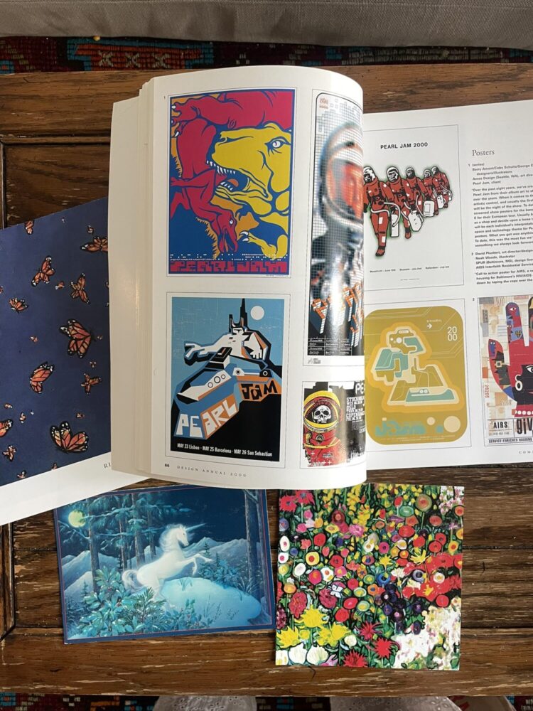
Part of what makes collages so special is that they often display tiny details that are telling of attention and care, adding a lot of meaning to the work. There are endless opportunities to explore different layering techniques, material combinations, compositions, textures, and patterns. There is no one particular artist or designer that inspired me to begin the project because I was already relatively familiar with the art of collaging and the various related aesthetics. However, upon researching to gather inspiration at the beginning of this process, I came across a few artists whose styles I admire: Jennifer Wilkin Penick, Chelsea Ragan, and Christine Stoll.
Jennifer Wilkin Penick employs multicolored, painted pieces in combination with vintage black and white images. I was inspired by her use of repeated patterns, bold colors, and floral designs. A few examples of her artwork are shown below:
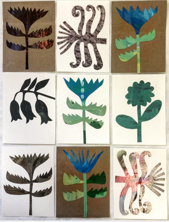
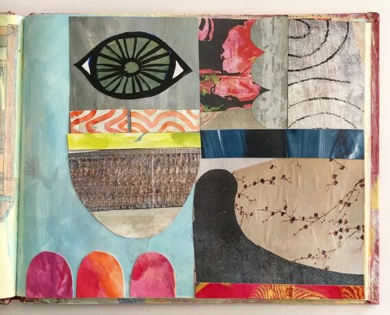
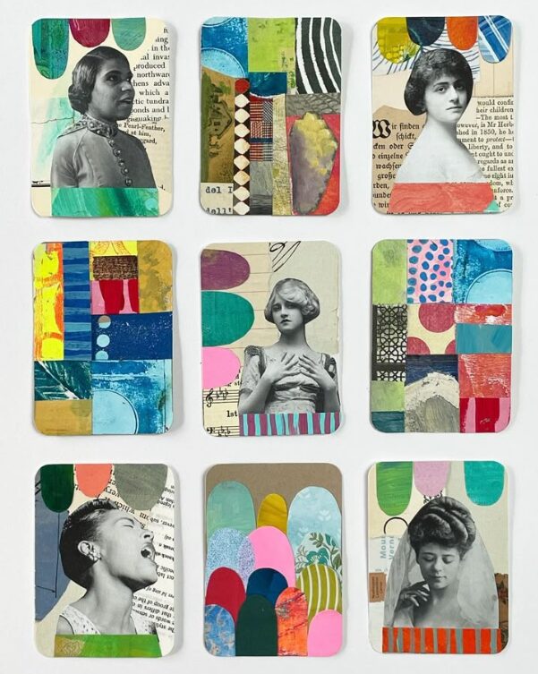
Image credit: Jennifer Wilkin Penick
Chelsea Ragan has a very distinct collage style. It seems as though she uses cutouts of paper sheets she’s painted herself to achieve the desired color. There are not many components in her collages that seem to be upcycled, however, her use of tiny snippets to create detail and texture in her designs inspired me. Ragan’s art is depicted below:
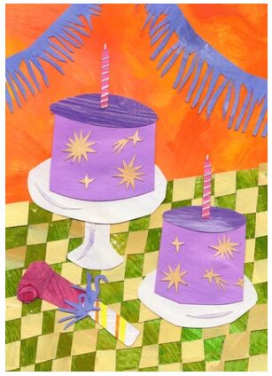
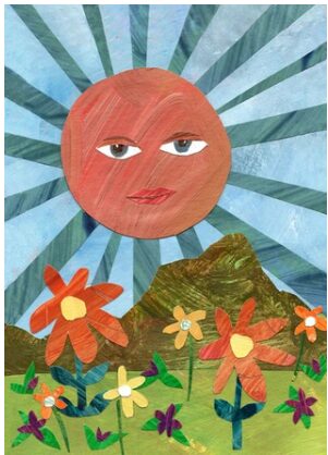
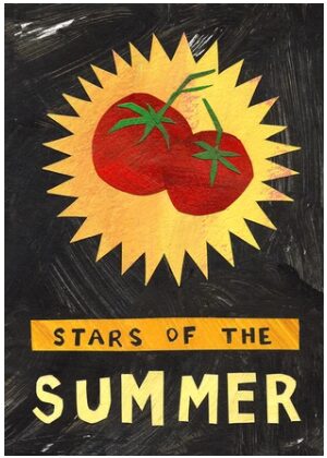
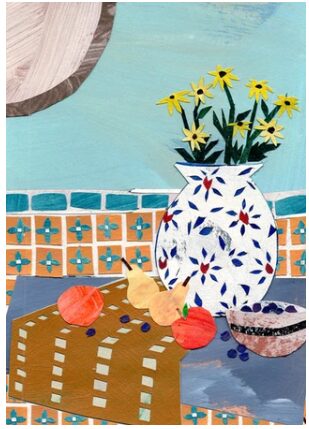
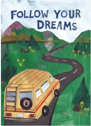
Image credit: Chelsea Ragan
Christine Stoll inspired me through the personality she gives her cards, as well as her clear vintage aesthetic. Her primary materials are old maps, old typewriter cutouts, and vintage photos and magazines. A couple of her cards are shown below:
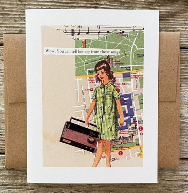
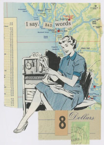
Image credit: Christine Stoll
My Desired Aesthetic
When I initially decided to make these cards, I determined the aesthetic would be maximalist, vintage, whimsical, and natural. The maximalism comes from the quantity of items pasted on the card, meaning there are plenty of things for your eyes to follow. The vintage retro aesthetic is created by the materials used in the collage, such as postcards from the 60s, an old newspaper, or a magazine containing film photos. The whimsical and nostalgic charm comes from all the layers and detail that are telling of attention and care within the cards. I also noted that the cards would have a hint of a natural, earth-tone aesthetic because many upcycled or recycled materials are not stark white or fresh-out-of-the-factory feeling. Brown paper bags and torn-up, wrinkled materials with organic edges and textures create this aesthetic.
The above paragraph is originally from my 1st upcycle post.
I believe the maximalist, retro, whimsical aesthetic is characteristic of many forms of multimedia art. My opinion is that collages are more interesting when there is more going on. Plus, the combination of new and old materials adds contrast and dimension. I love the overwhelming amount of variety within the layers, colors, and textures. Thus, this is what I sought out to achieve in my final product. My vision for my collection of cards was to get inspired by the materials themselves, then decide what exactly to put on the cards, rather than the other way around. I had no formally structured plan of how I wanted each and every card to turn out. However, I wanted to make sure that there was a lot of variety between individual cards, but when they were all viewed together as a collection, there were obvious uniting factors that signify a cohesive vision. That way, each card can have a personality of its own while still contributing to the overarching aesthetic.
The Design Process
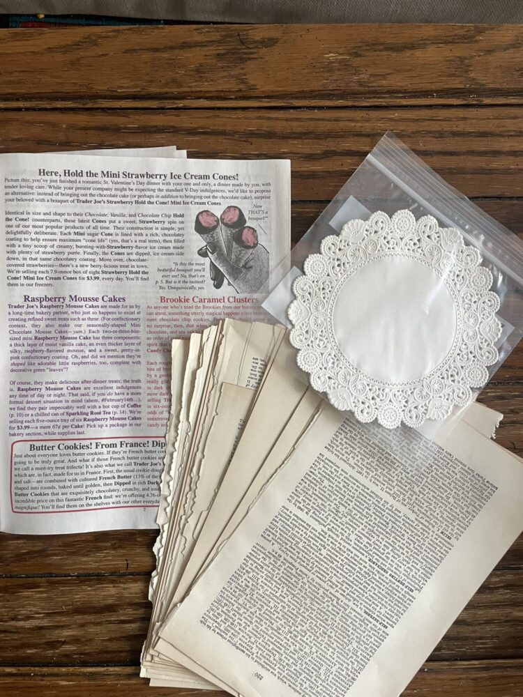
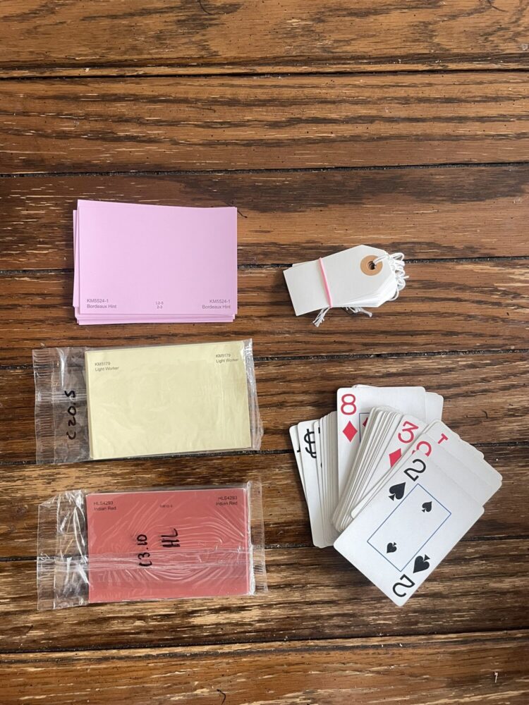
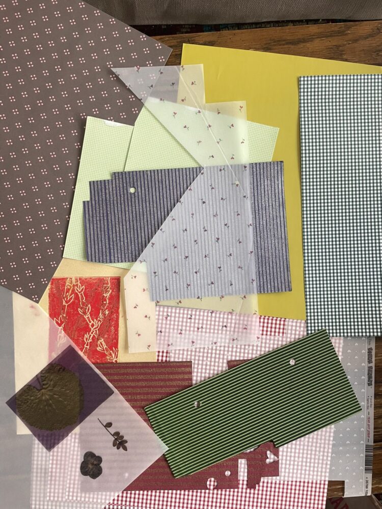
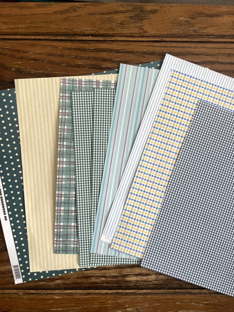
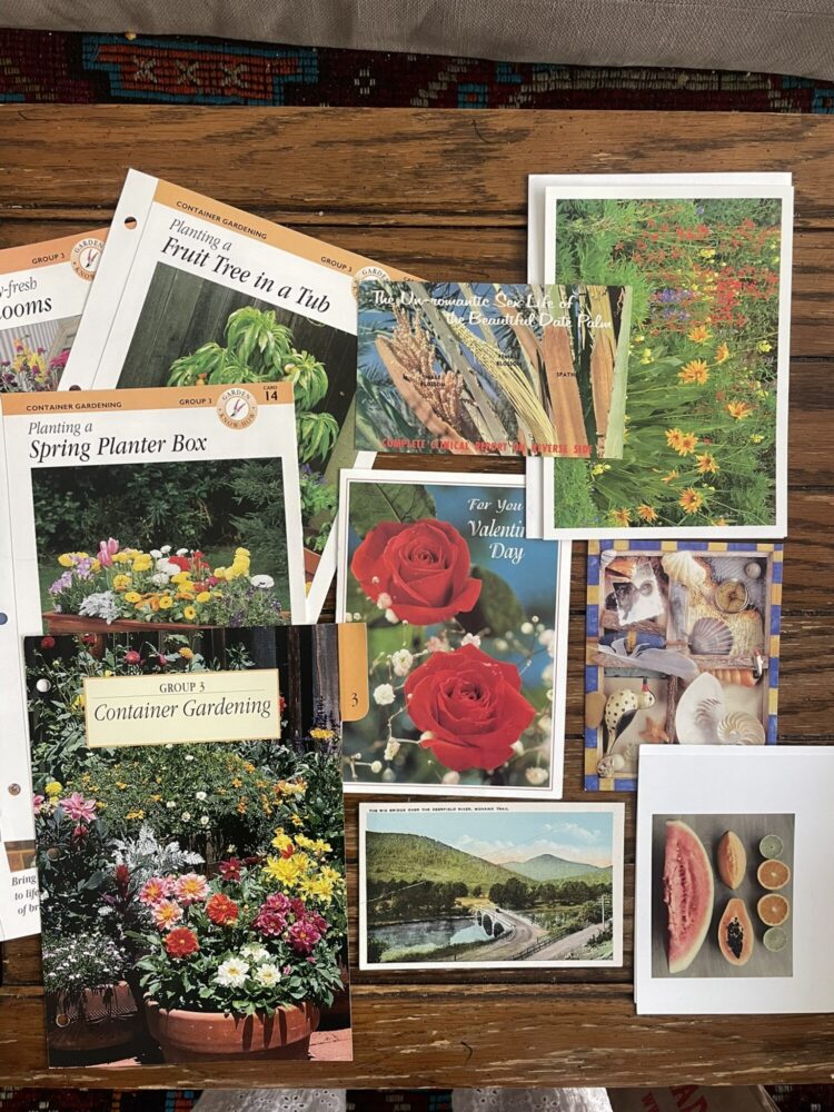
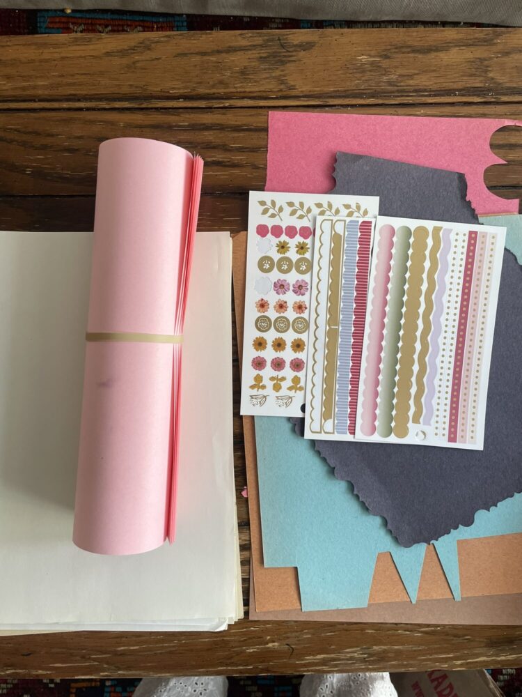
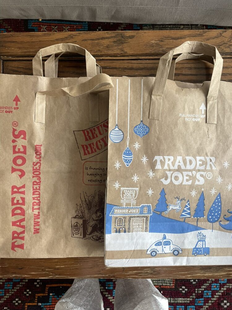
The first step in putting my cards together was gathering materials. Many of my materials were things I already owned, but I went to Art Parts to supplement. I ended up finding additional scrap paper, doilies, books, magazines, tags, paint swatches, cards, construction paper, and more for under $15. After laying out my supplies, I realized I could categorize them into two groups: 1) materials that are already associated with card making and collaging, and 2) materials whose original functions are not crafting. Category 1 materials were: scissors, glue stick, scrapbook paper, cardstock, vellum, construction paper, and stickers. Category 2 materials were: magazines, postcards, doilies, playing cards, paper bags, books, paint swatches, and gift tags. These categories were an interesting distinction to make because they helped me be conscious of which materials I was truly upcycling, and which were actually being used for their intended purposes. I believe it ended up being a 50-50 split between the two categories in my final product. Lots of the bases of the cards were made of typical card making materials (cardstock, construction paper), whereas the layering on top of the card was done with many upcycled materials.
After obtaining all my supplies, fabrication began. This was a very process-oriented design. Each card construction typically followed this order:
- Pick a color and material to be the base of the card. Fold this piece of paper in half and set it aside.
- Flip through the piles of supplies and pick out a few colors and textures that feel inspiring
- Determine which additional materials would best supplement the current ones, then flip through the supplies again and pick out more scraps
- Cut out shapes or trim the selected scraps into useable pieces
- Start placing shapes onto the card base, keeping in mind which layers I want to be on the top, middle, or bottom.
- Iterate and trim shapes to accommodate the desired composition as it starts coming together.
- Start pasting components to the card base, continue iteration until all components are glued down.
- Determine if any final touches are needed (decide on any small additional cutouts to be glued on, trim excess material off the edges, add any designs or writing in pen, etc.)
For some cards, there was an extensive iteration process that flowed naturally, allowing the layers to build up and determining desired textures and colors along the way. For other cards, I had a more clear vision from the start and I would first cut out pieces, then lay them out and take a photo to remember how exactly I wanted them to be positioned, then take all the components off and glue them in the proper order. Two examples of that process are depicted below, with the image on the left showing the pre-glue plan, and the image on the right showing the final product.
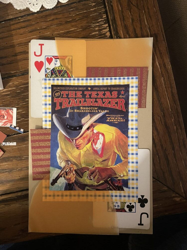
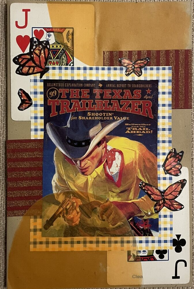
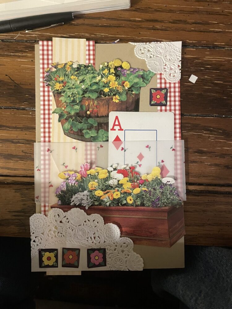
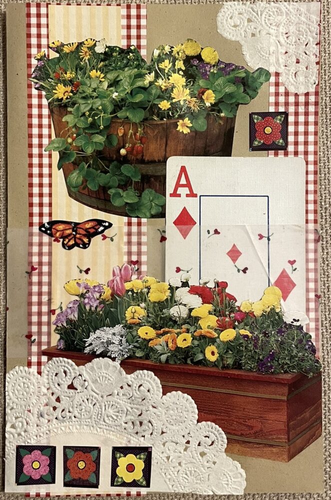
Image credit: images are my own.
The Final Product
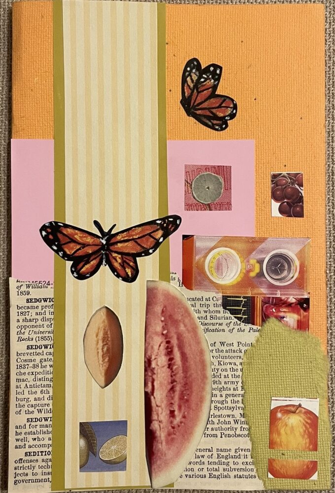
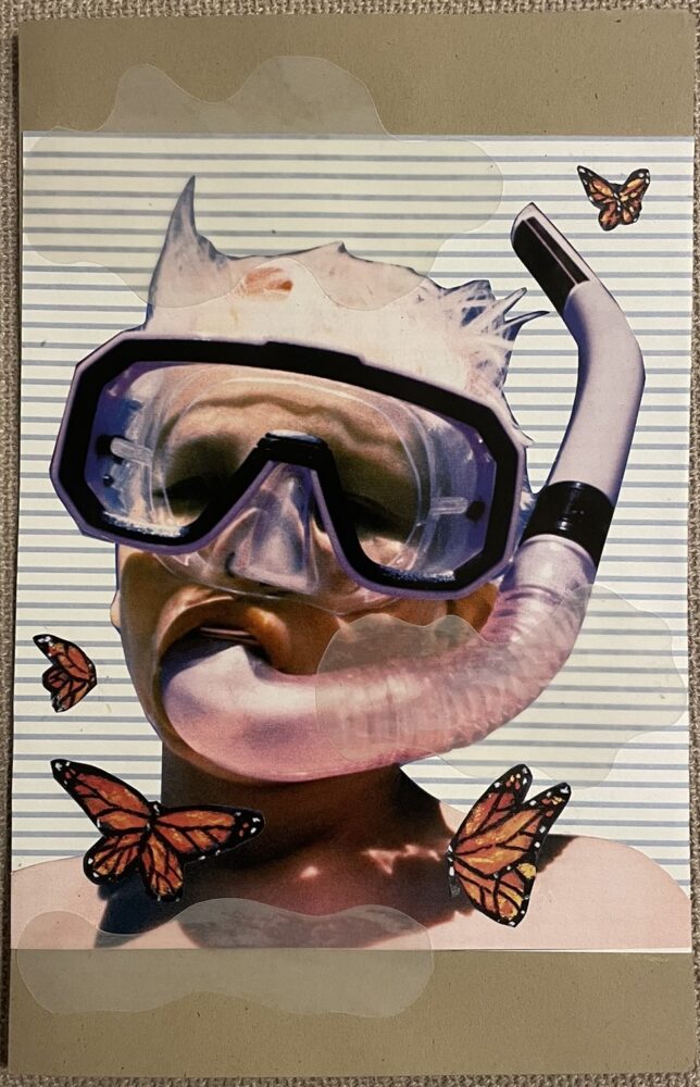
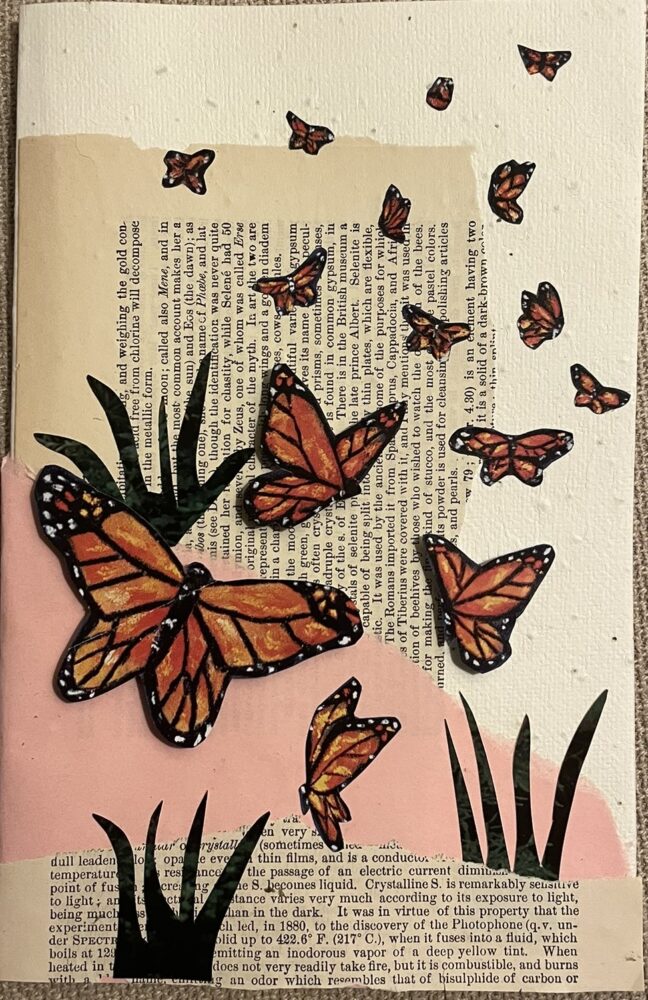
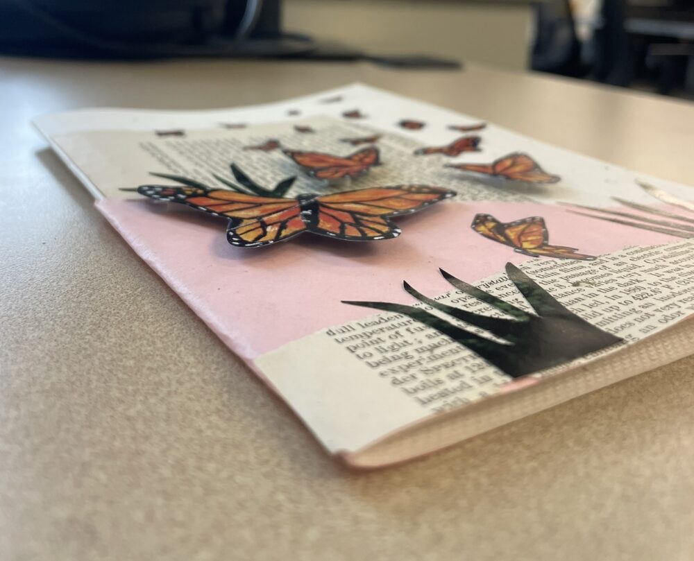
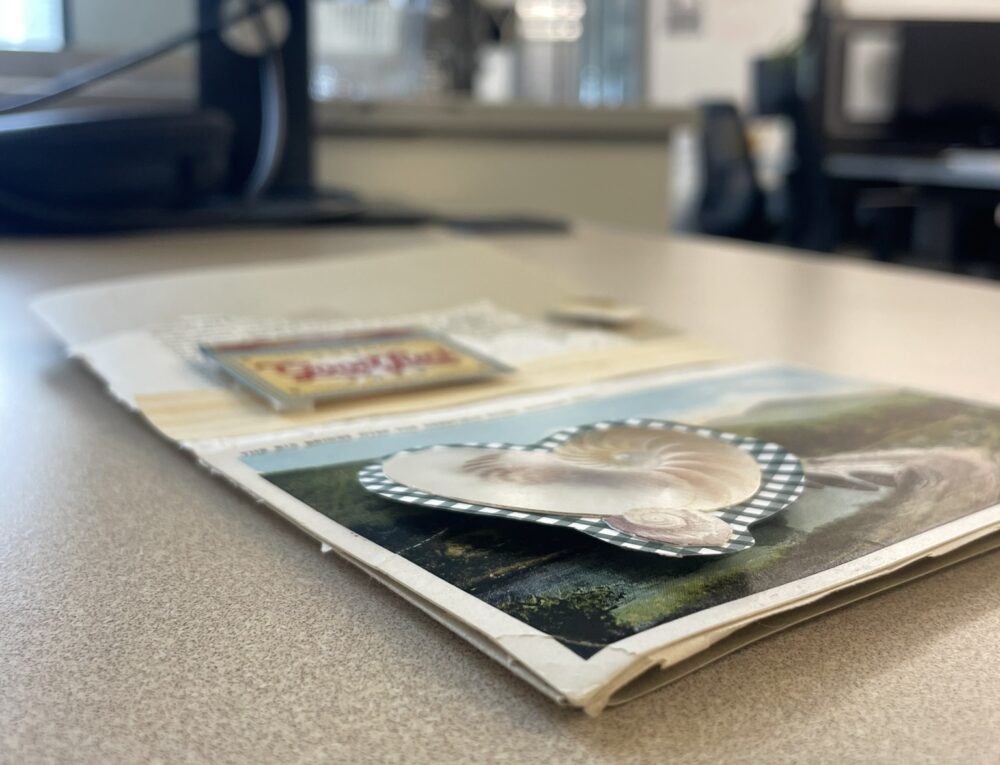
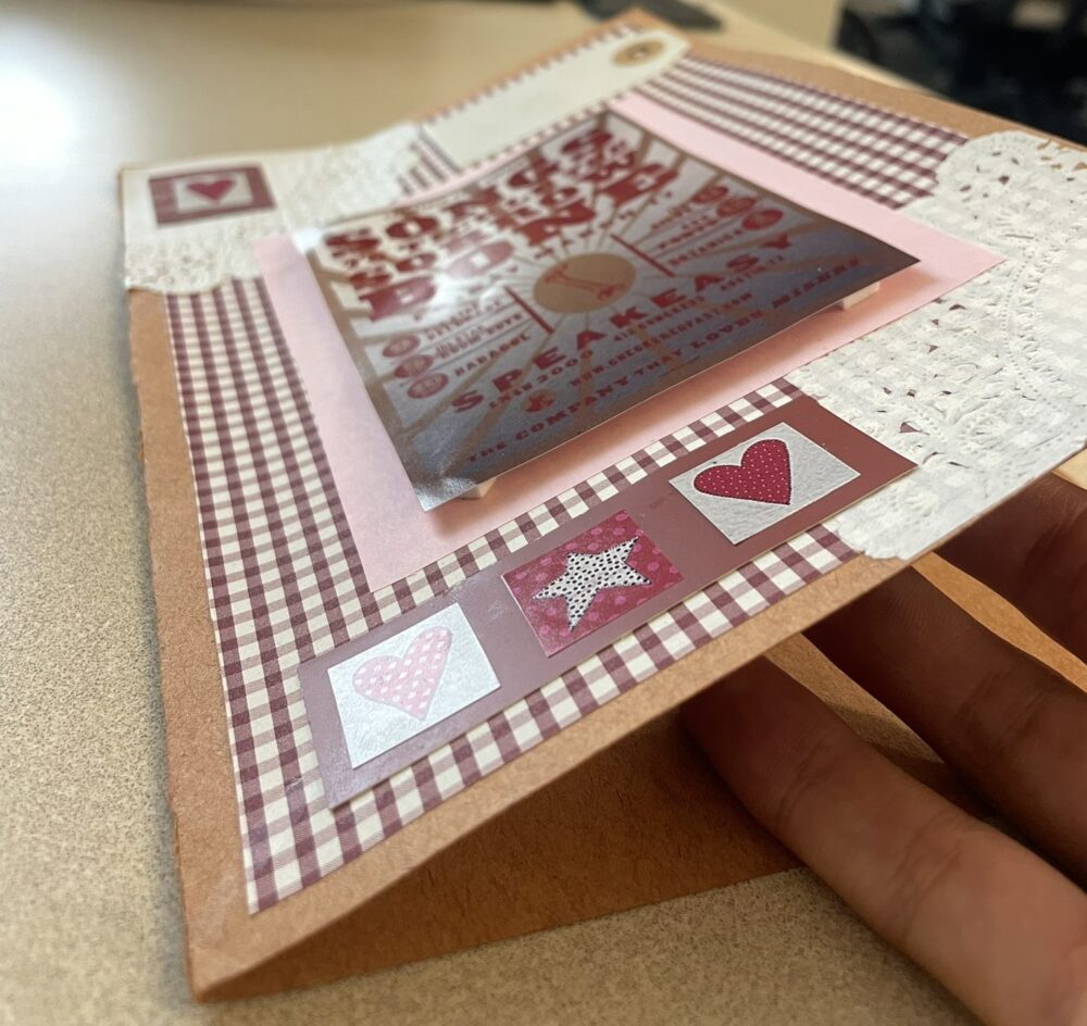
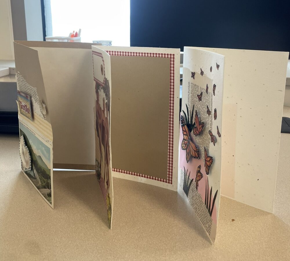
Below, I’ve included photos of all 12 cards I created. I’m very happy with the result and I think I achieved my goal of each individual card being unique while the overall vintage, maximalist, whimsical aesthetic is cohesive.
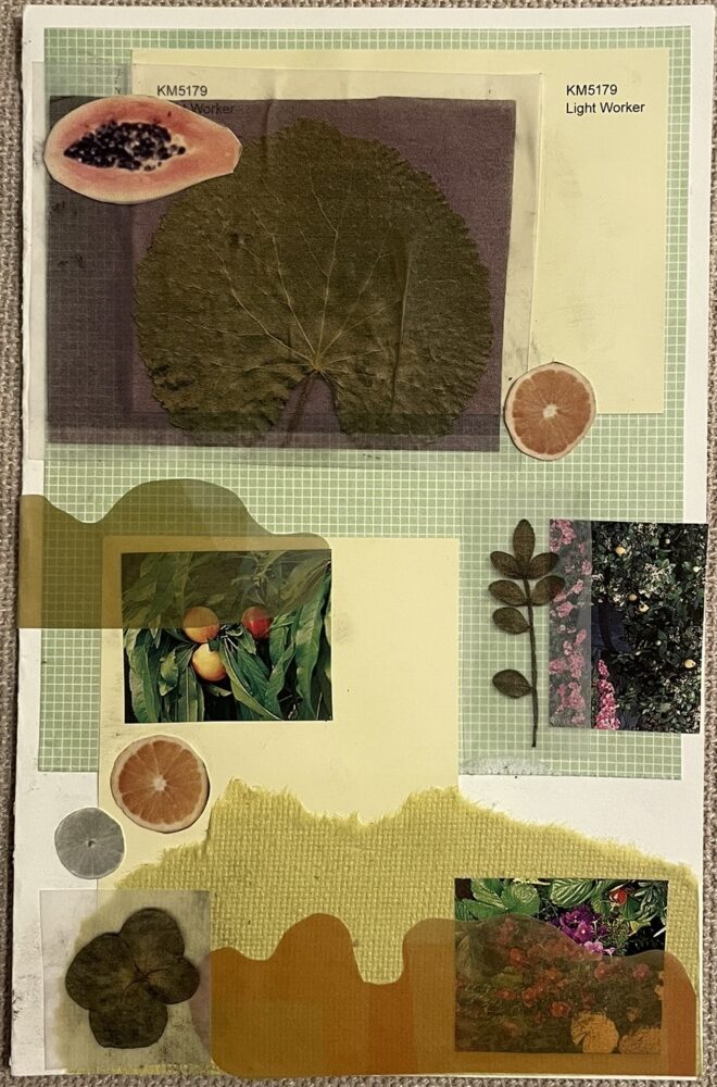
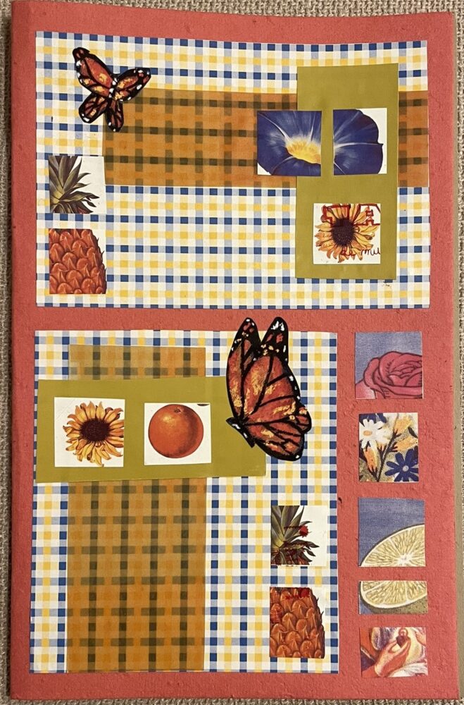
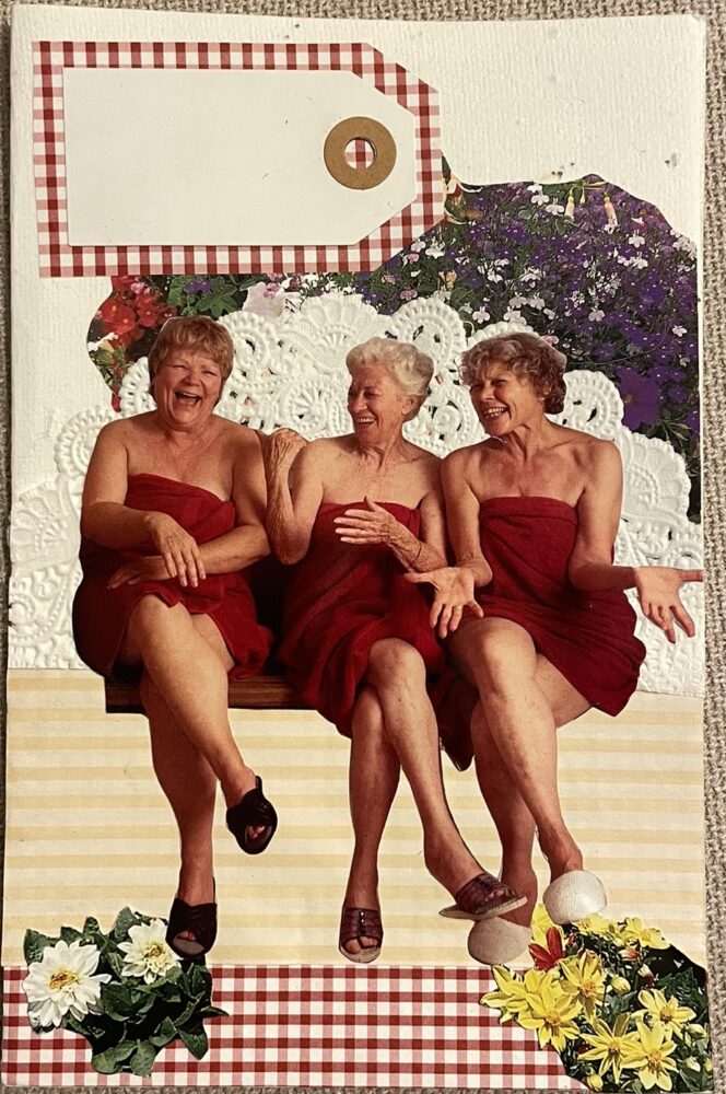
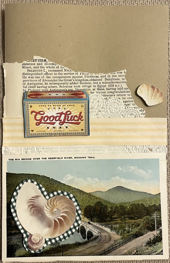
![]()
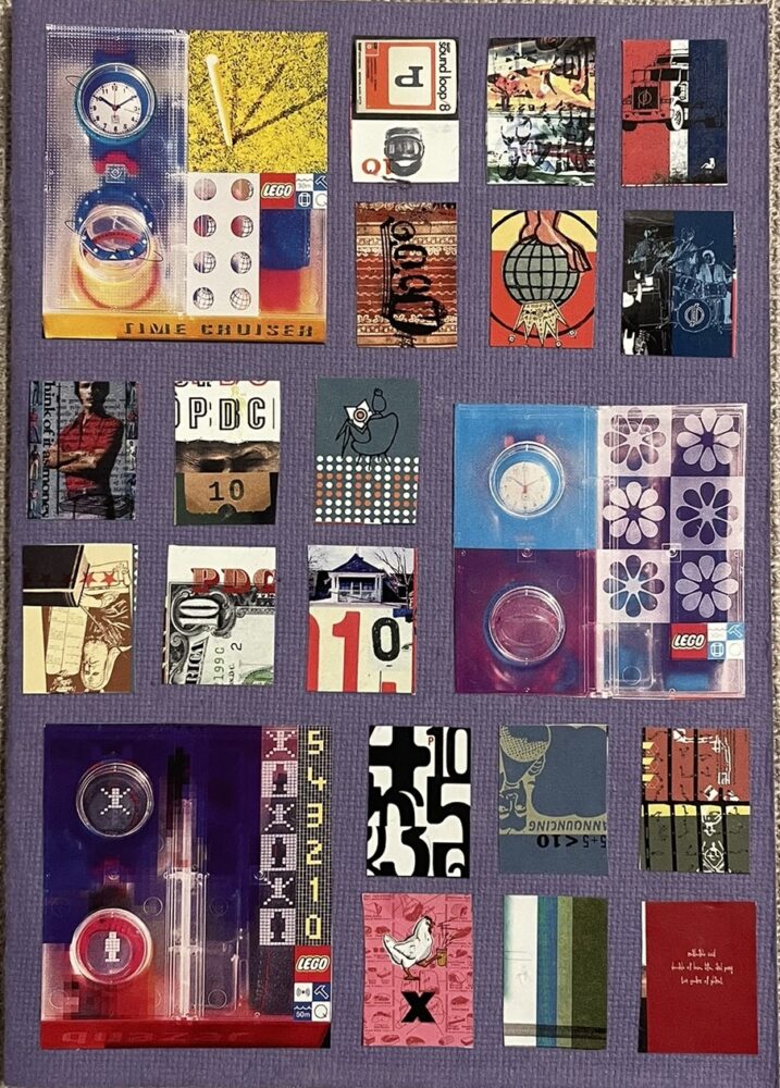


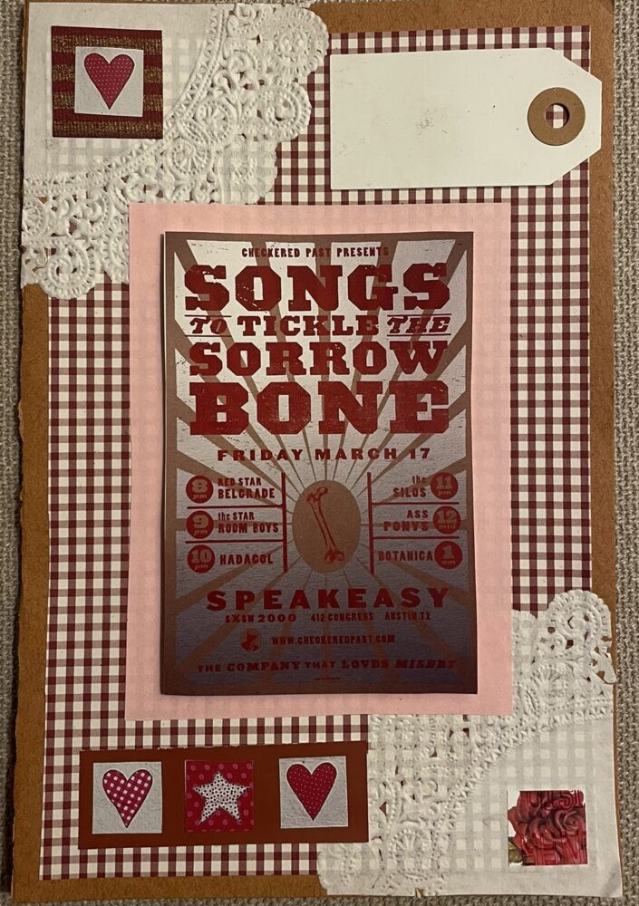
Image credit: images are my own.
I’ve also included a couple detail shots that show the 3D components featured in a couple of the cards, as well as the designated writing areas.
Reflections
My functional goals for this project were straightforward: the cards must not fall apart, there must be space to write notes on the inside, the cards must properly open and close, and the cards must be able to fit inside an envelope. I can confidently say that I achieved these goals. The one functional area that may be lacking is the ability to fit in a standard envelope, since my cards are bigger than typical store bought cards, however I should be able to easily source compatible envelopes if I end up mailing the cards. My artistic goals for the project were more ambitious than the functional ones. They involved ensuring a balance of cohesion and variety in the collection, implementing old materials that evoke a vintage aesthetic, determining which combinations of textures and colors work well together, layering to conform to maximalism, and implementing elements that give the cards a whimsical and uplifting feel. I feel as though I was able to achieve this in my 12 cards. I trusted the process and the end product fits the desired aesthetic. It was fascinating to explore the different avenues I can go down while still operating under the umbrella of aesthetics I chose. For example, one of my cards has a western cowboy theme, another is garden themed, and another contains elements of hearts and roses, but each still conforms to my goal vision.
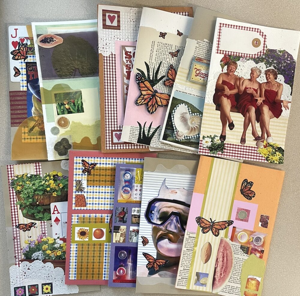
Image credit: image is my own.
Next up, I have no plans to refine the existing cards, but I will possibly make even more cards to add to the current stack. I still have plenty of materials left over and I genuinely enjoyed the collaging process, so this is likely an activity I will return to when I have free time in the future. I hope to give my completed cards away to family and friends. Since most of them aren’t specific to a particular holiday or event, maybe I’ll write notes of gratitude in them and distribute them within the next week or so.
Sources
Upcycle post 1: https://www.aesdes.org/2025/01/29/paper-collage-cards/
Image 1, 2, 3 (Jennifer Wilkin Penick): https://www.jenniferwilkinpenick.com/my-work
Image 4 (Jennifer Wilkin Penick): https://www.instagram.com/p/CuJtTt8uJsf/?epik=dj0yJnU9bGRCV2t4cVoxRDZnQmFHUHd6SlEybWNGbFNoeEVmSHQmcD0wJm49Unh0cVhxb1o1NktMeWVRZDNGY21VZyZ0PUFBQUFBR2VhV1pz&img_index=1
Image 5, 6, 7, 8, 9 (Chelsea Ragan): https://www.chelsearagan.com/cards
Image 10 (Christine Stoll): https://christinestoll.com/products/collage-greeting-card-you-can-tell-her-age?pr_prod_strat=e5_desc&pr_rec_id=3d9b20c50&pr_rec_pid=8439958438189&pr_ref_pid=8439958274349&pr_seq=uniform
Image 11 (Christine Stoll): https://christinestoll.com/products/collage-art-print-i-say-bad-words
4 Comments. Leave new
This project turned out great, I commented on one of your earlier posts, and now seeing the finished product along with other cards that you made, I can see the aesthetic you were trying to achieve turned out great. How long did the project take you in general? Its seem everything is done by hand so how long would it take someone to recreate one of these cards in this style.
Hi Cort, thanks for your comment! I didn’t precisely track the time, but if I had to estimate, I’d say each card took 10-15 minutes. Cards that had more precise cutouts took longer, maybe 20 minutes.
Hi Abby,
I am blown away by the intricacies and design of these cards- they are SO COOL! I love the overall aesthetic, and I think you did a fantastic job of sticking to your chosen aesthetic. All 12 cards feel like they belong together, and they look extremely cohesive. I’d love to see some concepts for future cards you may make, I think it would be an interesting addition to the reflection. Amazing job!
Thank you Ayesha!