

I confess I’m not an avid reader, but I am avid about a few of the few books I’ve read.
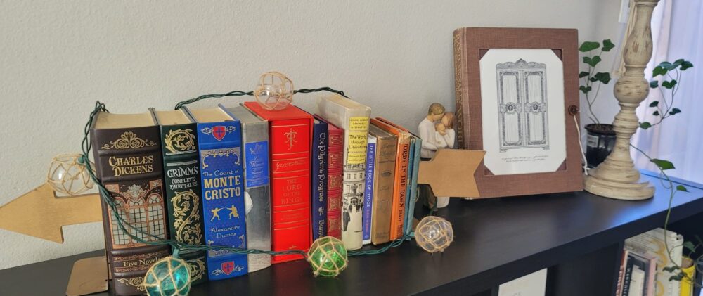
My wife and I are slowly growing a collection of ornate books we enjoy having on display in our home. Whether they’re classic to literature or just “classic” to us, these well-built copies are made to appear as taken from an aged manor in western Europe – or simply are taken off the shelves of a mid-century school library. The books, alongside various odds and ends that change from time to time, form the “old bookshelf” (or “vintage bookshelf”) aesthetic we’ve chosen for this space in our home.
The aesthetic of a bookshelf is self-evident: Alternating titles organized (or disorganized) with regard to height, cover coloring, and varying themes propped vertically by or next to trinkets and souvenirs unique to their owner. The emphasis, however, is on the “old” in “old bookshelf”. This aesthetic depends on leather- and cloth-bound books, often favoring earthy tones with gilded pages of some copies one finds in the inventory. The pages and written language themselves are critical for a piece to sink into this backdrop and appear it belongs on the shelf it’s placed.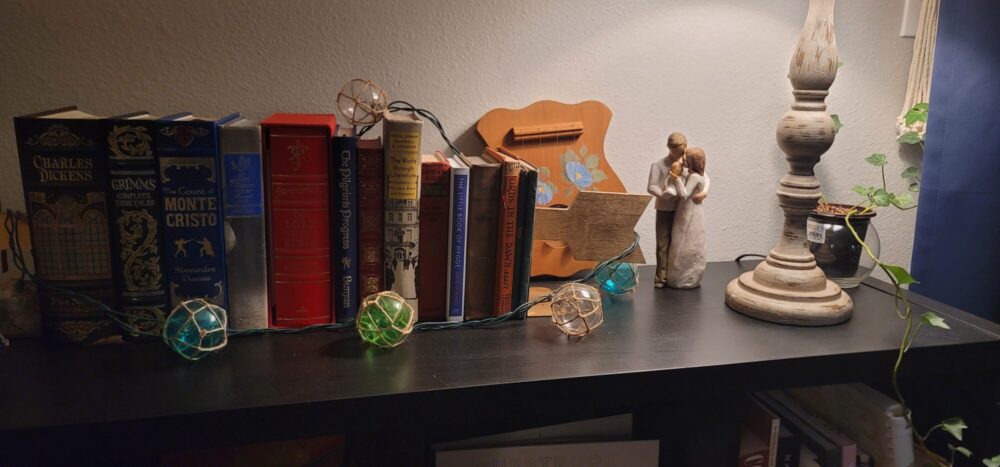
The aesthetic of this part of our home is the driver for the aesthetic of my upcycling project. However, it’s only partially the motivation for making an artifact to fit the old bookshelf at all.
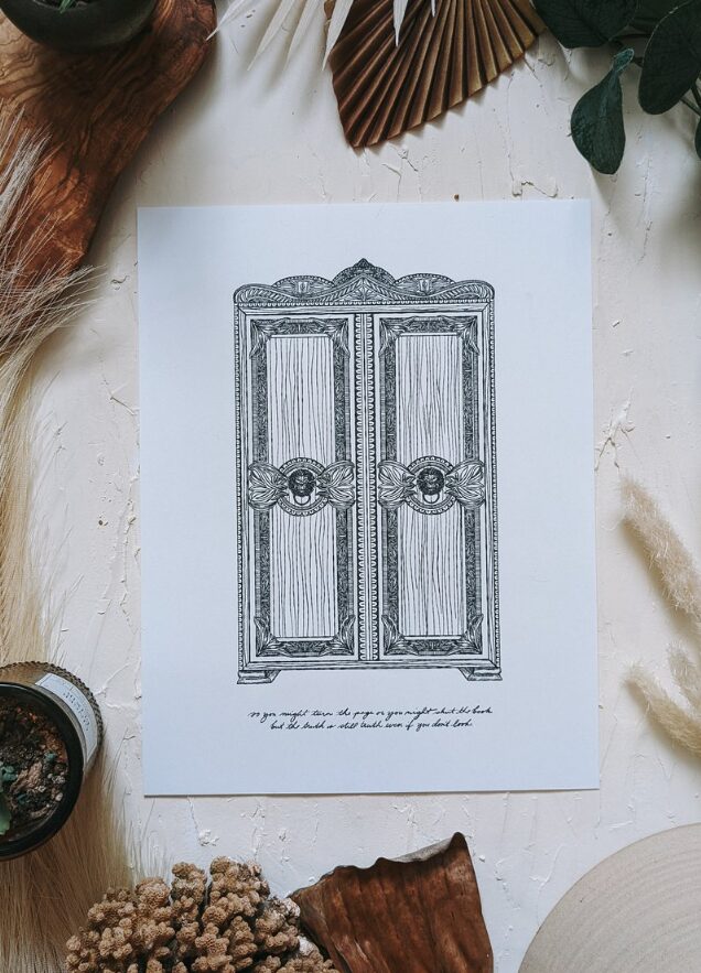 We recently purchased a print from Sarah Sparks (1), one of our favorite artists and musicians. The print (2) keeps with this broader “book” theme both in appearance and meaning in depicting Sparks’ take on the wardrobe from C.S. Lewis’ children’s classic “The Lion, the Witch, and the Wardrobe”. The subtle but central focus, however, is on the writing at the foot of the piece, taken from Sparks’ own song and album “Into the Lantern Waste“(3). It reads, “So you might turn the page or you might shut the book, but the Truth is still Truth even if you don’t look.” Thematic of the song, the rest of the album, and of Lucy Pevensie’s plea for her siblings to come and see what wonders she’d found inside the wardrobe, this lyric emphasizes the truth behind and beyond Lewis’ fairytale. A closed curtain cannot put out the sun.
So, a wardrobe from a book – with a lyric about a book – complimenting good-looking books – on a bookshelf. . . The idea dawned on us that we should display our print, somehow, within the framing of a book – an old book.
Using an entire book and keeping it in very nearly its original form was what got me most of the way to matching the intended aesthetic. Making it functional, durable, and to have a clean finish was the challenge of turning a large and increasingly fragile book into a steady and display-worthy art frame.

 To my surprise as well, I found very few similar projects online and none remarkably close to the method and final appearance of my “bookframe”. One DIY blogger hollowed out the cover and some pages of a smaller book for a photo (4), and another removed the pages to hang the cover on a wall (5). I opted not to border the wardrobe with a page as the bordering text would draw attention away from the featured lyric. Likewise, the pages serve an integral part of the message being conveyed in that they may still “turn”, and the book is still “shut”.
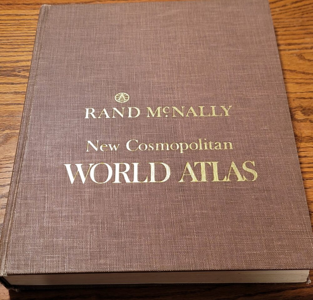 We ventured into the labyrinth of the Lafayette Flea flea market to find a book big enough to border our 8.5″x11″ print. Lo and behold, this 1985 world atlas fit the bill and had the perfect neutral, earthy tone to compliment a black and white drawing and fit the “old bookshelf” color mold. I envisioned the central section of the cover to be hollowed and replaced by glass, behind which the wardrobe art would be displayed. If the bookframe is meant to stand vertically like a picture frame, then the pages need supporting so the spine is not under stress and the cover doesn’t slouch. Finally, I decided to make the bookframe stand on its own, complete with a fastener to keep the cover and pages from accidentally falling open.
 I first took to cutting the cover, slightly under-sizing the 8.5″x11″ space so that the print’s edges wouldn’t show once inserted. Versus cutting with the blade perpendicular to the inside cover, I angled my cut by about 30 degrees all the way around the opening with the angle opening inward toward the pages. This way, a slight edge exists on the front cover that may hide any rough edging not completely smooth after cutting.
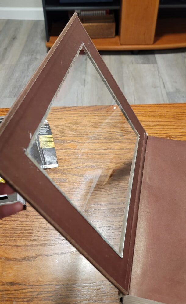 Once the cover cutout was removed, I found a cheap 8.5″x11″ picture frame and used the glass for my own project. Placing the glass on the back side of the book’s cover, I traced its borders and removed some of the cover below the glass to do two things: Create a rougher edge for glue to adhere to and allow the glass to seat more uniformly within the cover itself. Once the glue was applied and glass fitted, I was impressed at how well the glue kept the glass securely fastened to the hollow cover.
![]() Next, I needed to find materials for bracing the pages of the atlas against its back cover. The ITLL’s Manufacturing Center had scrap pieces of sheet metal and steel tubing sized well for the book, so I took to cutting, bending, and drilling. Two pieces of sheet metal are overlapping and joined. The bottom section has a 1-1/4″ lip at the bottom for the pages to rest on. The top piece has two prongs on either side and bent backward so as to protrude through the book’s rear cover.
Next, I needed to find materials for bracing the pages of the atlas against its back cover. The ITLL’s Manufacturing Center had scrap pieces of sheet metal and steel tubing sized well for the book, so I took to cutting, bending, and drilling. Two pieces of sheet metal are overlapping and joined. The bottom section has a 1-1/4″ lip at the bottom for the pages to rest on. The top piece has two prongs on either side and bent backward so as to protrude through the book’s rear cover.
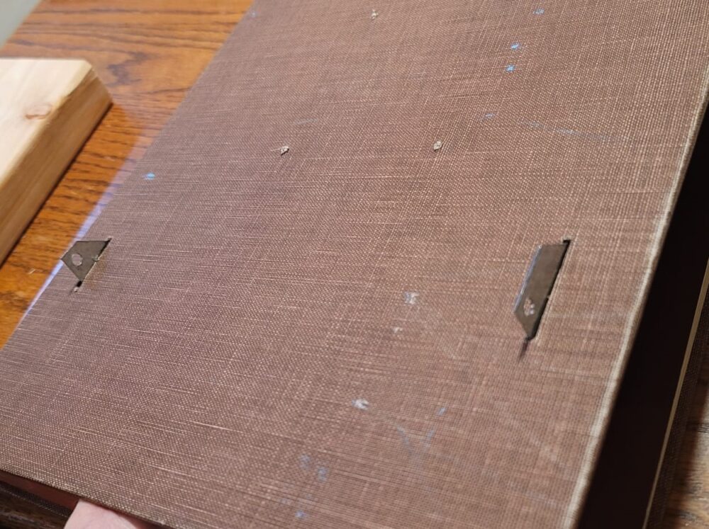 These prongs have holes drilled through to receive and allow my kickstand to rotate.
Once the bracket was made, I cut slots in the rear cover for the kickstand arms to protrude through and drilled holes through the back cover matching those in the bracket.
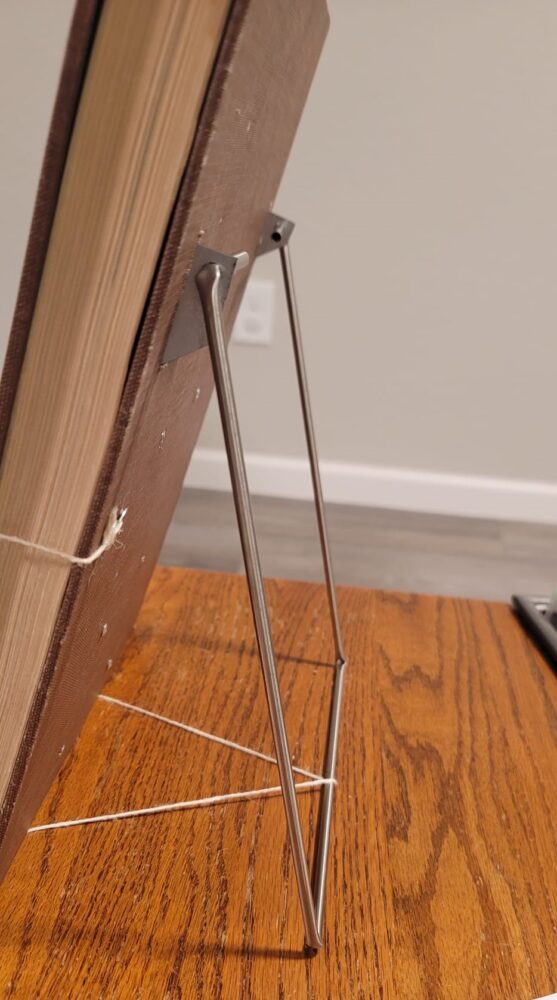
 With the bracket in place, I used pop rivets to join it to the rear cover. The pages rested perfectly inside and were no longer prone to falling out of the cover. I then inserted the kickstand and, with luck, it came to rest level with the bottom edge of the cover and isn’t prone to wobble or tipping. I simply added a bit of twine wrapped around the bottom of the support bracket and kickstand to prevent it from slipping.
Finally, I weighed a few options for how, exactly, to place the artwork inside the bookframe. I considered hollowing out more pages so the piece would be seated deep inside the book or fastening it to the first page inside so the cover and glass would lay overtop the artwork. Ultimately, I decided the best way to ensure the artwork was pressed cleanly against the glass and properly centered within was to fasten the artwork directly behind the glass in the cover.
 I did this by cutting out the first page of the book and making use of the matching color scheme (dark brown/maroon) it already had. I cut so that the edges of the page would be hidden outside the view of the glass, but the color would be seen in each corner of the frame – as pictured here without the artwork.
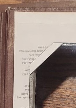 To secure the artwork inside, I removed an additional page from the book and cut it in the same manner, except leaving less material in each corner of the page. This second page was pasted directly behind the first so that the corners of the artwork could slip between the first decorative page and the second. Notice the overlapping corners in the picture to the left.
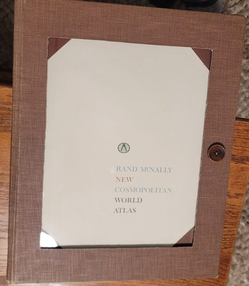
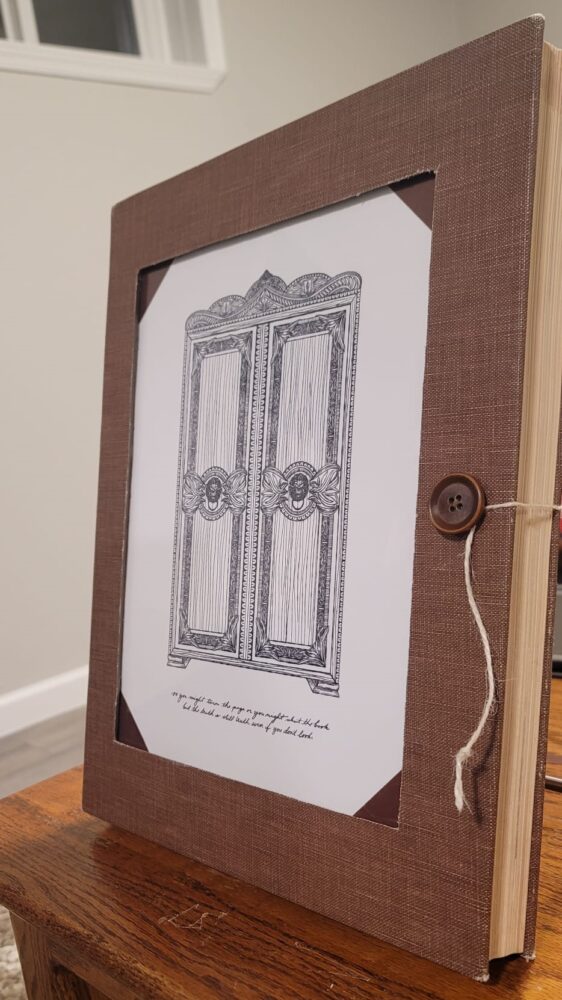 After securing the print behind the cover, I needed one last means of securing the cover itself to the rest of the book – both for uniform appearance and to prevent the cover from sagging and damaging the book’s binding. I decided to use twine, since it matched the rest of our bookshelf’s aesthetic, and a button. I sewed the button to the front cover via a few small holes drilled behind, and I tied one end of the twine to the rear cover through a few more holes I drilled as well. The twine could then be pulled from the back cover to the front and wrapped around the button the same way as a manilla envelope is secured by string. This worked perfectly and holds the cover and artwork fast to the pages behind.
The finished Bookframe turned out better than I’d hoped, looks clean, and fits its placement on our bookshelf seamlessly. The aged and earthy aesthetic matches well, and I believe it can translate to many different backdrops around our home as we see fit. In the future, I may undertake a similar project with a smaller book and picture, perhaps continuing to hollow more pages and use a second pane of glass to create a “floating frame” aesthetic commonly seen in modern decor. I believe it would be a welcome merger of the appeal of an aged book and the physics-defying appearance of a modern frame.
 Citations:
4 Comments. Leave new
I love this project, great job! I think the vintage book aesthetic is really cool, and the twine & button help the aesthetic a lot. One thing I noticed is that it looks like it’s leaning up against the wall behind it. Maybe it would look like it’s defying gravity more if it was pulled away from the wall or standing up straighter. Is it possible to adjust the angle of the stand?
Hey Jules, thanks for the ideas! I’d love to adjust the angle and can easily do so by shortening the string tied from the bracket to the kickstand. Trouble is stability, both from tipping and the pages/cover being more prone to sag when they’re vertical, even with the bracket built in. I agree though and may rethink how the design stands on its own if I tackle another one of these in the future!
I really like how much thought went into this project. The way you tied everything together—the book, the artwork, the bookshelf aesthetic—makes it feel really intentional. The detail about finding a book that fit the theme and then reinforcing it so it could stand on its own was really smart.
One thing I’m wondering is how sturdy is the twine/button closure over time?
Thanks for the feedback Matthew. Great question. Since the twine closure isn’t meant to be opened frequently, I think it’s plenty sufficient to hold and is easily and inexpensively replaceable in the likely case it eventually breaks. The button is sewn on pretty good (maybe a little too good). The rework I might do, however, is move the twine’s connection point on the back cover up an inch or two. That way the twine can pull upward on the cover at an angle – to both cinch it, horizontally, and keep it from sagging, vertically.