
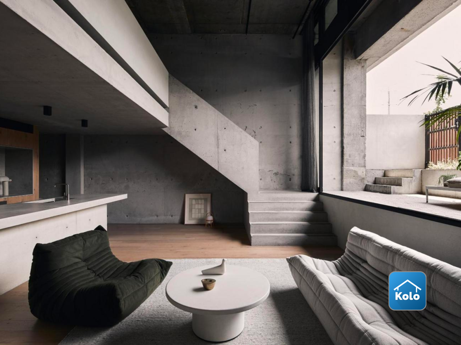
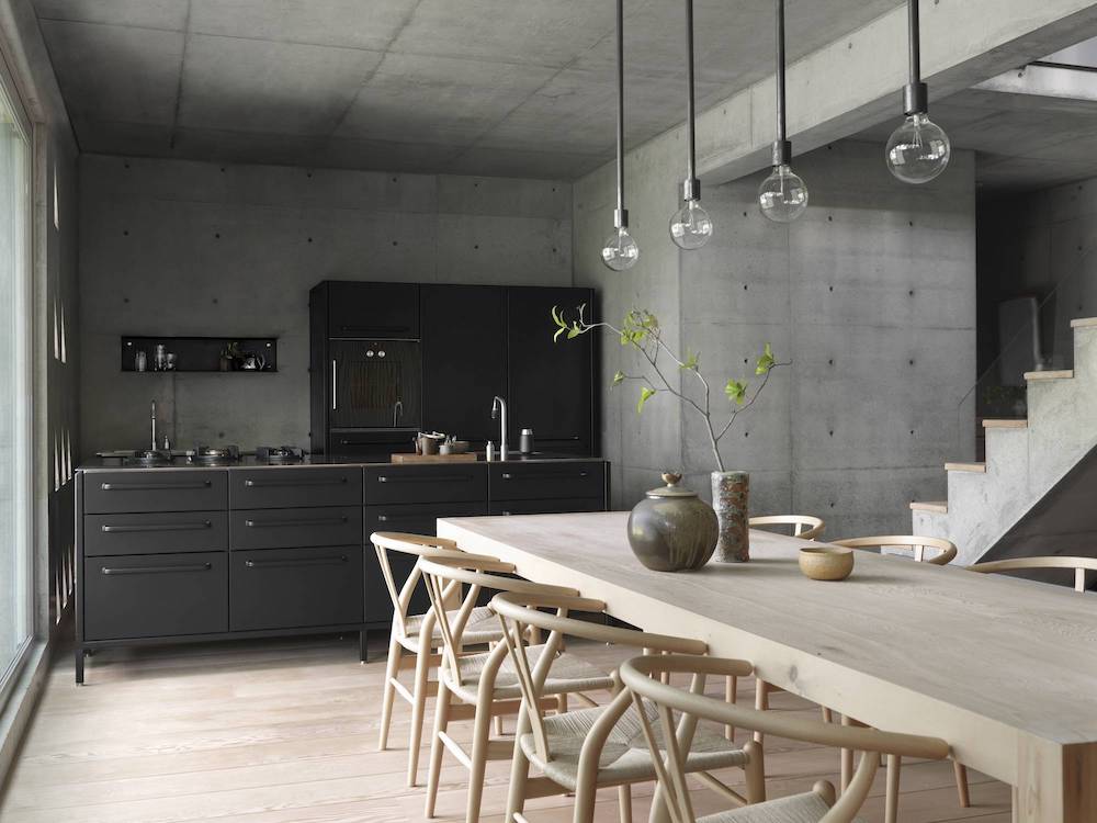
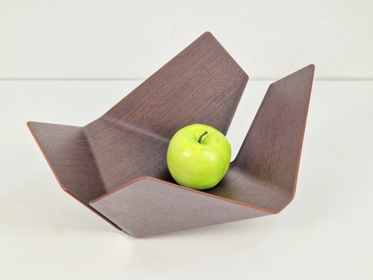
Instead of a brightly colored, bubbly, organically shaped fruit bowl, the opposite of my upcycling project aesthetic would be brutalist and geometric, my fruit bowl would have minimal earth tones, rigid, industrial shapes. This alternate bowl would be grounded in a world of harsh structure and stark minimalism.
This alternative fruit bowl would embody Brutalism, an architectural and design movement that prioritizes raw materials, functionality, and an unpolished aesthetic. Instead of curves, spirals, and bubbly forms, this bowl would be a stiff, angular composition—perhaps a jagged, monolithic structure resembling a miniature concrete building or a steel framework.
Materials would play a key role in this inversion. While my current project uses paper mâché and cardboard to create something fluid and sculptural, this version would use welded metal, exposed concrete, or rough-cut stone, embracing a cold, heavy, and industrial aesthetic. The surface would be textured and raw, showing imperfections, cracks, or welding marks rather than being smoothed over or polished.
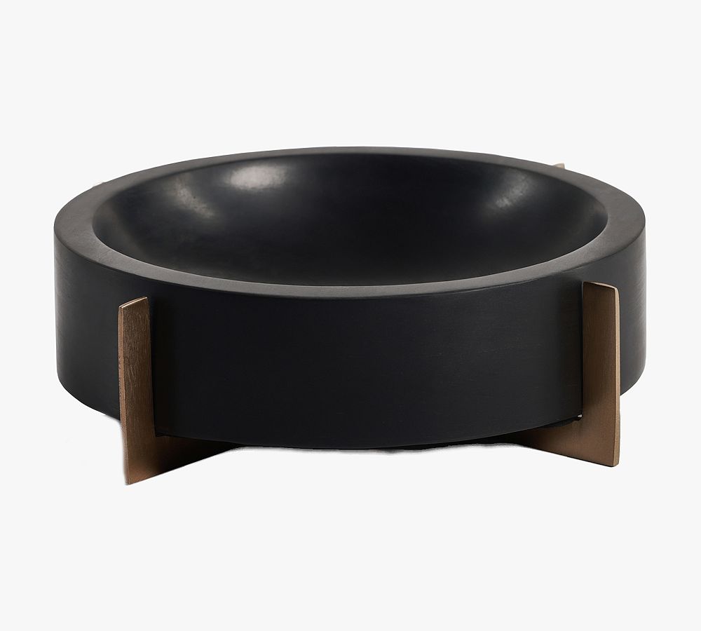
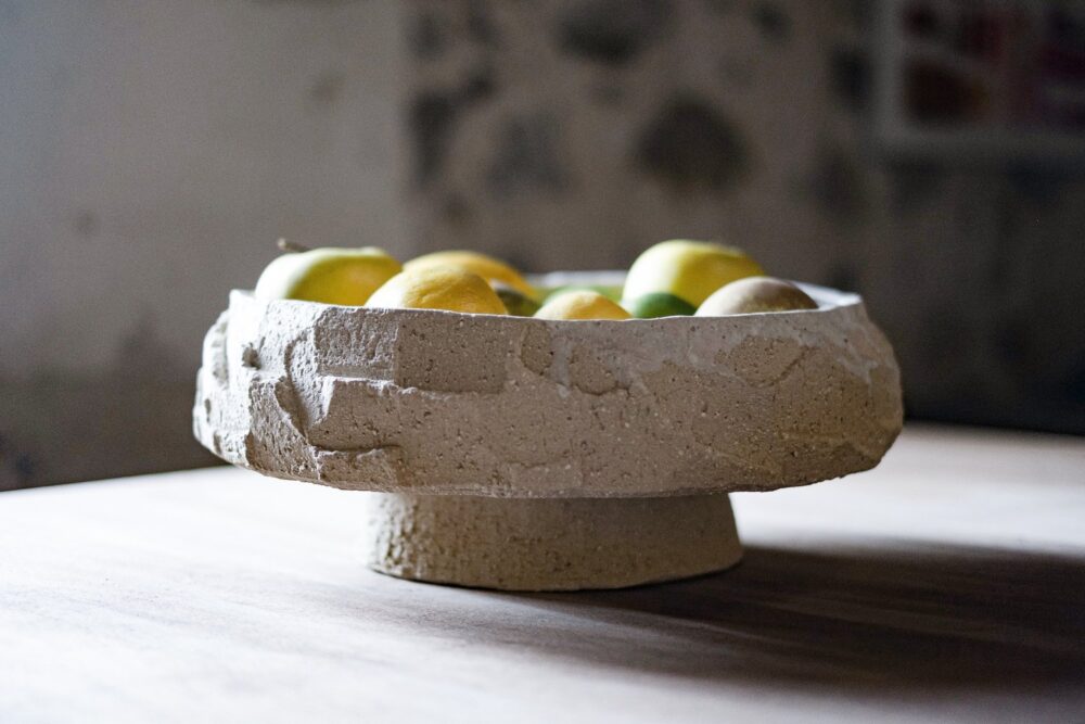
While my current project embraces bright, welcoming colors—possibly a vibrant citrus hue or a high-gloss pastel—this alternative bowl would lean into a monochrome, muted, or raw metallic palette. Aged steel, oxidized copper, slate gray, or even unpolished, unfinished cement would dominate. If any color were added, it would be deep and moody, like a dark rust red or a muted navy blue, meant to enhance a sense of seriousness and industrial weight rather than playfulness.
Comparing these two aesthetics highlights how form, material, and intention completely change the feel of an object. My curvy, playful fruit bowl embraces fluidity, movement, and warmth, while the brutalist version feels rigid, cold, and architectural. One is organic and futuristic, the other industrial and utilitarian. Changing the aesthetic of a design really impacts how the piece is interacted with. If my bowl where to built with a brutalist, utilitarian aesthetic, it would be a very different bowl.
4 Comments. Leave new
Hi Witt,
This seems like a perfect contrast. The brutalist version of your fruit bowl sounds so striking, raw materials and bold, rigid shapes definitely give it a totally different vibe. It’s interesting how the mood shifts from something playful and organic to something more serious and industrial. Good work.
Appreciate it! Yeah, it’s wild how different the same basic concept can feel with a material swap. Definitely makes me think about how much mood plays into design.
Hello Witt,
I definitely agree. This does feel like the opposite of the aesthetic for your upcycle project. I looked at your blog post 3 and put the fruit bowls side to side and they do feel like complete opposite. I think you did a great job of creating a “new” design for a bowl in this aesthetic.
Thanks Ariana! It was cool to push the design in the opposite direction and see how much that transformed the vibe. Glad the contrast came through!