
Introduction
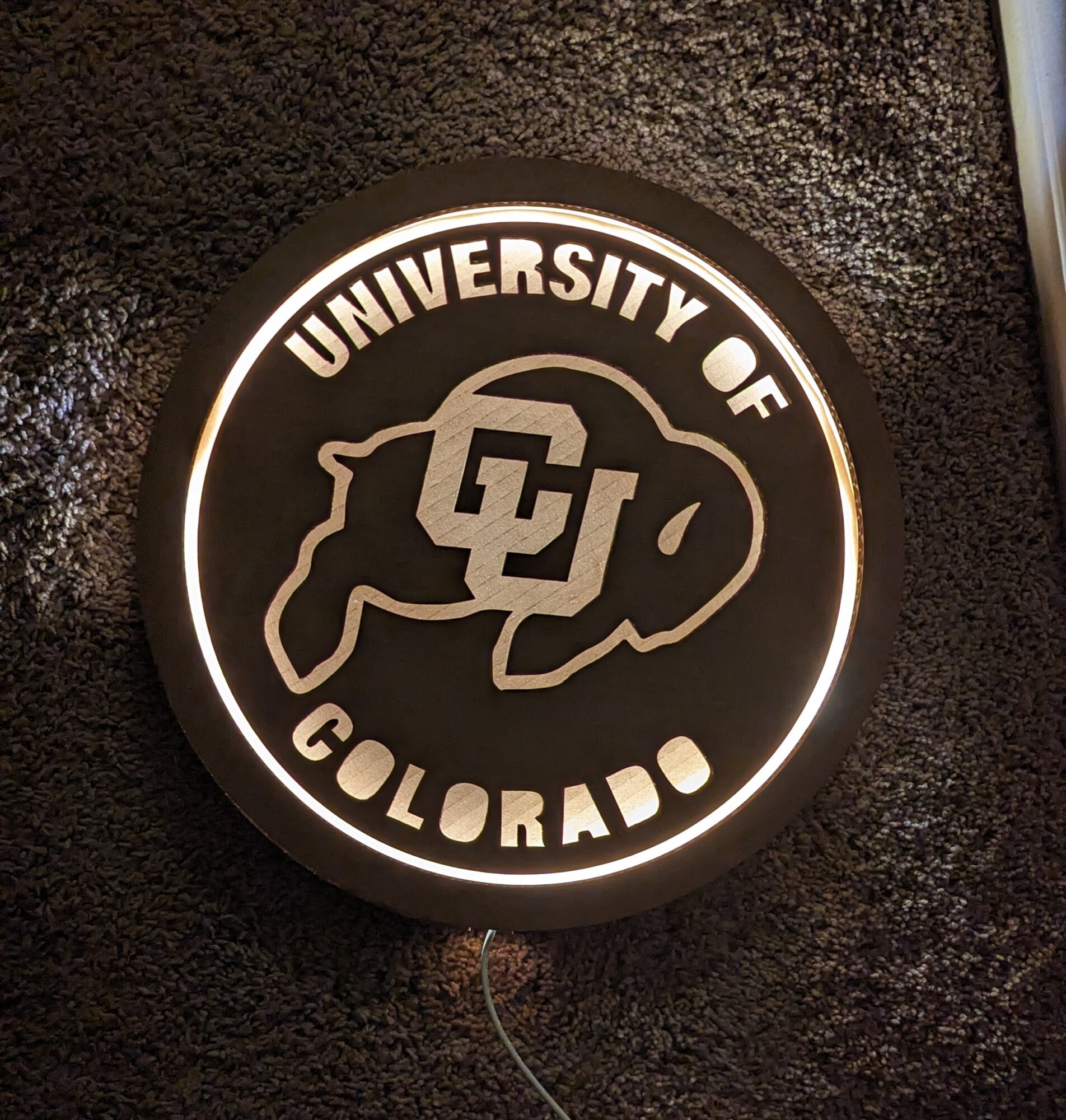
For my upcycling project, I designed and created a backlit CU Buffaloes wall decor piece using laser-cut cardboard and LED lighting. The project was motivated by my college pride and love for CU football, aiming to create a visually striking yet simple decorative element that enhances interior spaces with a unique backlit effect.
Concept and Motivation
I wanted to merge my enthusiasm for CU with a functional and aesthetic piece of decor. The idea was to create a wall-mounted artwork that not only represents CU Buffaloes but also serves as an ambient light source. The backlit effect was crucial in making the design stand out, creating depth and highlighting the form of the logo. Instead of using traditional materials, I chose cardboard for its ease of laser cutting and its ability to create layered effects when stacked.
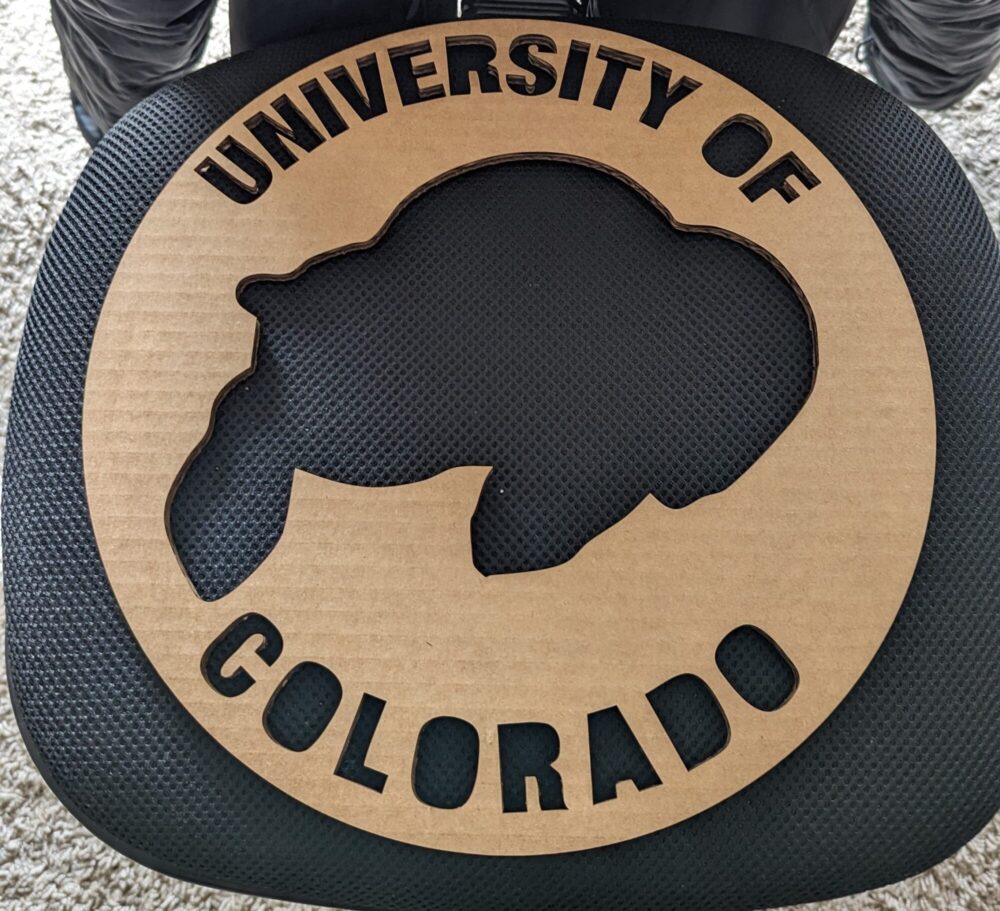
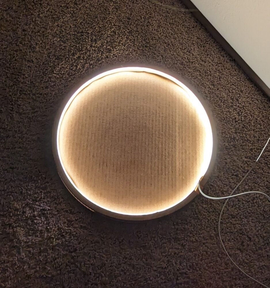
A key highlight of this design is how it transforms between day and night. When the LED lights are turned off during the day, the front face appears gold while the background remains black. At night, when the LED is on, the cutout areas glow, creating a golden backlit effect while the front appears black. This dual nature symbolizes CU’s black and gold color theme, reinforcing the school’s identity in an artistic way.
Design Process
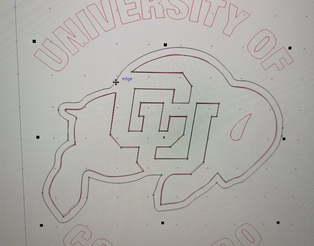
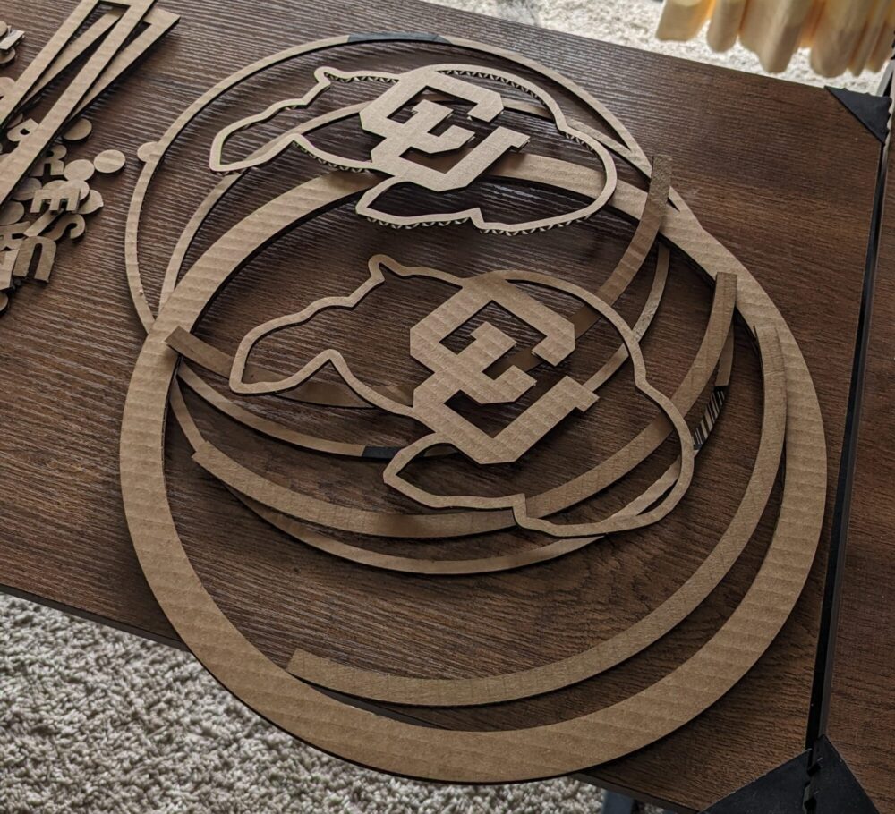
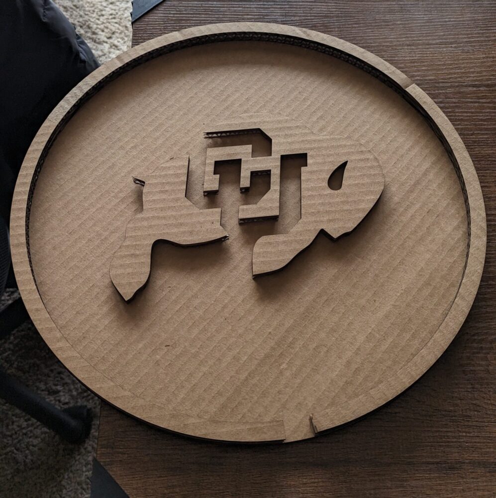
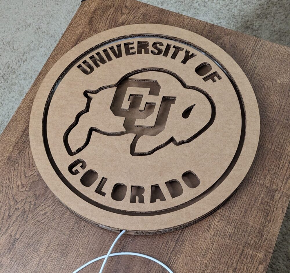
- Sketching and Planning – I started with rough sketches of possible shapes and designs before finalizing the idea of a circular frame with the CU Buffaloes logo in the center. I also decided to include border cutouts around the logo to allow light to shine through.
- Material Selection – The entire piece was made from laser-cut cardboard, stacked in layers to create depth and structure. I selected yellow LEDs for the backlighting, ensuring it complemented CU’s color scheme.
- Fabrication – Using a laser cutter, I cut multiple layers of cardboard, then assembled them with glue. The internal space was designed to accommodate LED strips for even lighting distribution.
Aesthetic Considerations
The design was influenced by four key aesthetics:
1. Modern Minimalism
The design embraces modern minimalist principles, focusing on simplicity, functionality, and clean aesthetics. The CU Buffaloes logo is presented in a bold yet unembellished manner, ensuring a clutter-free visual impact. The circular shape and laser-cut precision emphasize geometric harmony, keeping the composition sleek and intentional. The minimal use of materials—just cardboard and LEDs—reinforces the “less is more” philosophy while maintaining an elegant and sophisticated look. The contrast between light and dark enhances the minimalist appeal, ensuring the piece remains visually striking without excessive detail. This aesthetic approach not only makes the artwork timeless but also perfectly aligns with contemporary interior decor trends.
2. Industrial Aesthetic
The use of laser-cut precision and raw material layers enhances the industrial feel. The structured, stacked cardboard layers mimic the look of machined metal or architectural models, reinforcing a rugged yet controlled aesthetic. The contrast between a rough, natural material (cardboard) and advanced technology (LEDs) represents the harmony of industrial design.
3. Futurism
The LED backlighting adds a dynamic, futuristic appeal, making the artwork visually striking, especially in dimly lit environments. The interplay between light and shadow enhances the sense of movement and depth, embodying futurist design elements. The contrast between the illuminated edges and dark silhouette gives it an almost floating effect, a characteristic often seen in futuristic designs.
Fabrication Process
- Laser Cutting – The individual layers of the design were precisely cut to ensure alignment and clean edges. I used the machines at the ITLL.
- Layering and Gluing – Multiple layers were stacked and glued together to achieve the necessary depth for embedding LEDs.
- LED Integration – A strip of yellow LEDs was installed behind the cutout areas, creating a soft, glowing effect that highlights the logo.
- Final Assembly – The entire piece was carefully mounted to ensure the lighting was evenly diffused and the structure was stable.
Final Outcome
The finished piece successfully embodies the CU Buffaloes spirit while maintaining a minimalist, modern, futuristic, and industrial appeal. The backlit effect enhances its visual presence, making it a statement decor piece suitable for any CU fan’s space.
Day vs. Night Transformation
One of the most striking aspects of the final design is how it changes between day and night:
- Daytime (LED Off): The front face appears gold, while the back remains black, creating a solid and elegant look.
- Nighttime (LED On): The cutout areas of the logo glow, appearing gold from the backlight while the front face looks black.

- This dual nature enhances the CU Buffs’ black and gold identity, making the decor piece a symbolic embodiment of school spirit.
Conclusion
This upcycling project allowed me to explore design, fabrication, and aesthetic principles while repurposing simple materials into something unique and meaningful. The combination of college pride, bold aesthetics, and functional lighting makes this piece a standout example of how upcycling can be both creative and visually compelling. The industrial, modern minimalist, and futuristic influences combined with the dynamic transformation of color between day and night make this piece more than just decor—it is an artistic representation of CU Buffs’ legacy and spirit.
2 Comments. Leave new
What an awesome project, I’m very impressed by how clean your final result looks! The back lighting design and 3D assembly seems to be really well thought out and carefully executed. Would it be possible to fill in the blank space in letters with loops (the Os, Rs, A, &D)? I think that could look really cool. Maybe you could suspend them with three pieces of fishing line or floss taped from the back. Did you save them from the laser cutting process? If not it should be pretty easy to cut them out since you already have the CAD files and cardboard. The powering strip is also attached to match the clean minimalistic look, well done!
Thank you! I really appreciate the feedback. I did consider filling in the loops, but due to the small sizes, they wouldn’t appear to float as intended. For the next iteration, I might add a subtle bridge to connect them while maintaining the clean look. Thanks again for the suggestion!