
I think black and gothic would be the most obvious answer for the opposite of my cute and pink aesthetic, but I wanted to explore other options. I looked up what the opposite of pink was, and Google said green. That got me thinking about how the green and grunge aesthetic could be a really interesting opposite. If you search “cute and pink aesthetic” and “green and grunge aesthetic” on Google, the difference is pretty clear—they feel like complete opposites.
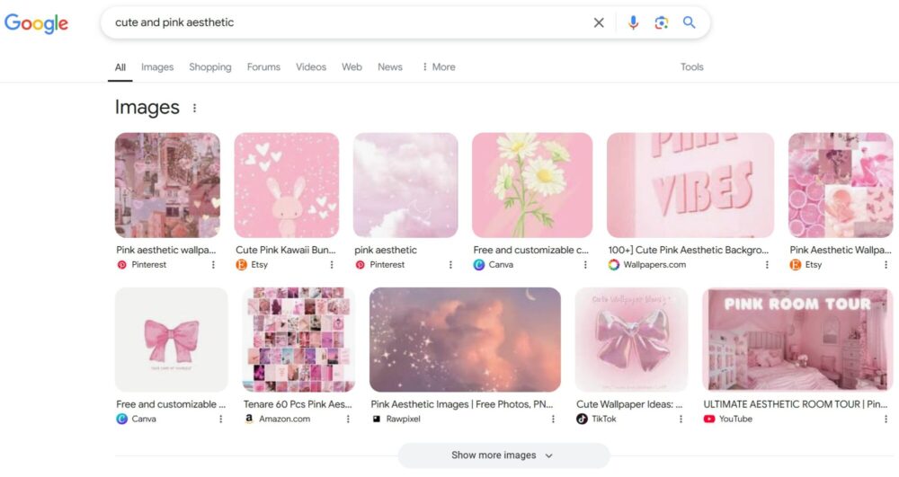
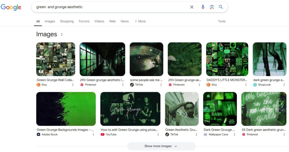
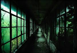
The cute and pink aesthetic is soft, playful, and lighthearted. It uses pastel colors, rounded shapes, and fun patterns like bows, hearts, and flowers. In contrast, the green and grunge aesthetic feels rough, dark, and more grounded. It often features deep, earthy greens, browns, and blacks, with distressed textures, sharp lines, and patterns like plaid or abstract shapes. While cute and pink feels dreamy and fun, green and grunge feels raw and unpolished.
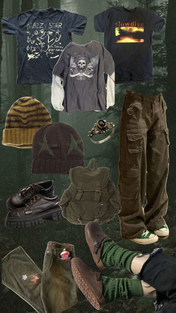
If I were to switch my project to the green and grunge aesthetic, I would make a lot of changes. For my pink jean jacket, I could dye it a dark olive green or even black. I could distress the fabric by fraying the edges or adding patches with rough stitching. Instead of cute bows and flowers, I could add jagged shapes, maybe even sew on some plaid or corduroy fabric to get that grunge feel. For my tote bag, I could use dark green embroidery thread and create rough, abstract patterns or stitch on some patches that look worn and vintage.
Another key part of the grunge aesthetic is the texture. Cute and pink is often smooth and polished, while grunge is more textured and imperfect. I could experiment with layering fabrics, using thicker yarn for embroidery, or even adding paint splatters to give a more worn-in, edgy look.
Even though I love the cute and pink aesthetic, it was fun to imagine my project with a completely different vibe. The green and grunge aesthetic might feel like the opposite in every way, but it’s interesting to see how the same materials and items can look so different just by changing the colors, textures, and patterns.
Reference
[1]. Google Search [2]. https://www.pinterest.com/pin/retro-grunge-outfit-inspiration–850898923369012096/ [3]. https://www.pinterest.com/jayleimeares/green-grunge-aesthetic/
4 Comments. Leave new
Hi Ariana,
Interesting post! I Iike how you go into what would be different about your project if you picked the opposite aesthetic. Even though the pink and green are opposite aesthetically I think they would go well together. I look forward to seeing how everything turns out!
Hey Mila,
Me too, I think that green and pink kind of do go together. Thank you.
Hey Arianna, I like your exploration of the opposite aesthetic. There is definitely a big difference between your original one vs. this one. I’m excited to see how your project plays out!
Thank you
– Ariana