

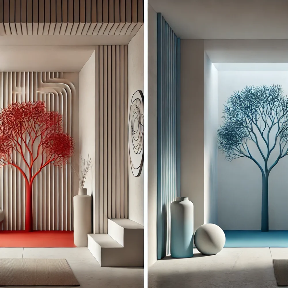
My upcycle project follows the Unexpected Red Theory, where a bold and intentional use of red disrupts an otherwise neutral or natural setting to create a striking visual contrast. But what would be the opposite of this aesthetic? If my project embraces warmth, vibrancy, and energy, then its opposite would focus on coolness, calmness, and serenity.
The Random Blue Theory
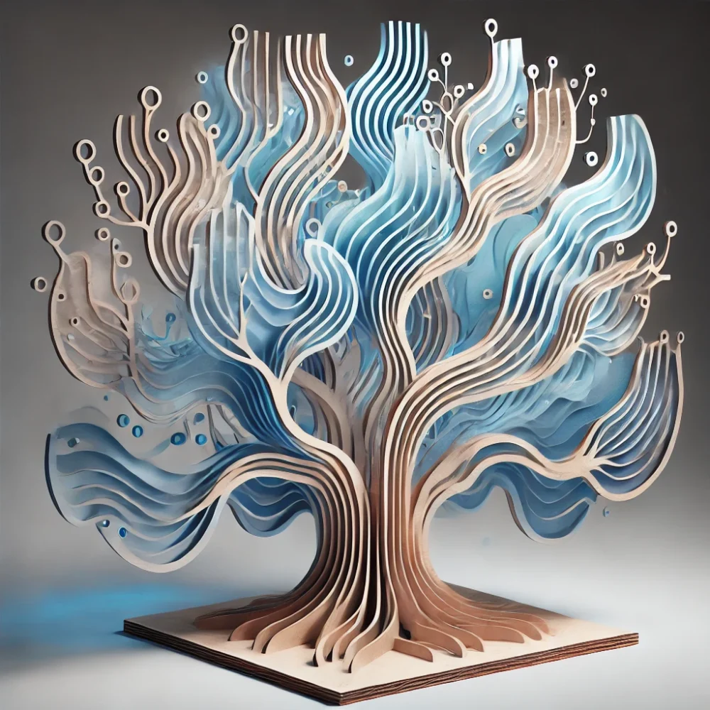
A counterpoint to the Unexpected Red Theory could be called the Random Blue Theory. Instead of a strong and dominant red that radiates warmth and intensity, blue introduces a sense of coolness and relaxation. Blue is known for its soothing, introspective qualities, making spaces feel tranquil and expansive rather than energized and bold.
If I were to reimagine my laser-cut tree sculpture in the Random Blue Theory, I would:
- Use various shades of blue instead of a uniform, bold red. Cooler tones like light blue and deep navy would create a more peaceful and meditative atmosphere.
- Apply blue in a gradient or soft wash, rather than a striking solid tone, to convey a sense of flowing air or gentle waves.
- Introduce translucent materials like frosted acrylic or light blue glass to give the sculpture an airy, weightless quality.
- Emphasize smooth, organic curves rather than sharp contrasts to reinforce a feeling of calmness and fluidity.
Enacting the Opposite Aesthetic with Existing Materials
To incorporate this concept into my current scrap wood and laser-cut design, I could:
- Use blue stains or light washes of paint to soften the wood instead of a bold, opaque finish.
- Incorporate clear or lightly tinted acrylic panels to diffuse light and create a cool, ambient glow around the sculpture.
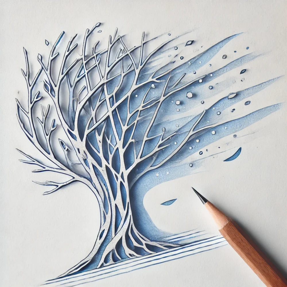
- Introduce wave-like or flowing patterns in the laser engravings to mimic water or air currents.
- Modify the arrangement of the branches to be more spaced out and open, creating an airy, spacious structure instead of a dense, compact form.
Sketch and Visualization
To represent this idea, I would create a sketch of the tree sculpture with soft blue hues that gradually fade in and out, rather than stark color blocks. The overall look would feel calm and refreshing, like a cool breeze on a warm day. Some sections might be subtly translucent, allowing light to filter through gently rather than reflecting it harshly.
Conclusion
While my project embraces warmth and intensity with red, the Random Blue Theory would create a space that feels cool, soothing, and expansive. This exploration highlights how color psychology shapes our perception of objects and environments. Where red draws attention and creates energy, blue invites introspection and calmness. By experimenting with a cooler color palette, the sculpture could take on an entirely different emotional impact, shifting from a bold statement piece to a serene visual escape.
This exercise in reimagining aesthetics deepens my understanding of the emotional weight of color in design and how subtle shifts in hue and structure can alter the experience of a piece. I look forward to exploring more about how color choice influences mood and perception!
4 Comments. Leave new
Hi Airyl,
Very insightful post! I agree that random blue does bring in an opposing vibe to the unexpected red. Why do you think this is? After all, green is the complementary color to red. I think blue is always a cool color, but green can sometimes have a warmth to it. I’d be interested to hear your thoughts. I’m looking forward to seeing how your project turns out!
Hello Chrisanna, I believe with pre-existing notions on the color red and blue, it always has meant opposing views, where red usually shows warmth, and blue shows coldness. Maybe this is due to nature laws where heat is usually associated with red, and the cold associated with Blue. Thanks for your comment!
Hi Ayril,
Really interesting read. I have never heard about the random blue theory. Your post does a great job outlining the key aspects of each aesthetic and comparing them visually. You mention how the colors and shapes have emotional weight and I think that is true and really interesting how we can experience different feelings through art. I wonder if there are any overlapping feelings that can be experienced even though the aesthetics are opposites of each other. I look forward to seeing how your project turns out!
Hello Mila, Glad you enjoyed my aesthetic post. I do think that the feeling of familiarity can be experienced with both colors even though they are the opposites of each other. I didn’t realize that until now, thanks for your comment!