
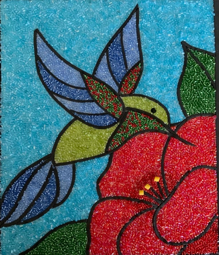
 For my upcycling project, I chose to create a mosaic out of paper of “The Great Wave of Kanagawa”. The style of a mosaic is putting pieces together to make a masterpiece in which can be defined into picture, shape, object, something identifiable. Mosaics are found to decorate walls and floors and were fairly popular in Rome. These pieces come together in a sort of pattern sorted into a limited color pallet that can’t really be formed into realistic art. It is something that cannot be reassembled from it’s individual pieces and have been found to be used for religious and cultural aspects. Shades of color are more choppy in transition but can be formed in an order that makes sense to the viewer.
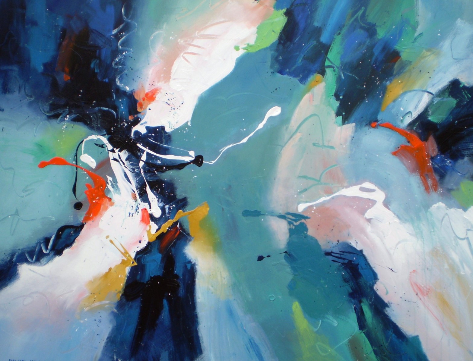
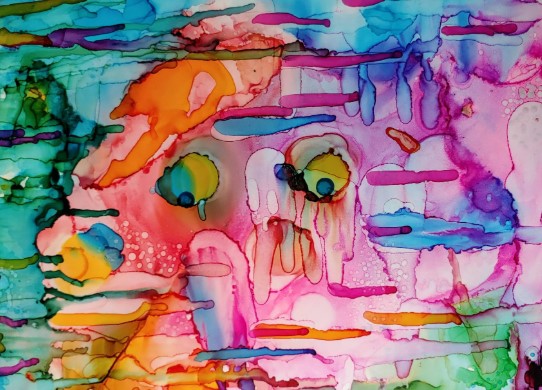
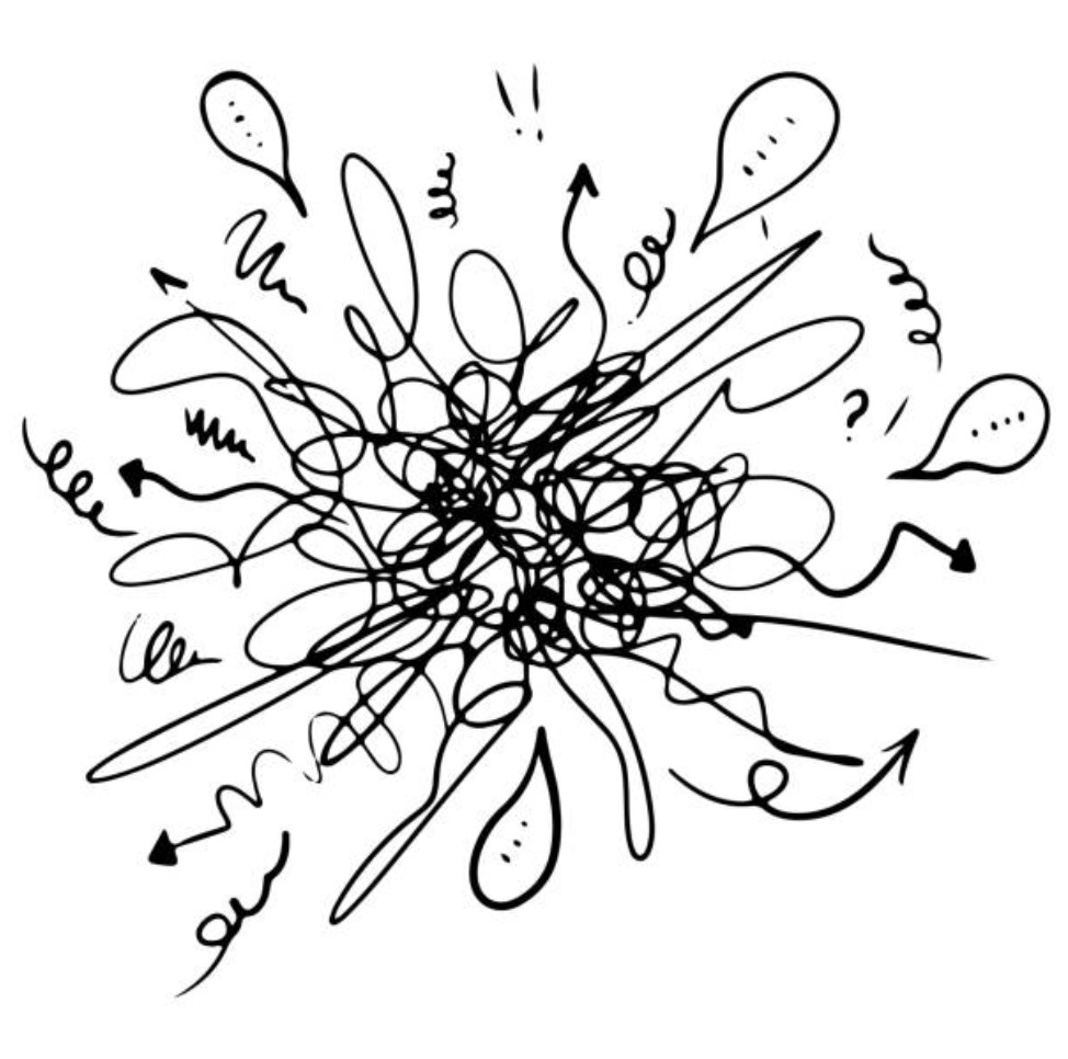 The opposite of a mosaic is disorder. Disorder can be described as chaos as pieces can come together but still not make sense to the viewer. Think about a tornado and how it destroys everything in it’s way and the disorder it creates. Colors can be identified but it doesn’t create anything from them. Scattered lines and speckled dots can cover the canvas yet with no story to tell. It’s a bit more on the abstract side. In the picture below, shapes, colors and objects are used to describe the reality of the artists message to the world. In comparison to the mosaic above, you can see how colors aren’t meant to fit in the lines as they blend with each other to create different colors. Eyeballs can be shown as a glimpse of something identifiable but it still brings chaos to the overall piece. It screams more experimentation than it does the reality of this world.
Cited work:
https://en.wikipedia.org/wiki/Mosaic
2 Comments. Leave new
I think you perfectly captured what the opposite of your aesthetic would be with disorder and chaos. I like how you even thought about how colors affect the different aesthetics since both can be pretty colorful.
Great read! I like how you connected disorder to chaos, like a tornado scattering everything, this really helps visualize the concept. The idea of using colors and shapes that don’t fit together into a clear picture definitely gives a sense of abstraction and experimentation. I really enjoy looking at the last picture you used in your post. It would be interesting to see or think about how you could incorporate that sense of unpredictability into your project! Nice job.