
For my upcycle project, I’m going for a witchcore and rustic aesthetic (which was somewhat forced by my own inability to mold tiny figurines smoothly). As it turns out, everything that I sculpted has some kind of imperfections, and I’ve already accepted that.
The opposite of this aesthetic would be simple and clean. It would use a light color palette to contrast with the dark colors of my project. Moreover, there are a lot of wooden and stone textures in my design, which are considered natural. Hence, the opposite aesthetic would focus more on metal and solid plain textures. Furthermore, one of the goals for my project was to create a space that felt well lived in. This meant adding random trinkets throughout the diorama and scattering items all around, making it feel used.
Minimalism is an aesthetic focused on the “lack of clutter or unnecessary detail” (Aesthetic Wiki, Minimalism). It emphasizes only the necessary with the motto: less is more. Colors commonly associated with it are white, neutral colors, and muted tones. As described above, the concept behind this aesthetic greatly contrasts with my vision for a lived in and somewhat messy design because it focuses on lack of clutter. Additionally, minimalism is often connected with a light and clean color palette. Hence, it’s an aesthetic that is very opposite to my project aesthetic.
Bauhaus is another aesthetic that is opposite to my project. Similarly to minimalism, it focuses on simplicity and function. Moreover, it embraces geometric shapes and the use of manufactured materials such as glass, concrete, and steel. These contrast with the roughness and (intended) details of my rustic gothic furniture designs.
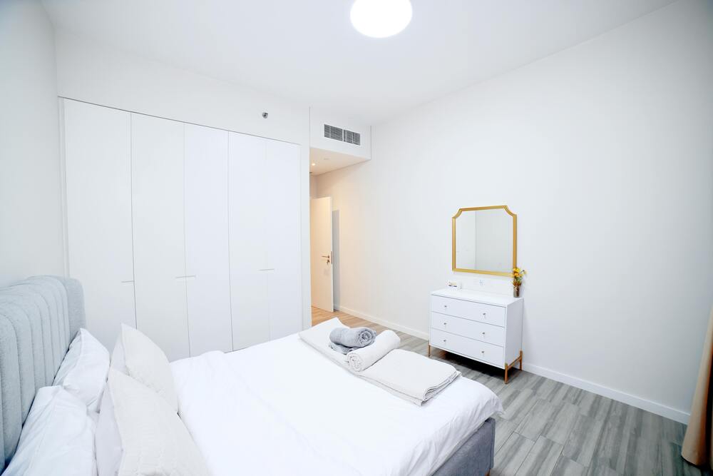
With these thoughts in mind, I redesigned my diorama to be a more minimalistic kitchen-like space. The design heavily focuses on simplicity and the use of Bauhaus materials. It uses smooth stone countertops on top of solid colored kitchen cabinets. Moreover, the original wooden shelves are replaced with a large minimalistic shelf next to the corner and a small shelf in the corner. Both shelves are metal in nature and feature a geometric mesh pattern, an ode to the geometry of Bauhaus. The shelves designs were inspired by my image of minimalist shelves featured in the above image. The “stone oven” has been upgraded to a simple modern-style oven, and the wooden flooring has been replaced with concrete tiles. Furthermore, the window frame is now metal instead of wood.
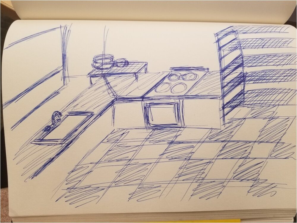
I would not want to create this design. But if I did, I would likely forgo clay (or get proper sculpting tools) and use materials that can maintain their shape. For instance, I would buy and cut popsicle sticks to form sturdy structures and smooth surfaces for the counter. Additionally, I would cut thinner strips to create the shelf and window frames, using mesh for the shelves.
Featured Image: (0) Photo by Haider Syed, 2025: https://www.pexels.com/photo/minimalist-white-bedroom-with-modern-decor-30688577/
Research Citations:
2 Comments. Leave new
Hi Annie,
I think the minimalist and Bauhaus approach is such a striking contrast to the rustic, witchcore aesthetic. It’s interesting how the clean lines, geometric shapes, and solid materials completely change the vibe of the space. Nice to see your sketch too. Good work.
Hey Annie, This is truly an amazing design for a minimalistic kitchen. I have a similar design back in India. The white color looks fantastic and brings a sense of peace. The design is straightforward and clean, without being clunky or chaotic.