
My Collage Card Aesthetic
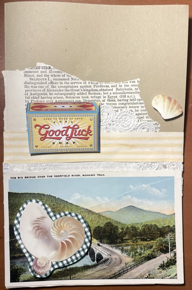
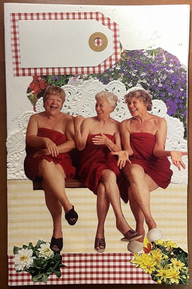
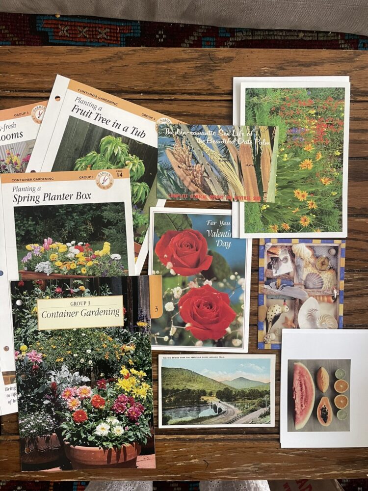
In my initial post about my upcycling project, I determined the aesthetic would be maximalist, vintage, and whimsical. The maximalism comes from the quantity of items pasted on the card, meaning there are plenty of things for your eyes to follow. The vintage retro aesthetic is created by the materials used in the collage, such as postcards from the 60s, an old newspaper, or a magazine containing film photos. The whimsical and nostalgic charm comes from all the layers and detail that are telling of attention and care within the cards. I also mentioned that the cards will have a hint of a natural, earth-tone aesthetic because many upcycled or recycled materials are not stark white or fresh-out-of-the-factory feeling. Brown paper bags and torn-up, wrinkled materials with organic edges and textures create this aesthetic.
What is the Opposite Aesthetic?
The exact opposite of the aesthetic I described above is minimalist, modern, stark, industrial, and clean. When these styles are imposed on a card, I would imagine a plain card with a lot of black, white, and grey, perhaps devoid of personality and sentimentality. Rather than evoking emotions of nostalgia and whimsy, this type of card would be more appropriate for a formal business setting. Images and text would be printed and perfectly aligned, there would be no natural edges or organic shapes among the collage layers, and most features of the card would be incredibly simple.
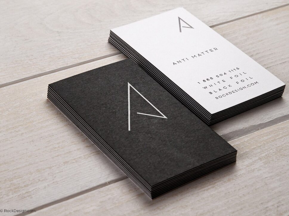
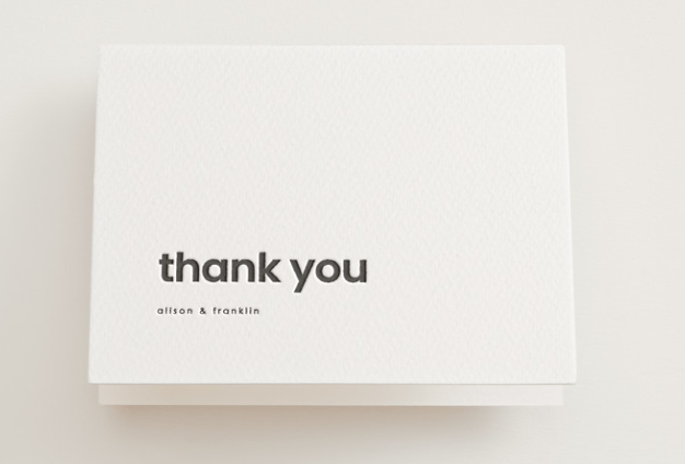
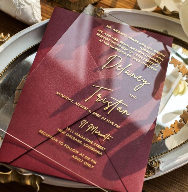
Images (in order): Rock Design, Minted, Clarity & Co
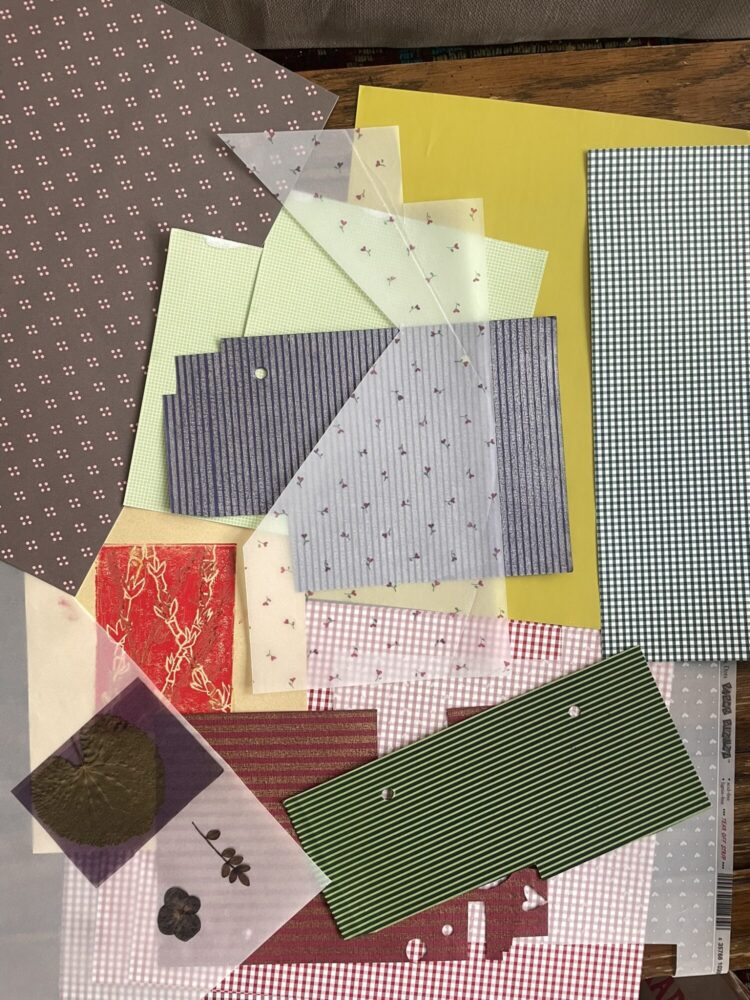
Creating the Opposite Aesthetic with Materials I Have
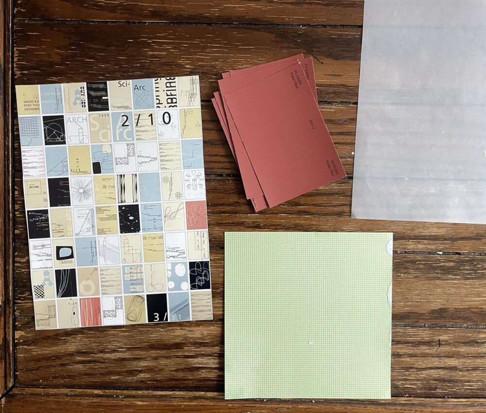
Sleek minimalist cards would ideally be factory-made, or contain brand new materials that are conducive to the style. They would maybe have phrases perfectly printed on them, nothing handwritten. However, with the materials I’ve gathered for my upcycle project, the following would be useful in creating the opposite aesthetic:
- Scissors
- Plain white cardstock
- Plain black cardstock
- Very small amounts of muted colorful cardstock
- Clear or white vellum
- Images, but only if they are precisely cropped and don’t express personality
Some examples of these materials are pictured below.

Even though I’ve gathered the materials specifically to create a maximalist, vintage aesthetic, some small components of the same material can be used to evoke the opposite aesthetic. Instead of cutting out natural shapes and human forms, I could pick simple, monochrome images and cut out sleek rectangles. Instead of layering 5 different pieces of paper, I could combine at most 2 pieces and ensure edges align perfectly. Rather than picking out the colorful, vintage photos from various magazines, I could find modern designs to implement.
Personally, I definitely am not a fan of the opposite aesthetic. I believe any hand made card should contain a lot of sentimentality and embrace the imperfections that come with the process. I find maximalist collages to be far more interesting than minimalist cards. However, it is interesting to think about what other aesthetics are possible with the materials I own.
Cited images:
Image 1 (Rock Design) – https://www.rockdesign.com/business-card-templates/minimalist-modern-black-and-white-business-card-anti-matter
Image 2 (Minted) – https://www.minted.com/product/wedding-thank-you-cards/MIN-YHY-LTY/min-mod?custom_foil=unselected&quantity=50&utm_sub=cj&utm_sub=pla&utm_medium=sem&utm_source=google&utm_campaign=G_S_Wedding_WeddingMarketplace_PLA_USA_PerformanceMax&utm_custom_a=WeddingMarketplace&utm_custom_b=feed&utm_custom_c=shopping&utm_int=b&utm_keyword=&utm_device=a&AudId=&gad_source=1&gclid=CjwKCAiAh6y9BhBREiwApBLHC6to81RAU_FZED-Af8eeRwS8b9Zwd8eGuc9lzbhGG2-4I2s7W1XCfhoCNm8QAvD_BwE&color=A&shape=
Image 3 (Clarity & Co) – https://www.claritynco.com/simple-greeny-minimalist-acrylic-wedding-invitations-cax085.html
1 Comment. Leave new
This sounds like a cool project to have for whenever you need cards! I appreciate that they will all be unique and expressive in their own way. It’s also kind of cool how the difference between one aesthetic and another is actually pretty small. You mentioned the way to cut things out can determine the feel. I guess this also means it can be hard to perfectly represent an aesthetic when the smallest things affect the outcome. I hope you enjoy collaging!