
Naturalism focuses on the incorporation of elements found in nature. The opposite of this aesthetic could be many things, with the common denominator being industrial elements not found in nature. This could be seen in industrial or brutalist aesthetics. But I also think maximalism could be considered an opposite aesthetic, as naturalism frequently shares some characteristics with minimalism. For this post, I will focus on industrialism as the chosen opposite aesthetic.
As an aesthetic, naturalism has a color palette based on colors frequently found in nature. This includes an array of blues, greens, and browns. It can also include yellow, orange, purple, red, and more, as long as they are natural versions of the color. An opposite color palette could be one void of color, filled with whites, greys, and blacks. Another way to view the opposite palette is neon colors that are less commonly found in nature. The more natural colors are what I focused on for the design of my upcycle project to stick with this aesthetic.
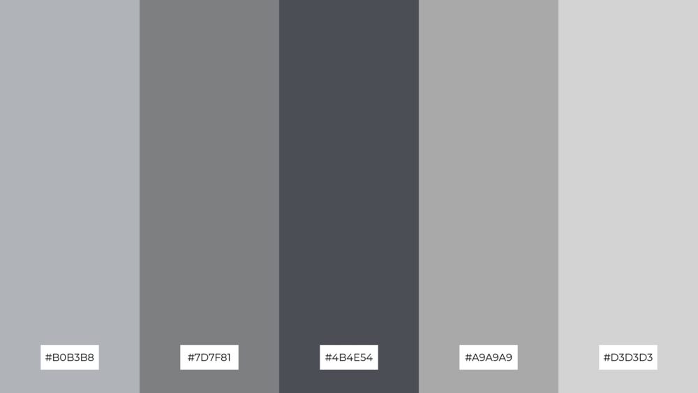
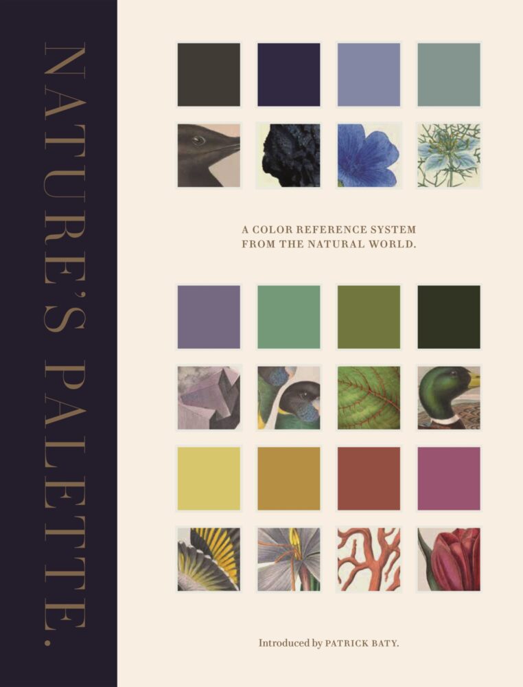
Figures 1 & 2: Industrial (left) and Naturalism (right) Palettes
To rework the project I have planned, I would change the design of the stained glass, and more importantly, the colors of the glass used. If I were to focus on an industrial aesthetic I would do something like a cityscape scene (Figure 3). I would use mostly grey-monochrome glasses with varying shades to add dimensions. I think incorporating angled shapes and using different colors to give the illusion of shade and shadows would be a great way to make it feel very industrial.
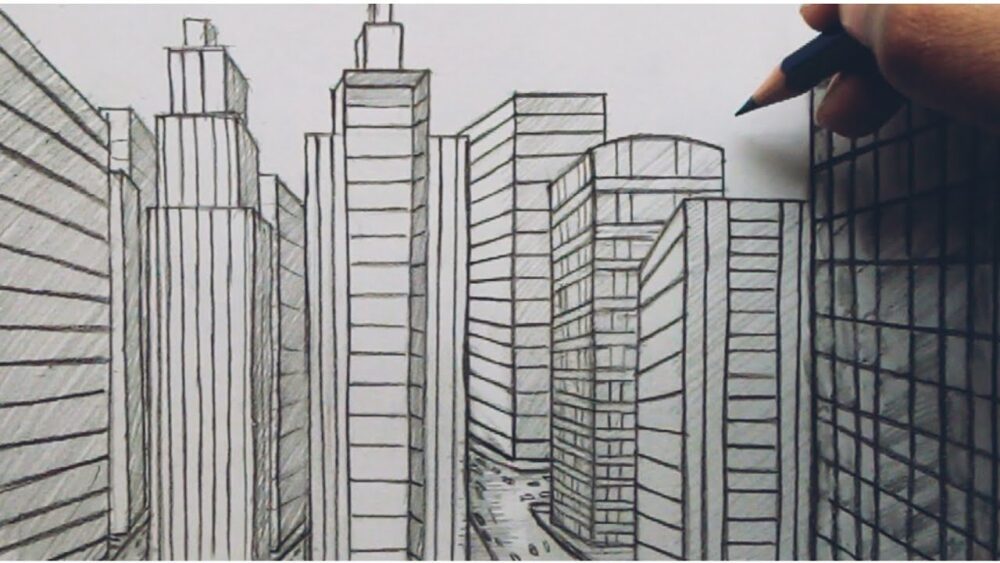
Figure 3: City Scape Sketch (Youtube)
Another way to make stained glass less natural is to have sharp harsh lines and incorporate other industrial materials like metals. This can be seen below in a piece I found online, titled, “Pia Manu Brutalist Illuminated Wall Sculpture in Steel & Red Stained Glass 1970s.” It has very harsh lines and incorporates bronze copper and slate materials. It very clearly takes stained glass in a different direction and is much more industrial than natural.
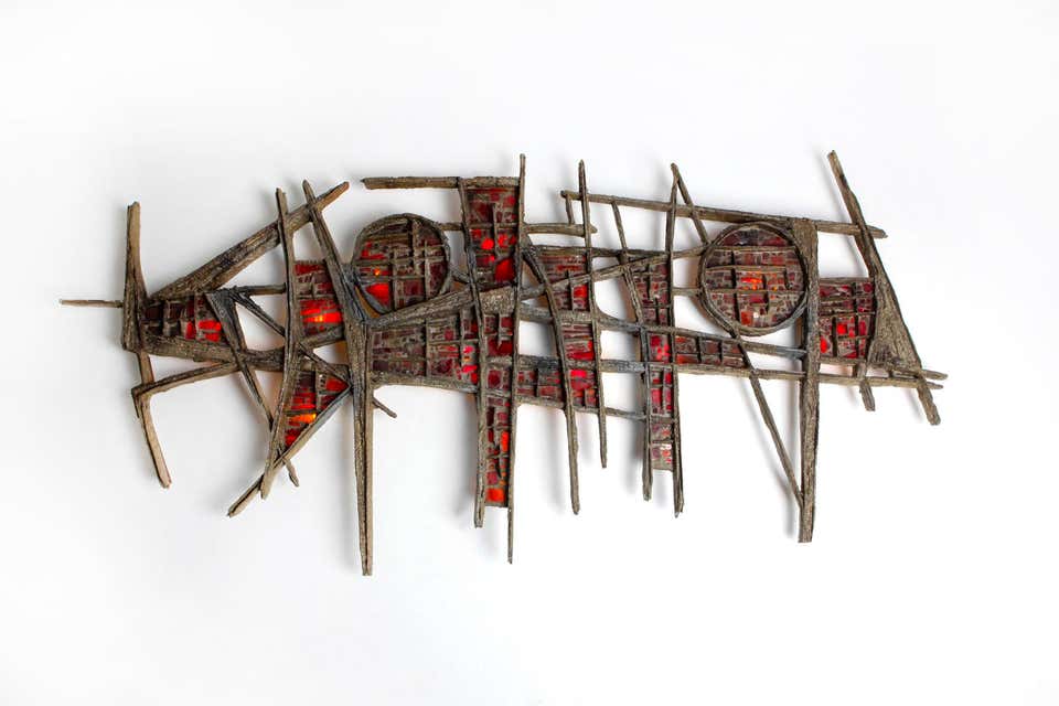
Figure 4: Pia Manu Brutalist Sculpture, Steel and Red Stained Glass
I would be interested in making an industrial stained glass piece in the future. I think the concept of playing with light and shadows versus drawing from nature would be unique.
Sources
Images –
[1] https://piktochart.com/tips/industrial-color-palette [2] https://press.princeton.edu/books/hardcover/9780691217048/natures-palette [3] How to draw cityscape view easy [4] Pia Manu Brutalist Illuminated Wall Sculpture in Steel & Red Stained Glass 1970s – 20c Design
2 Comments. Leave new
I feel like with some small tweaks, that steel stained glass piece could actually look quite natural. It already kinda looks like a bunch of pieces of wood stuck together, I feel like it could work in a natural cabin environment or something. But this is from my untrained eye.
Thanks for the comment! That is a really good point; the way you described it, I can also see the piece fitting a cabin aesthetic!