
Just to make this very clear: My project involves a visual pun and I will not apologize for that.
As evident in my last post, I am a large believer in how music influences aesthetic, and this is a way to put that into effect. I had the idea for my project in mind, but I did not have an idea for what aesthetic I wanted until I heard the song “When the Sun Goes Down” by the Arctic Monkeys. While the song isn’t confined to an aesthetic, the album cover stuck out to me.
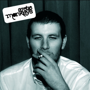
The color scheme of this cover is what stuck out to me first. The muted, black and white colors make the simple scene of someone who is not even in the band stand out as unique. This is what influenced me to look into an indie aesthetic for this project.
“Indie” is a very broad term that describes independently made art. While this means that practically anything could be Indie, it does have a distinctive aesthetic to it. Many indie creations use lower quality gear, giving photos and videos a less professional look. A lot of indie fashion is also cheap and unassuming, perhaps even thrifted, which felt right considering this project will be using upcycled materials. Of course, album covers remained my main inspiration.

When researching different Indie album covers, I noticed several recurring themes in them that I gravitated to. One look that I found complimented the Indie aesthetic more than anything else was the grainy, photographed look that many of them had. It was was drew me to the Arctic Monkey’s album cover discussed earlier and what drew me to many others, like “Tonight: Franz Ferdinand.” I especially enjoyed the way this cover was staged.

I was intent on trying to make something black and white until remembering “Hot Fuzz” by the Killers. While not in black and white, it manages to capture the same unrefined, homemade look as the others.
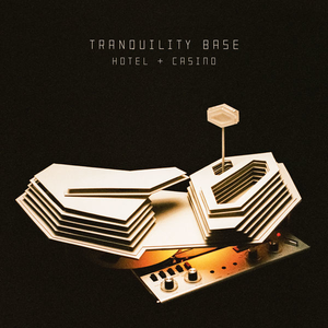
With all of this in mind, I have decided for my upcycling project to be an “album cover.” In reality, it will be more akin to an almost flat diorama with a scene inside. To match the aesthetic these covers have, I intend on making a filter of sorts that will cover an open face of the diorama, making it so you can only view the scene with the same unfocused look that the other album covers had. The actual scene was harder to think of, however I had the concept of “Rock music” in my mind. By this, I of course mean using actual rocks, likely in the form of a miniature instrument. This would be more inspired by a different Arctic Monkey’s album, “Tranquility Base Hotel and Casino.” I am still figuring out how to do this, but I will have a prototype design by next week.
References:
Featured Image: https://en.wikipedia.org/wiki/Tranquility_Base_Hotel_%26_Casino
Figure 1: https://en.wikipedia.org/wiki/Whatever_People_Say_I_Am,_That%27s_What_I%27m_Not
Figure 2: https://en.wikipedia.org/wiki/Tonight:_Franz_Ferdinand
Figure 3: https://en.wikipedia.org/wiki/Hot_Fuss
1 Comment. Leave new
This sounds really interesting. Will this album cover be for any particular band you have in mind? Like, will it be an album cover for your music, or for a band you like? Also, you said that your work will have a visual pun, but I don’t think I got it. What is the pun suppose to be?
Do you have any ideas for materials that will create the filter you’re looking for?