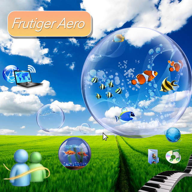
The Frutiger aero aesthetic emerged as a transformative visual language during the late 1990s and early 2000s. It represented a pivotal moment in digital design history. It usually gets confused with Y2K futurism, but the difference is that Y2K had a more primitive, lower quality approach. Frutiger aero distinguished itself through sophisticated visual elements, higher-definition graphics, and a different approach to technological representation.
The aesthetic’s visual language was characterized by several distinctive elements: translucent surfaces, subtle gradients, rounded corners, metallic highlights, and a sense of depth that suggested technological sophistication. These design choices communicated an optimistic vision of technology—sleek, approachable, and almost magical in its potential.
This aesthetic was influenced by advancements in digital design tools. With digital design tools providing new creative capabilities, designers discovered new techniques for creating clean gradients, precision vectors, and glossy finishes that captured the era’s technological advances and innovation. These visual elements weren’t merely stylistic choices but reflections of broader societal fascination with digital progress.

The term “Frutiger aero” itself has an interesting history. It references Adrian Frutiger’s typeface from 1976—known for its clean, modernist lines—and the Windows Vista interface design from 2006, which is the epitome of the aesthetic. It represents a design approach that aims to be clear, see-through, and technologically sophisticated.
Major technology companies played instrumental roles in defining and propagating this aesthetic. Microsoft’s contributions were particularly noteworthy, with designs like the MCE Royale Energy Blue theme, Noir and POS2009 taskbar interfaces, and Microsoft Plus sound schemes becoming iconic representations of the era. Apple’s Aqua UI and various Linux distributions such as Mint and OpenSUSE further expanded the aesthetic’s reach, each adding unique adaptations.
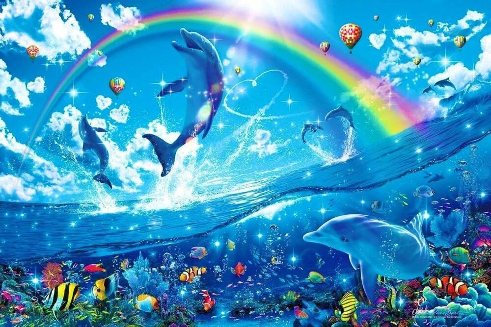
The Frutiger aero influence extended far beyond digital interfaces. These elements shaped product concepts, toys, advertisements, TV bumpers and idents, episode openings, film prologues, and more. Each category uniquely adapted and interpreted the Frutiger aero aesthetic, which showcases individual styling changes while reflecting the trends of the era.This widespread adoption demonstrated the aesthetic’s remarkable versatility and cultural significance.

Other design movements continued exploring and reimagining the Frutiger aero philosophy. Other aesthetic styles like Helvetica Aqua Aero, Frutiger Aurora, Dark Aero, Technozen, and Vectorgarden emerged, each offering unique interpretations while maintaining core aesthetic principles. This aesthetic also has reemerged in today’s time with memes. These offshoots demonstrated the enduring influence of the original design language.

Frutiger aero represented a cultural moment—a collective imagination of technological potential. It captured a period of optimism about digital innovation The aesthetic’s clean lines and smooth surfaces suggested a future that was simultaneously futuristic and immediately accessible.
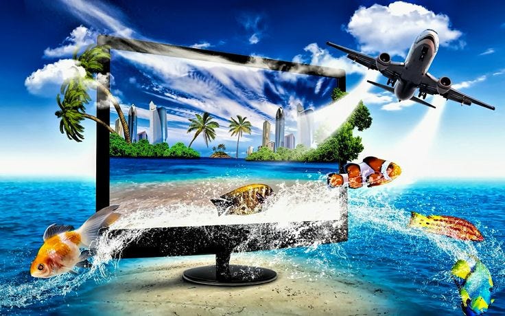 Frutiger aero is now viewed with a sense of nostalgic appreciation, representing a specific moment in
digital design history.
Sources:
https://aesthetics.fandom.com/wiki/Frutiger_Aero
https://en.wikipedia.org/wiki/Bliss_(photograph)
https://frutiger-aero.org/frutiger-aero

2 Comments. Leave new
Love, love, love this post! Great pick of aesthetic, I had no idea what this was called! I would have referred to it as Lisa Frank style maybe? Especially the 3rd pic really evokes Lisa Frank stickers/notebooks for me. I have a quick question. I think you had a great point that this design style was popular due to innovations in computer graphics such as clean gradients, precision vectors, and glossy finishes. What you think is the value of this aesthetic in modern times when computers are capable of so much more?
Hi Nita, that was a great post. The information was extremely well used and explained in great detail the aesthetic. Your writing is also superb, it has layers of detail and feels very full in essence. However, I feel the post would benefit from a slight reorganization. For instance you discuss elements that characterize the aesthetic fairly late into the post. Setting this up before discussing some commonly known examples would make it easier for readers to relate what was just said to the examples provided. Also weaving in pictures throughout as they are described in the post would make information more “sticky”. Overall great work!