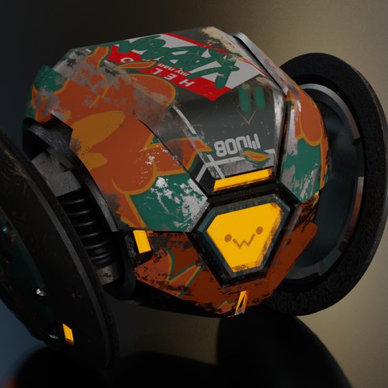
The aesthetic for my main project will be a combination of cyberpunk tech and graffiti. I don’t really have a name for this aesthetic, but it involves the aesthetic we usually see in sci-fi or cyberpunk technology and some graffiti art and illustrations. The main focus with this aesthetic is to bring some contrast to the enclosure of the virtual assistant. I will be using colorful paint and vibrant illustrations to make the enclosure stand out on my desk. The following image helps show the aesthetic I’m going for.

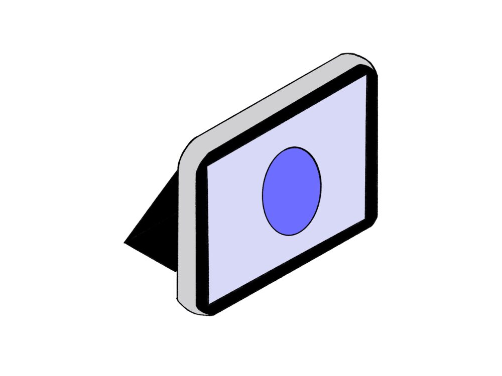
This aesthetic is almost the opposite of what I usually do. I usually go for minimalistic design. One of the first alternative aesthetics that came to mind was the minimalist aesthetic. This aesthetic can look a lot of different ways. In my opinion the virtual assistant in a minimalist aesthetic would be kind of like a tablet. A large display that has voice recognition and very little analog buttons. The following image is a sketch of the virtual assistant in a minimalist aesthetic.
Minimalistic:

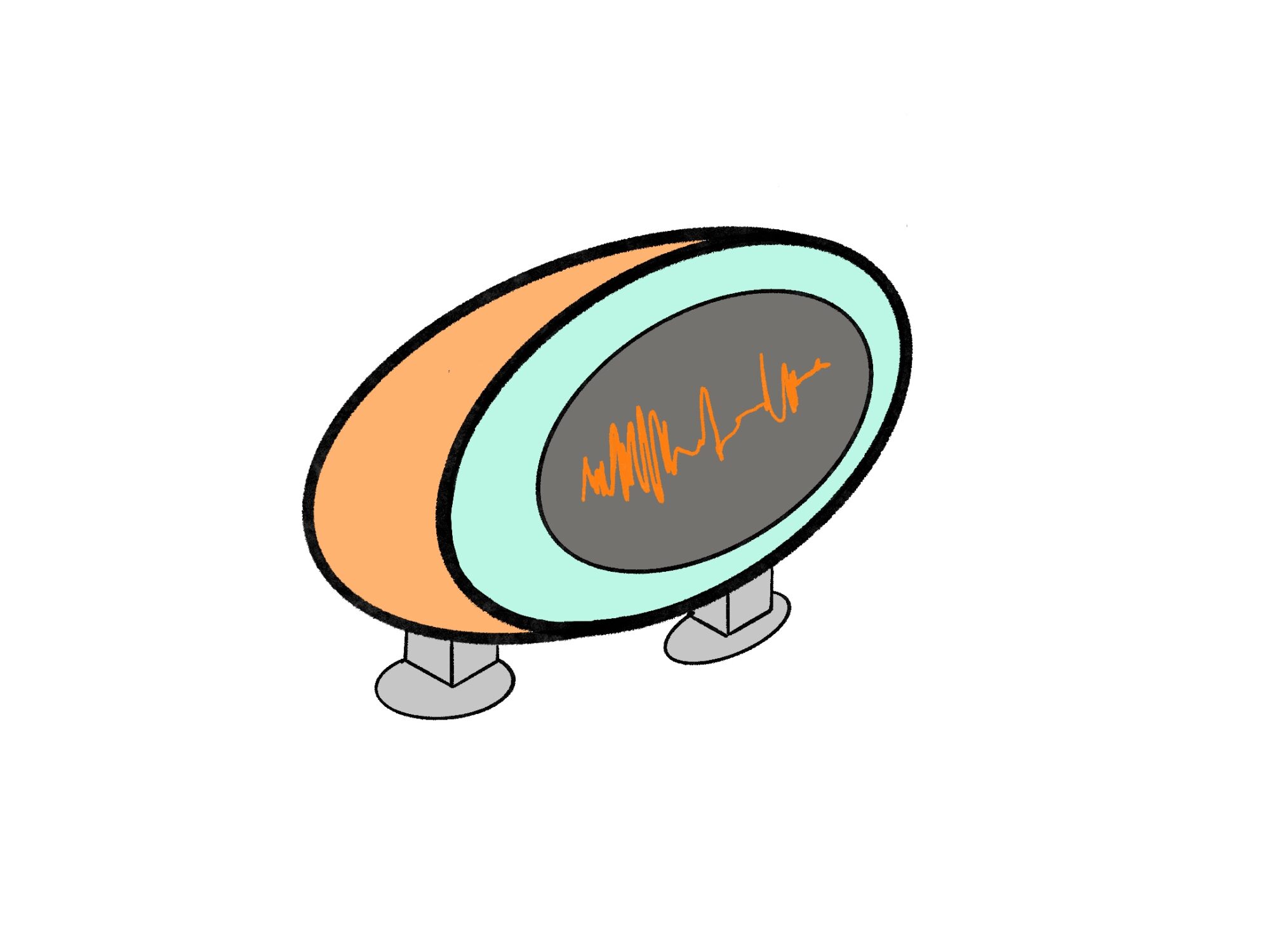
Another alternative aesthetic I really enjoy is retro futurism. There is sleek design and natural shapes. For a virtual assistant, I would consider a circular shape to the enclosure and a few knobs a dials. These would be used to interact with the virtual assistant. I think for this design I would remove the robot face and add the sound waves on the display instead to better fit the aesthetic.
Retro futuristic:


1 Comment. Leave new
Hi Alexis ,
Your post intriguingly outlines the development of a virtual assistant that combines cyberpunk and graffiti aesthetics, diverging from your usual minimalist style to explore vibrant and dynamic designs. It would be beneficial to discuss how these aesthetic choices enhance the functionality and user interaction, and what challenges or benefits this transition offers in terms of user engagement and product usability.