
For my main project aesthetic, I’ve decided to go with an OEM (Original Equipment Manufacturer) aesthetic. This aesthetic essentially is trying to create something that looks as similar to an original Mazda part as possible. To do this, I will need to try and encapsulate the design features in the car as it stands using matching colors and quality 3D printed finish. I also want to try and include a Mazda logo somewhere on the part as well. This will help to add to this aesthetic by showing that the part is Mazda branded. Another large part of this aesthetic is trying to make it as high quality as possible. In cars, OEM parts are always known to be the highest quality due to the fact that they are designed by high end engineers and are required to meet company quality inspections. They are also more often than not, tested at an extremely high level to make sure that customer satisfaction is met. That being said, although the look of the design needs to look quality, the product itself also has to be strong to withstand the requirements of a cup holder and have nice components via the spring idea. Below you can see the OEM sketch I made. This sketch includes the Mazda branding logo. Unfortunately I didn’t have any colored markers but you can imagine that the logo and back plate would be black to match the main interior color and the claws and base would be silver to match the secondary interior color. 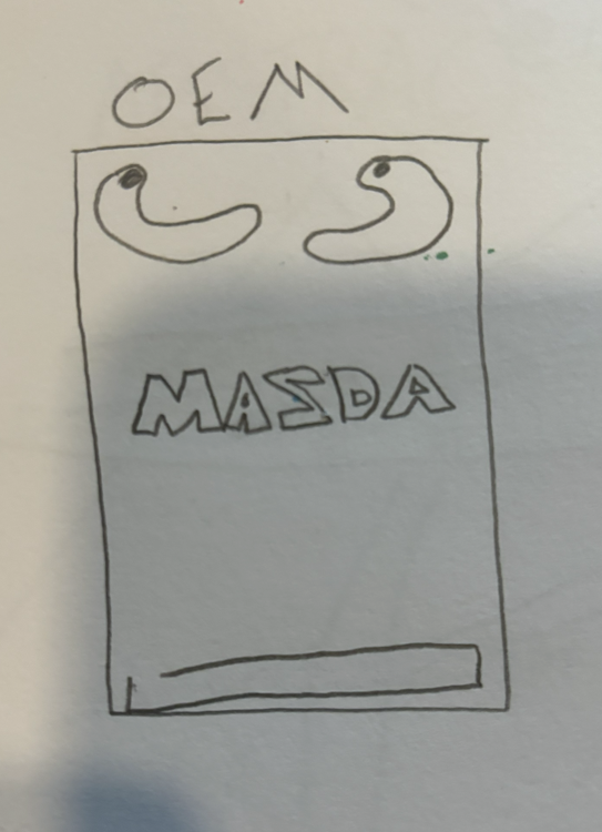
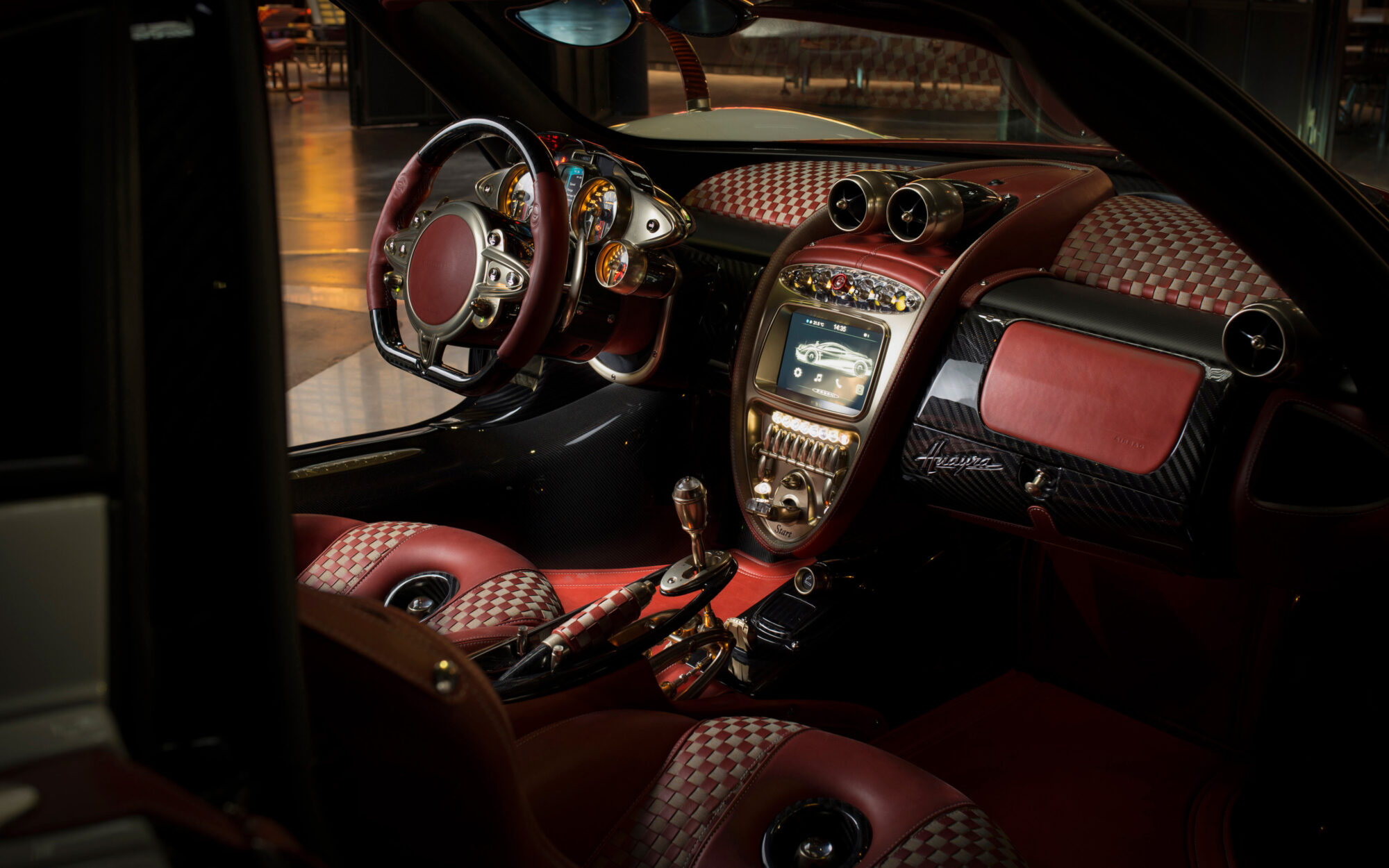
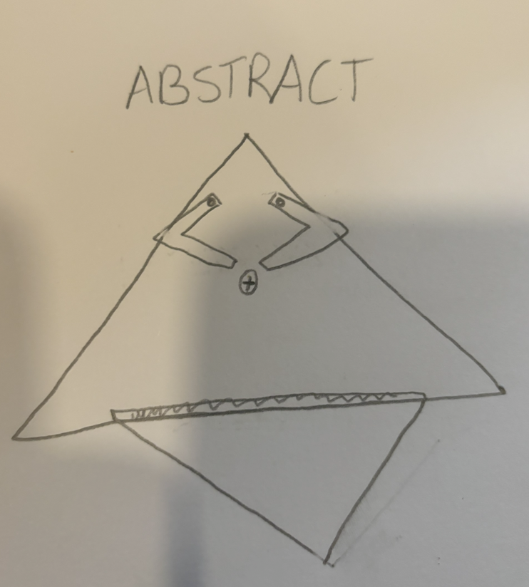
The other aesthetic I think would be wildly different would be abstract. An abstract aesthetic is all about creating a design that doesn’t try to look like anything specific. Instead of creating recognizable objects like trees or houses, artists focus on using shapes, colors, and patterns in unique ways. It’s like they’re playing with visual elements to evoke feelings or ideas without spelling them out directly. So when you look at an abstract design, you can let your imagination run wild and find your own meaning in the colors and shapes. It’s like a visual adventure where you get to explore without any set rules. To achieve this I tried to use a mixture of different shapes to create a bizarre looking cupholder. This is something you likely wouldn’t see anywhere. I took inspiration from Doritos funnily enough. I think this design would actually work if I were to develop this as my actual project but it would look really out of place. However, if you look at something such as a Pagani interior shown below the sketch, this might be fitting. I like to think Pagani vehicles are more of an art piece rather than a vehicle and I really enjoy the design of these cars.
Pagani Interior

Citations
Pagani Interior, Horacio Pagani, Oct 13, 2020, Pagani | Tutti i modelli, la storia di Horacio Pagani e le novità sul mondo Pagani Automobili
1 Comment. Leave new
Hi Luke,
I think this idea of an abstract cupholder sounds very interesting, and a wacky organic shape to a cupholder would be cool to see. After considering this opposite aesthetic, have you come up with any new ways to ensure you are reaching your OEM aesthetic with this project?