

The artifact I built is one which wholly represents my interests and area of study, all combined into an animated and moving sculpture that I can display as a symbol of myself. After my research and experimentation on various styles and design techniques from previous posts, I developed a more refined plan of what my final artifact was going to look like, and what functionality it would include. These design ideas were inspired by a variety of other works, design styles, and elements that I believe to be symbolic of the interests that I have.
For my project, I wanted to focus primarily on symbolism in order to make something that I can cherish and remember. I also wanted it to be an artifact that I could appreciate every day. This led me to consider the design of a small, dynamic desk sculpture that would have decorations and motions relating to the kinds of things that I find fascinating. To begin my design process, I researched desk sculptures and animated sculptures to look for inspiration. I found a variety of examples that I liked. Shown below are the images I found initially that inspired my design.
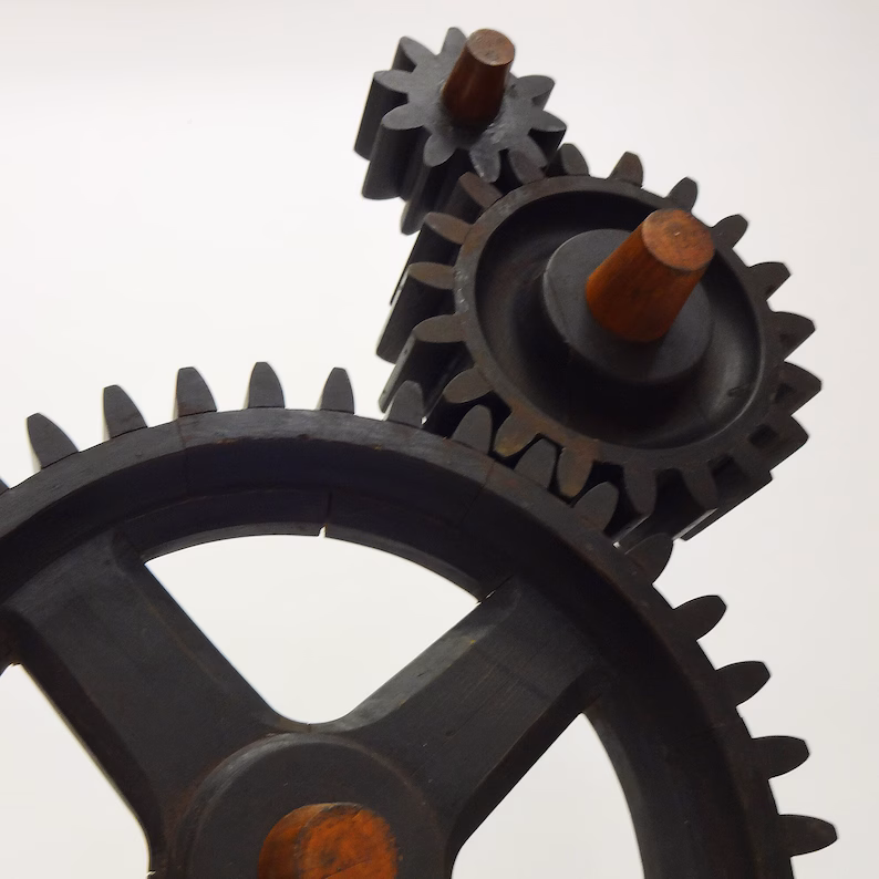
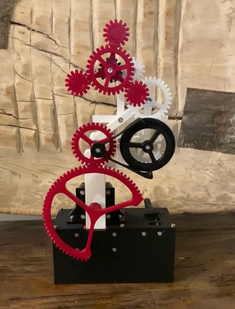
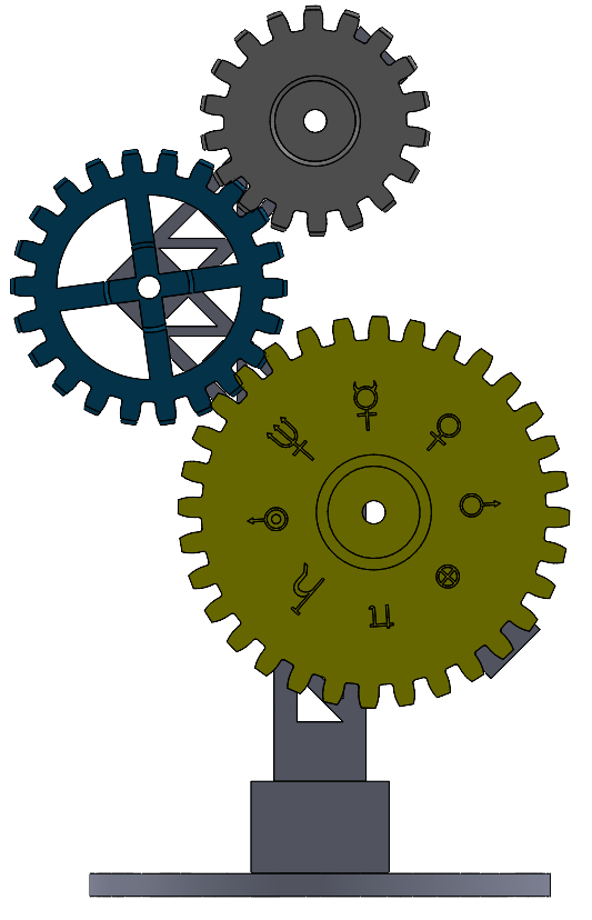
I knew from the start that an important element of symbolism in my project would be gears. Incorporating gears would allow me to implement the symbolism typically associated with Mechanical Engineering, and they are ideal for building mechanical moving systems. They offered a way for me to have a dynamic element that was meaningful to me. In my early searches for gear train sculptures, I found one that allowed me to implement some additional symbolism, which I will discuss later. This sculpture of three wooden gears stacked on top of one another offered a nice orientation that felt balanced yet interesting to look at. While the gears on this particular piece do not move, they are arranged in such a way that inducing movement in them in this orientation would be possible.
I also found this example of a functional gear train which uses 3D printed elements. I liked the modern look of the 3D printed parts, and the vibrant look of the colors which make up the piece. This inspired me to consider 3D printing as a fabrication technique for my final artifact, since I knew that it could reliably make all of the pieces I required. My project will require some precision manufacturing, since for the gear train to be functional, the teeth must slot together with a tolerance which allows some movement, but not too much. I would also like the movement on my final artifact to feel smooth and uninhibited by mechanical defects.
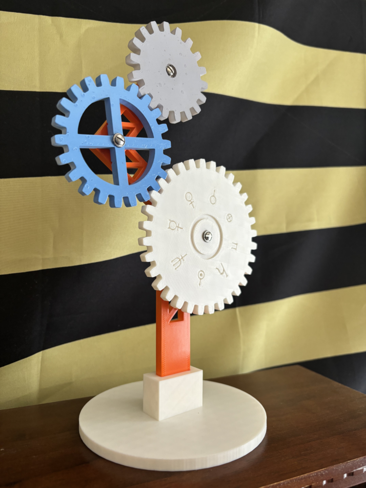
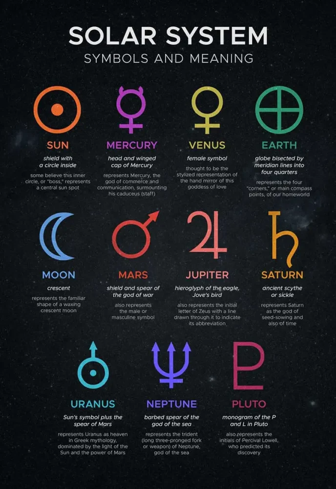
To add additional symbolism to my piece, I thought about the things that I enjoy working on, and how I could implement that into my work. I have always found space and other planets to be particularly fascinating, so I knew that I wanted to implement symbols related to that subject area into my final design. To symbolize the planets in my piece, I decided to use the planetary symbols shown below. I decided to use the solar system symbols from NASA, an organization which I admire, and I wanted to have a symbol for every major celestial body in the solar system. The symbols which I included in my design were for Mercury, Venus, Earth, Mars, Jupiter, Saturn, Uranus, Neptune, the Sun, and the Moon.
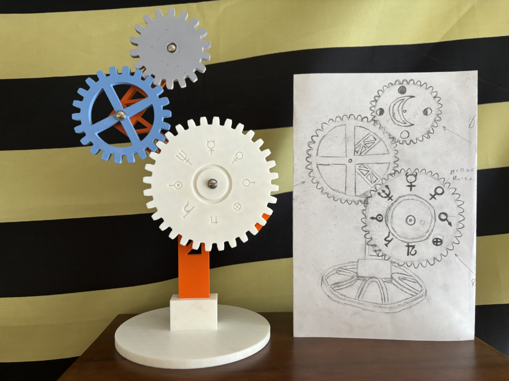
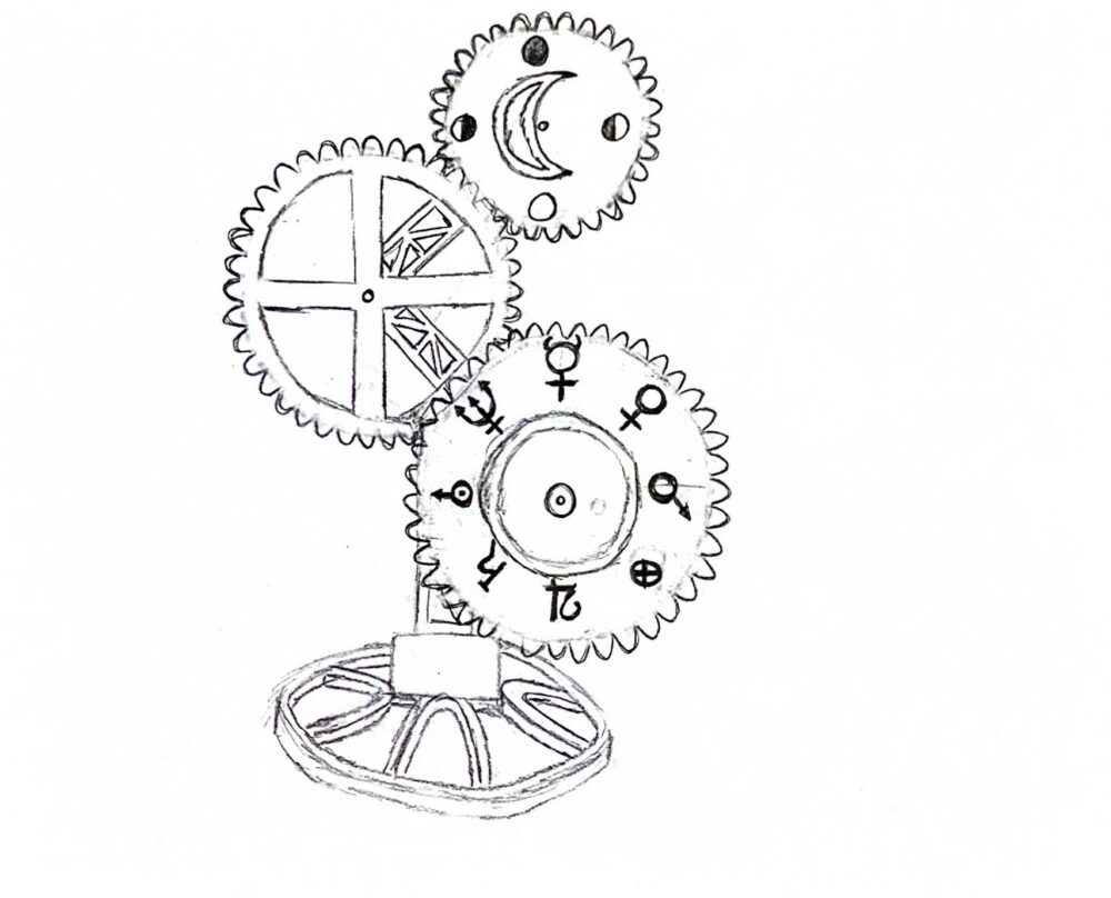
I also wanted to place a specific emphasis on the more important celestial bodies necessary for life. These would be the Sun, the Earth, and the Moon. This is what made the three large gear design perfect. I could have a gear for the Sun, one for the Earth, and one for the Moon. Additionally, I could orient the gears so that the Sun would drive the rotation of the Earth gear, and the Earth would drive the rotation of the Moon gear, which mirrors the true physical orbits of each body. This was my first sketch for the overall layout of my final artifact.
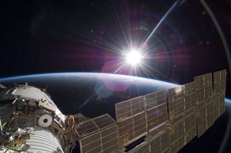
For my final design, I wanted to implement colors that would be symbolic for each gear. I had a couple of options for what color I wanted to make each element, and I am still deciding on the final color for the Sun, but I have selected colors for the Earth and Moon. For the Moon, I used a matte gray color similar to the dusty gray appearance of the Moon’s surface. This was a pretty straightforward decision. I wasn’t initially sure what color I wanted to use for the Earth, however. I initially narrowed down my choice to blue or green, one being the primary color of the land and one the color of the water. To make my decision, I thought about how other planets appear from Earth, or from very far distances. To make my decision, I researched the appearance of the Earth from far away, and found the below image taken by the Cassini spacecraft as it passed below the rings of Saturn. Far in the background, you can see the Earth as it would be observed from another planet. It appears to be a pale blue point, which helped me make the decision to choose light blue for the color of the Earth.
I chose the color white for the Sun gear since the Sun appears white when viewed from space, since it emits visible light at all wavelengths. Since the project is space-inspired, I wanted to use the real color of the Sun, not just the color that it appears from the Earth.
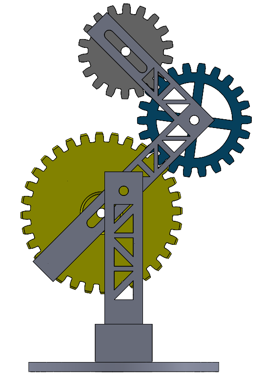
This is my first initial CAD design which I have used to size the gears and support elements for my final version. It is barebones at this point, but I wanted to make sure I had everything sized correctly prior to adding intricate details to the parts. You can see that the three gear design and support structure look similar in orientation to my initial sketch.
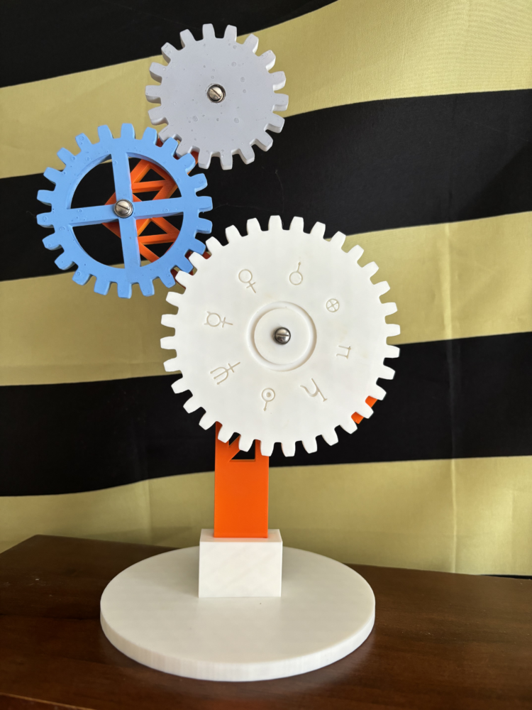
When viewed from the back, you can see the final symbolic element that I decided to include. The support pieces have a distinct trussed design. This was inspired by the trussed support structures used when launching rockets, and is a subtle homage to space travel, an industry which I would someday love to work in. In the final version of my sculpture, the bottom support and L shaped arm holding the gears will both have trussed elements, which will be visible through the cutouts in the Earth gear, as shown in my initial sketch.
I decided that I also wanted to include the color orange somewhere in my project. I remember as a kid seeing the bright orange suits worn by astronauts during the shuttle program, and I wanted this to be an element in my design. For this reason, I painted the support structure on the artifact a vibrant orange that adds some bright color to the piece.
Overall, my current design has a plethora of symbols that are important to me. The sculpture has a clean, modern feel, and it is sized to fit comfortably on an office desk or home shelf.