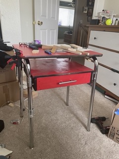
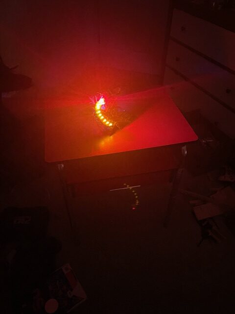
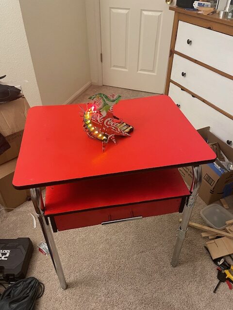
Hello everyone! My two projects for Aesthetics of Design this year was a 1950’s space age inspired light up sign made of soda cans, and a Bauhaus inspired table that I up-cycled from an old school desk.

One of my biggest struggled with these projects was how open ended they were. I couldn’t decide where to start so I ended up looking for inspiration from the objects that I had around me. Creating these ideas from a more open ended starting point was a point of pride throughout this semester. I have never taken a class quite like this one, so being placed in a position where there was no team members and no outside influences forced me to be creative about what I wanted to build when I could create anything. My 1950’s sign was born out of a personal passion, I have always been a fan of old metal signs so I attempted to create a handheld one for my wall. A big point of pride was the up-cycle value from this project, no money was spent (outside of buying soda). The rest were up-cycled from old projects. The highlight of that project was finally getting all of the LED’s to work. When I was cutting and bending the cans for the sign base I put hours of effort into very precise dimensions to achieve a clean look. One of my struggles was the LED’s touching with this metal base and shorting their circuits. It took me just as long to adjust each LED individually to ensure it would go off as it did for me to make the sign itself. However the feeling when all of them would illuminate was absolutely worth it.
The Bauhaus Table came more out of a need than the sign did. I was already looking to build a table when this project started, so I figured I’d kill two birds with one stone. The hardest challenge I had with this project was balancing form vs function. Bauhaus is such a clean aesthetic that I wanted to make this desk look perfect. Trying so hard to do this actually ended up perhaps causing more issues than solving them! Some examples of this are the legs. I took apart the desk and then used those pieces to reassemble another set of legs. One of my first big decisions was how to attach these steel parts. The first idea that came to mind was welding. However, I am not an experienced welder, and even with the use of a grinder to get excess material off I was afraid that I would never recapture the shiny look of the steel. Therefore I decided to use couplers with set screws. This gives off a more industrial vibe that better matched the Bauhaus aesthetic. It did, however, sacrifice some strength within the desk, especially with horizontal forces, and it gives the legs a slight lean that I am not pleased with. Some other struggles I encountered was during painting. Trying to reach an even distribution and an even hue across the dest was a challenge for me, someone who is not a painter. This project did provide a good opportunity to learn from these mistakes, and more importantly, learn how to recover and still make a product that I can have pride in.


If you would like to see more of my 1950’s sign check it our here: https://www.aesdes.org/2024/02/21/led-googie-sign/
If you want to see more of the Bauhaus Desk you can see how I designed it here: https://www.aesdes.org/2024/04/24/the-bauhaus-desk-what/
Or how I built it here: https://www.aesdes.org/2024/05/01/bauhaus-table-how-and-what-next/
All images are my own.
