Blog Post #7: Main Project Aesthetics: Plans and Alternatives
In this post, I look into possibilities, sketching my programmable LED display project in two distinctly different aesthetics from my initial rustic-modern design.
Quick Overview
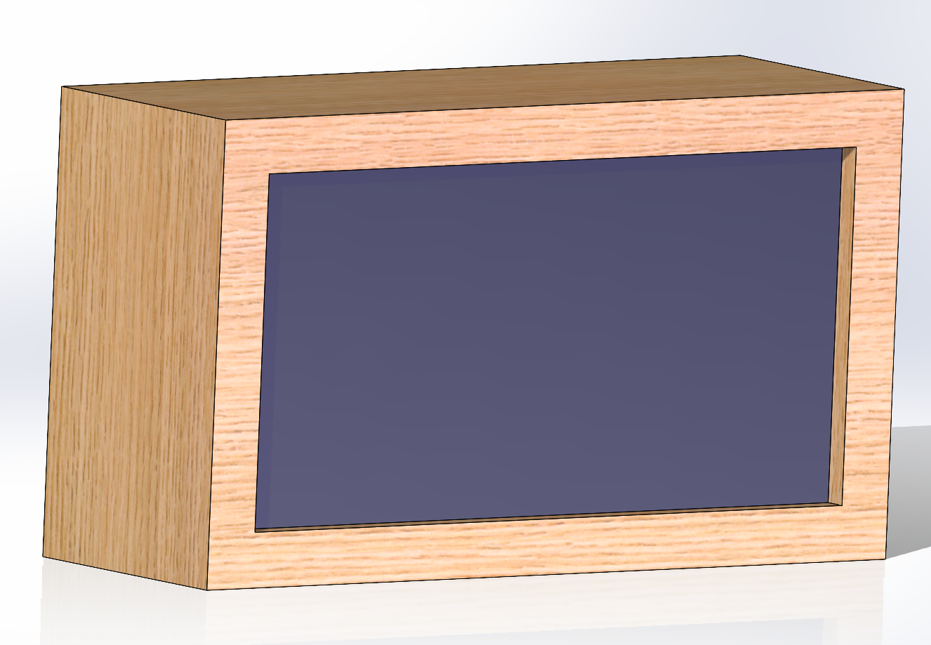
My current idea is to create a led matrix of 64×32 and encase this in a wood frame. I would like to code in a way for me to upload my own pictures and gifs to the matrix. I think that this would fit my aesthetic because if im being honest it slightly changes every day and this method could adhere to how im feeling on any given day.
Alternative 1: Glass/Acrylic design
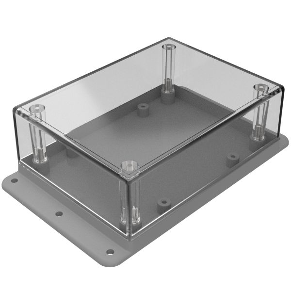
For this avenue of design, I would take an approach that would make the planned housing see-through, allowing you to see the guts of the electronics. This approach is mainly designed toward a more cyberpunk/steampunk aesthetic. Allowing the user to see how the inner workings of the artwork would add to the art itself.
Though this idea would be cool, having the housing be see-through takes away from my personal aesthetic. Personally, I don’t want to see the inner workings of this design and would rather have a sleek wood design to house a retro-led panel.
Alternative 2: Vintage and Industrial Aesthetic
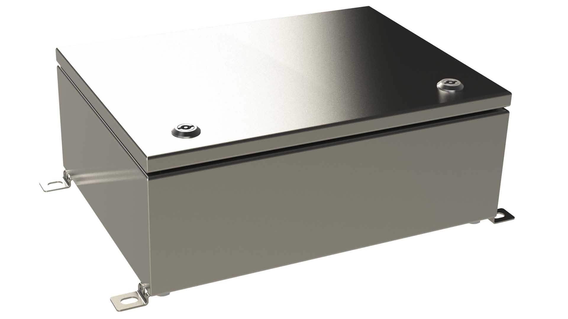
In this alternative, the LED display takes on a robust, industrial look, encased in a frame that mimics old factory windows or rustic ironwork. The wood is replaced with distressed metal or reclaimed industrial materials, such as weathered steel or iron, with visible bolts and rivets holding the frame together. The LEDs could be diffused with frosted glass to soften the light, giving it an aged, vintage feel.
For this idea, it could be cool to see a case for it too. What I mean is something that could open and you could see the electronics along with the screen. My concern with this avenue is that it might come across as just a metal box on my desk which is not what im going for.
This aesthetic could be pretty cool and applicable to me. One concern of mine is the reclaimed metal sheets and rivets. During my last design, I got pretty lucky with finding the resources I did, and I feel that wood is more versatile when it comes to desk art that needs to be modular with its art.
Conclusion
Both alternatives present a stark departure from the initial design, offering new perspectives and ideas. The glass/acrylic approach uses cyberpunk/steampunk vibes, while the vintage-industrial aesthetic combines historical elements with modern functionality. These explorations highlight the versatility of the project and the potential to adapt and transform according to different design aesthetics.


1 Comment. Leave new
Hi Matthew,
I like the alternative aesthetics you presented. They both give us a completely different route that the project can go. Your descriptions on the different aesthetics helped better understand what they could look like. The images also helped a lot.