For my final project, I have created a coffee table that has an extending second tabletop that not only increases counter space but adds a very cool visual aspect to the design. The artifact is designed in a modern minimalist aesthetic specifically the subsection of American Minimalism that takes strong roots from Japanese traditional minimalism.
The Minimalist Aesthetic
Before fully diving into my design I wanted to decompose the minimalist aesthetic to ensure that my design was staying true to its embodying aesthetic. Minimalism embraces simplicity, functionality, and the reduction of elements to their essential forms. It’s about stripping away unnecessary ornamentation and focusing on clean lines, neutral colors, and open spaces. In various fields such as art, architecture, interior design, fashion, and even lifestyle choices, minimalism emphasizes clarity, order, and tranquility. Minimalism has its roots back to Japanese minimalism and cultural exemplars and has gained a lot of traction since the 1960s in the United States recently as the culture started to counter the supreme consumerism of the previous generation and the Industrial Revolution and the focus of the general population started to go towards ecological impact and carbon footprints. Some great examples that show off the minimalist aesthetic at work can be seen below.
:max_bytes(150000):strip_icc()/GettyImages-1162697484-774d7e66c20649eda0d964ee0176485c.jpg)
Image of Japanese Minimalism from: https://www.treehugger.com/cultural-concept-ma-heart-japanese-minimalism-4858440
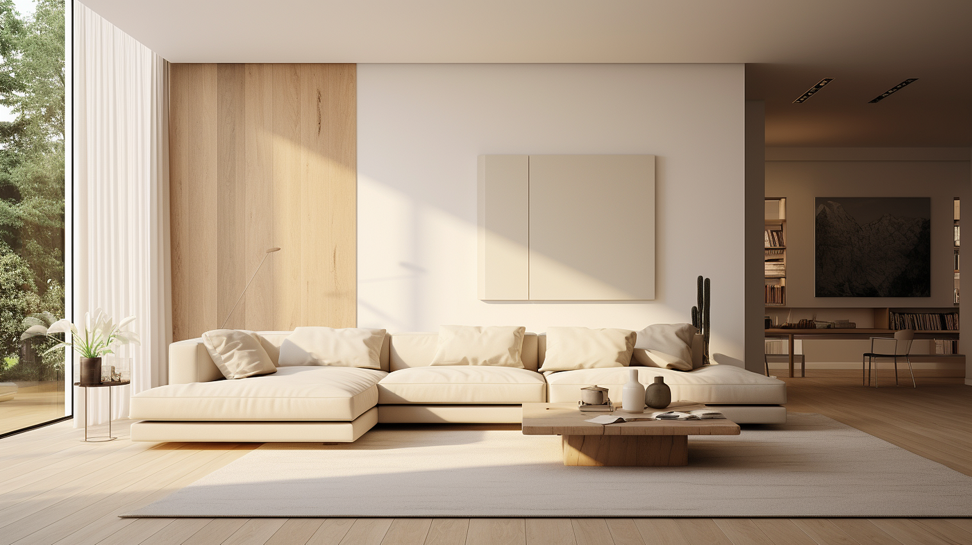
Image of American minimalism from https://medium.com/@ella_49915/minimalist-interior-design-less-is-more-for-timeless-elegance-3128af61e728
One of my favorite trends within this aesthetic is the use of natural colors and greyscale and solid blocks of these colors to increase the cleanliness of the design and make the artifact feel welcoming. As an engineer, I think that this aesthetic calls to me most because it can be characterized as eliminating unnecessary additions and I strongly believe that the pinnacle of design is a perfectly optimum design that has the least amount of features possible while still succeeding at its design intent.
Moving forward to my design phase my main takeaways from this research was that using those natural tones and keeping the design clean and as minimal as possible to keep the design intent honored is vital to embody the minimalist aesthetic. Before getting to the design in its completion I would love to go into the inspiration I had going into the project.
Inspiration
The inspiration for this project is the fact that I have been wanting a coffee table in my apartment for almost 2 years now and yet have never found one that is something that interests me and I actually want to have in my house. My living room is already in a very minimalist aesthetic that utilizes a two-color uniformity with an off-white cream color and a low-shine black. With this in mind, I started to investigate some of the different minimalist coffee tables that are out there and found some things that really caught my eye. Below are two examples that caught my eye visually and really started to inspire my design.
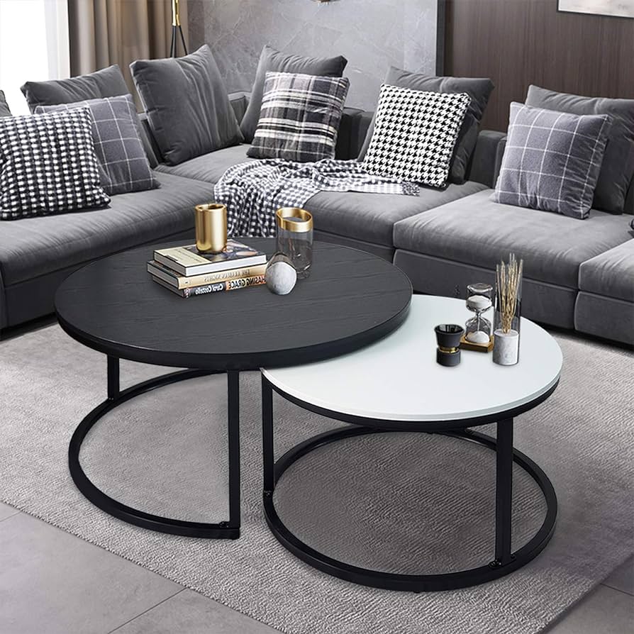
Minimalist coffee table from https://www.lakiq.com/solid-back-wood-side-chair-with-low-back-height-and-armless-design-for-kitchen-dining-s-466625.html?gad_source=1&gclid=CjwKCAiA0PuuBhBsEiwAS7fsNds13BFBobe2TP-UGyQh0VDsOBuvBgNKspTEtuDZkK4zoYE9N3lM-RoCbE4QAvD_BwE
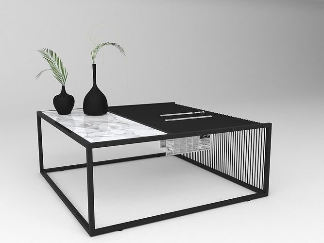
Another coffee table design that is more modern but could add some interest: https://www.lakiq.com/solid-back-wood-side-chair-with-low-back-height-and-armless-design-for-kitchen-dining-s-466625.html?gad_source=1&gclid=CjwKCAiA0PuuBhBsEiwAS7fsNds13BFBobe2TP-UGyQh0VDsOBuvBgNKspTEtuDZkK4zoYE9N3lM-RoCbE4QAvD_BwE
These two examples are very eye-catching to me because for one they both utilize that dual color relationship and secondly they have a simple supporting structure that lets the tabletop talk for itself instead of being overly loud. Going into the design phase the big things I am bringing from this investigation are the first examples use of a hidden extra surface of the table and this idea of having dual colors happening in the tabletop surfaces.
The What
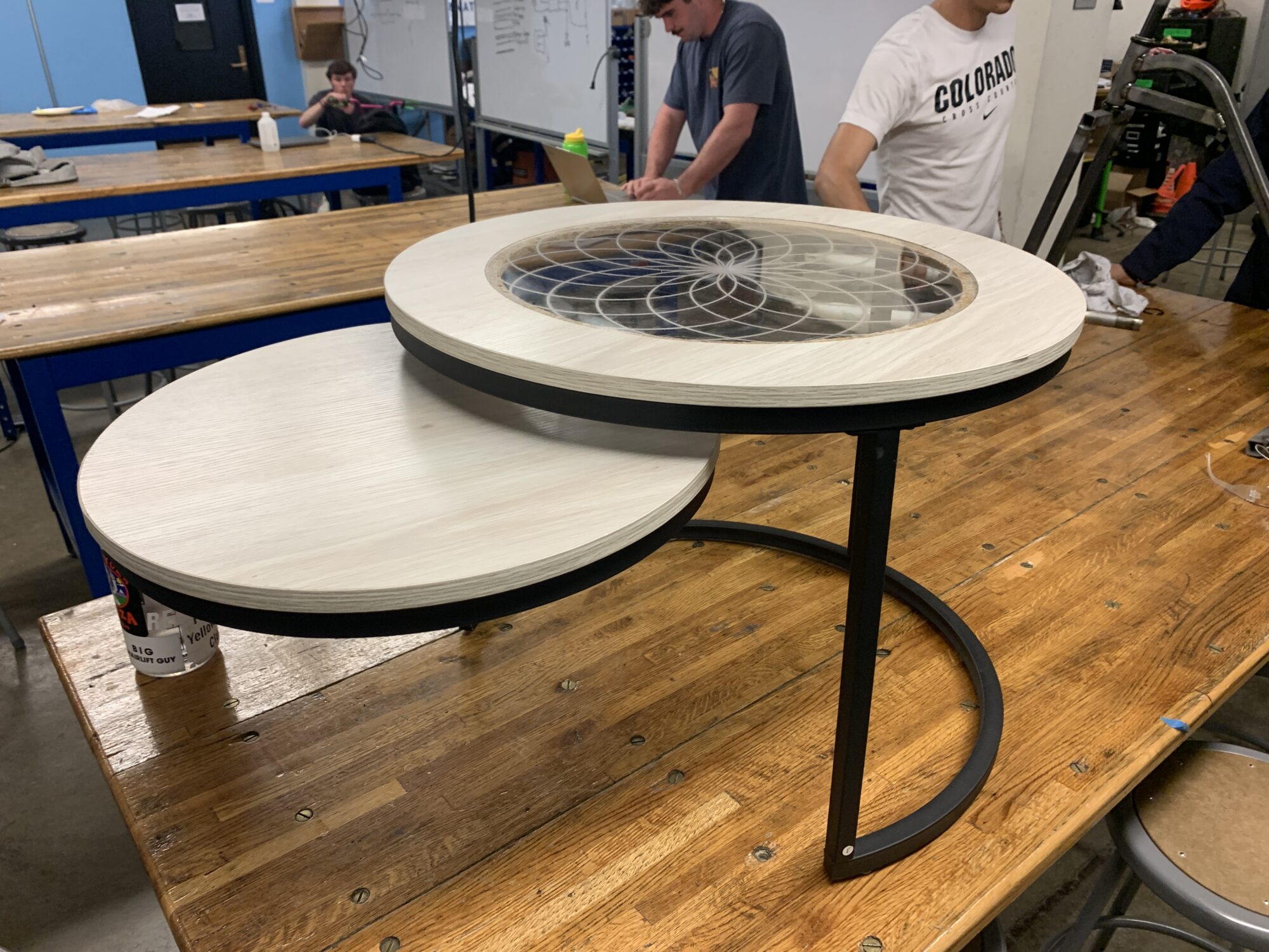
Next week we will go way more in-depth about how I made my artifact but this week I just want to showcase exactly what it is that I made and how it works. Below is an image of my final project that has achieved the described aesthetic above while also being able to have this dynamic swinging motion as well.
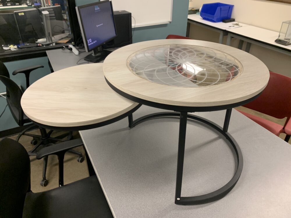 Image of artifact fully assembled and in the 75 percent open position
On top of the main dynamic component, there is also a cool acrylic inlay that was extremely fun to tolerance and get a wooden internal circular cutout that can hold the acrylic flush with the top without a gap between the wood and acrylic walls so that crumbs and things on the table don’t fall into it.
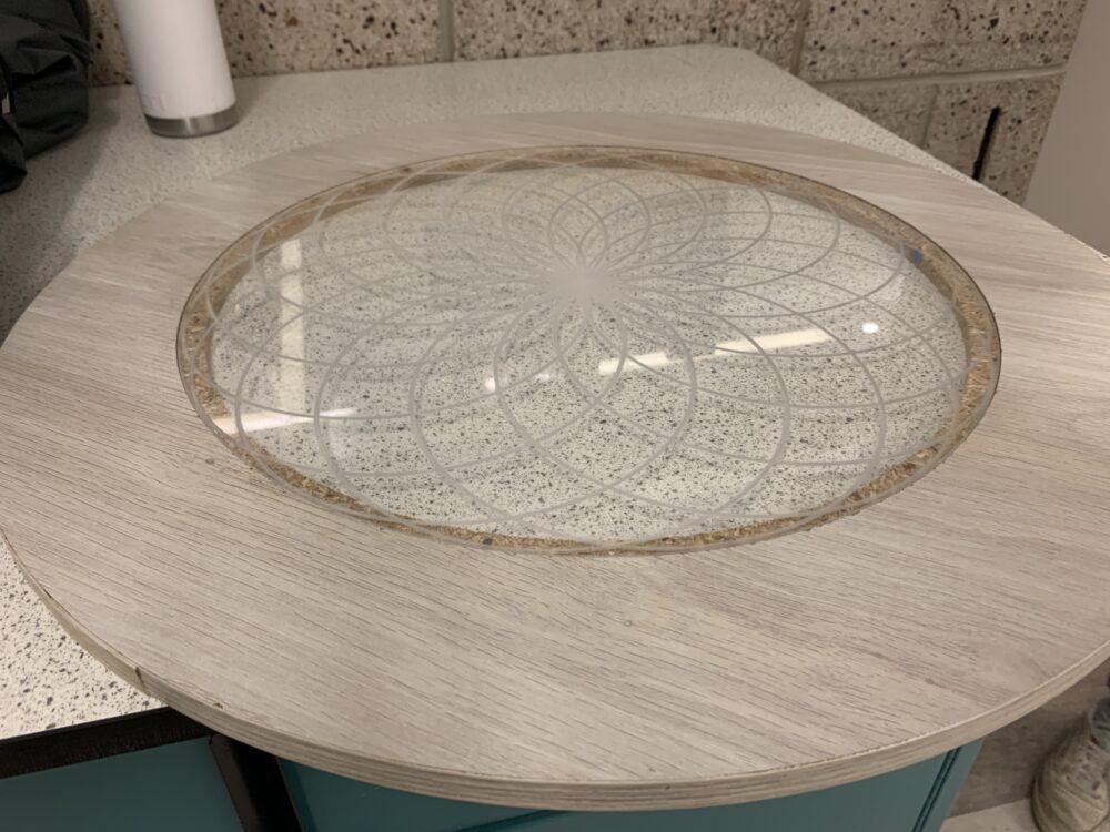 Close-up of the top of the artifact to showcase acrylic inlay
This inlet design is inspired by how in minimalism they can use a singular pattern or really soft accents to produce a visually satisfying pattern while not being busy in any way. The pattern is a circular repeat pattern of smaller circles that just overlap together to make almost a blooming look that nicely fits the acrylic inlay which is also circular much like the overall assembly. This circular consistency also gives a very good consistency to the aesthetic because it doesn’t force the user’s brain to overcome hard corners or constantly changing slopes to interface with. In addition to this consistency, it emphasizes the dynamic component of the design even more because it is the only part that is not in line with the rest of the circles which gives a really good visual pull to the key feature without being overbearing. The addition of the inset was designed with the intent of being a little hint or tease to the user that the bottom part of the table extends without being visually distracting and I am super happy with how it came out and think it still adds to the aesthetic more than it pulls away from it.
Future Work and Next Week
I have had so so much fun working with this project and though I am very satisfied with the current fidelity of the artifact there are a few more steps I am excited to make over the next week before I implement it into my house. I want to paint the top black to make the aesthetic pop a bit more and make it interface with my current space a bit better.
If you have been sitting here dying to hear about the process of the creation of this artifact then please tune in next week to get to see the whole manufacturing and design process!
Thanks,
References
OpenAI. (2024). ChatGPT (3.5) [Large language model]. https://chat.openai.com
Weingus, L. (2022, May 5). What does it mean to have a minimalist aesthetic?. Silk + Sonder. https://www.silkandsonder.com/blogs/news/what-does-it-mean-to-have-a-minimalist-aesthetic
Weisskoff, E. (n.d.). 25 types of aesthetics: Your guide to 2022 trends | redbubble life. Redbubble Life. https://www.redbubble.com/life/types-aesthetics/

2 Comments. Leave new
Hello Colton,
WOW! Your project has really taken shape and it looks fantastic! I have seen coffee tables that utilize a similar design that you showed in one of your examples but I thought you interpreted it in a creative way. By making the two tables into one assembly instead of two separate tables you have made something unique. Do you plan on finishing it any further by potentially sealing the wood or leaving it the way it is? Great job!
Hi Colton, This turned out so cool! I really like the black legs with the natural wooden tabletop, it still gives a strong minimalist aesthetic without being boring. The circular pattern on top also gives this table another element without being too distracting or overbearing. Your attention to detail during this design really stands out. This whole project is very well assembled and looks like a product that you could purchase. I love the dynamic element of the second section swinging from underneath, and I look forward to your “how” post to see it being put together. Is there any finish on the table top, either an oil or some other wood sealer? This also may be an issue on my end but the images in “The What” section of this post are not loading, the other minimalism reference images are loading just fine.