Background and Purpose
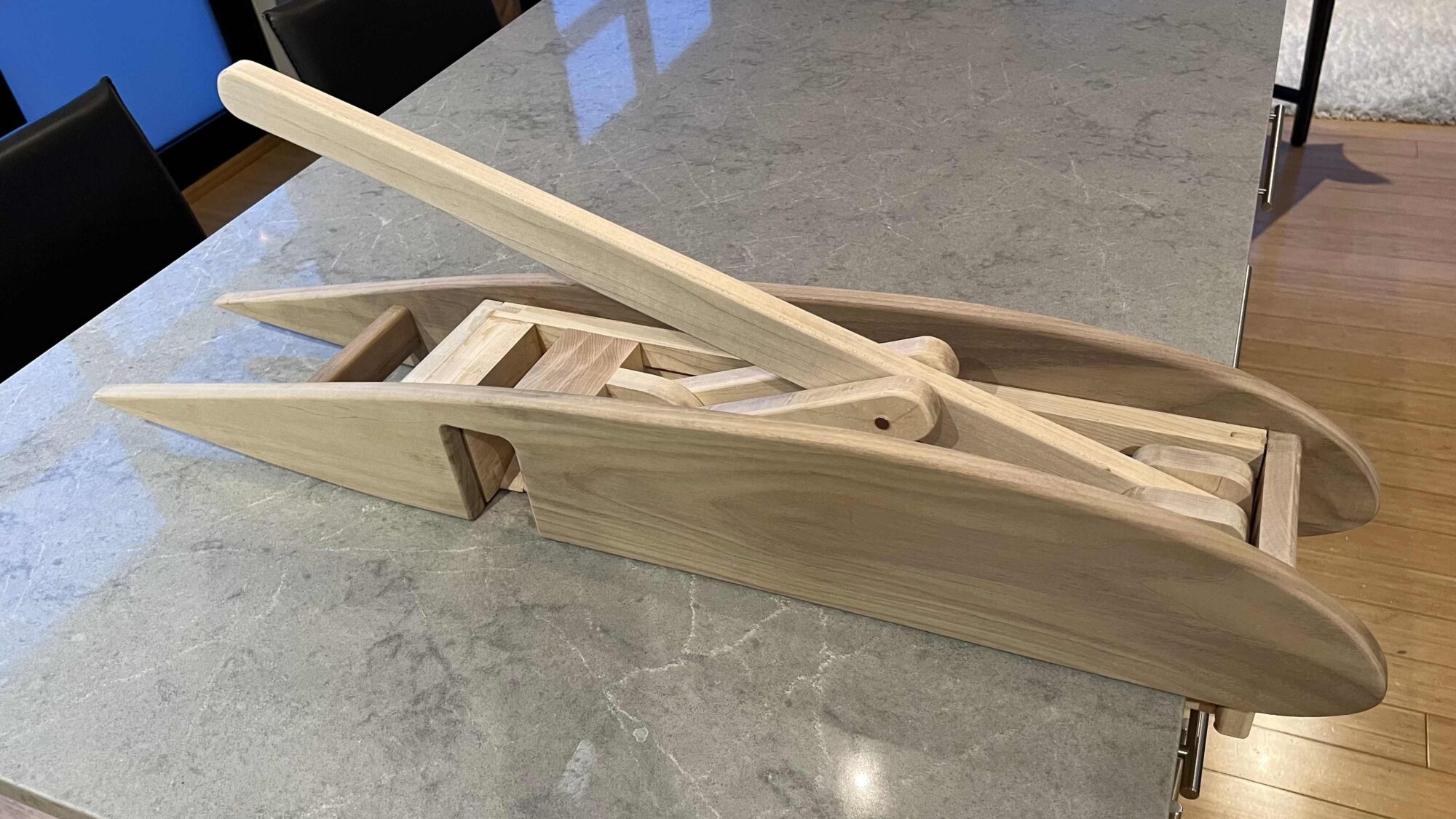
Growing up in a family with German roots, I developed a fondness for sparkling water, finding its refreshing taste irresistible. However, this preference led to accumulating numerous aluminum cans, all destined for the recycling bin. The sheer volume of cans occupied significant space, necessitating frequent emptying of the recycling bin. In contrast to Michigan, where I previously lived and benefited from store credits for bottle returns, such incentives are not available in my current location. To address this issue and streamline recycling efforts, I embarked on creating an aluminum can crusher, showcased in Figure 1. This endeavor not only served a practical purpose but also provided an opportunity to delve into woodworking, exploring diverse tools and techniques essential for achieving intricate design elements in wood.

Figure 1
The airfoil design was originally an alternate aesthetic and I decided to go with this alternate aesthetic because I liked the profile of the airfoil much more than the original industrial aesthetic goal I had in mind. I also identify with the modern aesthetic more than the industrial aesthetic. The aerodynamic aesthetic of the crusher introduces a modern flair to the space that it is in.
 The main inspiration for the mechanical component of this design comes from the RPG woodworking YouTube Channel. I have made some changes to the design that is seen in the RPG woodworking video linked in the references section [1]. I wanted the can to automatically dispense out of the crusher after being crushed. This is a great feature because once it gets crushed it rolls down the chute, into the recycling bin. This also eliminates the risk of the user getting cut by any sharp aluminum edges while attempting to remove the crushed can by hand. The original sketch of the mechanical component can be seen in Figure 2.
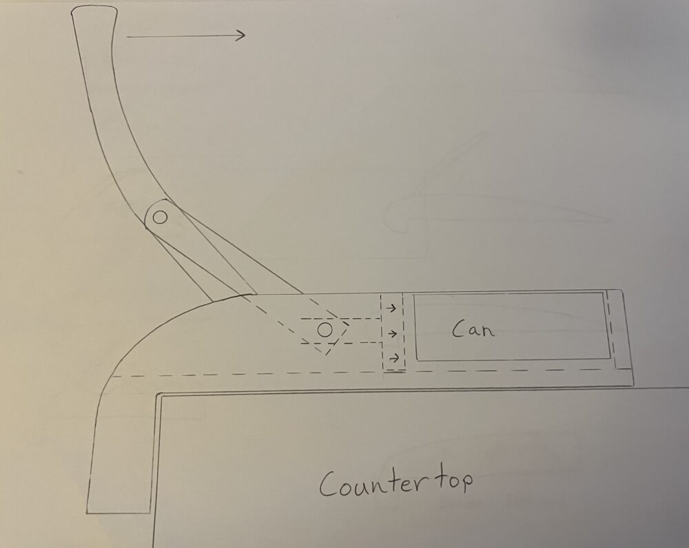
Figure 2
Another aesthetic I had in mind was a motorized and dynamic aesthetic as seen in Figure 3. This design included having an electric motor that would be geared down using a belt drive system. This design was originally my favorite as I thought the moving parts would add a very cool component to the aesthetic. Ultimately, the device would have been unsafe as hands or other objects could get caught in the very fast moving components. I also do not have the space for a larger system like this as storing it would have been an issue in itself. This aesthetic and design was influenced by RPG Woodworking [1].
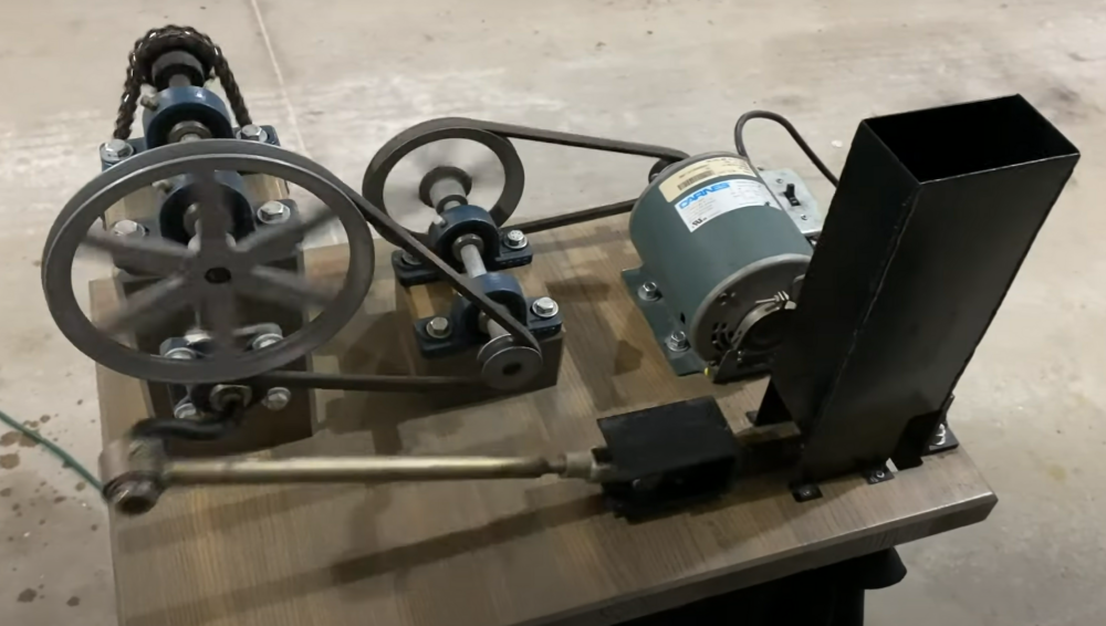
Figure 3
Ideation
When I had the mechanical design of the crusher finalized, I shifted focus to the aesthetic component of the design. I translated my ideas and thoughts onto paper to get a better understanding of what I do and don’t like. I started by sketching the side views and profiles that I would either be able to carve, burn, or cut out of the wood. I made numerous iterations of profiles and shapes, some of which may be seen in Figure 4 below. Up to this point I did not even consider using the airfoil design as the profile. By making multiple similar designs with different profiles, I soon realized that some of these look similar to an airfoil. I thought aerodynamic would be the perfect aesthetic however, it was not until this point of the ideation stage where I figured out the aesthetic I was going after.
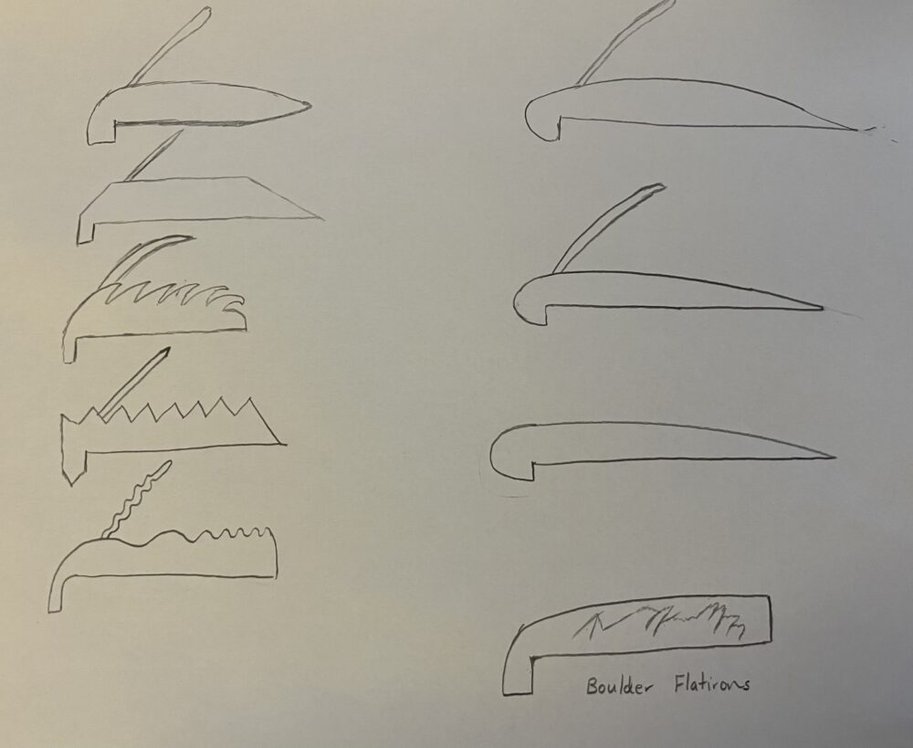
Figure 4
Vision and Aesthetic
The artistic vision I had for the device was that it incorporates clean curves and has an uncluttered look. The profile of the design when viewed from the side takes on the aesthetic of an airfoil. An airfoil, also known as an aerofoil, is a shape designed to produce lift when air flows around it. It is a key component of wings on airplanes and other aerodynamic surfaces. The shape of an airfoil is asymmetrical, with the upper surface (known as the upper camber) typically curved more than the lower surface (lower camber). This asymmetry contributes to the generation of lift. This profile will cover some of the moving components and linkages that are used for the mechanical design. Because of this, the design will have a hint of minimalism as the profile of the wing and the lever handle are the only components that can be seen when viewed from the side. The material I used for the profile of the airfoil was made out of Walnut which I later sanded so it has a very smooth and soft finish. The components that needed to handle larger forces and stresses were made out of high quality maple. Maple is a very strong and dense wood and has material properties which make it an ideal material for these mechanical components.
The main aesthetic that I was after for this crusher was the aerodynamic aesthetic. It also has a hint of minimalism because of its streamlined profile with no exposed fasteners. The wood itself is not the main aesthetic, however, it does contribute to the aesthetic by adding natural warmth, texture, and organic qualities. The beauty of wood lies in its diverse grain patterns, colors, and the way it responds to light. The lighter and darker color of the wood is complemented and contrasted well by the lighter toned countertop. One can argue that there is a hint of an industrial aesthetic that the design will introduce into the space when looked at from above because all of the moving pieces, linkages, fasteners, and other components of the mechanical device can be seen. The main component of the design will be the aerodynamic profile of the airfoil.
Design
My final design implemented two different kinds of wood. The mechanical system was made out of maple, a stronger and denser wood, while the airfoil was made out of Walnut. The design looks sleek and uncluttered when seen from the side, as seen in the left and right images of Figure 5. When seen from above, the components that make up the mechanical system are visible, giving it a more mechanical and industrial aesthetic.
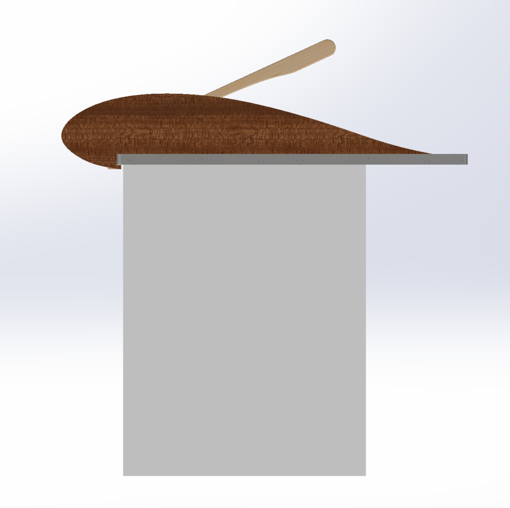
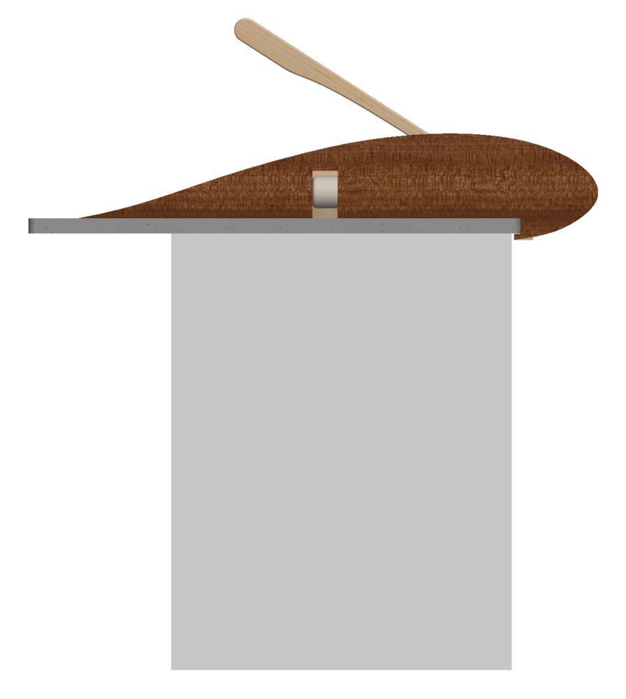
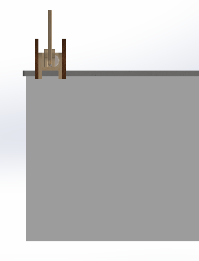
Figure 5
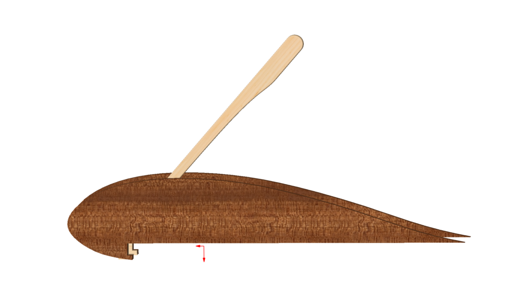
Figure 6
Figure 6 depicts the airfoil profile of the aluminum can crusher as it looks without the countertop seen in Figure 5. There are slots in which the countertop would slide into. This keeps the system from sliding or flipping over if the user inputs a force at a wrong angle.
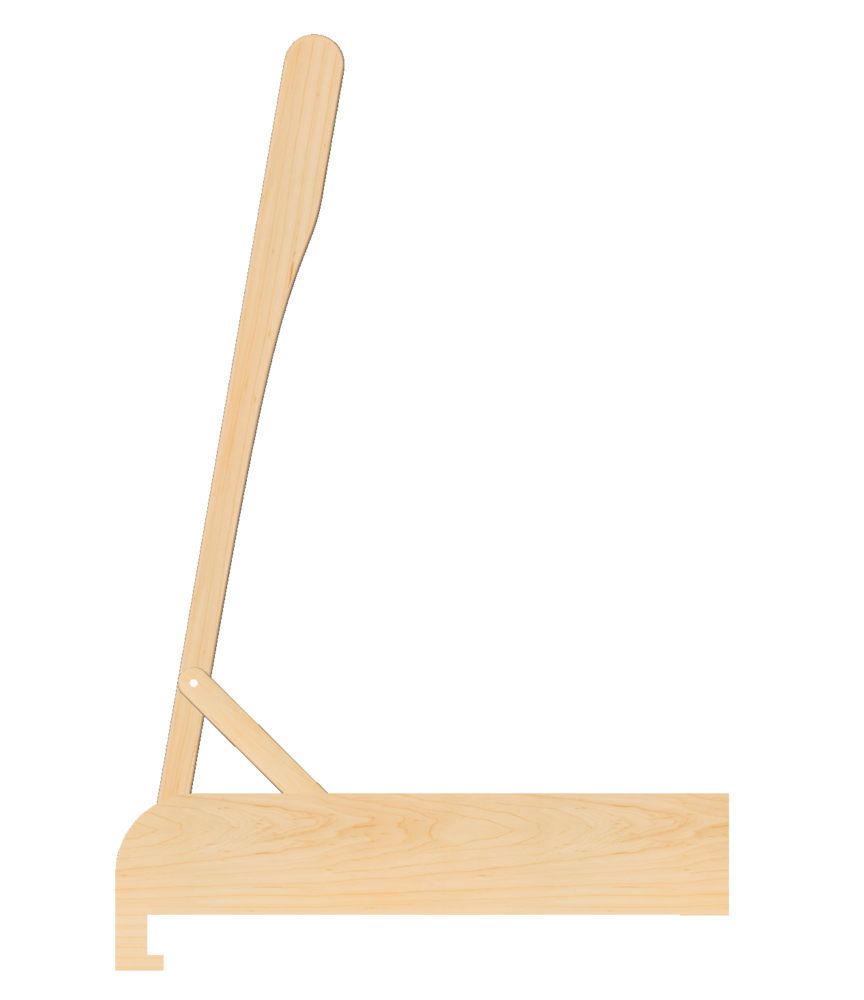
Figure 7
Figure 7 depicts the mechanical module of the overall design, which was made out of maple. This is what needs to withstand the forces required to crush the aluminum cans.
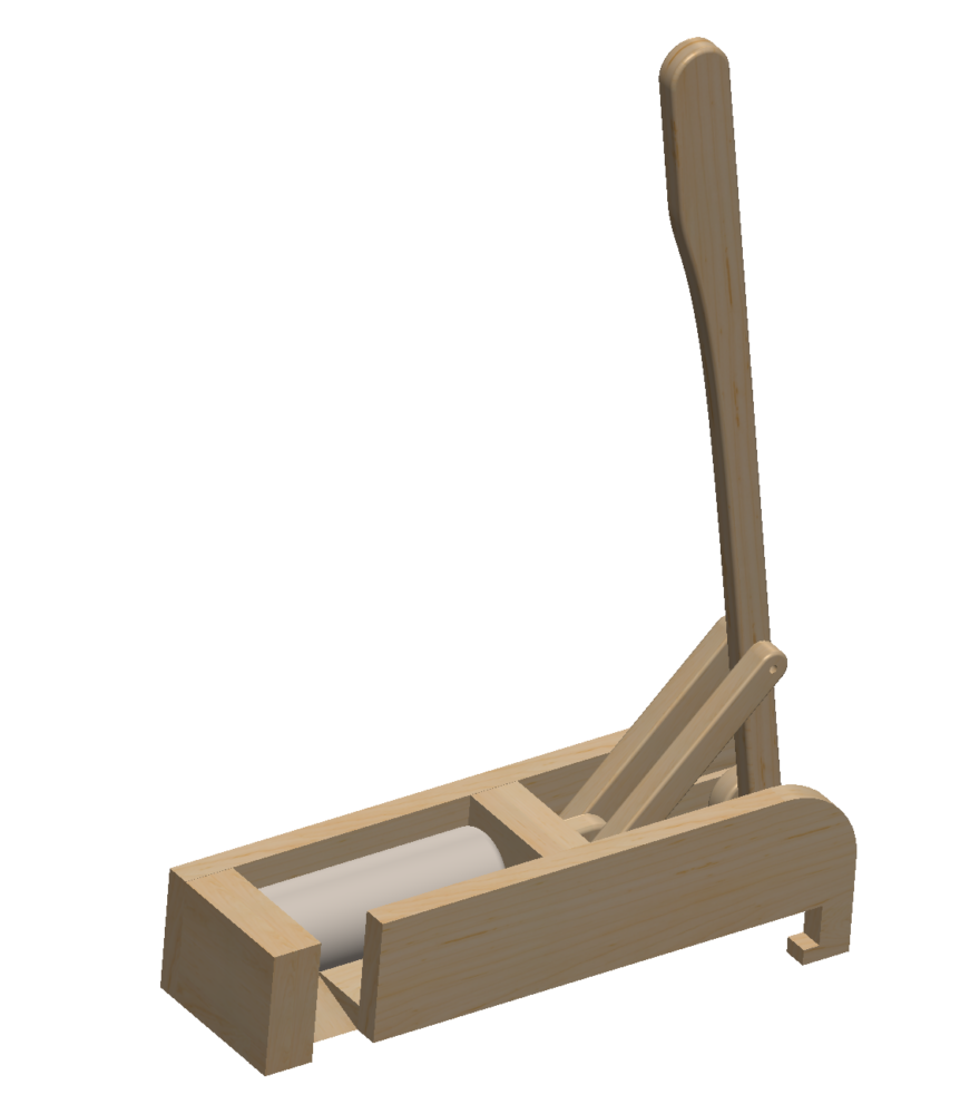
Figure 8
Figure 8 shows where the can would be before it gets crushed. The user would press forward on the lever and watch the can collapse. Once the can gets crushed, it automatically roles down the chute and into the recycling bin below.
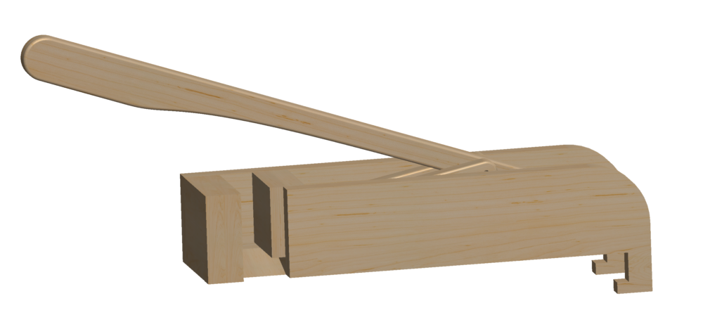
Figure 9
Figure 9 depicts the can crusher in the position when it has completely crushed the can. The crusher does not extend further than it is, as seen in the figure, because an integrated rail system that the crushing plate slides in. This feature can be seen in Figure 10 where the slot keeps the can crusher in the correct position as it crushes and releases.
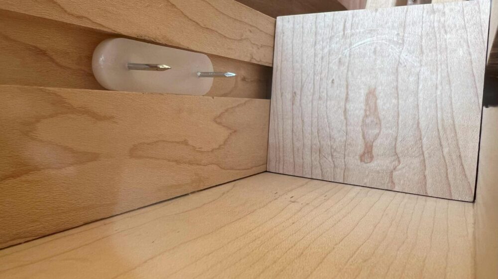 Figure 10
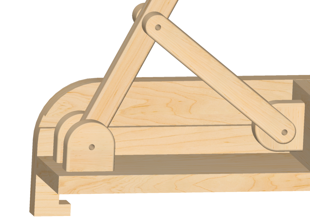
Figure 12
Figure 12 depicts the linkage system and how the forces get transmitted to different components of the system. The fasteners that were used for this project were polished, stainless steel binding post screws. This minimized the wear and tear on the joints as the fastener had a smooth finish. If a bolt were used with a nut, the threads of the bolt would erode the maple over time.
Specifications
- The aesthetic of the device was the most important spec as it was an aesthetics in design class. The aesthetic goals for this design were that it would look aerodynamic, with a hint of minimalism. The main aesthetic component of the design was the profile of the aerodynamic airfoil. The wood itself was not an aesthetic; however, it did contribute to the aesthetic by adding natural warmth, texture, and organic qualities. The beauty of wood lay in its diverse grain patterns, colors, and the way it responded to light. The lighter and darker color of the wood was complemented and contrasted well by the lighter-toned countertop. There was also an industrial aesthetic that the design introduced into the space when looked at from above because all of the moving pieces, linkages, fasteners, and other components of the mechanical device could be seen.
- Safety was also a very important specification as I did not want to injure any fingers when using the device. This meant that there were no pinch points or sharp edges at which the user could pinch or cut themselves. The device also had channels where the countertop could slide into. This ultimately kept the module from sliding across the countertop or from being flipped over if the user inputted a force at different angles.
- The functionality of the device was important as its main job was to crush aluminum cans with ease. A standard 12 oz aluminum can was 4.83 inches tall, and the device had to crush the can to a new length of 1.75 inches or less. The device also had to accommodate a standard plastic water bottle, so the feeder had to be greater than 8.5 inches.
- Human Factors were also accounted for in the design. I designed the device for myself, and therefore my build allowed me to comfortably use a 2-foot lever without putting myself in any uncomfortable positions. The handle also had an ergonomic grip for fingers, which prevented slipping and sliding. After the can or plastic bottle got crushed, it automatically dispensed from the device out of an opening in the side. The force of gravity was used to remove the crushed object out of the feeder, and it then automatically fell into the recycling bin. This made the process more efficient. Any components that interfaced with the user were not too long or short because this could sacrifice and negatively affect the ergonomics as well as the power and force needed to be inputted by the user. The user crushed the can using their strength by taking advantage of leverage and physics, and the user was considered to be the average adult. The user did not have to apply more than 20 pounds of force to the lever to crush the can.
- Size and Weight were also important specs. A slim profile was needed because when the device was not in use, I hung it from a cabinet wall in the kitchen area. Therefore, the device was also under 30 pounds, which made it easier to transport and move around.
Credits and References
[1] RPG Woodworking: https://www.youtube.com/watch?v=6JiS1TmXhyI [2] Danimal’s House: https://www.youtube.com/watch?v=S1rUooUhZAo

2 Comments. Leave new
Hi Tim, this really came together well. Im impressed at how seamless your design is and how the internal mechanism is shielded by the foil design. It looks like you put in a ton of work into the design and CAD before building it which is great. Really great Job overall.
Hi Tim, I love this idea. Can crushers are always fun to use as they are still a novelty to me. Do you have any videos of it working? I would love to see how well it does. Additionally, what was the decision process behind horizontally mounting it? I have only ever seen them mounted vertically to a wall or something but I like how you have shifted it horizontal. Overall, great job and it looks great!