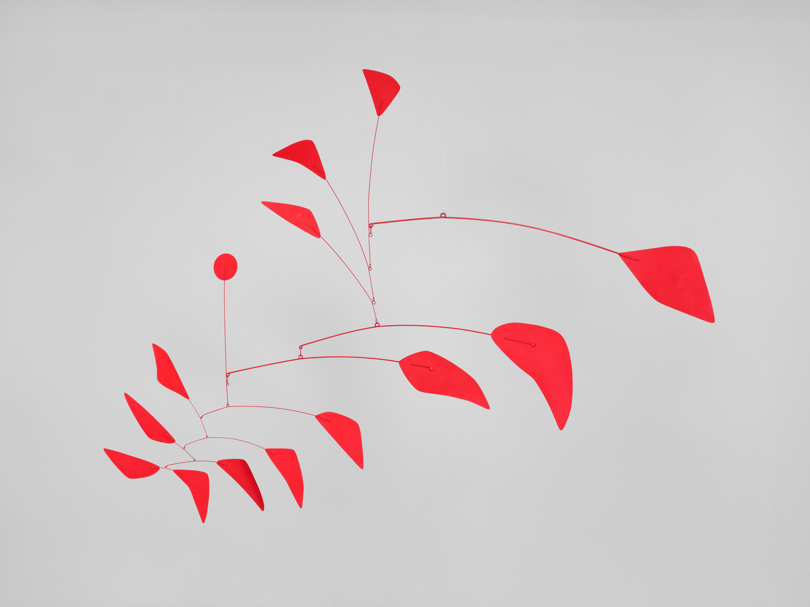
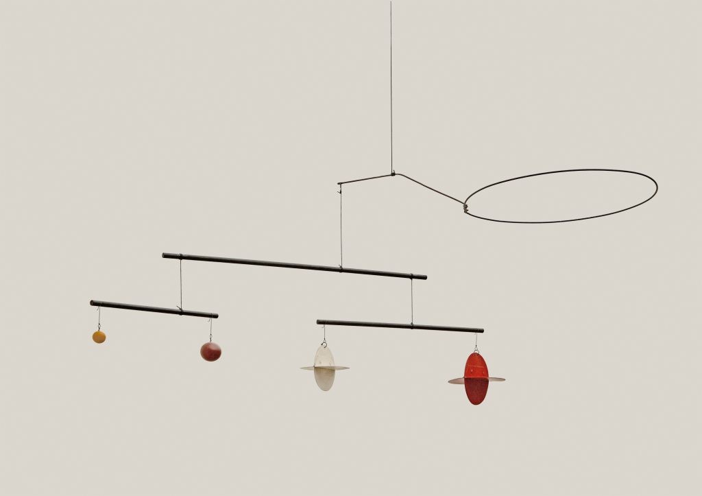
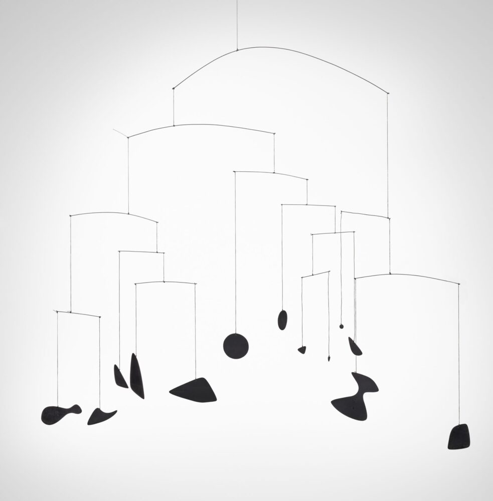
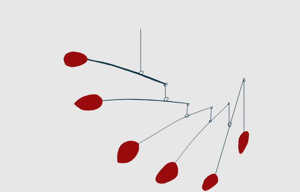
For my final project, I drew significant inspiration from the work of Alexander Calder, one of the most prolific mobile makers of all time. His creations fall into the category of impressionist modern art, with his sculptures embodying quintessential modernism. Throughout his lifetime, he crafted thousands of kinetic sculptures and received astounding critical acclaim, with pieces ending up in places like the Guggenheim Museum and various other exhibits worldwide. I vividly remember seeing his mobiles in third grade, and they have stuck with me since then. At my elementary school, we participated in an activity called “Art in the Suitcase,” where parents would volunteer to teach art to students, dedicating the entire afternoon to delving deeply into the work of a specific artist. Afterwards, we were set free to create our own versions of their work. My attempt at Calder’s mobile during that time ended up being fully lopsided. This time, I hope to create one that’s more effective. Below is one of Calder’s most famous mobiles.
I also wanted to utilize bright colors in the project, which I hoped to achieve by using primer and spray paint on the aluminum panels that I’ve cut out using tin snips. By coating the wire attachments that lock the metal panes in place I hoped to create the illusion of a seamless transition from panel to arm (benefited by the fact that the mobile will be hanging above the head of the audience out of range for scrutinization). I used 14 gauge wire to secure everything together as it has both appropriate rigidity levels while also being bendable enough to be easily manipulated to create the physical structure that I’m looking for. I planned to affix the individual ornaments to the bars with some back of the napkin calculations on the general lengths of the mobile beams, then moving the fulcrum of the mobile with my hands to eventually loop the wire back on itself to create a permanent fixture. I then used fishing line to connect the individual arms together and do overall assembly of the model.
Initially I made a number of rough sketches but they all lacked the central theme that I found intriguing like the golden ratio. I think I settled into a good idea that I can be genuinely proud of now that I’ve finished project. This wasn’t a type of art that I’d really tried before so I was a bit nervous about messing up the project and then needing to present to the class a failed art project.
A lot of the art I had the opportunity to consume and be educated on throughout my life has been modern art or impressionist works of art. I know there sometimes is a narrative that abstract and modern art can be overly simple and lack some of the technical skills that are required to make “Traditional Art” but I am a firm believer in the ability to make an audience feel emotions and perceive certain ideas through abstract shapes and carefully constructed lines. Throughout the semester I’ve spoken in an almost neurotic level of depth about the implementation of the Bauhaus and it’s influences on modern aesthetics, I believe that this project really represents this idea: embodying the central design elements of the philosophy.
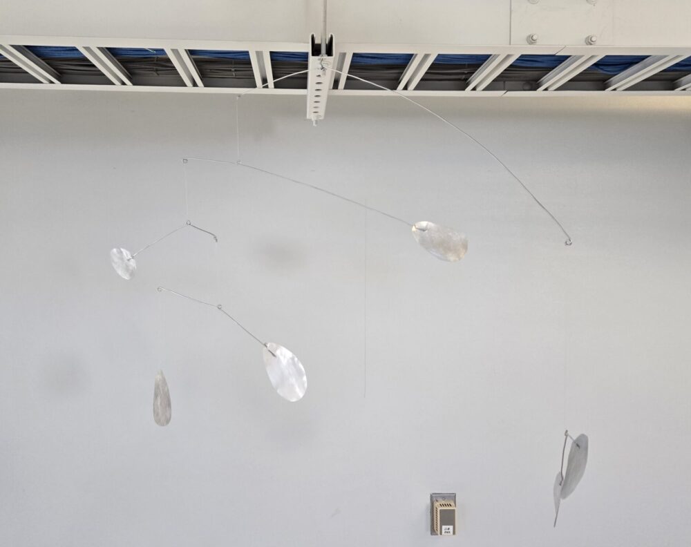
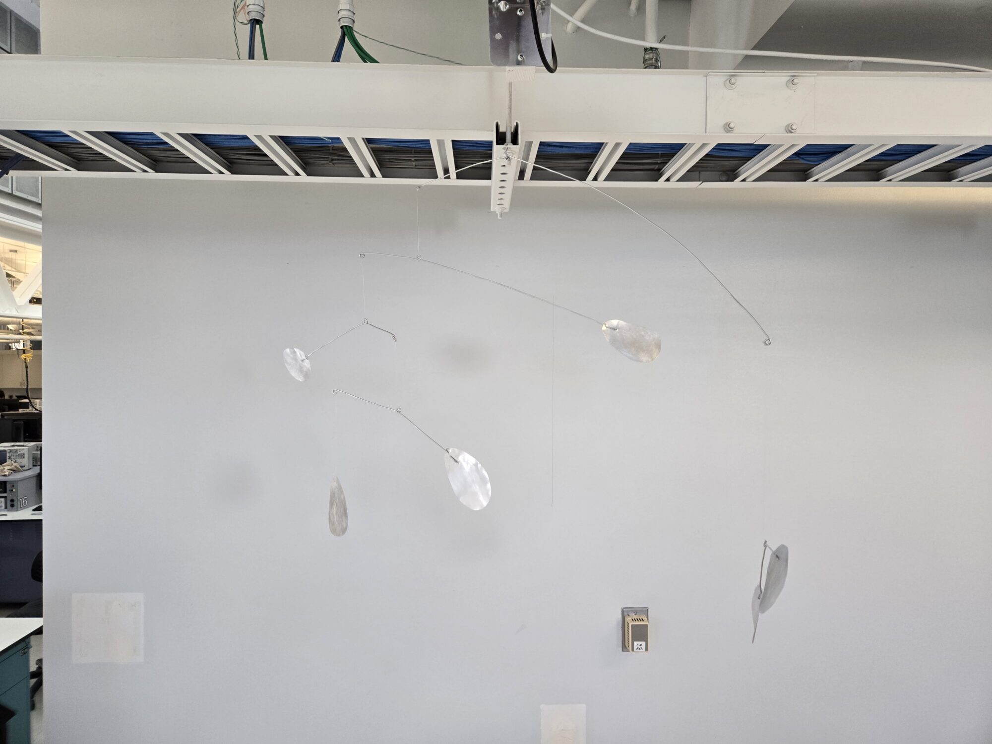
As is, the my final project is shown in the following image. I still need to implement the paint to correct the color, but other than that it’s been finished:
 [1] https://whitney.org/collection/works/2826

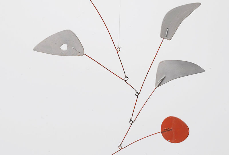
 I planned to manufacture the project using aluminum sheeting that I cut using wire snips and then sand down to a rough finish. I punched holes that I used to attach the wires to the panels with a steel punch. Calder slightly bent the metal to create a dynamic look for the metal panels, looped the wire through the first hole, and then loops back to the main branch through the second hole. In essence the wire is locking the rotation of the metal sheets from rotating without requiring epoxy, welding, or another form of external bonding.The below image display this method:
4 Comments. Leave new
I’ve commented on one of your posts before and I am happy to see the progress that this has made! I think it’s great that you used the golden ratio in order to make this project actually work. Do you think you’ll do anything else with it? Maybe add more color or more pieces to it?
Hi Andres, thanks for the comment! I think I’ll add more colors, but that’ll definitely be past the end of the semester!
Hello Trent,
I really like your final product. I think that the current color that you have is actually really appealing. Although, I would love to see it with the bright colors that you mentioned. Overall, I like the thought process that you had going into this project, I think it really shows in the final design.
Hi Sierra, thanks for the comment! I appreciate the kind words.