Inspiration
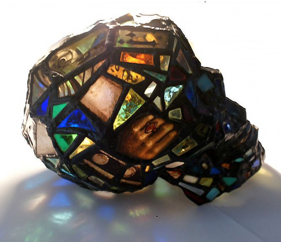
I was inspired by several things. The first was a slow-speed but fatal motorcycle crash that I witnessed. The motorcyclist had done everything right in terms of protective gear yet still died. I wanted to make a motorcycle helmet from a fragile material that would inflict harm on the wearer if it were to be used as an actual helmet. The inspiration for the material came from stained glass sculptures made by Laura Keeble. She made stained glass sculptures of everyday objects that exposed consumerism. She was able to capture the shapes of curved objects with an extremely rigid and fragile material and I felt that would work well for my project [1].
Vision
The vision for this project was to create a slick, curved, motorcycle helmet from fragile materials. The aesthetic of the project was born from the materials I was able to source and the inherent geometry required to make a curved silhouette. I knew that metallics had to be incorporated due to the nature of stained glass assembly. Because of the colors, metals, geometry, and symmetry of my materials and design, this project fit into the Art Deco aesthetic [2]. The goal of this project was to make people think about what metals are used for designs and to elicit an emotional response about the fragility of health and life. For this project, the form was incredibly important and so was the material choice.
Fabrication
Because I had never worked with stained glass before and had no pattern for the shapes of glass I needed, I began the fabrication process by creating a cardboard version of the helmet. I began at the top of the head using a foam model and cardboard from old boxes, continuing the upcycling theme of this project. Cardboard pieces were held in place with pins and connected using tape. Since this project was symmetrical I mocked up the central pieces first, completed one side, then mirrored it using the same techniques.
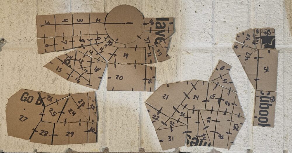
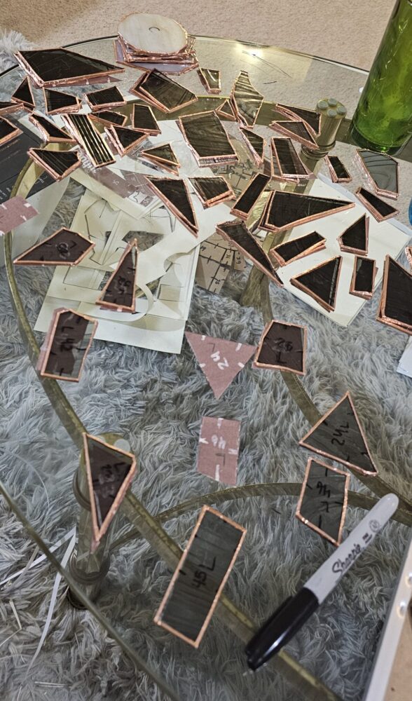
After the mockup was completed, I drew lines so that I knew what pieces were connected. I also numbered the pieces. I then scanned the midline and one-half of the mockup pattern. Then, I cut up the pattern and traced it on the glass with a marker.
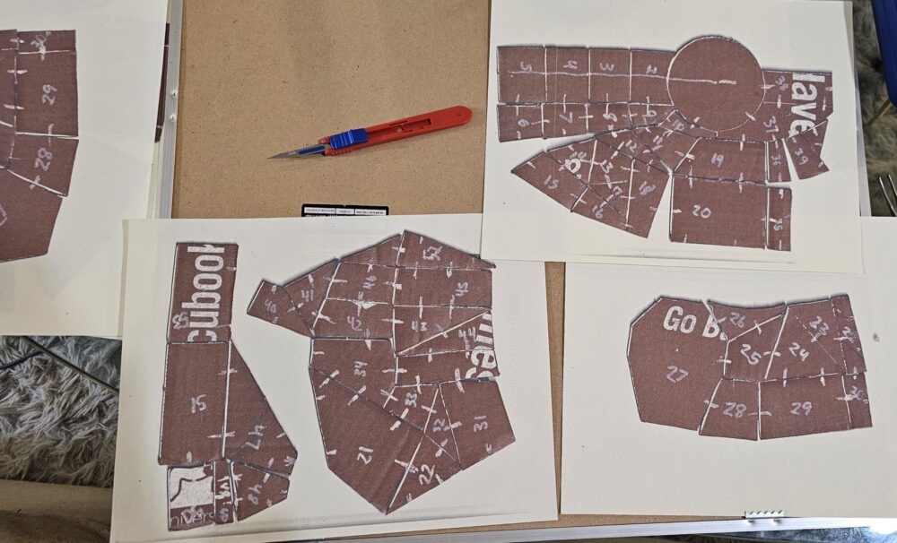
To cut the glass I used a scoring tool to trace the lines and a pair of specialized pliers to break the glass along the score line. When cutting the glass I ran into several problems. Several times the glass did not break along the scoring. Additionally, a huge amount of glass shards are now embedded in several surfaces in my living room. Because I did not have a wet sander I could not shape the glass or dull its edges. This led to many pieces being misshapen enough that it affected the shape of the helmet.
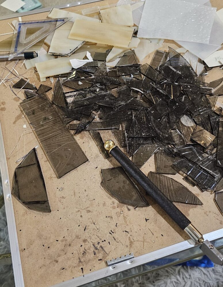
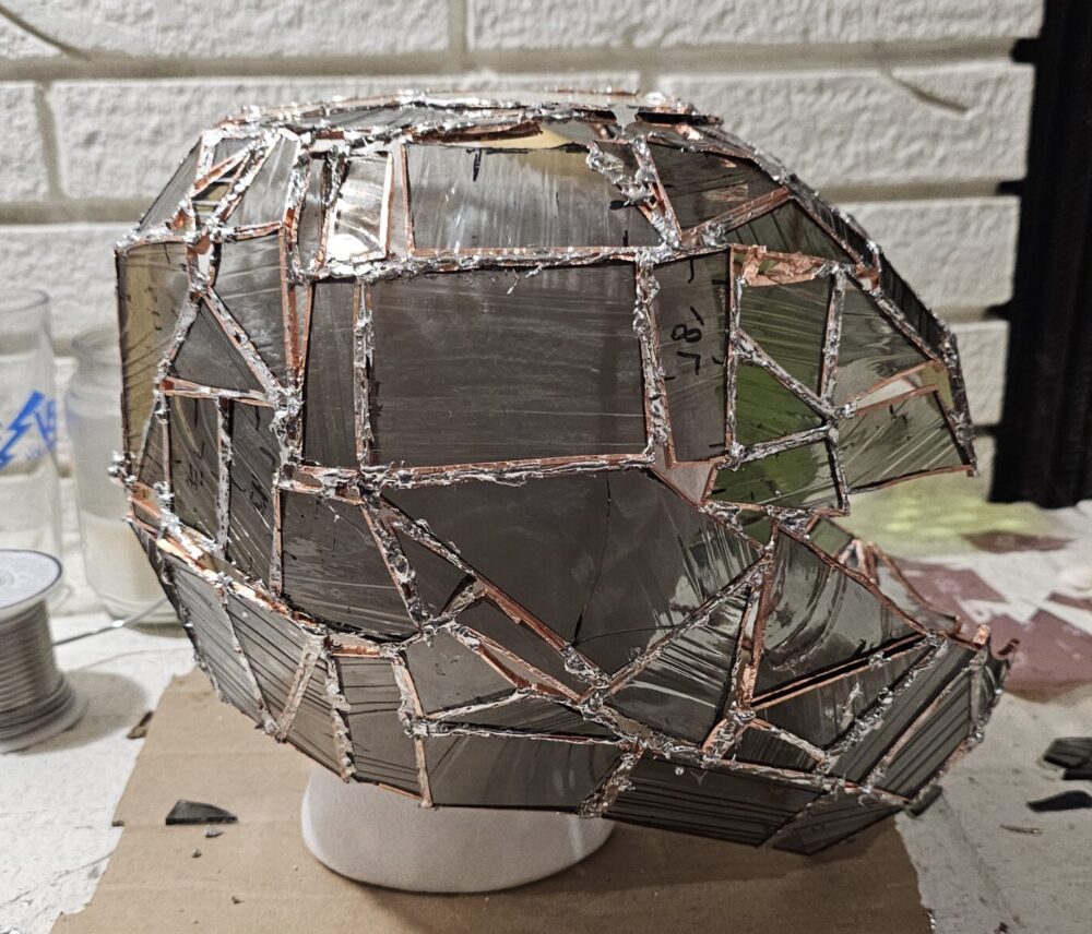
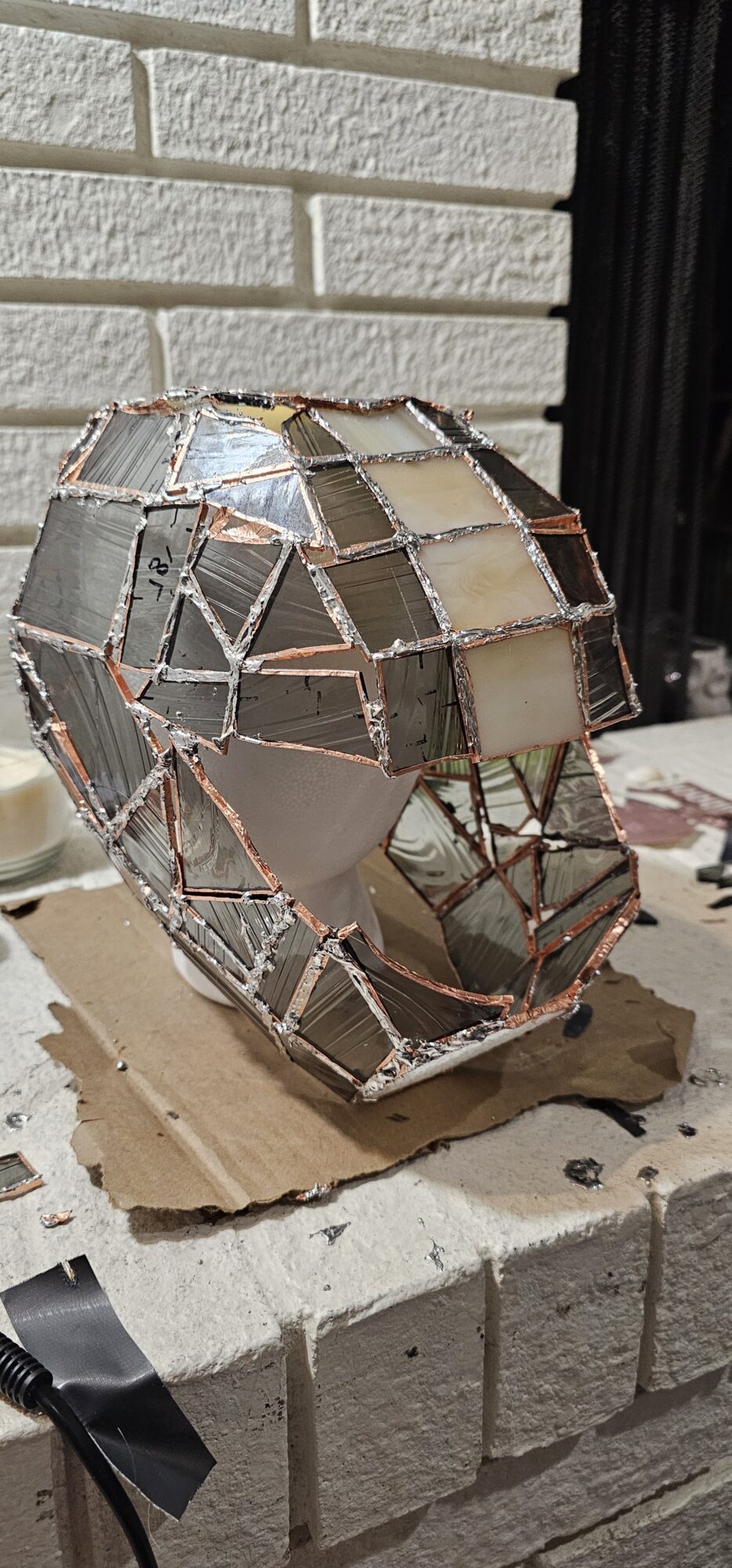
After cutting the glass I lined all the edges of the pieces with copper and paired up matching pieces. Once taping was completed I began to solder pieces together. I only got a small amount of the top done before I needed an extra set of had to hold the pieces in place as I applied solder to the connecting tape seams. Because many pieces were misshapen this was difficult as many edges had large spaces between them that had to be filled with liquid metal. During this process, I burnt some of my hair and got several burns on my hands and arms.
Since this was a large object, it had to be rotated flipped, and moved to get proper connections or angles to apply the solder. This presented a difficult situation as it was not very structurally stable. To counteract this, I placed it on a large beer stein to support it and provide a way to rotate it that did not apply pressure to any of the seams and joints of the helmet. Several times I had to reapply tape and solder as it slipped off from the force of holding up the pieces against gravity or being turned upside down. I also applied solder to the inside seams of the helmet.
Final Artifact

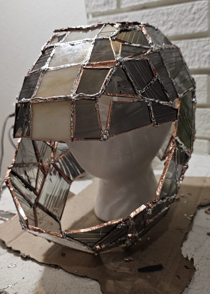

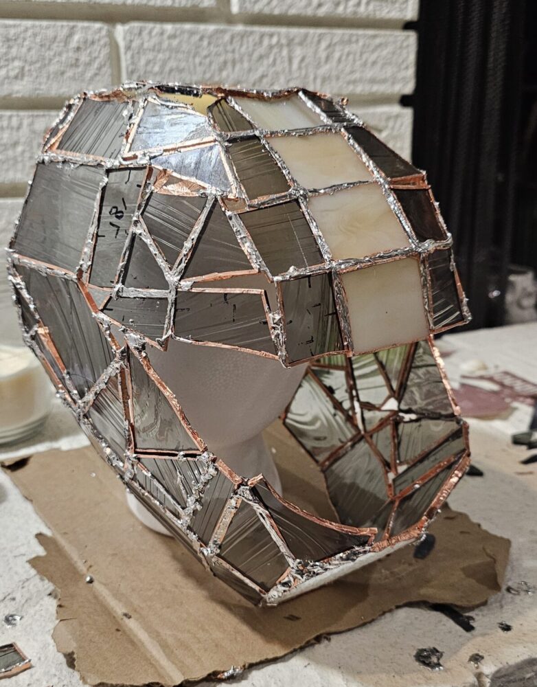
The final artifact boasts bold, angled lines, and a somewhat curved silhouette. The colors of the metals and glass fit well together, unifying the piece. Unfortunately, the lines of the solder are not as smooth or crisp as I would like or as is common in stained glass work. Functionally, I failed to reach my goals as it is not structurally sound. It can not stand under its own weight and begins tearing at the seams without any additional movement thus making it unwearable. That being said its form is clear and understandable allowing the goals I had for the emotional response to be met. Aesthetically it fits the aesthetic of Art Deco well with the exception of exact symmetry and messy lines caused by solder.
Future Plans
Honestly, I’m unsure what to do with this project. It is not stable enough to move at all. Likely I will end up recycling it as all the materials can be recycled. I might try to recreate this again under a different aesthetic with wider tape and stiffer solder which would hopefully create more structural stability.
References
[1] Andrius. (2016, April 28). Popular objects made of church-like stained glass. Popular Objects Made Of Church-Like Stained Glass. https://www.demilked.com/church-like-stained-glass-sculptures-laura-keeble/
[2] Wiki, C. to A. (n.d.). Art deco. Aesthetics Wiki. https://aesthetics.fandom.com/wiki/Art_Deco

1 Comment. Leave new
This project is so awesome! I really liked that we shared the same critique room to share opinions on your project! I decided to go and look at some of the previous blog posts to get a better idea of the journey of the project. It is so crazy how much time you spent on this project. I can tell the idea was really personal and important to you. I think the aesthetic of art deco is somewhat achieved, however I feel it falls more into a sci-fi modern aesthetic. I think this primarily comes from the color pallet using silvers instead of gold like most art deco.