Art Nouveau
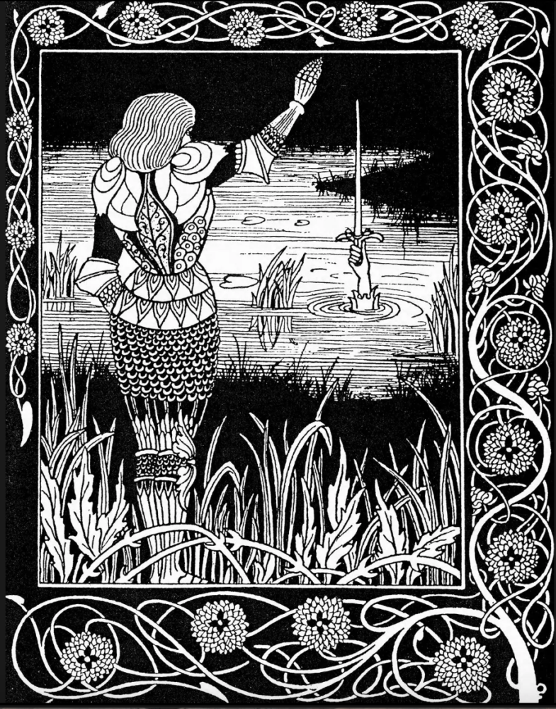
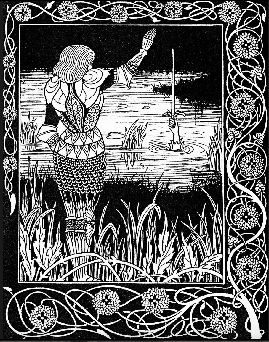
Art Nouveau flourished between 1890 and 1910 in the U.S. and Europe. It is an ornamental style characterized by the use of long, flowing, organic lines. Like Art Deco, it was “employed most often in architecture, interior design, jewelry and glass design, posters, and illustration” [1]. This was a movement to escape the imitative historicism that dominated many of the previous aesthetics. Also, asymmetry was not only present but also characteristic of Art Nouveau. It was an ornamental and somewhat eccentric aesthetic.
Opposition to Art Deco
Art Nouveau is the opposite of Art Deco in many ways. Like many successive aesthetic movements, Art Deco directly contrasted the values of Art Nouveau. While Art Nouveau valued flowing organic lines, Art Deco focused on straight angular lines. Additionally, Art Nouveau had vibrant colors while Art Deco supported neutral tones with high contrast and metallic accents. Also, the clarity of design in Art Deco was not present and was often outright avoided in Art Nouveau.
Visualization of Upcycle Project in Art Nouveau


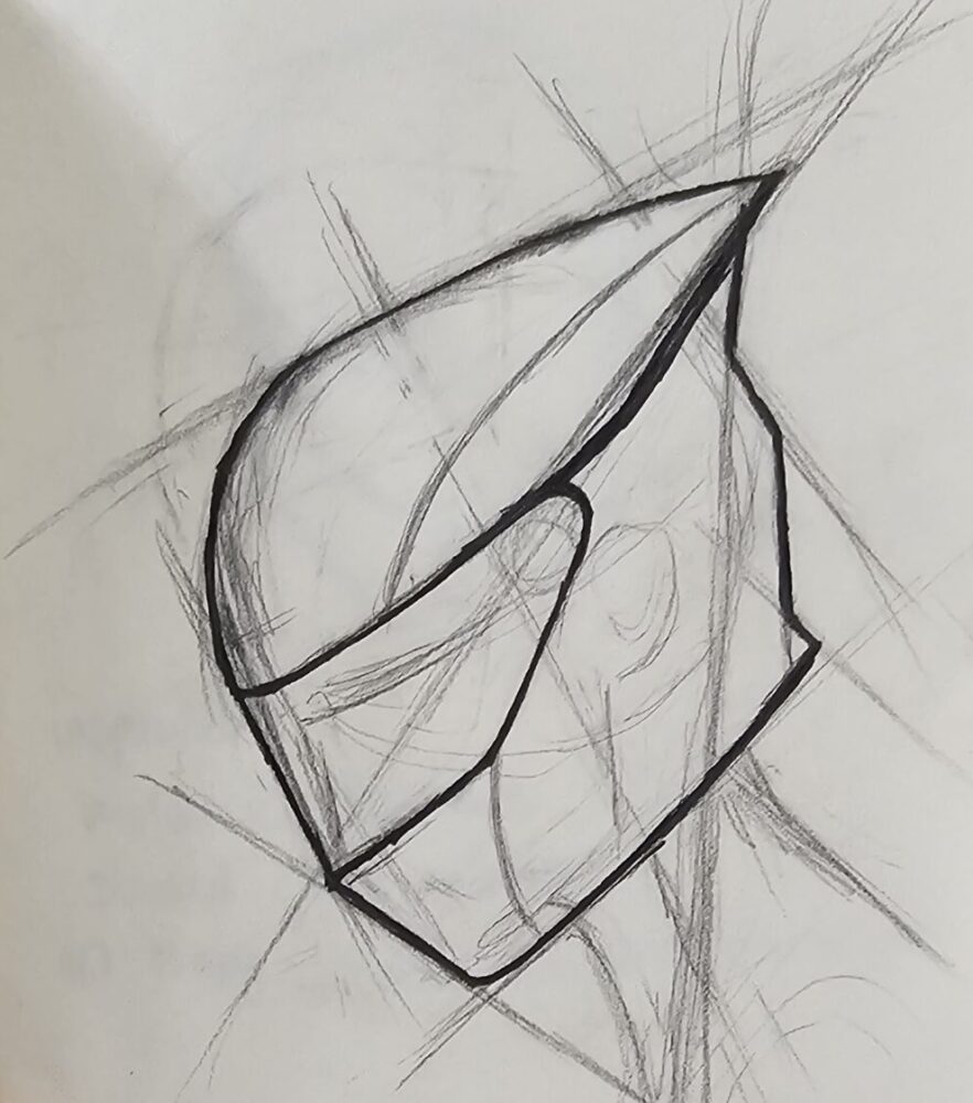
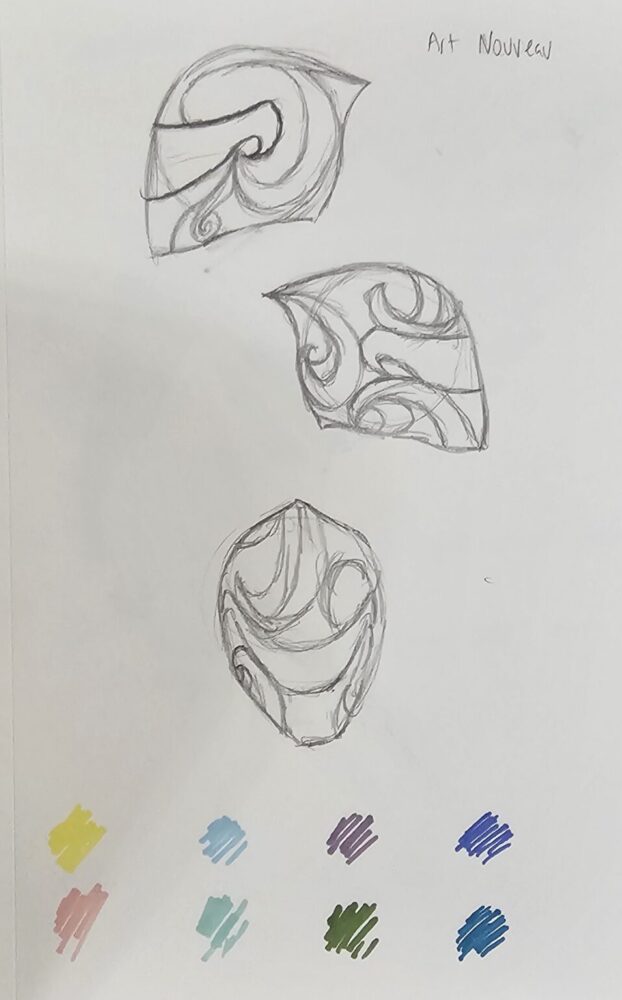
Here these two images contrast the Art Deco designs and the Art Nouveau designs. As shown in the images the Art Nouveau design boasts more smooth and organic lines. The shape of the helmet has been altered to provide a less sharp and more flowing visualization. Personally, I find the Art Deco design to be more pleasing to the eye.
Hypothetical Implementation
If I were to apply Art Nouveau to this project with my given materials I would attempt to make the sections of glass that conglomerate together to form the helmet more curved. Also, I would make the helmet design asymmetrical while keeping the overall shape of the helmet symmetric. This means that patterned pieces on one side would not be mirrored on the other. I would try to emphasize and elongate the lines of the eye-opening. To make this look better I would change the shape of the helmet to have more curved lines. Additionally, I would use permanent markers to add more vibrant colors to the glass.
While the changes to the design would be massive the overall lesson and function of the project would remain unchanged. The materials would still be brittle inference, the fragility of safety and the aesthetic of painting on light would still hold if not gain strength. The function of the helmet would remain the same as a change in aesthetic would not affect the overall use of this project.
This being said, incorporating any organic lines into this project would be incredibly difficult as glass is partial to cutting in straight lines. Unfortunately, without any inexpensive alternative ways to shape or cut the glass, the project would likely be nearly impossible to complete. The curvature of the aesthetic would be lost or my materials would be depleted because of failed attempts to create the curved pieces needed. Additionally, it would take a considerably longer time to fabricate.

