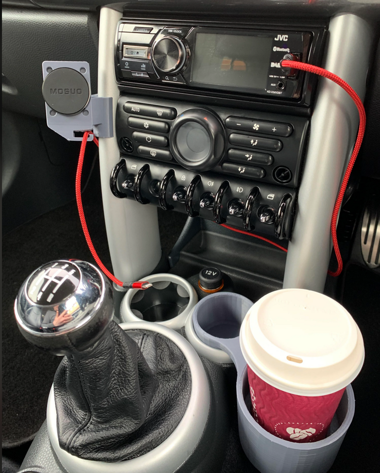
For my final project I’m aiming to design a minimalist coaster that will both fit many different mugs that I have but also be extremely functional. I have gotten really tired of having cups that don’t have coasters that feel like they’ll fit, and my current coaster is a limited warranty pamphlet because I haven’t found one that I’m really happy with. I could have gotten a coaster at Target and forgotten about it, but I wanted to see what my design for a great coaster would be. The picture below is still my guiding principle of what I want to avoid. Needing to print something like this so that you can fit a regular coffee cup into a cup holder that’s too small is stupid and pisses me off. It’s horrible design that can be improved.

The main specifications for my project include the following:
- Fit multiple cup/mug diameters.
- Fit multiple cup/mug handle distances and lengths.
- Move in such a way that the cup locks itself into the coaster but can also be easily removed.
- Be designed in such a way that the coaster doesn’t move when something is placed or removed.
- Be designed in a way that I can place and remove my mug without needing to look directly at the coaster itself; I don’t want to have to take my focus away from what I am currently doing to focus on not spilling my drink.
The first two of these are the most intuitive. During my initial designs I realized that I totally neglected to include some way that the mugs could have their handles fit, which was a massive oversight but also one that I’m happy I made early in the design process. The third and fourth specifications were given by some of my pod members during my initial presentation. I’ve found them to be extremely helpful in addressing some of the shortcomings that I knew my project had; most specifically the dynamic aspect. One of the solutions that I liked the most was incorporating a sort of spiral cutout for the mug’s handle into the side of the coaster and having a sprung platform that the mug would sit on, so that as the mug was moved up and down it would also slide in and out of the slot. The final specification is one that I personally have; I have nearly spilled a lot of hot things over my laptop because I’ve been in the middle of something important. I don’t want to have to take my attention away from what I’m working on, and think that my design might help me find a way to do that.
The main constraints of the project are the following:
- Time
- CAD skills
- Machine/3D printer errors
- Focusing too much on unimportant details
- Changing the design too frequently or biting off more than I can chew (see #1)
The first and fifth are pretty common. My Upcycle Project ended up being an extremely large project, much more significant than I expected it to be. Because of this, I’m trying to design something that, while still important to me, feels a bit more in my wheelhouse. My knife block needed quite a bit of woodworking help which was a great learning experience, but also required a lot of time. I’m hoping that this project will instead allow me to hone my CAD skills (which I want to improve anyways) while also creating a design that incorporates other parts (i.e. not a single part that is printed and then it’s done).


2 Comments. Leave new
Super cool idea and something I have experienced before too. Have you thought of any specific colors or graphics to add? Or are you not to worried about that. Can’t wait to see the final project and I hope your CAD model works out!
Hi Collin,
I’m thinking white for the color, mostly because my desk is dark and I was thinking that the contrast between the two would look good.