For my final project, I wanted to challenge myself and develop a large wooden piece that utilizes a hinge to make an innovative and conversation-provoking centerpiece in my living room. To accomplish this I have taken several steps to make this concept a reality including doing a deep dive into the aesthetic that I will be utilizing, an initial design of the project, a little experiment of designing the same project in another aesthetic, and then some practical logistics preparation for the fabrication stage.
Inspiration
The inspiration for this project is the fact that I have been wanting a coffee table in my apartment for almost 2 years now and yet have never found one that is something that interests me and I actually want to have in my house. My living room is already in a very minimalist aesthetic that utilizes a two-color uniformity with an off-white cream color and a low-shine black. With this in mind, I started to investigate some of the different minimalist coffee tables that are out there and found some things that really caught my eye. Below are two examples that caught my eye visually and really started to inspire my design.
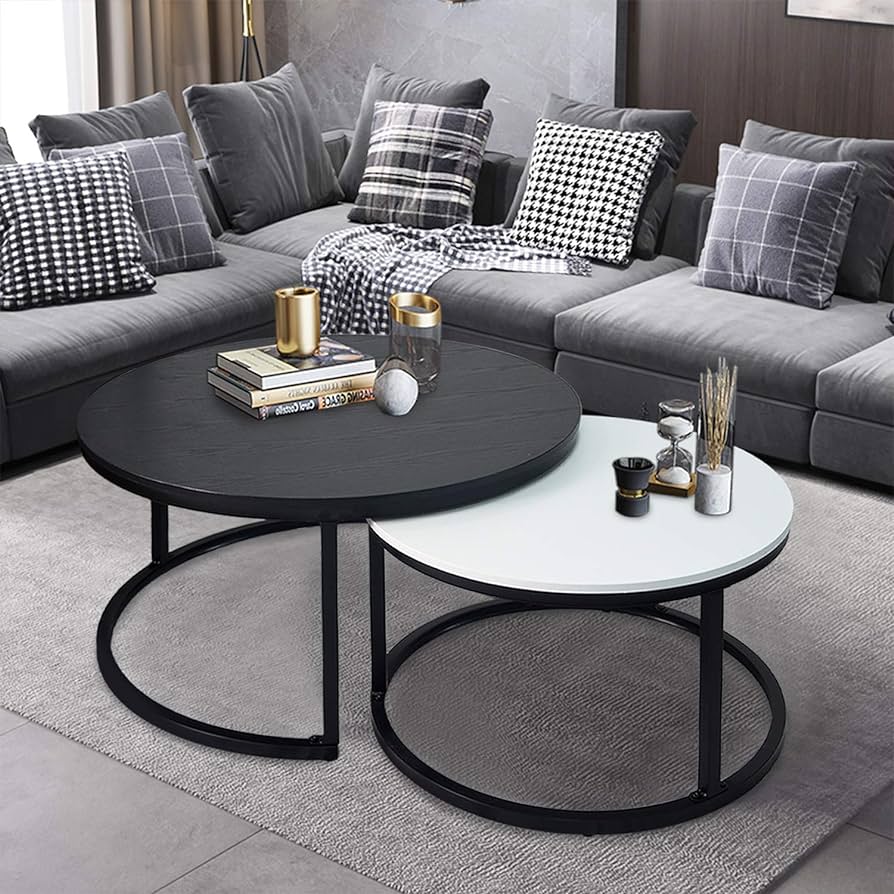
Minimalist coffee table from https://www.lakiq.com/solid-back-wood-side-chair-with-low-back-height-and-armless-design-for-kitchen-dining-s-466625.html?gad_source=1&gclid=CjwKCAiA0PuuBhBsEiwAS7fsNds13BFBobe2TP-UGyQh0VDsOBuvBgNKspTEtuDZkK4zoYE9N3lM-RoCbE4QAvD_BwE
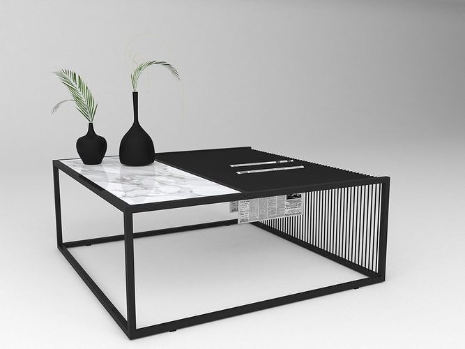
Another coffee table design that is more modern but could add some interest: https://www.lakiq.com/solid-back-wood-side-chair-with-low-back-height-and-armless-design-for-kitchen-dining-s-466625.html?gad_source=1&gclid=CjwKCAiA0PuuBhBsEiwAS7fsNds13BFBobe2TP-UGyQh0VDsOBuvBgNKspTEtuDZkK4zoYE9N3lM-RoCbE4QAvD_BwE
These two examples are very eye-catching to me because for one they both utilize that dual color relationship and secondly they have a simple supporting structure that lets the tabletop talk for itself instead of being overly loud. Going into the design phase the big things I am bringing from this investigation are the first examples use of a hidden extra surface of the table and this idea of having dual colors happening in the tabletop surfaces.
The Minimalist Aesthetic
Before fully diving into my design I wanted to decompose the minimalist aesthetic to ensure that my design was staying true to its embodying aesthetic. Minimalism embraces simplicity, functionality, and the reduction of elements to their essential forms. It’s about stripping away unnecessary ornamentation and focusing on clean lines, neutral colors, and open spaces. In various fields such as art, architecture, interior design, fashion, and even lifestyle choices, minimalism emphasizes clarity, order, and tranquility. Minimalism has its roots back to Japanese minimalism and cultural exemplars and has gained a lot of traction since the 1960s in the United States recently as the culture started to counter the supreme consumerism of the previous generation and the Industrial Revolution and the focus of the general population started to go towards ecological impact and carbon footprints. Some great examples that show off the minimalist aesthetic at work can be seen below.
:max_bytes(150000):strip_icc()/GettyImages-1162697484-774d7e66c20649eda0d964ee0176485c.jpg)
Image of Japanese Minimalism from: https://www.treehugger.com/cultural-concept-ma-heart-japanese-minimalism-4858440
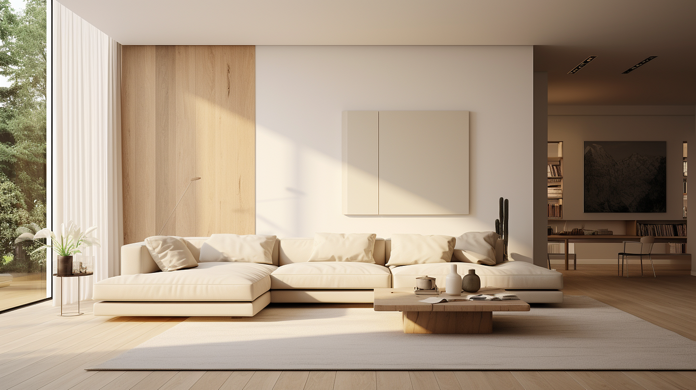
Image of American minimalism from https://medium.com/@ella_49915/minimalist-interior-design-less-is-more-for-timeless-elegance-3128af61e728
One of my favorite trends within this aesthetic is the use of natural colors and greyscale and solid blocks of these colors to increase the cleanliness of the design and make the artifact feel welcoming. As an engineer, I think that this aesthetic really calls to me most because it can be characterized as eliminating unnecessary additions and I strongly believe that the pinnacle of design is a perfectly optimum design that has the least amount of features possible while still succeeding at its design intent.
Moving forward to my design phase my main takeaways from this research was that using those natural tones and keeping the design clean and as minimal as possible to keep the design intent honored is vital to embody the minimalist aesthetic.
Design Phase
My design goal is to utilize the inspiration of the set of coffee tables that sit inside each other from Lakiq and my understanding of engineering torques and assemblies to create a singular artifact that still gives a second surface that can swing in and out from the rest of the assembly. Now that I have this foundation I was energized to get into designing and so I started to utilize the Computer-Aided Design (CAD) software SOLIDWORKS to start to bring my ideas to life. This workflow is pretty usual for my designing brain because I like how the CAD lets me immediately understand the scaling of the different parts and get to see interfaces immediately. I started this design with the main base which I want to have an acrylic inlay so that when the assembly is closed you have a little peak into the hidden feature of the artifact from the top which can be seen below:
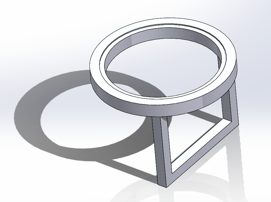
Starting concept with a circular table top and circular inlay.
Although this design was not exactly coming together exactly how I wanted it to I continued with the design and ended up building out the following full assembly:
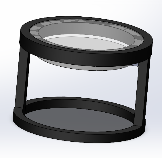
Full CAD with the insert fully inside
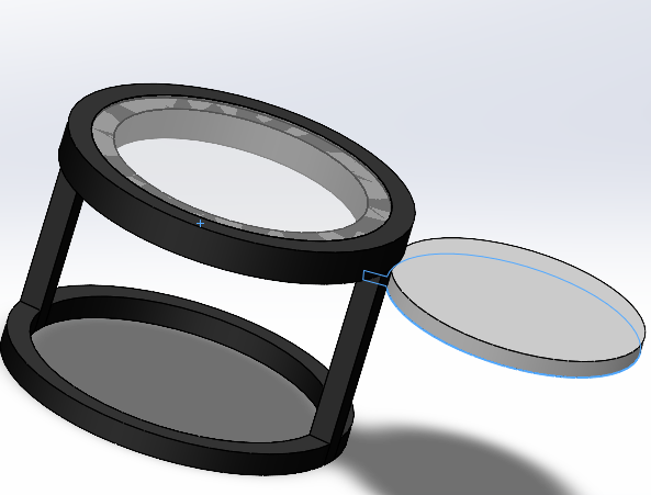
Full CAD with insert full extended out
After completing this CAD I was struggling to fall in love with the design so I decided that it was time to rethink my approach to this design process and decided to go back to my sketchbook and think more about the minimalism concepts than the inspiration documentation I found. This led me to design the following sketch:
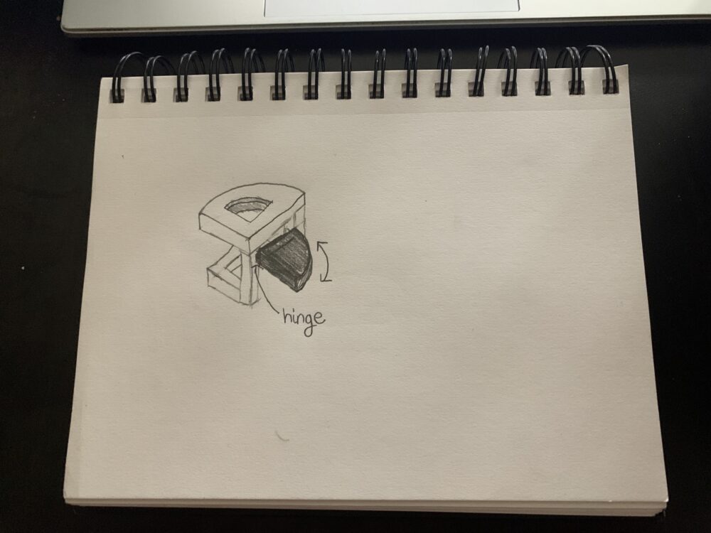
Image of my sketchbook second design of the coffee table design
This design has me a lot more excited for this project because the semi-circle design is something more unique and interesting and makes the extended position feel more integrated and meaningful to the design instead of the two circles which was making me feel like they were a bit detached from each other. With this concept, I am feeling a lot more excited to work on it and I feel like it is going to give the desired effect that I am hoping for from the minimalist design. From here I will be updating my CAD in order to reflect this change and scale the design to make sure that it fits nicely as a centerpiece in a living room before I get into my fabrication.
Fabrication Logistics and Next Steps
Now that I have a design that has me excited it is now time for me to look a bit closer into the logistics of the fabrication process and start to plan out the rest of my semester to ensure that I have a final product that I can be proud to present at our aesthetics expo at the end of the semester. The first thing I am going to do is go through the woodworking workshop at the woodshop in the Idea Forge so that I can have access to their expertise and equipment to aid me in the fabrication of this project. I am signed up to do this on Monday, March 18th so I will be all ready to get working in the shop before any materials arrive. Speaking of the materials acquisition process I plan to look into local wood suppliers that might have thicker wood that I can use for my table tops because large distributors like The Home Depot and Amazon do not support large sheets of think wood like I am looking for. I plan to have these conversations done by the end of the week and have my acrylic and wood all ordered before spring break so that right when I come back from break I can have my engineering drawings finished and everything ready to go into the wood shop to start fabrication the day I get back from break. With these steps, I believe I will be able to finish my assembly within two weeks of being back from break including painting and finishing touches, and be good to present on time.
All in all, I am feeling very good about my project’s trajectory and am very excited to start to get hands-on and make this design a reality. I look forward to seeing your comments and thoughts on my project in the comments section below!
Thanks for your interest in my project and I look forward to keeping you updated on my project!
References
OpenAI. (2024). ChatGPT (3.5) [Large language model]. https://chat.openai.com
Weingus, L. (2022, May 5). What does it mean to have a minimalist aesthetic?. Silk + Sonder. https://www.silkandsonder.com/blogs/news/what-does-it-mean-to-have-a-minimalist-aesthetic
Weisskoff, E. (n.d.). 25 types of aesthetics: Your guide to 2022 trends | redbubble life. Redbubble Life. https://www.redbubble.com/life/types-aesthetics/

2 Comments. Leave new
Colton, your design embodies the essence of minimalism very well through clean lines and natural tones. The functional design elements are evident and will be a great addition because they allow for more table space. I’m particularly intrigued by your thoughtful reconsideration of design elements, as seen by your transition from the initial CAD concept to the more integrated semi-circle design in your sketchbook. I am looking forward to seeing the evolution of your minimalist expanding coffee table. The one suggestion I have is to speak to the staff in the woodshop because they will have some recommendations on how to improve your design when it comes to stability and functionality without sacrificing the aesthetic.
Hi Colton, I really like the looks of how your project is coming. The renderings you have already mocked up embody your aesthetic very well, and it looks like you have taken thought into the functionality of the table. Your timeline is very thoughtful and reasonable too, and will help you in the long run when there is troubleshooting to be done. Have you taken any consideration into the actual mechanism of the hinge? My project uses a 360 degree hinge, and I would direct you to McMaster-Carr if you need a specific dimensioned hinge that rotates 180 degrees. Good luck on the rest of your project!