Initial Thoughts
My initial inspiration for this project came from a desire to have a coaster that fits cups of different dimensions. I have many various mugs and glasses, but have never had a single coaster that was able to hold them all. I’ve definitely had coasters in the past that are able to hold cups of a single dimension, but every other cup dimension has felt forced or not right. I found this picture on Reddit that sums up how it makes me feel pretty well:
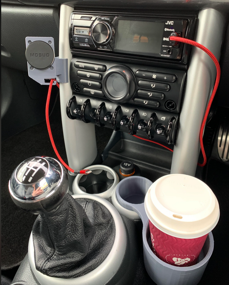
This is the kind of frustrating thing that I have seen about cup holders. Why are they so friggin small?? Someone shouldn’t need to 3D print something to be able to fit a regular coffee cup in it.
As far as aesthetics go, I have been exploring minimalism for most of this semester, and really wanted to try to incorporate more curved edges into this design. In my Upcycle project I wasn’t able to include as many rounded corners as I would have liked due to the fabrication process, but I thought that this project would be a good opportunity to do that.
Inspirations
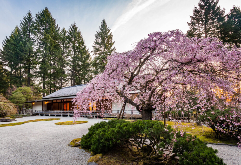
This is drawing a bit from two posts ago, but I figured it was worth repeating here. I have always loved the Portland Japanese Gardens, specifically how their design has always felt timeless. I’ve been going there for over a decade and always feel at peace and rejuvenated by visiting.
In a similar vein, I own a mug by Kinto Japan that is made using local artisan techniques that have been around for hundreds of years. The mug itself is an absolute joy to hold, even though it looks so simple:
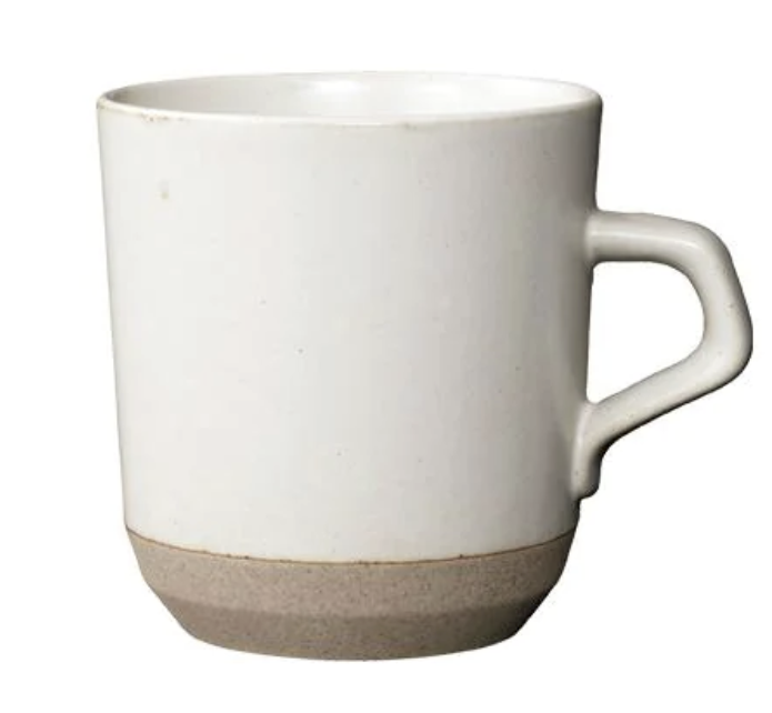
These are what formed the basis of my design aesthetics. I really wanted to try and push myself to use as few 90 degree angles as possible, focusing as much on curves as I possibly could and using as little material as possible.
Opposite aesthetics
Two main opposite aesthetics I found were that of the Baroque and steampunk styles. I was struggling to come up with good sketches for coasters that would follow those respective aesthetics, so I turned to DALL-E for the first time, and it came up with some designs that captured what I had in my head exceptionally well.
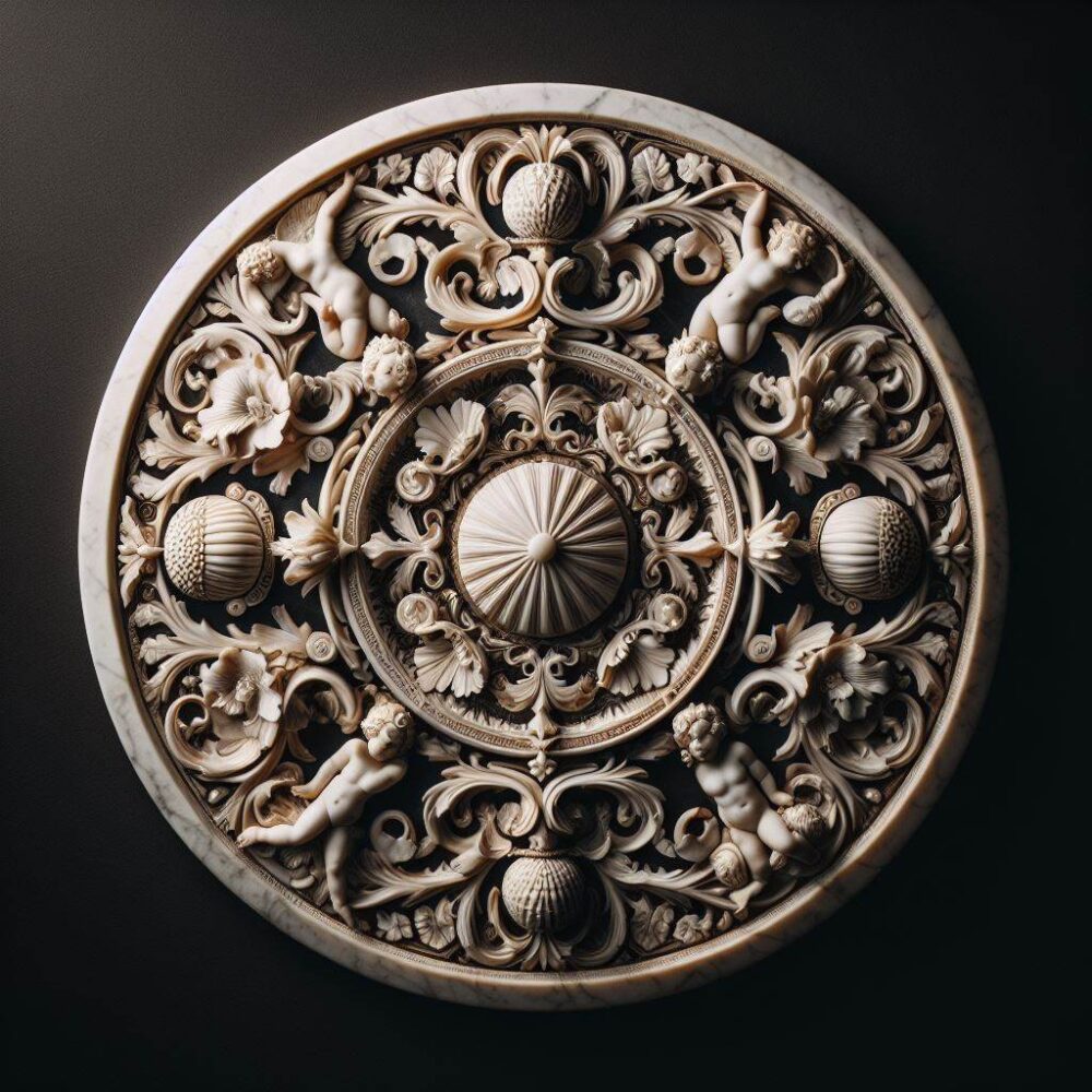
This really captures the opposite aesthetic of what I am going for. The main difference is how ornate and detailed the coaster is. There are a seemingly infinite number of flourishes and ornamentations present. My eyes are drawn towards the main five “nodules”, but then are quickly drawn towards what are surrounding them as well as the cherubs that are shown. It all becomes really overwhelming, and then my eye eventually realizes that the entire thing is made out of marble, like most sculptures of the time.
The other aesthetic is steampunk, which I also used DALL-E for:
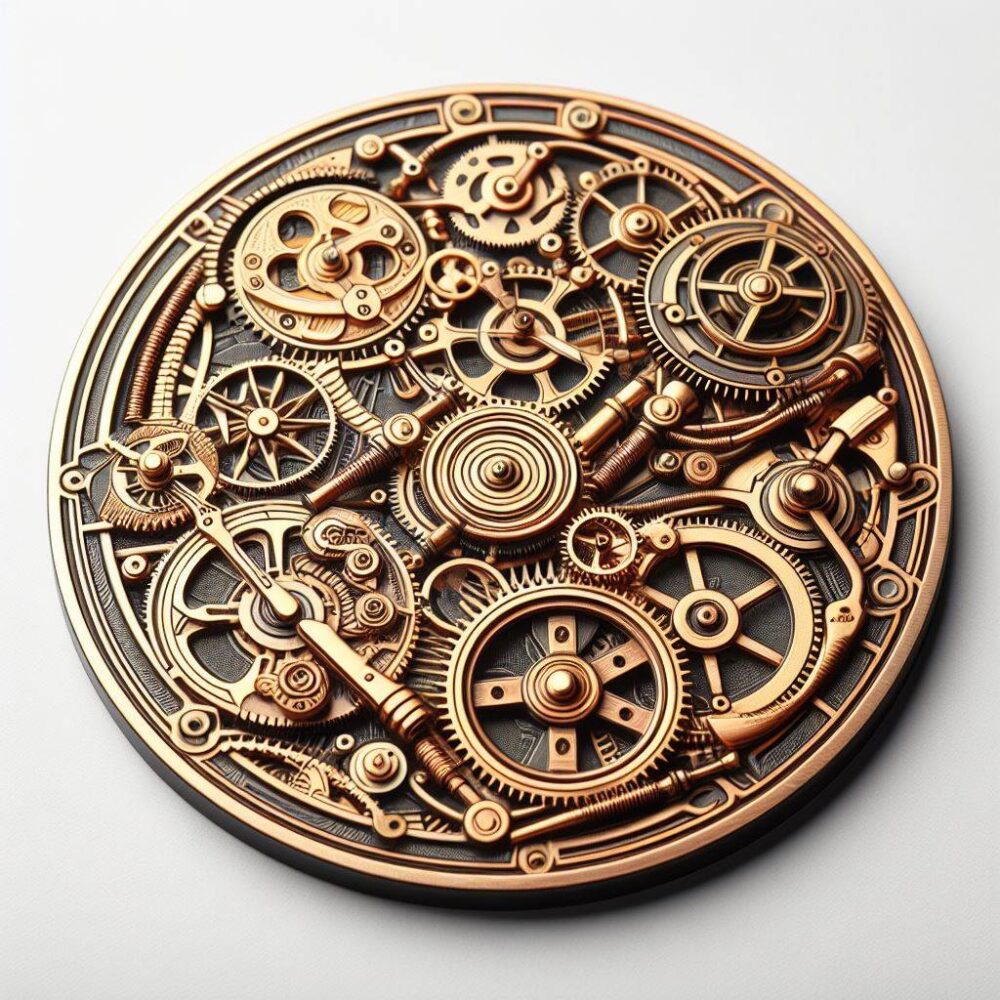
While this is also a very busy design, it is busy in a different way than the Baroque style one before. Instead of focusing on marbled flourishes, this focuses on using gears and mechanisms to create a sense of busyness and clutter. On the one hand, I do like imagining all of the different things that these gears could power (it sort of looks like a mechanical watch face), but on the other, I really dislike how much clutter there is, especially since I know that none of it is functional.
These two opposite aesthetics didn’t really influence my design that much, mostly since I knew that I wanted something that was simple and pleasing to both look at and use.
Some initial renders
What follows are some very rough renders of my thoughts. The base of the coaster is able to accommodate mugs that are 50mm in diameter, increasing by increments of 5mm until it reaches 80mm. It sort of looks like a tiered cake, and to be honest I’m not sure if I like the design.
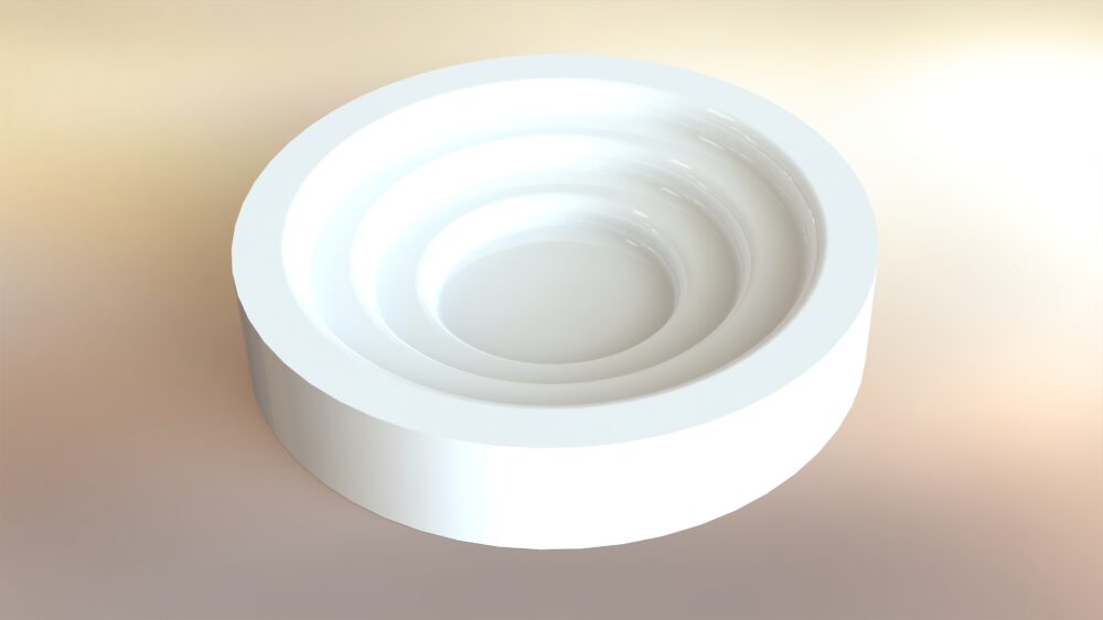
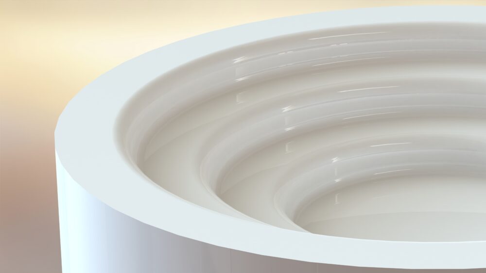
The one thing I do like about the design currently is the color, Most of the things on my desk are dark (the desk itself is black), so having something that is white would not only stand out from an aesthetics perspective, but would also mean that I could see it from my peripheral vision and could place a cup down inside of it entirely by feel without needing to look away from what I’m doing or working on. The number of times that I have tried to do that and nearly spilled something hot on myself and/or my laptop is too high. And I don’t think I’m the only one. So hopefully making it out of a color that is pretty much the opposite from everything else will help significantly with that problem.
Next steps
Fabrication is going to be 3D printing, most likely out of white PLA with the option to make this out of white resin using a FormLabs 3D printer, which I have already used extensively on my senior design project, so it’s a machine I feel comfortable with. Next steps are roughly the following:
Next week (18 March): Iterate on the design. Take some more measurements of different cups and test fits.
1 April: Print some prototypes and consider adding in flexible resin for a more streamlined up experience
8 April: Try seeing how a curved bottom might work. Could the bottom be filleted somehow to get rid of another curve? What would happen if it tilted with something inside of it? Can you put a cup in there blindfolded just by feel?
15 April-end: Extra time since something is going to go wrong, I’m going to want to change something, or something I haven’t thought of happens.

4 Comments. Leave new
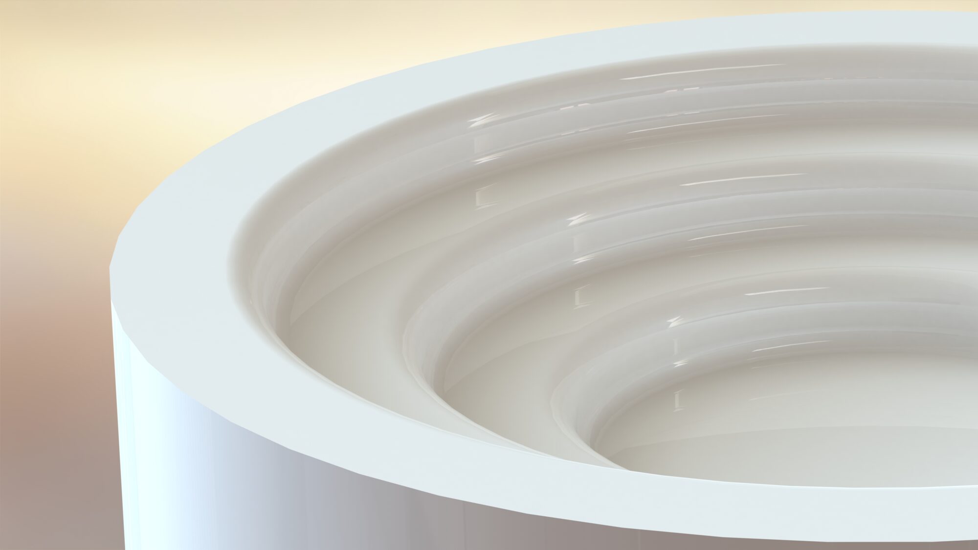
Hey Josh, love seeing the idea for you project develop. I really like the terraced internal design that you show in your initial render! One note, did you consider that the handles of the potential mugs might interfere with the outer steps? One solution might be to make a cut out along the side that would allow for the handle to stick out.
Hey Trent,
I did actually consider that, right after I posed this 🙂 Definitely something that I’m going to do, and after talking with the members in my pod I think I’m going to create a kind of spiraled cutout with a spring platform in the middle so that the mugs can lock themselves in when they’re placed if that makes sense.
These renders are beautiful! I could barely tell that it was a render at all – the only thing that gave it away was the sharp outer edge. Further, I think the idea of a stepped coaster is wonderful. Even if the cup doesn’t perfectly fit, it’ll be a lot more snug than it would be in a larger holder (unless the cup’s bottom is rounded; then, you might have some issues). By the way, have you considered adding some stylistic features to the bottom, or do you prefer it as a plain cylinder?
Hey Lavender,
Thanks so much! The features on the bottom would probably be some rubber feet to stop the coaster from moving, but now that you mention it, I could sign my name on the bottom, I think that might be a fun touch 🙂