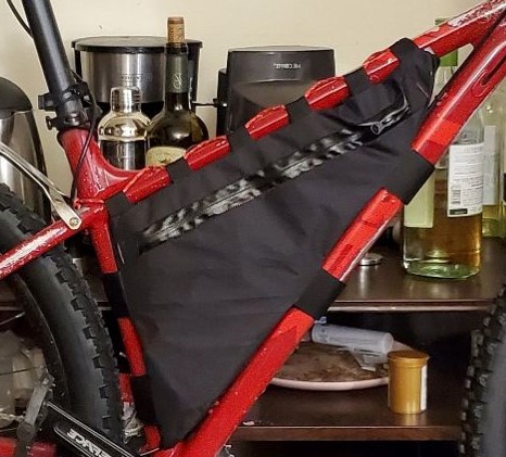
My plan thus far is to focus on redesigning the frame bag imaged below. I want to focus in on the minimalist outdoors aesthetic. I think this current design fits this aesthetic in the simplicity of materials and color. That being said the bag wasn’t very functional for me and I think rebuilding it with a more intentional aesthetic would be great. I really want to try and incorporate more colors and perhaps include some sort of logo to make the bag more personal to me. I think the logo should be some sort of patch or embroiderer to keep it minimal. I don’t have the ability to silkscreen and don’t want to add stickers to the bag I think keeping a very iconic logo with no words would be cool. I am looking at national forest and park logos to get ideas.

My plan for fabrication will begin by buying sample fabrics and testing color combinations. Since the bike bags are really specific and custom for the frame of the bike it will be critical that the bags nicely contrast/compliment the frame. For example making the bags blue would make the bike look like a spiderman cosplay. I have extra fabric from my first build but think I want to go away from the black color. It might be nice to use white with black and red accents to contrast the black wheels of the bike. I am unsure what software is going to be best to model the sewing but it would be cool if I could leverage the resources on campus to make this task more feasible. I think taking some sewing classes will be good practice to ensure the bag I make lasts longer than the first iteration.
Once I find the correct color scheme I will draw up some initial sketches/patterns to include the zippers (mechanical feature), the panels and the sewing materials. From there I can cut some extra fabric to test fit the bag before moving onto the final material. I will also look into a new logo or patch that could be embroider onto the bag to make it more unique while maintaining the outdoor minimalist aesthetic.
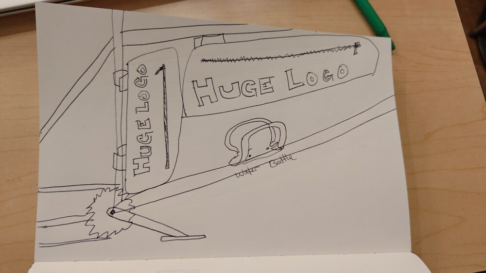
These two sketches below are the opposites of my aesthetic. The first drawing here shows an example of identical bags that are mounted into the frame. The point of the sketch is to show the jerry rigged aesthetic. This idea shows that a simple all purpose design can be incorporated into multiple ways to get a similar performance to a custom purpose built bag. This solution isn’t very aesthetically pleasing because it forces the product to be used in an unintended way.

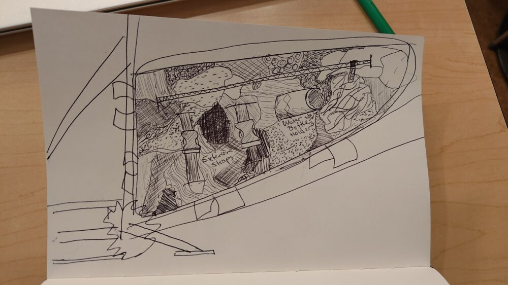
The second drawing here demonstrates a maximalist design where I upcycle different pieces of fabric to essentially make a camouflaged bag. Additionally we add the exterior straps and the water bottle holder to really lean into the maximalist aesthetic. This is very different than my intended design that will utilize large single panel constructions to keep the lines very clean and direct.


2 Comments. Leave new
Blake, these are really good sketches. I really like the idea for the maximalist design you’ve created. You mentioned that you haven’t figured out what color scheme you want to go with. I was wondering if your plan was to match the color of your bike or to do something else?
Hi Blake ,
I love your focus on improving the frame bag’s look and functionality. Could you tell me more about your ideas for a personal logo and what sewing design software you’re considering?