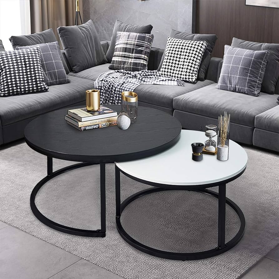
As a reminder from my last post, I plan to create a coffee table that has a second portion that rotates out to increase the surface area for more usage. This project is intended to be in the modernist aesthetic which is characterized by its strong blocks of the same colors and its didactic relationship of blacks and whites. A visual example that I am using as inspiration is the minimalist and modernist coffee table below.

Modern minimal coffee table from https://www.lakiq.com/solid-back-wood-side-chair-with-low-back-height-and-armless-design-for-kitchen-dining-s-466625.html?gad_source=1&gclid=CjwKCAiA0PuuBhBsEiwAS7fsNds13BFBobe2TP-UGyQh0VDsOBuvBgNKspTEtuDZkK4zoYE9N3lM-RoCbE4QAvD_BwE
This design shows the idea of how the two countertops will interface with one sliding in and out from being underneath the other. However, I want the top to have an acrylic inlay in it to showcase a hint of what is below as well as have the bottom part hinge and rotate out instead of being a separate piece. To accomplish this goal I will be making the base out of wood to increase the weight and reduce the effect torque will have on the artifact.
Two Alternative Aesthetics
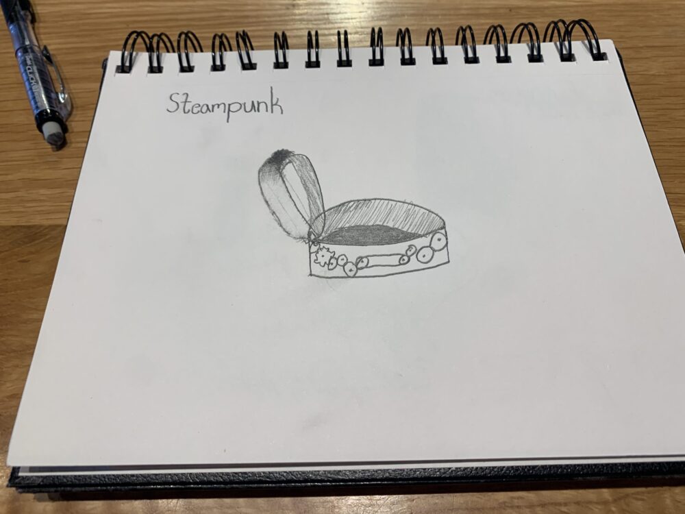
The first of the two alternative aesthetics that I sketched for my artifact is one where it is a steampunk aesthetic.

Image of drawing for Steampunk Coffee Table
This design would incorporate a large number of gears to create the hinging motion and flip the new space over to make a larger aesthetic statement with the motion. I do believe that this is a cool thought for a project. As I drew it, I got a bit of FOMO because I love gears and gear trains. Still, I understand that the practicality of designing this table in this aesthetic would be even more difficult than the current plan and would take a far out-of-scope strain on time. However, I do believe that letting the hinging be part of the design is possible and to keep it in the modernist aesthetic will be an exciting challenge to overcome.
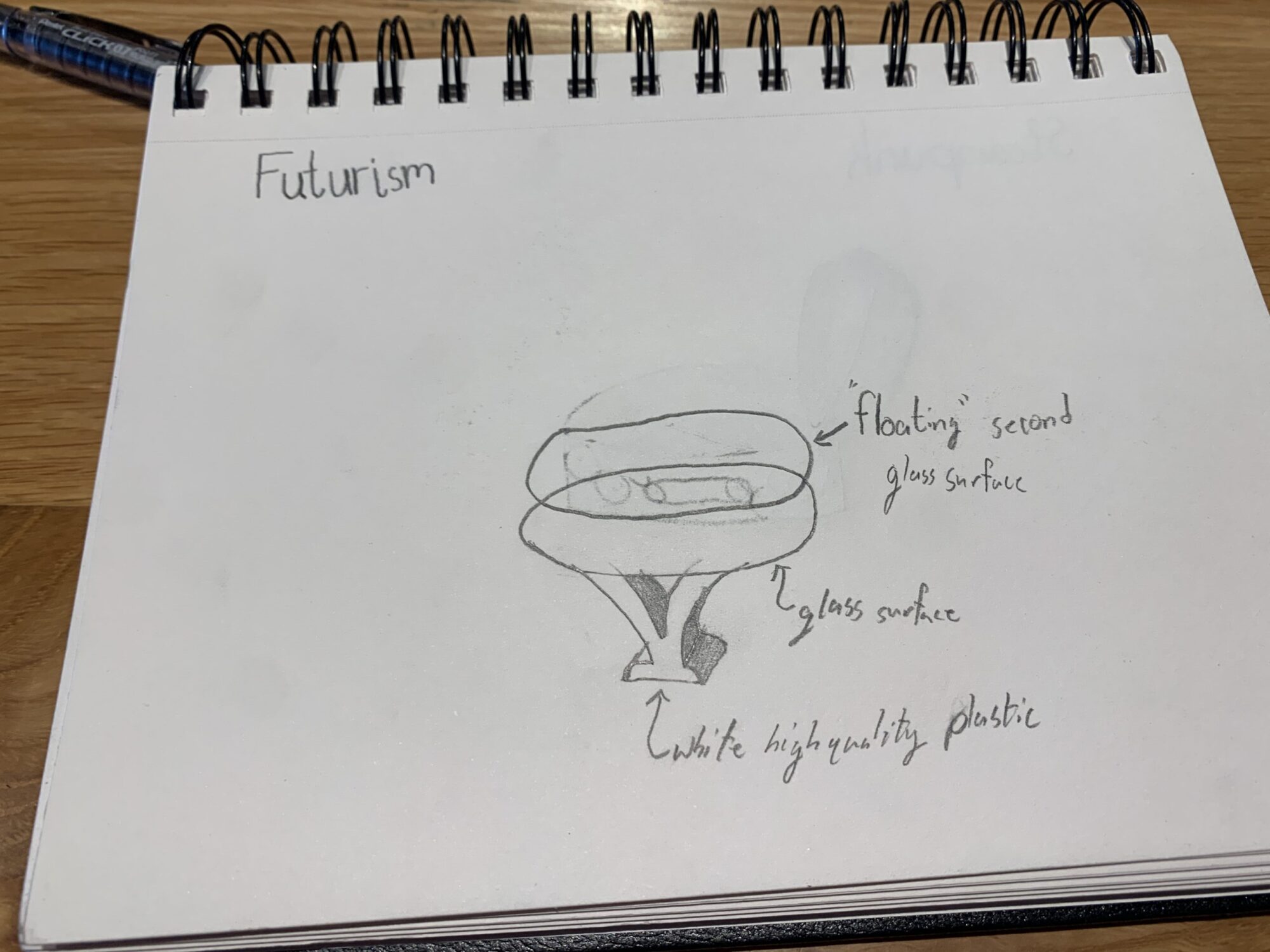
For my second Aesthetic experiment, I decided to draw the design in a futuristic aesthetic as seen in the following image:

Drawing of a Coffee table in a Futurism Aesthetic
This coffee table has a white polyethylene base to have a shiny white feel to it with a double stack of glass surfaces with one appearing to float above the other to make it seem out of this world! This concept is fun because of the geometric illusion in the glass and I think the base is an interesting idea. However, I am very excited to make the base more geometric than this is to develop a coffee table that is sturdy and visually compelling at the same time!


2 Comments. Leave new
I really like how your alternative tables functioned in two completely different ways in order to utilize more area! that was a really interesting addition to your rethinking. Since you are going with a minimalist/modernist aesthetic with an acrylic inlay top layer, what are you planning on making the bottom layer’s color and would you consider making that surface a different color from the vertical legs/support of the table?
Hi Colton,
I really enjoyed reading your thought process for this project, I think it’s nice that you are considering the two tables to be connected as well as using a specific material to showcase both parts. As for the aesthetic I personally think the modernist aesthetic would fit perfectly for the purpose and vision you provided. I wonder how you will decide on the scale of the table, in consideration of the desired space you intend it to be used in. I am excited to see how you will incorporate your expanding table feature, great job!