https://www.mr-beam.org/en/blogs/news/handy-ladestation-aus-holz-selber-bauen
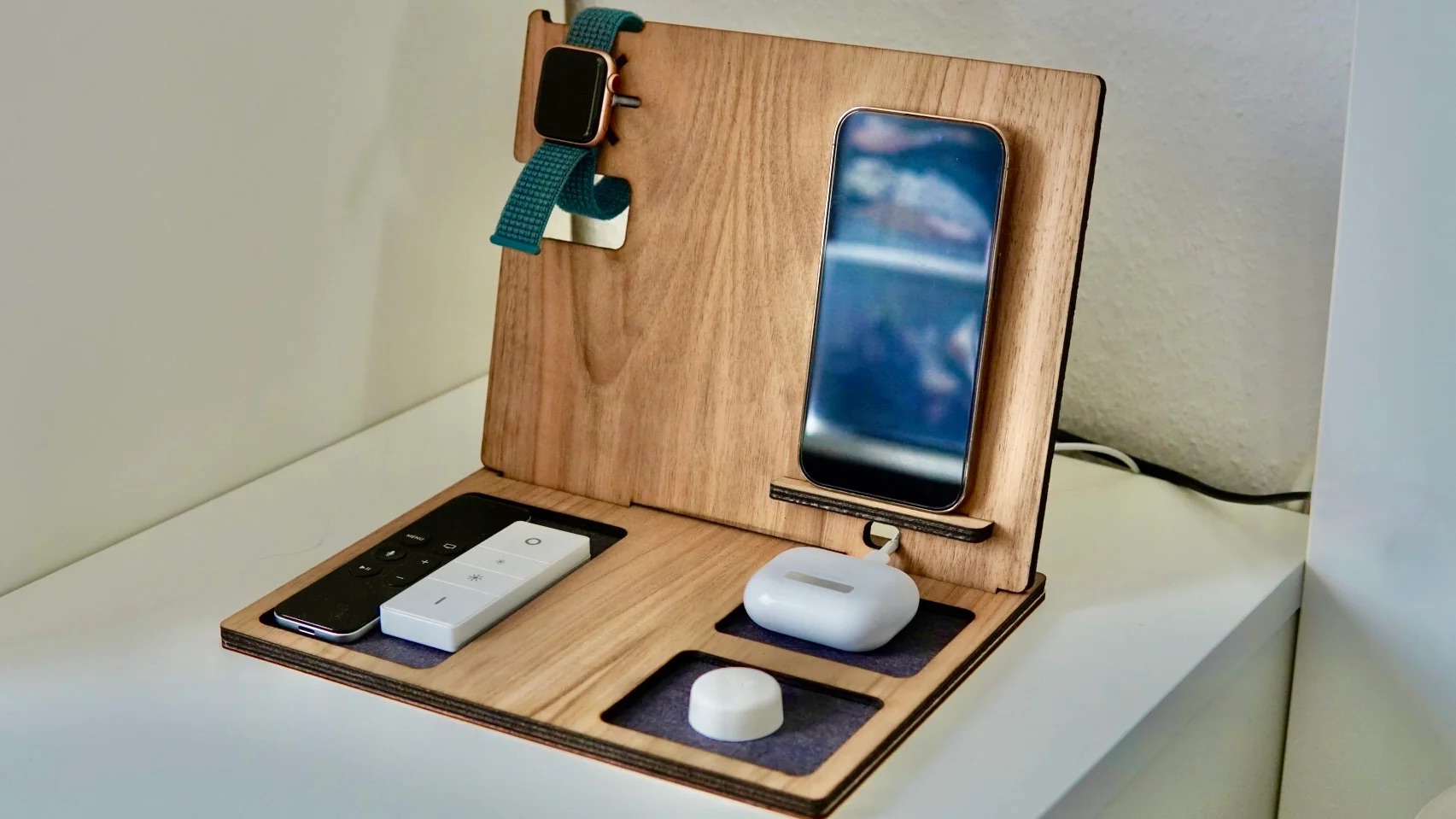
My main project aesthetic is going to be minimalism. This aesthetic is characterized by monotone colors and a lack of complexity. The reason I like minimalism as an aesthetic for my main project is because I am going to use this project on my desk as a charging station and it would fit the aesthetic of my desk setup. My current plans for the project is a charging station that has 3 ports, for iPhone, AirPods, and a Watch. The material I am leaning towards is wood for its simple and consistent tone as well as ease of manufacturing. Another reason why minimalism is good for this project is because I plan on using the charging station to hide wires and connections that make the desk look messy.

An alternative or opposite aesthetic might be Steampunk, Steampunk is filled with complexity and varying textures and tones. This would be a fun project to make as I could incorporate metal tubes and gears into the design, possibly with some functionality to them. While I think that this might be a more fun project tot manufacture I don’t think it fits the design intent of a charging station as well as a minimalist aesthetic would.


2 Comments. Leave new
Hey Finn, I like the steampunk idea and it could be interesting to have some sort of pseudo-mechanism attached to that which gives the illusion of charging/powering your devices. I am curious if you plan to charge stuff wirelessly or are you going to have wired connections? I think that you should make sure to consider how your cable management will look since you are going for a minimalist aesthetic.
Hey Finn that seems amazing and I cannot wait to see the interface come together!! Are you going to utilize Magsafe charging into your board to make an even cleaner more aesthetically pleasing and convenient user interface?