My current plan for my project’s aesthetic is very much modernist. Being a rigid, geometrically defined kite certainly lends itself to that, having large, flat planes and exposed spars. I do not have any plans of adorning it such as adding twirling tails or a wide color palette. I’ve even thought about coloring the main fabric sails orange, to stand out in front of the sky, but tried and true black on white seems irresistable to me. I’ve also got the temptation to add black lettering to the white sails on one or two corners – a model name, specifications, or something similar. I seem to remember some famous product that had it’s name and number printed in the bottom right corner in black Helvetica on a white background. I want to make something similar, and list this thing as an inspiration, but I can’t remember what it is! Internet searches of ‘model number helvetica’ do not give the best of results.
I still haven’t settled on the final geometry. I am likely going to make a box cell kite, but I’m not fully certain, especially given that I’ve recently found a massive online kite design repository (the Kite Plan Base, kiteplans.org) and would like to search around some more before deciding. Still, here are some of my initial sketches.
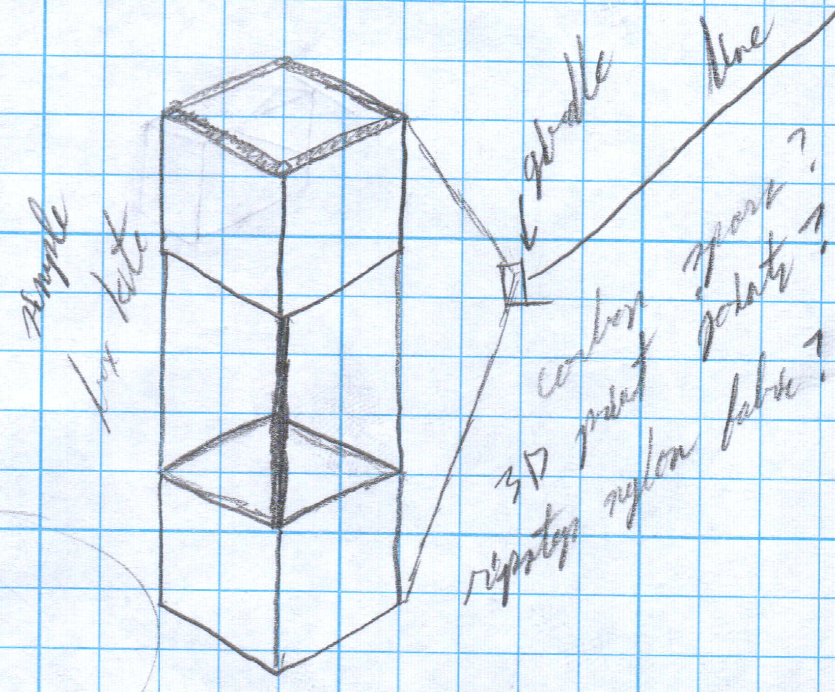
 A rough sketch of a cubic two-cell design.
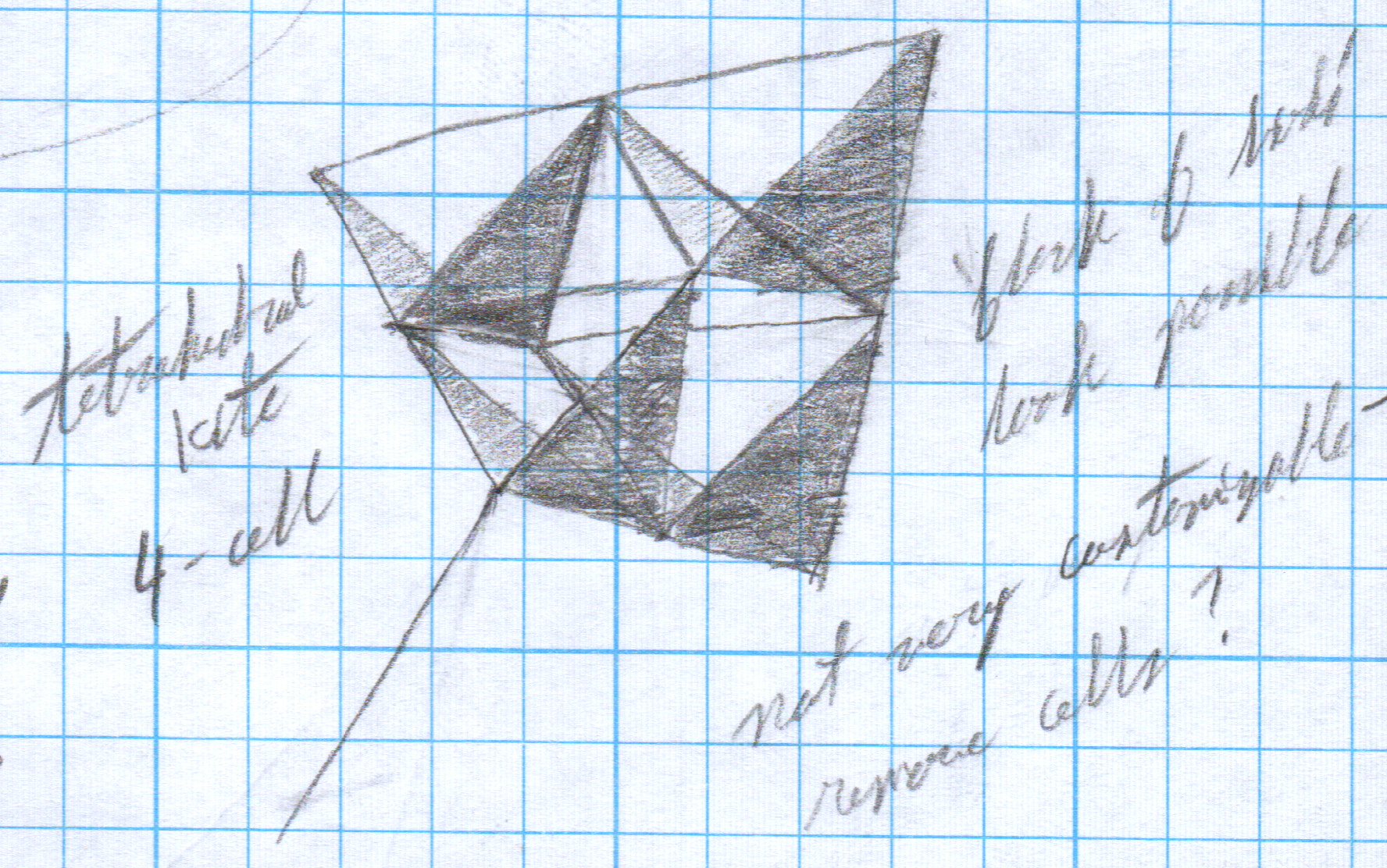
 A four-cell tetrahedral kite. I wouldn’t want to make many more cells than this; there would be so many sails to make.
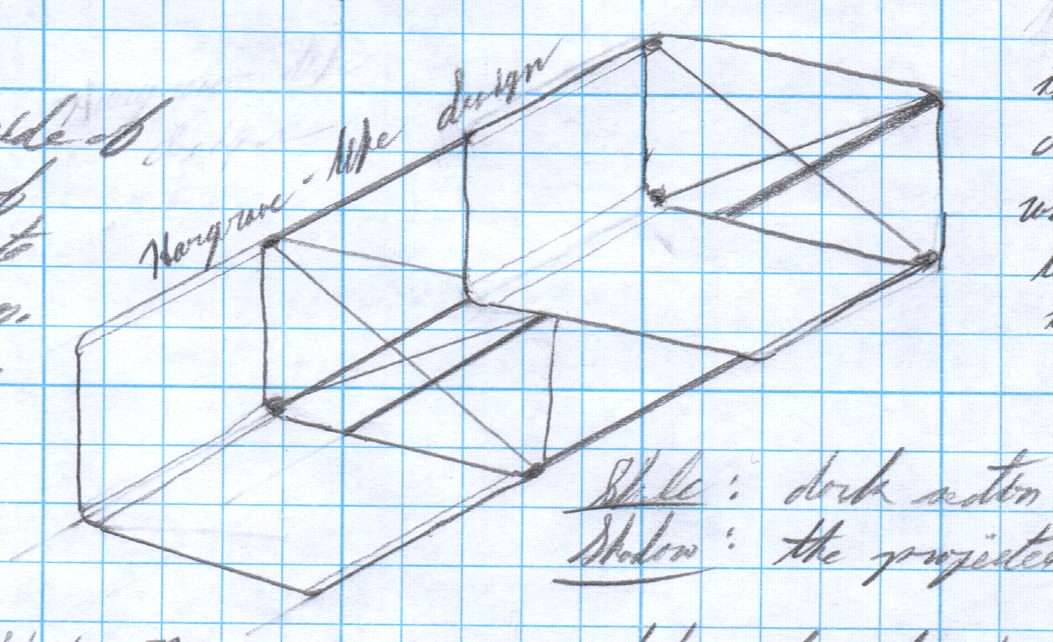
 A box kite similar to one of Hargrave’s designs. I love the very slight asymmetry of a rectangular cross-section; I felt that the cubic cell design was too regular. I’ll probably going to go with something like this, if I decide on a box design. Note the rounded edges; this was inspired by a chair I saw in the Phaidon Design Classics. More on that later!
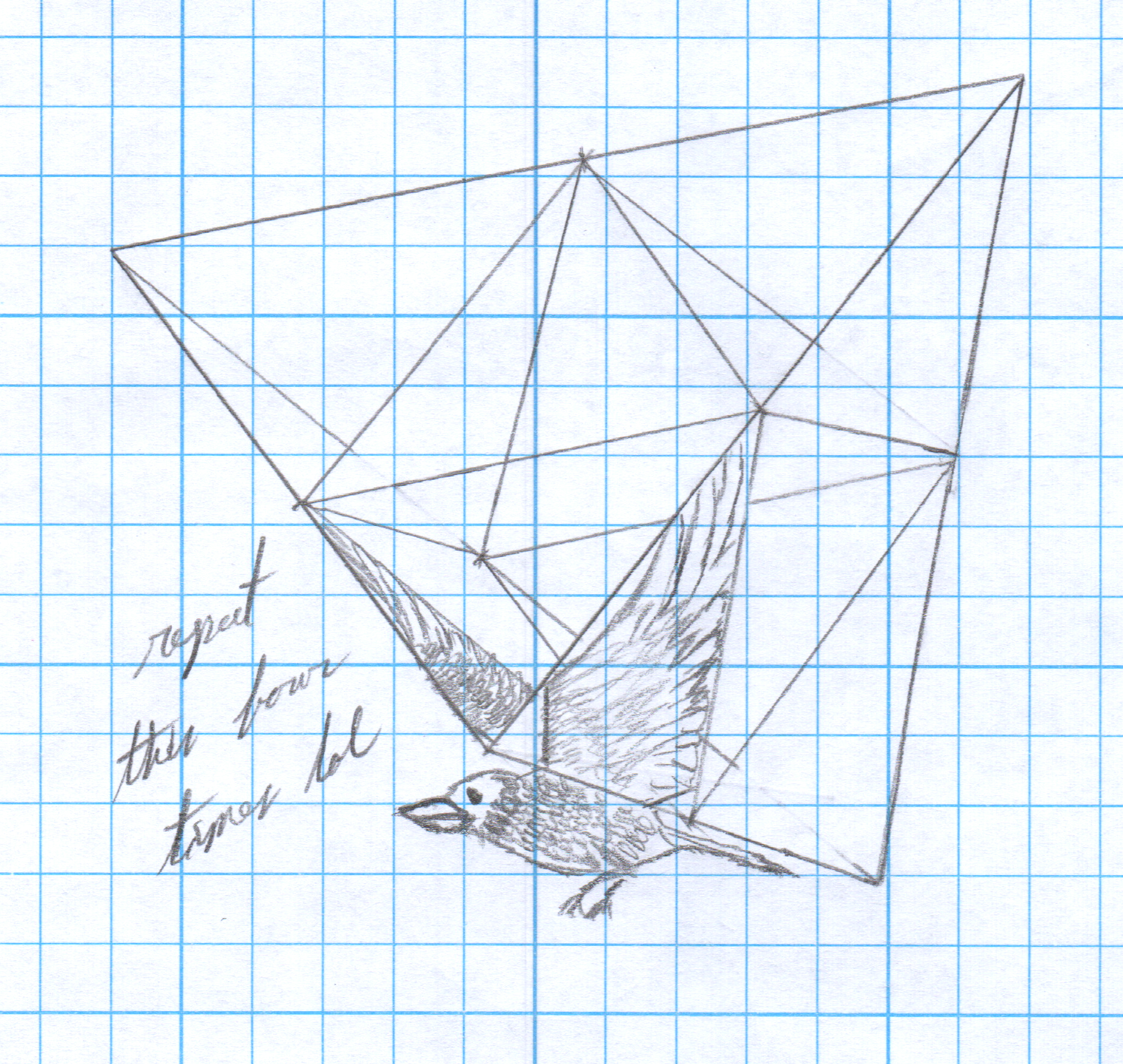
However, these kite’s designs don’t only inspire a minimalist look; one of the first impressions I got from a tetrahedral design was a great flock of birds, their wings being the sails. (Plus, I can remember being taught to paint birds at a distance as two wings and nothing else, which is very reminiscent.)
 A four-cell tetrahedral kite with only one of its cells decorated as a bird.
If I were to design something like this, paint the sails, and make a separate, almost vestigial ‘hanger’ with the body of the bird on it, I could have something rather detailed. Plus, put some natural, light, flowery colors to its design, and you’d have something straight out of the Arts and Crafts days.

4 Comments. Leave new
Wow, I really like the defining look of the trusses. It is very striking. Do you think it would look more distinct if you were more abstract and geometric like your first 3 pictures or merged geometric shapes with things that are not very boxy like birds?
I’m not sure, honestly. I suppose that it would depend on my design. A simple box is less striking than a beautifully painted set of bird’s wings, and a cartoonish overly-simple bird would be outdone by a well-made modernist piece, you know?
Lavender, your modernist aesthetic for your truss kite project is very fascinating! The idea of black lettering on the white sails with a touch of orange is a great addition as it will contrast very nicely. I am excited to see which design you end up pursuing. I am curious how you will balance the minimalist look with the potential for detailed and decorative elements. Good Luck with your project!
Still not entirely sure about that balance, myself! I was think of adding additional elements on the outside of the sail – maybe big, visible stitches, also in black. Also, I’m likely going to add ribs to the inside which I think break up the interior look pretty well (check out my latest post for the CAD!).