Main Project Aesthetic Plans and Alternatives
By: Michael Gray
For my main project, I will be continuing the theme of my previous project, of creating picture frames/wall art. For this project, however, I will be making 10 identical “mini-frames” which will interchangably and magnetically mount to the larger frame which stays on the wall. As any photos could be placed within the piece, I do not consider the actual photos (which represent various Biblical metaphors for God) a part of the industrial aesthetic I plan to create. Below are two sketches of the parts I plan to make, with their industrial aesthetic being shown through blank, flat-edged aluminum.
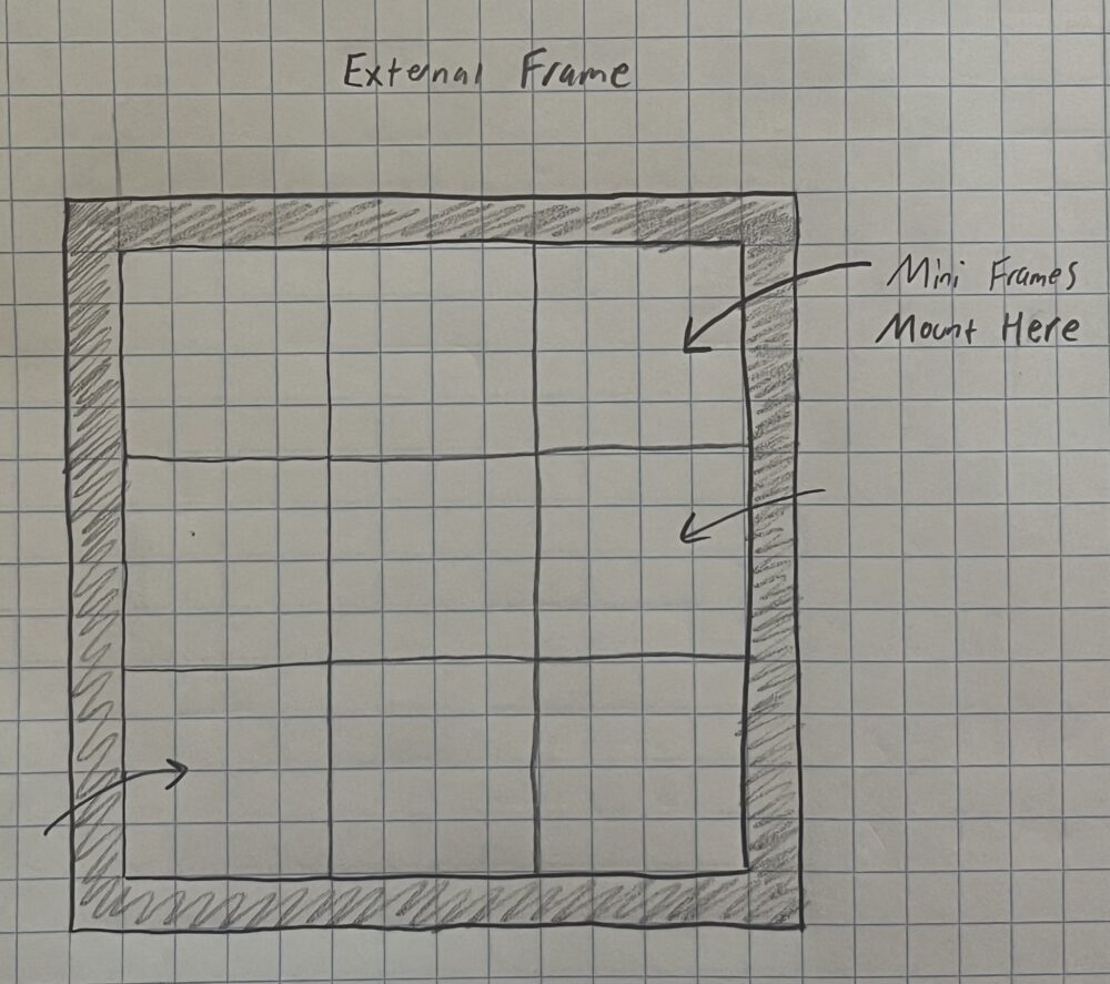
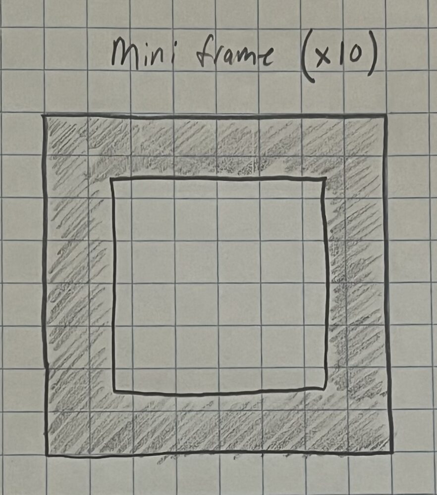
The industrial aesthetic is one that includes flat edges, sharp corners, high use of metal, and often somewhat “boring” designs. Many factories and buildings constructed during America’s industrial boom have these qualities. The industrial aesthetic is not too popular anymore, however, as the world continues to grow deeper into consumerism, individuals and corperations alike strive to produce flashy architecture, products, and services, which are far from the industrial aesthetic.
Ironically, the aesthetic of my previous project was rustic, and for my blog post on the idea of an opposite aesthetic, I discussed what the artifact would be like with an industrial aesthetic.
An alternative aesthetic that I almost went with for my project was Seussism: the aesthetic of Dr. Seuss’ famous children’s books.
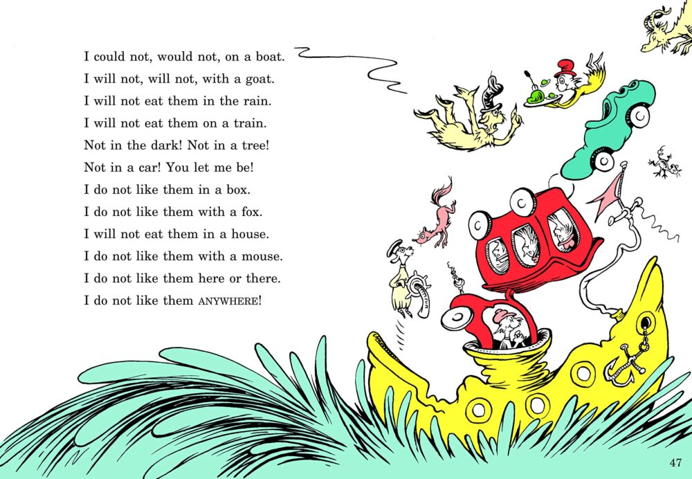
Above is an example of Seussism, found in”Green Eggs and Ham” [1]. Notice the bright colors, the lack of symmetry, and the whimsical feel promoted by the curving lines.
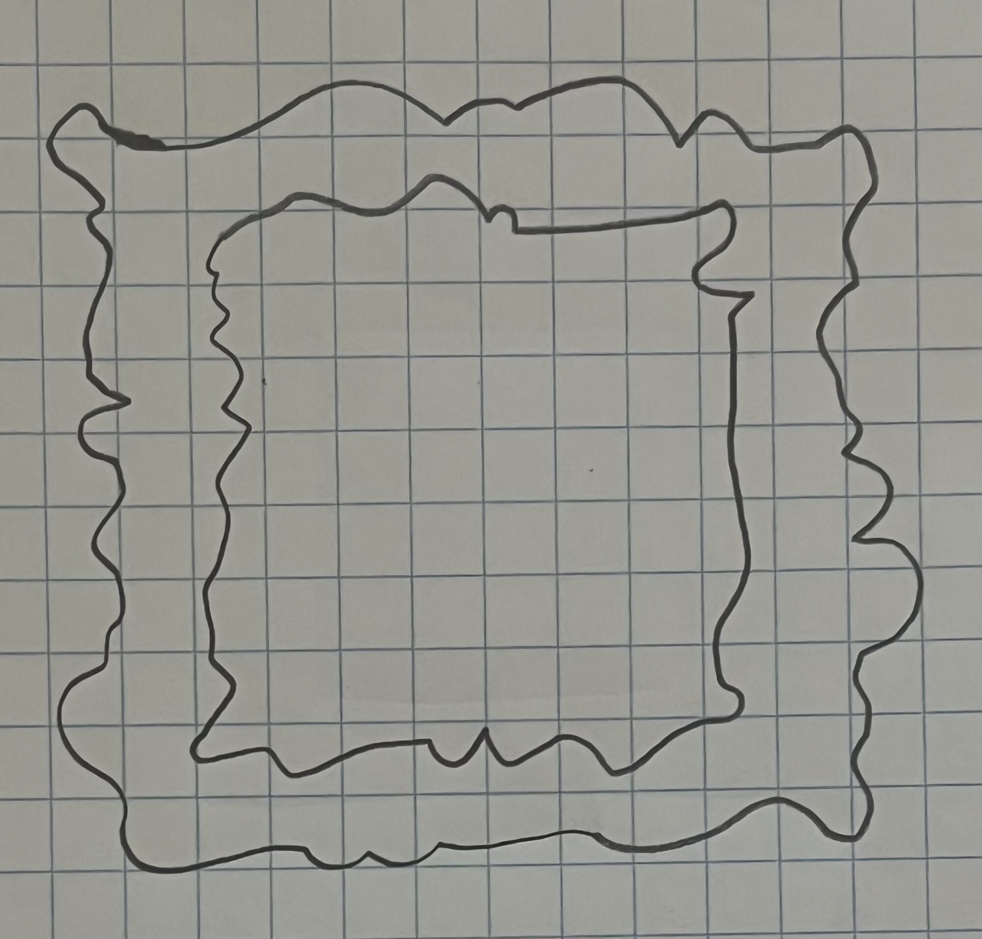
My project in this aesthetic would incorperate many more colors and curves into the picture frames, offering a very unique art piece, but proving to be very difficult to design and manufacture. To overcome this difficulty, I would likely 3D Print the parts, allowing for the complex geometries of Seuss’ work to be represented accurately in real life, while also utilizing the many colors of fillament available to 3D printers. I also avoided Seussism in the end for my final project due to the fact that I want all of the “mini frames” to be interchangable, requiring them to have the same shape. This contrasts the rarely redundant nature of Seuss’ aesthetic.
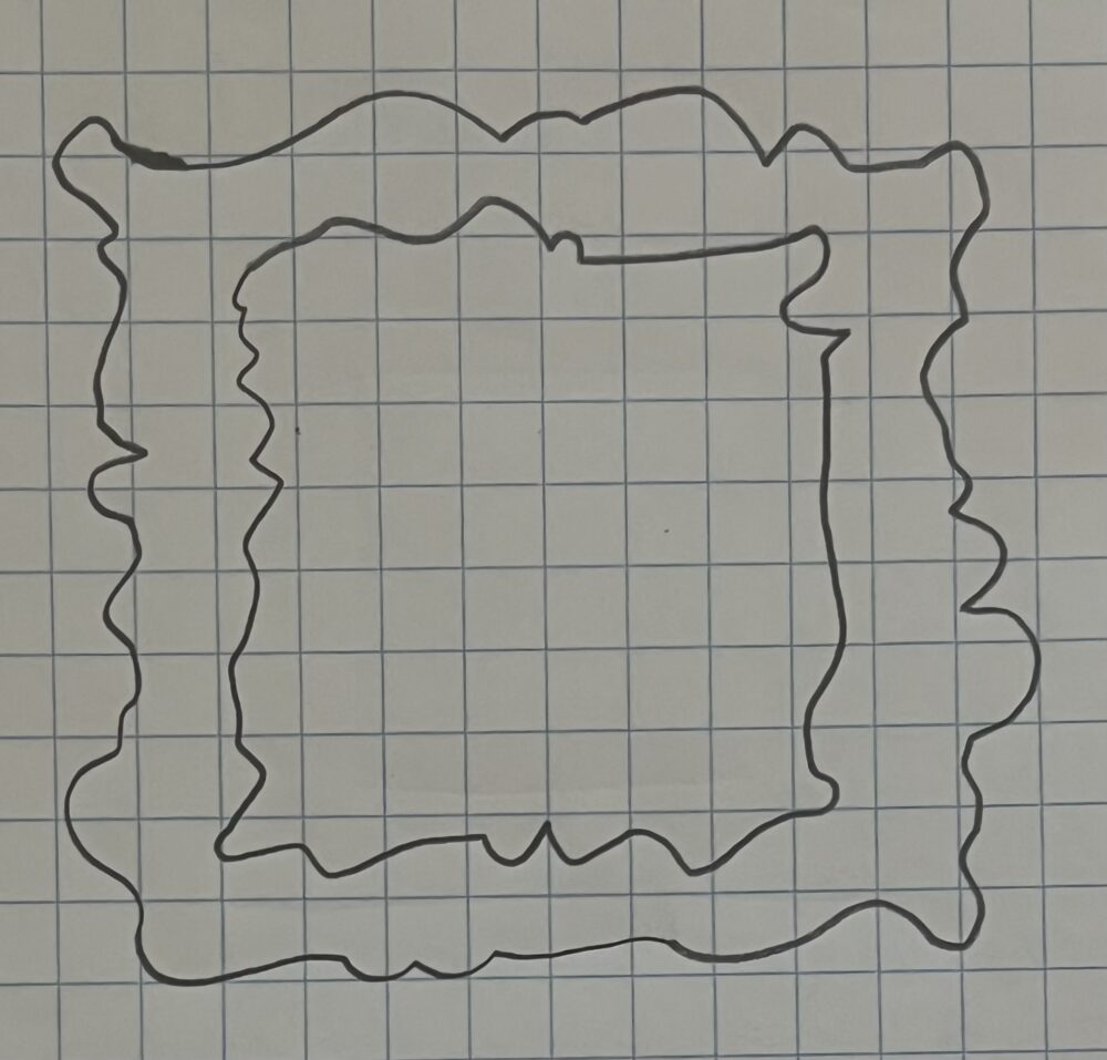
Above is a sketch of how the overall shape of the parts in my final project might look in the aesthetic of Dr. Seuss’ work. Additionally, each part would have a distinct, bright color, contrasting whichever frames are adjacent to it.
Refrences:
- Seuss, Dr. Green Eggs and Ham. Random House, 2001.

6 Comments. Leave new
[…] Post 7: Main Project Aesthetics […]
[…] Interchangable Photo Collage. As this is the third post about my final project, please see post 7: Main Project Aesthetics and post 8: Design Preview Report for […]
Hey Michael!
This is a really cool idea! I like the concept of one permanent frame with the interchangeable mini frames – I can see a business model for it!
I noticed that you are planning on making 10 frames and 9 spaces on the main frame, is this for the interchanging of the frames?
Also, do you plan to use any colors, or just plain aluminum? It could be cool to look into chrome color ideas!
I’m excited to see how the final product turns out, and I think the images you want to include sound awesome too!
Hi Jace! I will be making 12 “frames” for this project.
1 external frame that the mini frames attach to.
1 “God” frame that will stay stationary in the center slot.
10 interchangable “mini frames” which go in and out of the remaining 8 slots. This allows the interactive feature of the project to include taking photos in and out, instead of just moving them around the piece.
I currently plan to use plain aluminum, but I’ll look into chrome and other coloring options! I don’t have a lot of experience with metal, so I’ll be learning a lot over the course of this project.
Hi, Michael. What a fun project, and I really like the aspect of having the mini frames be interchangeable. I agree that the Seussism aesthetic would be more difficult to make the modularity possible, but possibly planning for the curves of the frames to fit like a puzzle might make sure opposite-aesthetic possible? I think it could be interesting to have wonky shapes and contrasting colors.
Hi Helen,
Great idea! The Seussism aesthetic is defenitely possible, but it would be difficult to pull off while incorperating the common asymetrical style of Seuss. If I make it fit together with asymetric mini frames, the frames will not be able to fit into any of the slots, ruining the interactive feature. Alternatively, I could make the frames have interesting external shapes, but they would have to be symmetrical, so any frame can fit next to any other frame, taking away from the somewhat random and asynchronous aspects of Seussism.