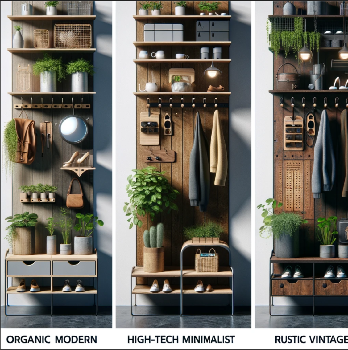
Main Project Aesthetics – Organic Modern Alternatives
AJ Terio
ATLS 4279 – Aesthetics in Design
3/5/2024
The Vision:
In pursuit of enhancing my living space at home with a multifunctional design, my main project envisions creating a full-sized, organic modern furniture piece. Designed to amalgamate utility with aesthetic pleasure, this piece is destined to house a shoe rack, shelf, coat/hat racks, planter hooks, a mirror, and a cork board. My goal is to infuse organic elements into this ensemble, aiming for a green contrast that seamlessly connects the kitchen to the backyard. A pivotal consideration for this design is its portability, allowing me to transport it cross-country with ease, embodying the modular design philosophy I previously employed in a family bookshelf project.
Inspirational Roots:
The genesis of this project was sparked by a kitchen renovation oversight, paired with my father’s unfulfilled wish for a cork board in the kitchen. This realization, coupled with discussions with my mother, fueled my determination to craft this multifunctional piece during my time at university, ensuring it would complement our home in Alexandria.
Choosing the Aesthetic:
The project’s aesthetic direction came to me upon engaging with our class prompts. Aiming to transcend the modern kitchen aesthetic, I was drawn to an Organic Modern style, envisioning greenery and spots for potted plants as integral components. Observations of natural light influx through our back door solidified my choice, though practicality dictates that the moss used will be artificial for ease of maintenance.
Execution Strategy:
The design process necessitates the incorporation of interlocking features for easy assembly and portability. My immediate task is 3D modeling, scheduled for completion by next week, followed by material procurement. My timeline envisions finalizing the basic structure by early April, dedicating the latter stages to intricate carvings and the integration of organic elements.
Project Ambitions:
- Ornate Detailing: I aim to embellish this piece with intricate carvings and patterns, particularly on the shelf and base, to infuse it with distinctiveness.
- Sturdy Foundation: A robust base is paramount for stability, especially to accommodate the anticipated foot traffic at the shoe rack.
- Wall Support: Given the design constraints, the piece will feature a mechanism for wall attachment, possibly through pocket joints or metal hooks, to ensure a snug wall fit.
- Innovative Shoe Rack: Responding to practical considerations, the shoe rack design will favor cleanliness and maintenance ease, possibly through removable metal shelves.
- Moss Integration: The placement and arrangement of artificial moss remain in the conceptualization phase, with detailed planning required to finalize its incorporation.
Diverging Aesthetics:
What if…? In exploring alternatives, I imagine diverging radically from the Organic Modern aesthetic. One direction could lean towards a High-Tech, minimalist design emphasizing sleek, metal components and LED lighting, offering a futuristic take on functional furniture. Another departure could veer into a Rustic Vintage theme, utilizing reclaimed wood and vintage hooks to evoke warmth and nostalgia, contrasting sharply with the initial vision. Each alternative would not only redefine the furniture’s visual impact but also its interaction with the surrounding space, offering intriguing possibilities for reimagining the role and design of multi-functional home furnishings.
Conclusion:
This exploration of aesthetics, from the planned Organic Modern to hypothetical alternatives, underscores the profound impact of design choices on both functionality and spatial harmony. The journey from conception to realization in creating this furniture piece not only highlights the intricate balance between utility and aesthetics but also reflects on the broader dialogue within design aesthetics, challenging us to reimagine the spaces we inhabit.


3 Comments. Leave new
Awesome planning AJ, very well thought-out and I can see how much this aesthetics gives you inspiration. The use of organics in space always looked please to the eye and offered a relaxing influence to the environment they are usually included in, so it will be fun to see the results of your project. The idea of merging high-tech also offers another range of design choices you could explore, and would be fun to see how the effect of lighting would have in organic included spaces.
Hi Aj, these are cool ideas and renderings of alternate aesthetics. I especially like the high-tech minimalist idea, since you could even incorporate electronics into the design with display screens. How do you plan on balancing this large piece of furniture? Do you plan on mounting it to the wall? Good luck on the rest of your project!
Aj,
I like your image renders at the top of this, but I still think they look kind of similar. When I think of high-tech minimalist, I see a white, flat board with LED strips lighting above and below the rack, while yours still has some of that rustic look of exposed woodgrain. Regardless, I like these three renders, and any of them is a great visual choice to go with. I especially like the green accents, and I look forward to seeing your project progress.