Aesthetic Choice: Steampunk
Steampunk is an aesthetic that focuses on industrialization in the early 19th century. It often includes mechanical elements such as gears and engines, and highlights the interest of developing technology in the early 19th century. It aims to combine nostalgia of the past as well as mechanical speculation and fantasy of the future. Steampunk art is often very intricate and realistic looking, yet includes obvious aspects of fantasy. There are often steam engines as well as clock mechanisms. The aesthetic is characterized largely by flowing pieces that seem to have moving pieces. Since its creation, steampunk has evolved into more than just wall art. There is literature depicting the steampunk aesthetic including stories about technological fantasy in the future, as well as steampunk bands. The aesthetic is often brought to life in real mechanical figures and statues, as well as the way people dress and the tattoos that people wear. Being a mechanical engineer, my fascination with this aesthetic is rooted in the rugged, mechanical aspect that combines with my interest in future technology and engineering. An example of the Steampunk aesthetic is included below.
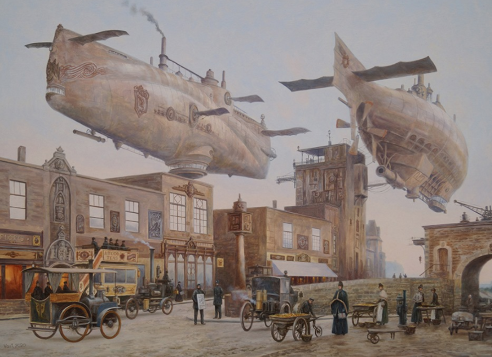
Artist: Vadim Voitekhovitch; https://delifictional.com/steampunk-concept-art-list/
Inspiration:
For my upcycle project, I wanted to achieve the Steampunk aesthetic using very simple materials. After looking around my house for materials, I decided that I wanted to mainly use beer boxes and cans for my project. My initial inspiration to use these materials was from a video I saw of a fish being created out of a beer box. Below is an example of something that is sold commercially by Cabelas, but the artist that initially inspired me is named Nina Rodgers.
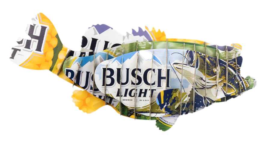
Artist: Nina Rogers; https://www.tiktok.com/@ninaoutdoors_/video/7236905011232394538
I did not think it would be possible to achieve the Steampunk aesthetic using the above templating/cutting style of art, so I decided to go my own way with the project and do something completely original and unique. The overarching goal of this project is to create a machine that I can convince people has the ability to function in a fantical sense. I plan on using the inside of metal cans to create gears, and possibly create dynamics/ rotation with simple materials. One thing I want to make clear is that my project does not perfectly adhere to the Steampunk aesthetic, rather it is inspired by the aesthetic. Some key elements that are different are that there is little ‘industrial’ aesthetic to my design. My goal was to incorporate metallic, shiny, and fantasy elements from Steampunk to create a pattern/ overall mechanical feel to my project. My plan was to take an empty cardboard case of beer to create an enclosed mechanical box, where there are gears formed from cut metal cans. Shown below is a drawing I made of a rough idea of what to expect.

Figure 1: Initial Sketch
Another element I wanted to include in the project is a character from a Voodoo Ranger box in the foreground of my piece. I decided to include this while I was brainstorming ways I could include the opposite aesthetic, Cyberpunk, in my project. Most Cyberpunk art has a character of focus in the foreground, and since the Voodoo Ranger illustration is almost of Steampunk aesthetic, I wanted to put him in the foreground and have him sitting on a gear which could rotate. Below is a photo of the character I intended to include.

Artist: Josh Holland
Fabrication:
When it comes to fabricating my project, I first started out by testing how precise I could make gears out of aluminum cans. This was more time consuming than I originally anticipated, and the metal proved to be tough to work with. The edges cut were often jagged and needed to be trimmed. It was also difficult to make the teeth of the gears even and symmetrical. Below is a photo of an original gear I cut.
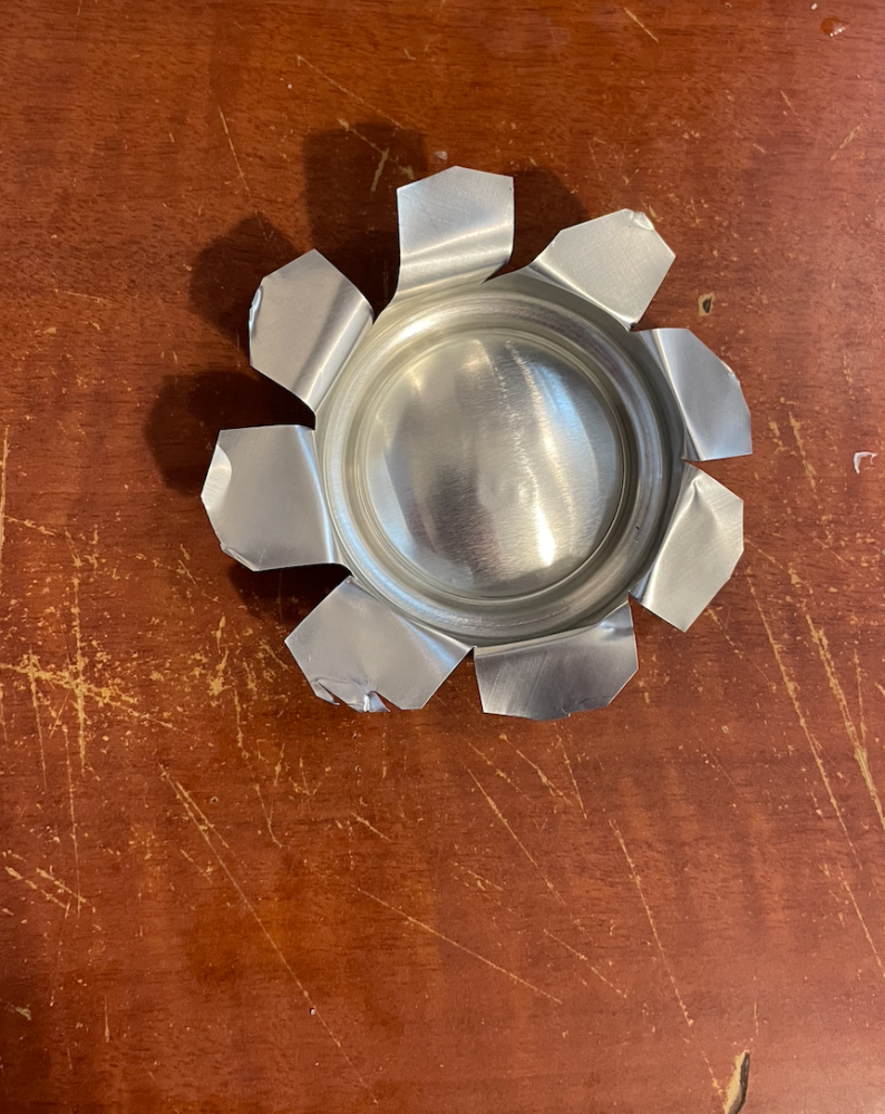
Figure 2: Initial Gear
As you can see, many of the edges are still jagged, and the teeth are not perfectly symmetrical. I figured that this would be similar to the level of precision I would be able to achieve while constructing the project, so I would need to figure out a method of interaction for the gears. I made another gear and found that bending the edges of the teeth slightly upward would help the teeth have more contact with each other, you can see this if you look closely at the figure below.
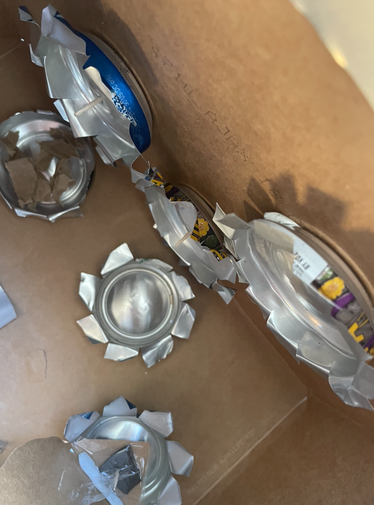
Figure 3: Gears Contacting
After coming close to solving the contact problem between the gears, and cutting my desired slot in a beer box, I started attempting to place them on the walls inside of my box. Getting these gears fastened tightly inside the box, positioned properly, as well as functioning in a way where they can interact with each other smoothly, was the hardest, and most time consuming portion of the project for me. I ended up creating spacers for the outside of the box which connected to the driving portion (tooth picks) of the gears. This is shown in the image below, next to the image of the mess I created along with some of the simple tools I was using.
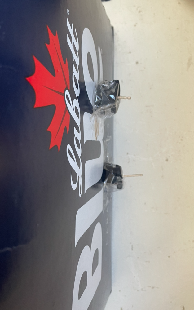
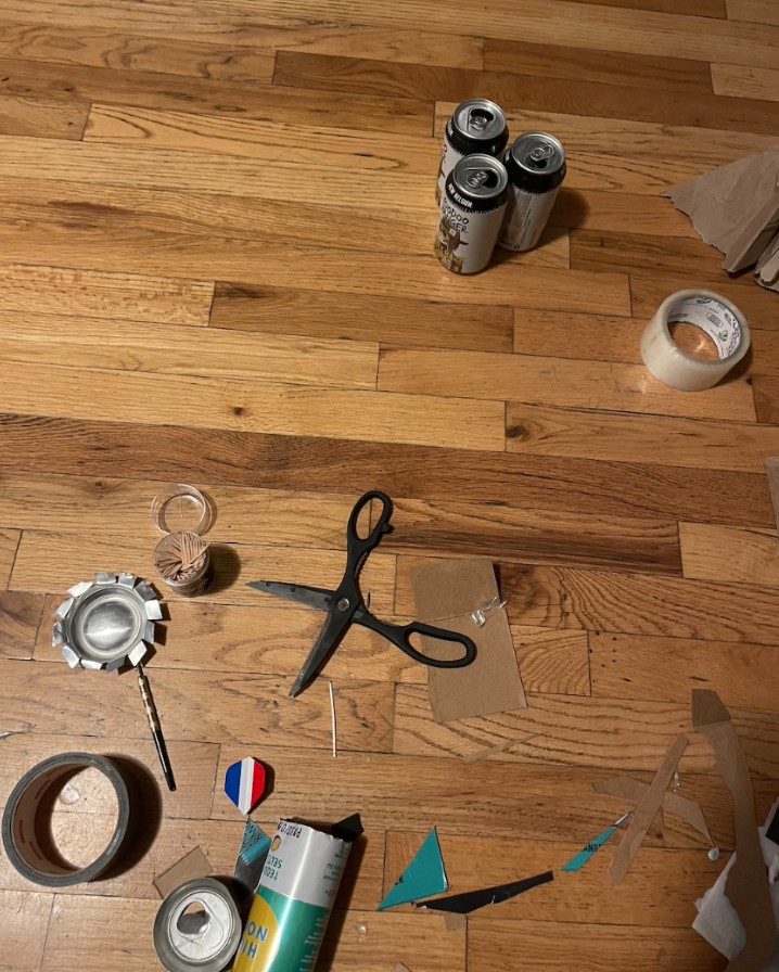
Figure 4: Padding for Gear Rods Figure 5: Mess/Tools
After making my gears as firm as I needed them, their contact was acceptable and they were functioning how I wanted, although they were fragile. I then walked my box downstairs to show my roommate and give a friendly “I told you so”, at which point I tripped on the very last step, falling directly on the box. This bent and contorted my gear formation which took a few hours to perfect. I managed to repair the gears to a point, but not to the level which they once were. It was time to move onto considering the actual aesthetic portion and the outside of the box. Below is a video of my final gear dynamics, as well as a video of my cut out character in the foreground moving how I anticipated.
** Please message me if these links are not functioning
Below is another video of how my Voodoo ranger character can move on his gear.
Vision:
After my dynamics were done, all of my fabrication was focused on the aesthetic and the story. I tacked inside out box components on the outside of my box, with cut out aluminum to give the illusion of bolts. I then placed more non-functional gears on the inside, as well as more aluminum pieces that play into my vision of fantasy for my machine. My vision is that this plant is what’s on the inside of one of the flying machines in the first photo of this post. The machine takes trash and converts it to energy which is used to propel the aircraft forward. The top chimney is where the steam/exhaust leaves, and the character in the front is the technician of the engine. Below are some photos of my final result, although it is impossible to get everything I want into a single photo due to the orientation of the box.
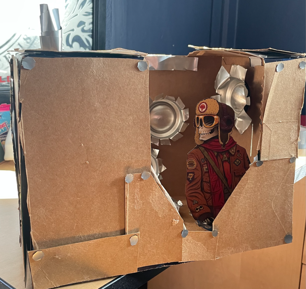
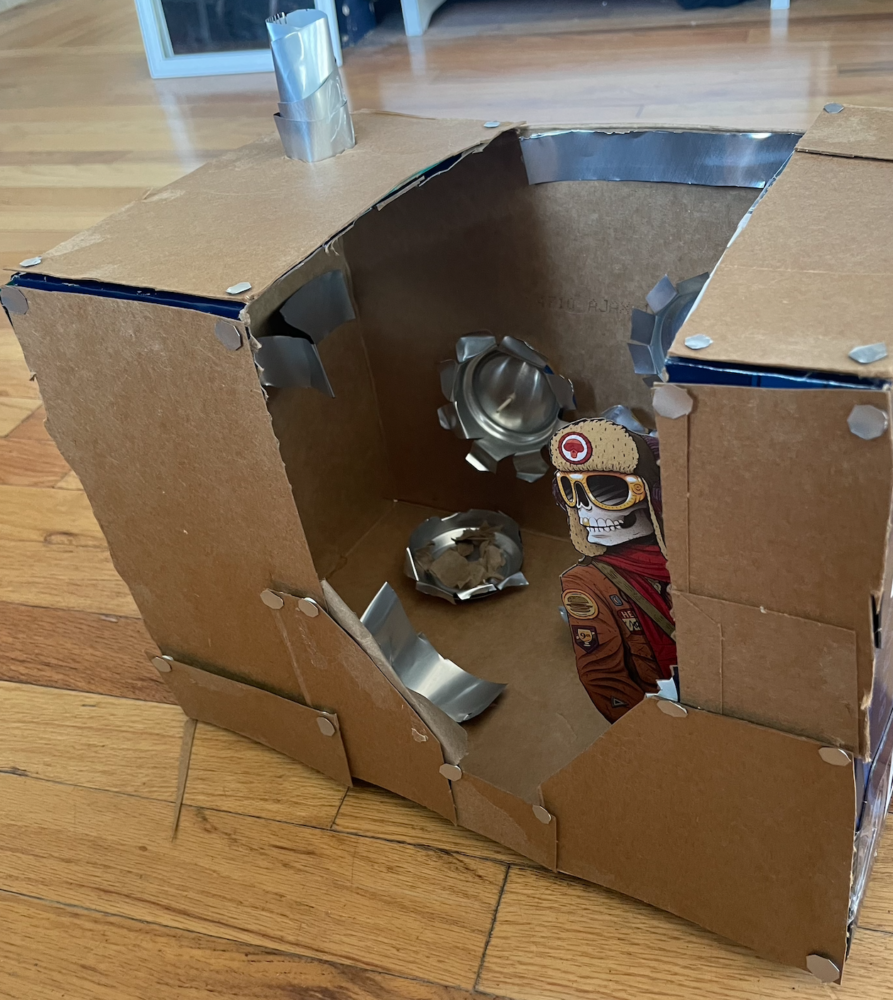
Figures 6 & 7: Final Result
Improvements/Self Criticism:
The main thing I would want to improve in my project is creating more of the older, rustic look. I was not able to achieve this as much as I would have liked. I would also like to further clean up the jagged parts of the aluminum. I think that I almost hit the Steampunk aesthetic, but did not hit it perfectly due to this. It was a challenge hitting my goals with the chosen materials. I would also like to clean up some of the gaps in the panels I put on the outside, but I think that they do create a little more color in the piece which otherwise would only be brown and metallic. I also think that I spent too much time attempting to create functioning gears to the point where I ended up neglecting the overall aesthetic of the project. Please let me know if you have any feedback/ room for improvement and thanks for reading my post!


1 Comment. Leave new
[…] https://www.aesdes.org/2024/02/21/punk-box/ […]