In my current project, I’m exploring an aesthetic that starkly contrasts with my previous work on the steampunk-themed levitating globe. This time, I’m leaning towards a design that is minimalist and modern, characterized by its simplicity and clean lines, vastly different from the intricate and ornate steampunk style.
My Vision for the Opposite Aesthetic:
- Style: I’m envisioning a design that’s sleek and minimalist. It’s all about embracing simplicity and letting the function speak for itself.
- Color Scheme: I’m drawn to a neutral or monochromatic palette. Think along the lines of whites, blacks, or greys, with perhaps a touch of natural color for accent.
- Materials: In this project, I want to focus on using eco-friendly and natural materials. I’m thinking about bamboo, recycled plastics, or even biodegradable elements.
- Textures: Smooth and streamlined textures are my focus here, a complete departure from the complex textures in steampunk design.
- Decorative Elements: I’m planning to keep decorative elements to a bare minimum, emphasizing the form and functionality of the piece instead.
Reimagining the Project:
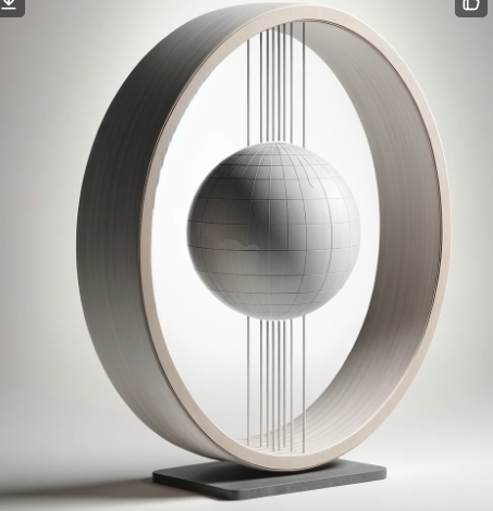
- For the globe, I’m considering a repaint in a matte, understated color. The idea is to simplify the globe’s appearance, sticking to a monochromatic theme.
- As for the C-shaped structure, I’m planning to either use or mimic the look of eco-friendly materials like bamboo. The key is to maintain a smooth, uncluttered appearance.
- The magnetic levitation mechanism, a central feature of my previous project, will still play a crucial role but will be seamlessly integrated to maintain the minimalist aesthetic.
- I’m also ensuring that any additional materials, such as paints or adhesives, align with an eco-conscious approach, favoring non-toxic and environmentally friendly options.
This new direction presents an exciting challenge. It’s about creating a piece that’s not just functional but also embodies a philosophy of minimalism, modernity, and environmental consciousness.

Generate by DallE

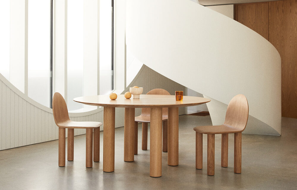
Arch chair by Sarah Ellison


3 Comments. Leave new
This contrast was very interesting. I especially liked the AI generated image. If you had time to make your project twice, is this the second aesthetic you would pick or another?
Hi Grreshan,
I think that the choice of minimalism and modernism as an opposite to steampunk is an interesting choice. I think it is a bit hard to chose an opposite aesthetic to steampunk, so this was a good take. I would love to read more on how these two aesthetics contrast. I like the approach that you took for this post, I can tell you really reimagined your project in a new aesthetic and style.
Hi Grreshan! I agree that a minimalist aesthetic could be an opposite to steampunk. Your blog makes it sound like you are actually considering changing the current steampunk design to a minimalist, is that true?