As a refresher on my upcycle project, I am planning to create a minimalist frame for an oddly shaped poster that I have. I am going to be reusing scrap wood to accomplish this. The use of minimalism is to not detract from the content of the poster, as it is very detailed.
Unfortunately, I have not been able to make much progress on my project yet. I had to go to the hospital and have some issues moving around currently, which makes it hard to use a woodshop. However, I am still going to be able to complete this project.
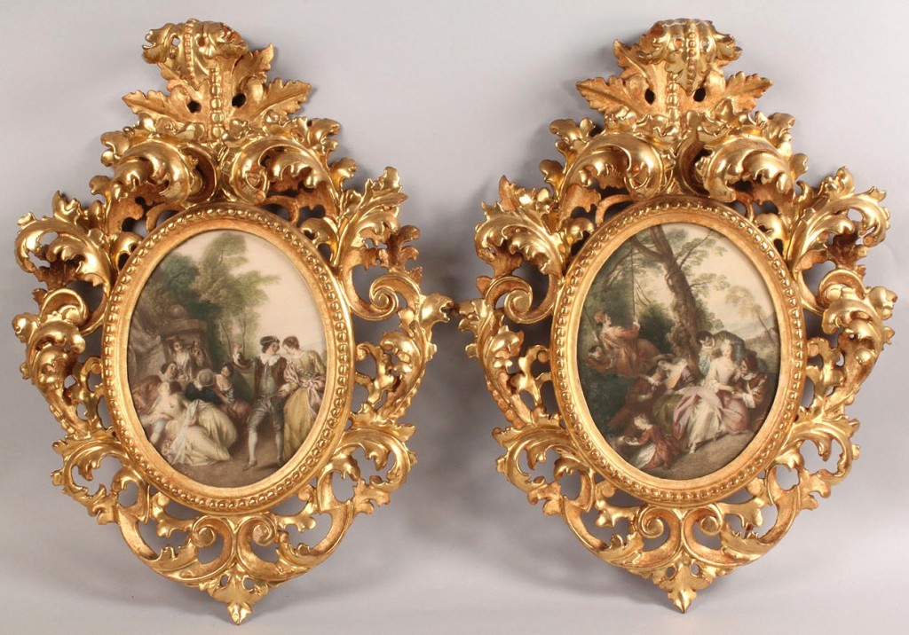
While the traditional opposite of minimalism would be maximalist, that doesn’t exactly apply to frames. There isn’t really a “maximalist” picture frame. What I found to be the most opposite to my goals in this project would be creating a Baroque or Rococo style of frame. Baroque frames are distinguished by their richly detailed and finely carved ornamentation. Intricate scrolls, floral motifs, and cherubic figures are common elements adorning the frame’s surface. These elaborate carvings create a sense of depth and texture, transforming the frame into a work of art in itself.
Additionally, Baroque frames are often gilded to enhance their appearance. Gold leaf or paint is applied to the carvings to create a luminous and reflective surface. Other precious metals can be used, depending on the goal. Shown below are some examples of Baroque and Rococo style frames.


These frames are as much a work of art as the picture or painting they hold. For the purposes of my project, I think that they would distract from the elements within the poster. To create something like this, I would likely need to spend many hours carving away at a wood frame. Another option would be to utilize 3D printing to make such complex and intricate designs consistently. Overall, it would certainly be possible to recreate a Baroque style frame, but with a lot more effort needed.
Citations:
https://www.invaluable.com/auction-lot/large-rococo-frame-80-x-46-inches-812-c-0514394b96


3 Comments. Leave new
Hi Jonathan,
I think you captured the maximalist aspects of the portrait frames really well, especially the usage of precious metals on the frames themselves. I was reminded of some earlier paintings, like The Night Watch by Rembrandt that has a large wooden frame around it. It’s not the same as the Baroque examples that you gave, but I also think that it is an interesting take on maximizing something, but maybe a bit closer to the minimalist aesthetic you’re thinking.
Something to consider might be how are you going to join the pieces of the frame together? It might be interesting to consider how minimalism might influence the way you join the frame pieces together.
Josh
Hi there, I love your choice for an opposite design aesthetic, I think it does a good job of countering the minimalist aesthetic you’ve decided to go with. I am interested in hearing more about how you would create this aesthetic. You said that Baroque typically has gold, gold paint, or is composed of another precious metal, but that you would make yours our of wood or 3D printed material. I’m curious to know your plan on how you would create a Baroque aesthetic out of wood or 3D printed material. Otherwise, I’m excited to see your minimalist design in action!
Hi Jonathan ,
You’ve done an excellent job in conceptualizing a minimalist frame that complements your detailed poster. The way you’ve contrasted this with more elaborate styles like Baroque and Rococo adds a great depth to your understanding of design aesthetics. It’s intriguing how you’ve chosen minimalism; could you share more about your thought process behind this choice? Maybe consider exploring subtle design elements, like a unique finish or texture, to add a touch of sophistication. Your project is a wonderful blend of simplicity and creativity. Eager to see the final outcome! Keep up the great work!