Hello everyone, in this post I will be discussing a contemporary design aesthetic with chilled undertones, the opposite of my upcycle design aesthetic. To review, my project is to create a rustic shou sugi ban (charred) chess board by using only three materials: barn wood from my friend’s mountain ranch in Kremmling, Colorado, wood screws from McGuckin, and a natural oil to finish and protect the final product.
I initially had a difficult time making a decision between contemporary and modern design aesthetics. The two terms are actually synonymous by literal definition, but in design practice, they are substantially different. Contemporary has a focus on simplicity and cleanliness, but also emphasizes decoration, sophistication, and elegance. Modern also focuses on simplicity, but does so in a much more “stripped down” fashion, often focusing on simple function, and also favors exposing natural materials. Because of this, I found that Modern has more connections to my design aesthetic, and could not be considered an opposite.
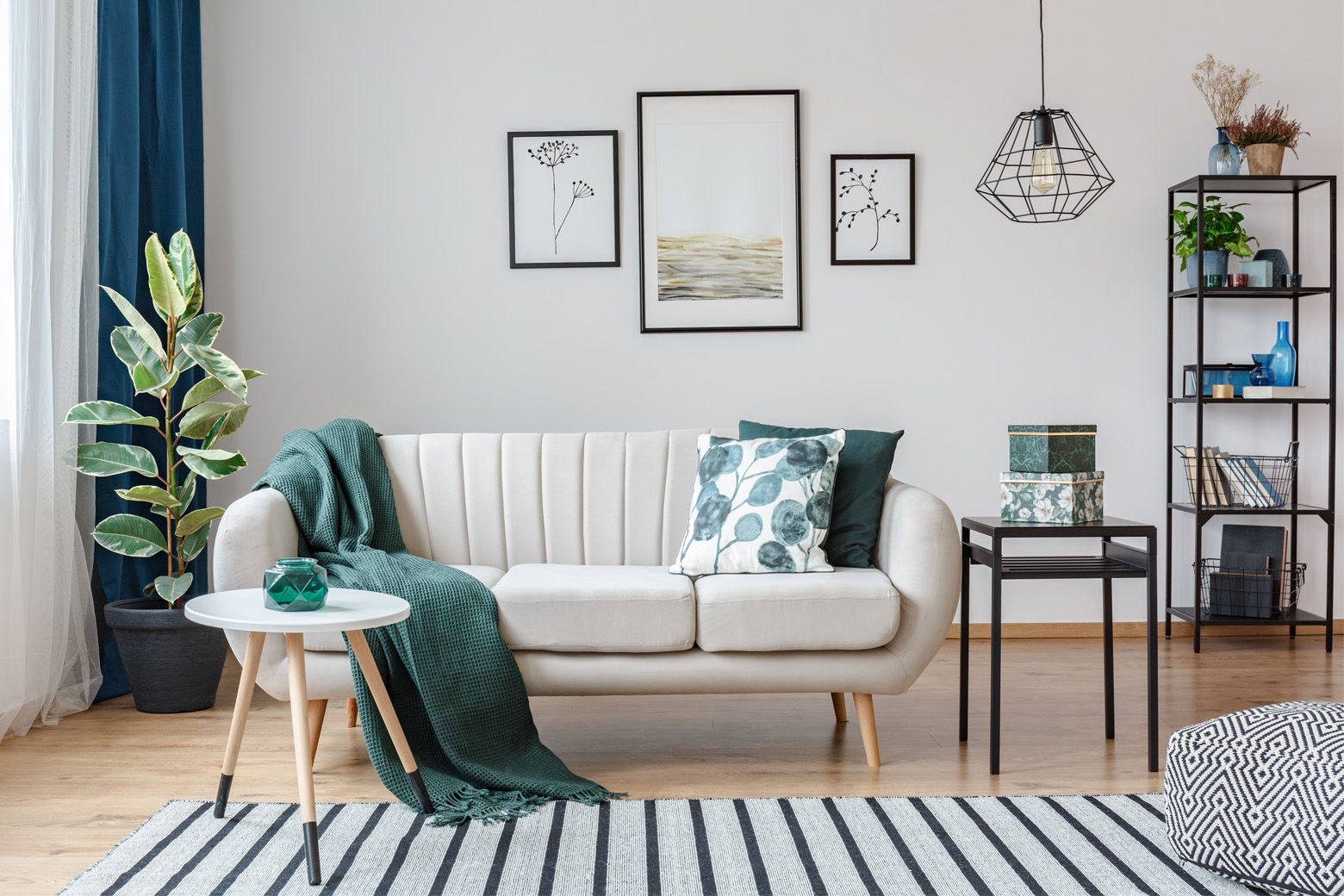
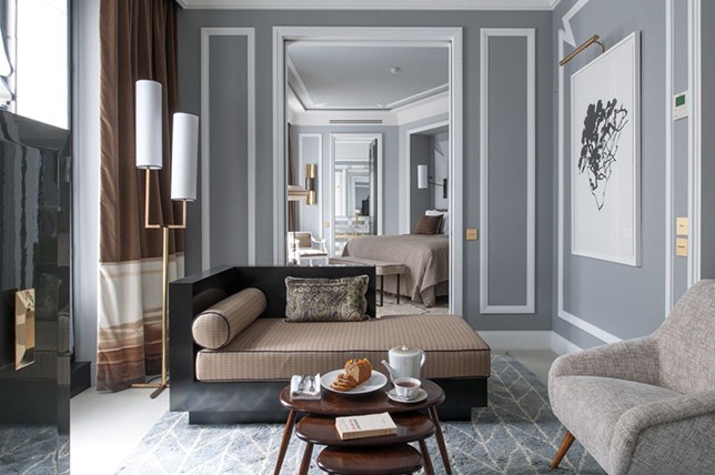
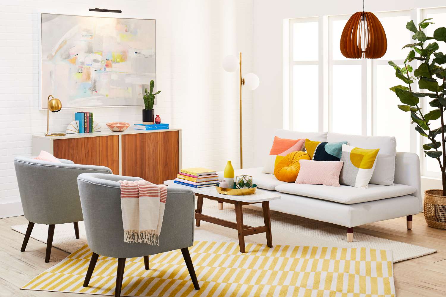
The contemporary aesthetic features simplicity and comfort, but also sophistication, cleanliness, and elegance. The style features clean, open spaces with muted background colors. These serve as a sort of blank canvas for a few decorations that are really meant to stand out and be shown off to viewers. In a sense, contemporary art is minimalist in decoration volume, but maximalist in quality. Lastly, this style also lends itself to bold geometry and lines to make different features of the design stand out and be highlighted.

I made the addition of the chilled effect to the contemporary design aesthetic because my design aesthetic, shou sugi ban, is the act of charring wood to add style and strength to the design. I figured that an acceptable opposite of fire was ice, or rather a chilled or icy design addition. This blends easily with the contemporary design style, where muted blues can be incorporated into the background of designs, and cold materials such as metal (to the touch), and quartz (to the eye) can be incorporated into the style to add to this effect.

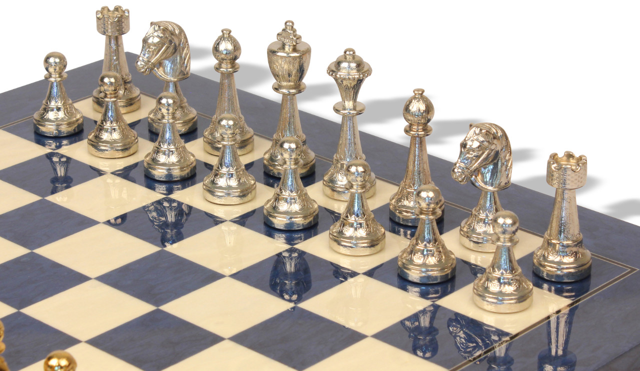
If I were to build a chilled contemporary chess board, it would looked much more polished and clean than my current project, but would also be vastly more expensive. I would start with a border of polished white quartz to give the visual interpretation of a clean block of ice. Then, I would make the light squares out of pure white resin, and the dark squares out of bright blue brushed resin. Because contemporary features strong lines and geometry, I would also feature gold lining around all of the squares. Lastly, for the pieces, I would maintain the classic silhouette of professional chess pieces, but I would make them out of metal. The light pieces would be bright and metallic, while the dark pieces would be shadowed and matte. To connect the pieces to the board aesthetically, I would also use a gold lining around the major features of the pieces.

I am starting manufacturing this week! Thank you for reading!

Sources
https://www.thespruce.com/designer-guide-to-contemporary-style-1976503
https://www.architecturaldigest.com/story/contemporary-interior-design-101


1 Comment. Leave new
Your post definetly does a good job at explaining the distinctions between contemporary and modern design aestetics. I was wondering if you could further go into how the “chilled” effect could be integrated into the rustic chessboard design.