Refresher:
The current aesthetic of my project is patchwork, utilizing a chessboard-like design in order to create a hangboard for rock climbing. This involves slightly differently colored wooden pieces arranged in a patchwork like formation.
The Opposite:
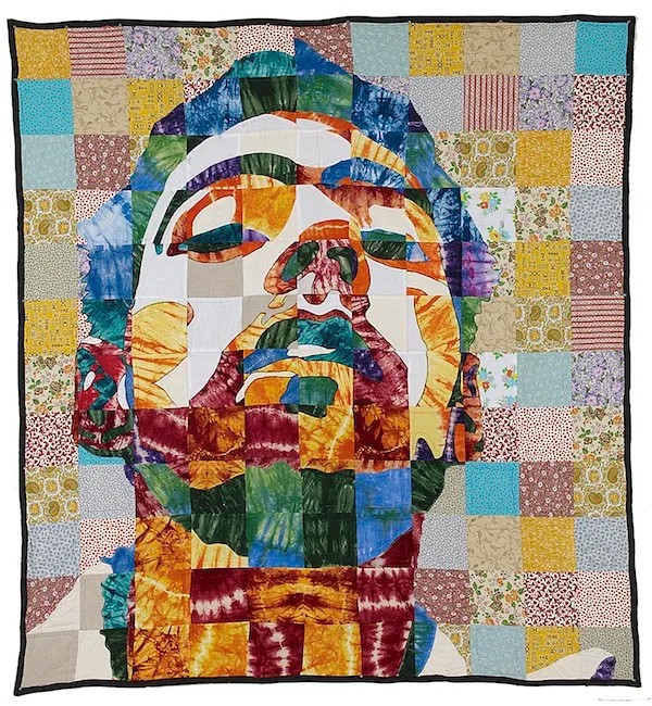
There are many aesthetics which could be argued to be the opposite of patchwork, although, minimalism is the one that immediately comes to mind. In patchwork, the purpose is to mix together multiple workpieces which do not match in various ways, but when finished, match together nicely. Minimalism, on the other hand, is quite the opposite. The purpose of minimalism is to remove any unnecessary elements in the design which may be a distraction, add visual complexity, or otherwise step away from a focused design. Below are some contrasting examples of minimalism and patchwork.


Diving deeper into the image designed by Abby Turner, she utilizes only a few key colors in order to generate simplistic contrast, strong outlines, and added emphasis in desired locations. For example, the woman’s coloring is relatively neutral and calm until you get to the lips. The lips are bright red which lead the viewer to look directly at them. The bright red lips really add some extra emotion into this photo. The choice of colors can be significantly contrasted against the art piece designed by Luke Haynes. This piece uses the change of patterns rather than change in colors to differentiate the outlines of the subject. Let’s focus on the hair, for example. This is notable by tracing the outline of the hair. While he does select similar colors, there are many instances where the color varies. In order to keep a consistent outline, he ensures that there is significant contrast between the pattern types of the hair vs the background.
Conclusions
Overall, patchwork and minimalism share many similarities, however, their distinct differences lie in how outlines and details are portrayed. By the nature of patchwork, the pattern of the pieces is significantly more difficult to control compared to digitally designing a portrait of someone where the color can be kept very consistent. This is where minimalism really shines as an opposite to patchwork. The artists generally utilize solid colors, minimal colors, and minimal fine details in order to portray the art they are developing. This is why I believe that minimalism and patchwork are opposites of each other, but as with many aspects of art, they are very different and very similar at the same time.


4 Comments. Leave new
Great work on this Ian! Your post got my attention because I am also doing a hangboard for this upcycling project. I appreciate your thorough analysis of the differences between the two aesthetics. I was wondering if you think it would be possible to make a minimalist hangboard with the materials you intend to make your hangboard out of. I can’t wait to see how your project runs out!
Hi Josh, I think it would be difficult to make a hangboard in the minimalist aesthetic. The main reason being that hangboards inherently have many patterns, cutouts, corners, etc. By modifying the design it something much simpler would allow for a hangboard with maybe one or two different hanging positions, and this could possibly fall under a minimalist aesthetic.
This post caught my attention because my main aesthetic is also patchwork, and minimalism also came to mind as an opposite aesthetic. I really enjoyed your analysis of how the two share similarities but have aspects that contribute to a noticeable contrast. If you were to instead integrate minimalism into your hangboard project, what aspects of your design would you change to achieve it?
Hi Helen, thanks for your comment. I think the one major aspect of the design which makes minimalism difficult is the complexity and details of the design. By simplifying the design of the hangboard, which could reduce functionality, it would allow the design to be minimalistic while the overall look and style is patchwork.