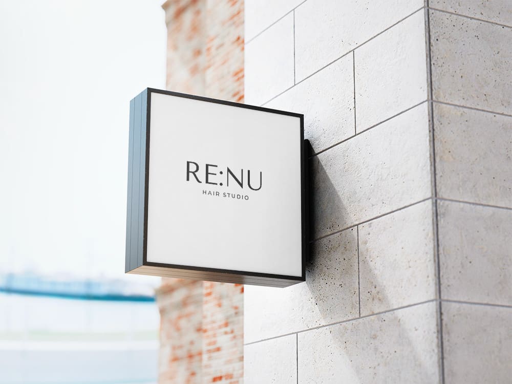
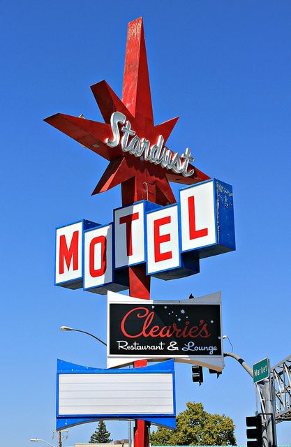
I think I’ll keep half of the aesthetic, signage, and use the opposite vibe for this post. I think that minimalist signs are the exact opposite. 1950’s signage is marked by bright colors, loud text, flashing lights, and starburst shapes. Minimalist signs use often thin text, neutral and muted colors, lots of blank space, and little decor. There is a stark difference between the two, although achieving similar goals of informing passersby of information. I think that the 1950s signage has a lot more personality, even if it does seem a bit tacky at times, and pops a lot more than minimalist signs.


If I were to change my upcycle project to this currently, I would have to discard most of my materials. I could likely make a larger sign since minimalist shapes require less wasted material, especially in my case the plywood used to support the sign. I am using aluminum soda cans to provide the color to my sign design, and the colors are predominantly red, blue, and white. Since minimalist designs do not use bright colors, my red and blues would become useless for the most part. I could still use the whites to create the blank space a minimalist design might be expected to have, and maybe some black colors from the can labels could be used for the text on the sign.
The content itself would probably change as well since minimalist signs often advertise different things than 1950s-style signs would. 1950s signs typically advertise motels, casinos, and diners, while a minimalist sign might be expected to advertise beauty products, cafes, and bookstores. Different connotations across the board. I think the location of these signs would be very different as well since 1950s signs are typically used to advertise to highway traffic with their huge size and loud fonts, while minimalist signs would be found mostly on walking paths like Pearl Street to get the attention of someone actively shopping or running errands.


3 Comments. Leave new
Hi Noah, I found your post pretty interesting because you followed a similar train of thought to what I considered my opposite aesthetic. The change from very loud, detailed, and extravagant signs to very simple, dual colored signs would definitely qualify as opposite aesthetics. From what I can tell, many people believe that minimalism is the opposite of their aesthetic in some way or another. This leads to a question, what would you consider to be the opposite of minimalism? Do you think there is one or can many different aesthetics be considered the opposite of minimalism?
Hey Noah. When I read your title and remembered the project and aesthetic you chose I thought to myself, what could possibly be the opposite of a 50s vintage sign? But I think you hit the nail on the head with this one and I completely agree with the minimalist sign aesthetic. Your description of what made a 50’s sign a 50’s sign painted a much clear image of what the opposite of that would look like as well. In diving into this opposite aesthetic do you think you would want to switch to this aesthetic? If you had the materials at hand and everything necessary?
I think that in practice it would be nice to switch my aesthetic for this project since the simpler shapes and colors would make design and manufacturing so much easier than my current work. After assembling my project I have realized how difficult of a time I gave myself, and a minimalist design would simplify my work exponentially.