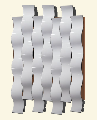
Sketch of wall sculpture
I am planning on creating a metallic wall sculpture using aluminum cans as my primary source of material. I plan to build something similar to the sketch shown above. The simple material and lack of ornate details gives the artifact a barebones minimalist aesthetic. The opposite aesthetic to my minimalist artifact is maximalism.

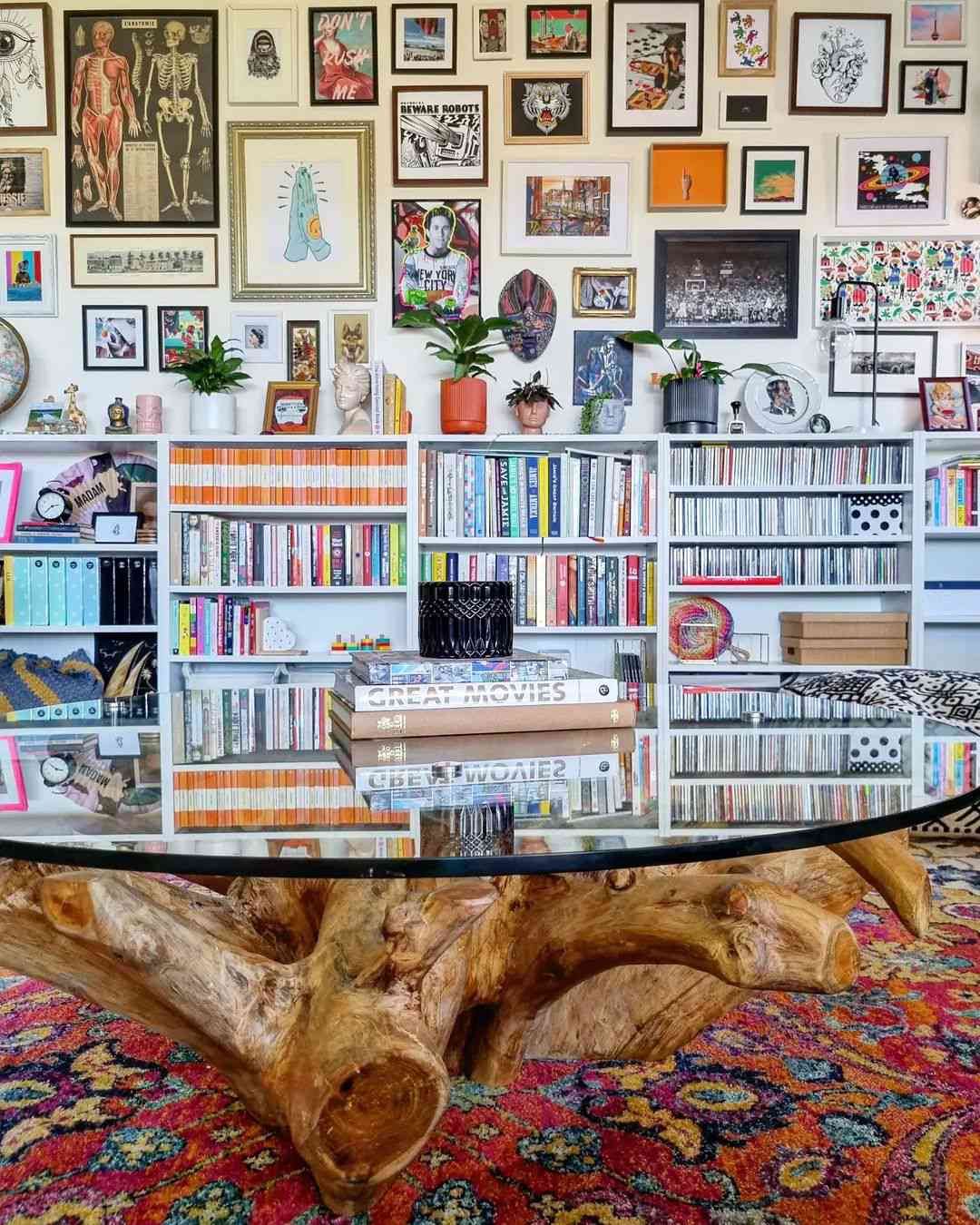
Maximalist Interior Design
Opposed to minimalist’s less is more, maximalism follows the idea that more is more. In maximalist interior design your eyes are overstimulated with the amount of “stuff”. They include bright colors and intricate details. Instead of sparse wall art the maximalist wall is filled to the brim with wall art.

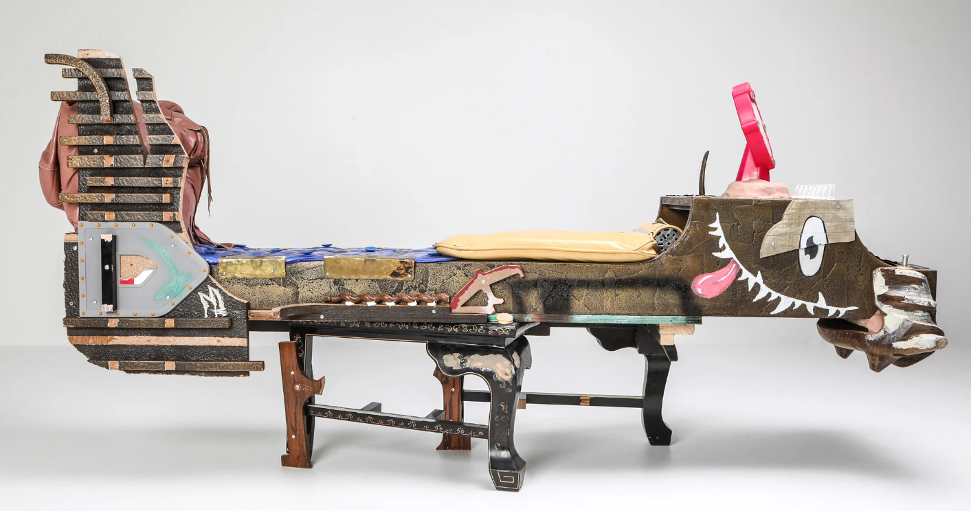
Maximalist Scultpure
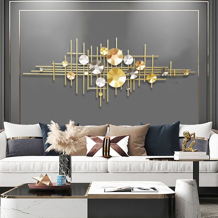
I’ve included a few examples of maximalist wall art and sculptures. They all have ornate details and flashy designs. The sculpture shown above is a hodgepodge of different materials and geometries and its utility is not obvious.

Maximalist Wall Decoration

Maximalist wall decoration
Bibliography:
https://www.thespruce.com/maximalist-decor-ideas-that-work-5206606
https://fineartamerica.com/featured/seamless-golden-geometric-tribal-diamond-fine-line-pattern-vintage-abstract-gold-plated-relief-sculpture-on-black-background-modern-elegant-lux-backdrop-maximalist-gilded-wallpaper-3d-rendering-n-akkash.html?product=metal-print

4 Comments. Leave new
[…] Opposite Upcycle Aesthetic – Maximalism […]
Hi Alex,
I think this is perfect as an opposite aesthetic. Will you have the metal shiny for your wall art or paint the aluminum?
Hi Alex, I think you nailed the opposite of the aesthetic of your project. Your post was interesting to read through because I feel that maximalism is very in right now especially with interior design. Your project concept looks awesome and it’s cool to see how you explored the opposite of its aesthetic. Good luck on the rest of your project!
Hey Duncan, thanks for the kind words!