The opposite of my Upcycle project — entailing a topographic tissue box cover — in terms of aesthetics would likely entail less organic form and more artificial. These could be rigid, symmetrical shapes that would be impossible to see in a natural environment. It would also include the change of only having the bare minimum so only essential aspects are present.
Translating to my project, it would ultimately culminate in having a diorama cover that does not invoke the idea of nature, emphasizing sharp edges and symmetry, and removing the redundant layers as it only offered no utility aside from aesthetic visuals.
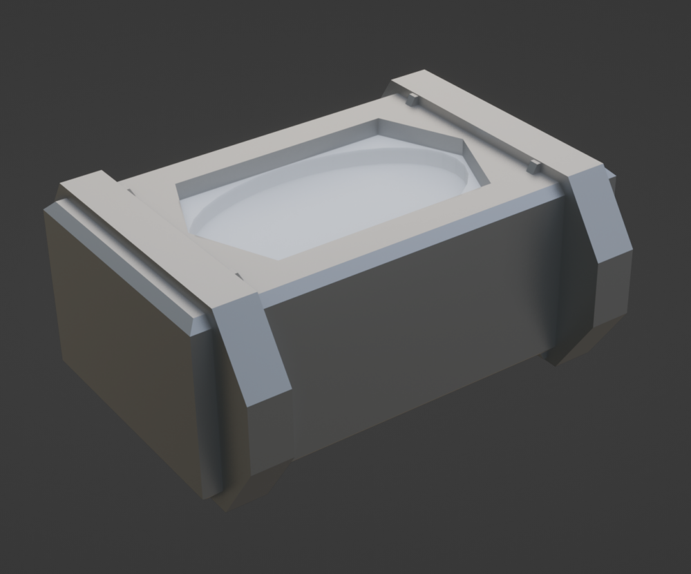
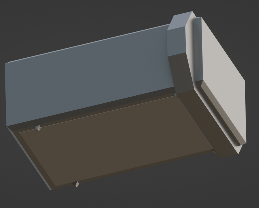
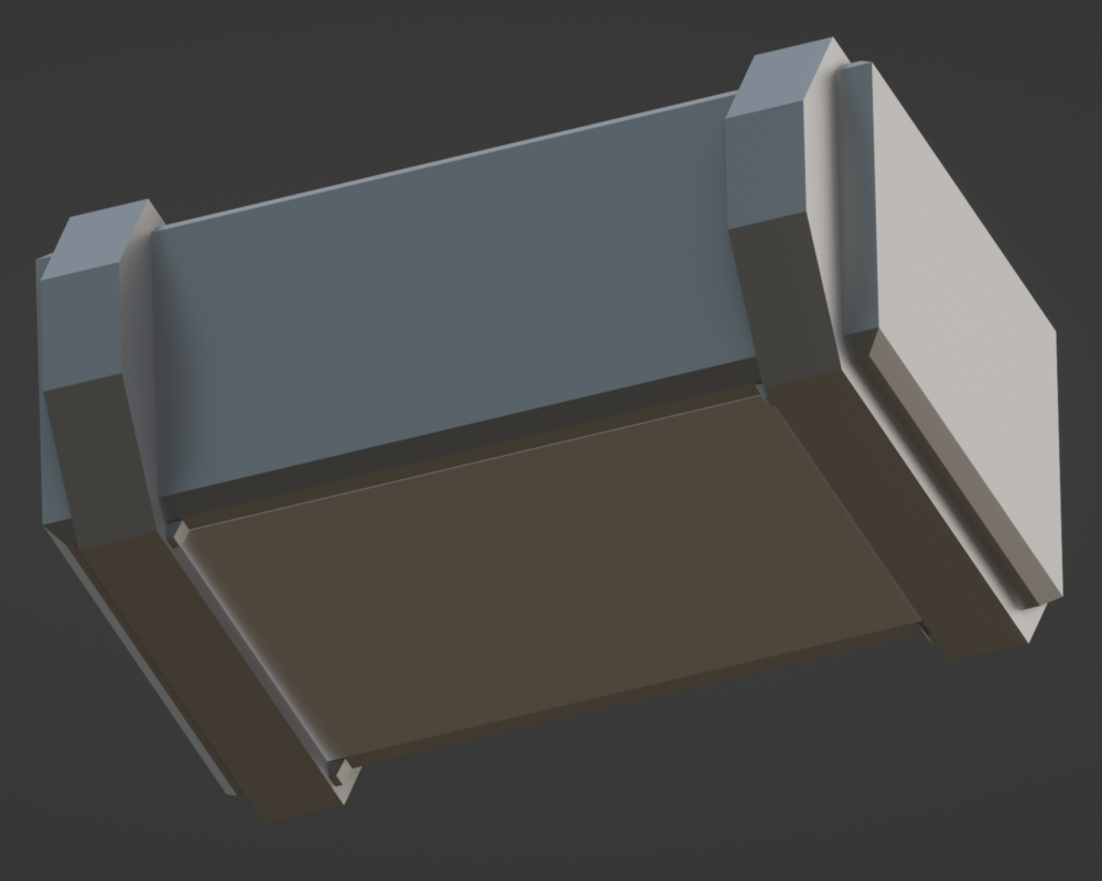
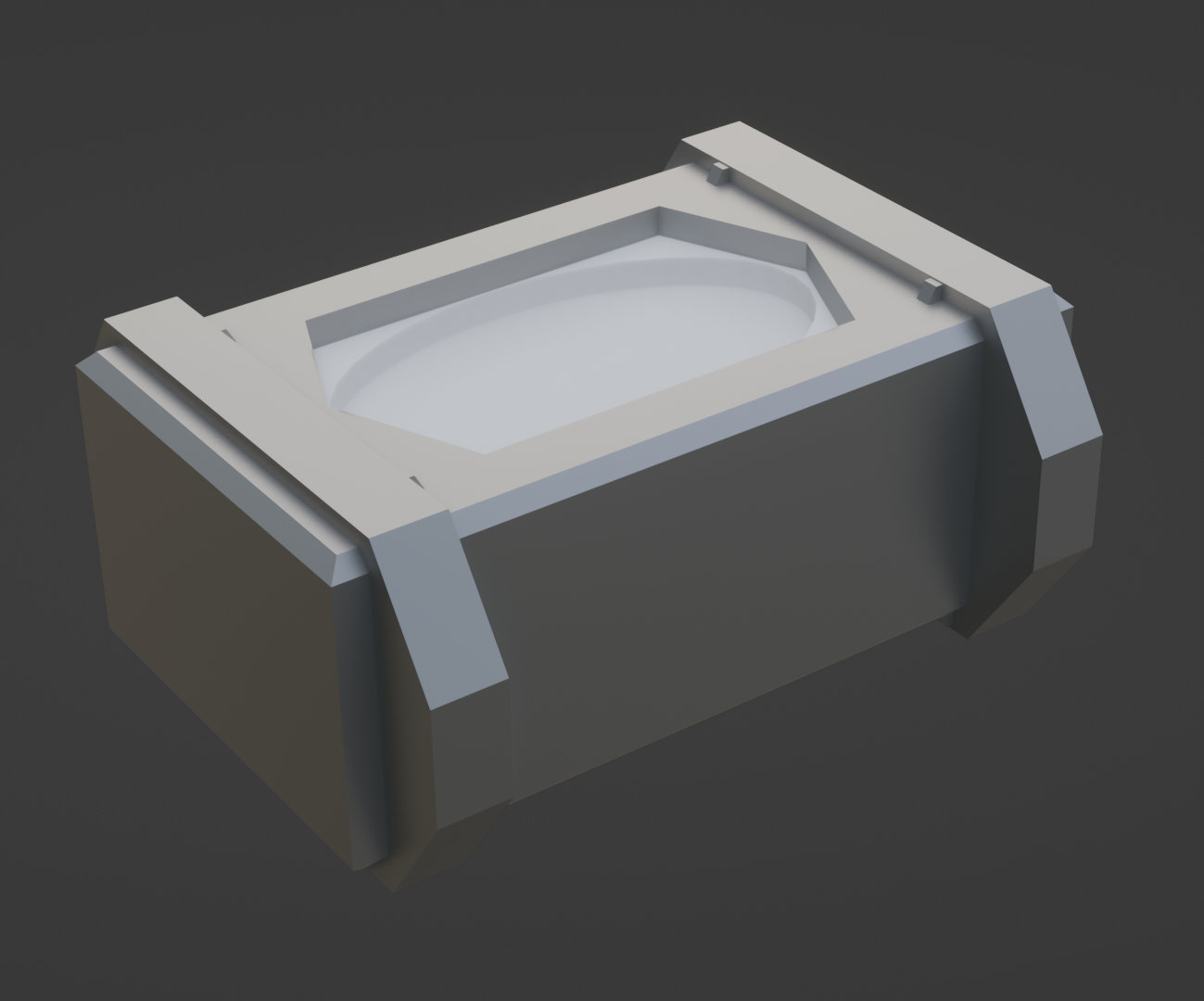
Below is a Blender rendition of what it would appear:
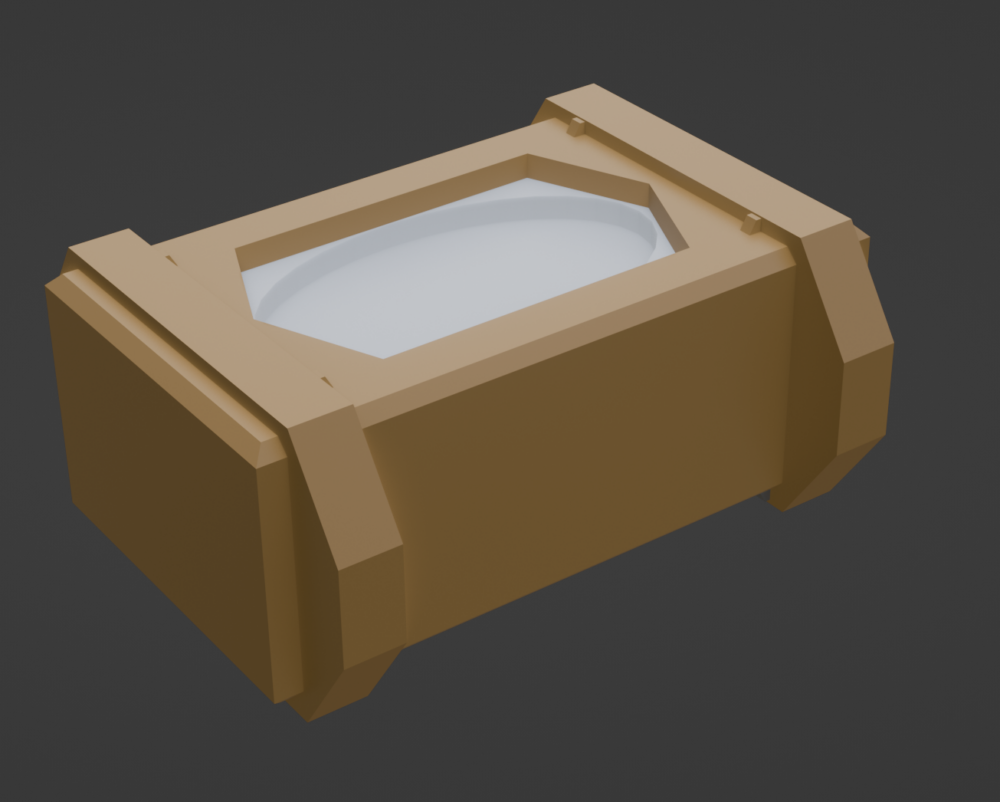
While this design retains having a tissue box slotted over it, two clamps were added to further secure the tissue box with small groves to prevent the clamps from obstructing the opening. Bevels — the angled bits around the top and bottom of the cover’s edges — can provide some safety by removing sharp corners when handling the cover.
Funnily enough, the cover inadvertently — I did not reference any images and just played around with geometry — resembled several game assets I noticed while playing a video game the other night.
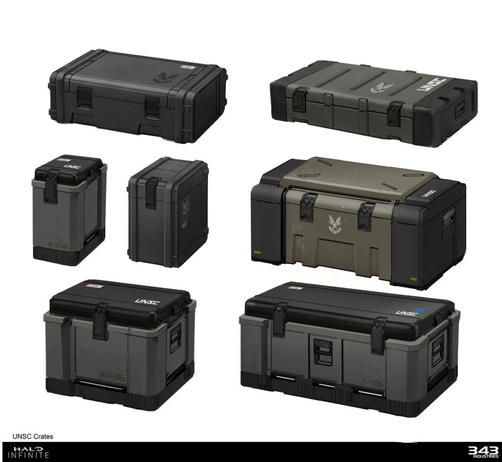
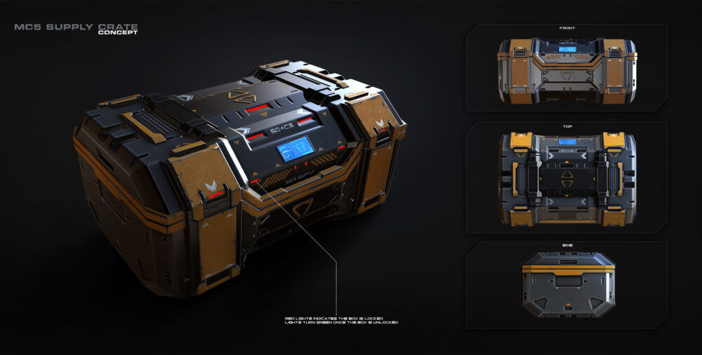
The feasibility of fabricating and constructing the opposite aesthetic Upcycle project would be beyond my capabilities and current scope. The opposite aesthetic model would require more precise cuts/machining, including the bevel, groves, and clamps — ensuring that the clamps fit perfectly around the cover.
As mentioned in a previous post, my primary fabrication method does not require laser cutting as — aside from the overall dimensions — the cuts made to each layer would not impact the overall design. This theoretical model, however, would absolutely require laser cutting and more complex assembly that will take additional time and effort compared to the actual project. Furthermore, given the scope of this theoretical opposite aesthetic model, it would be more beneficial to utilize material other than cardboard, like plastic or metal. This would improve the cover’s appearance and have the added benefit of having better duration.
References
[1], [4], [5], [6]: Blender 4.0 – https://www.blender.org[2] https://www.halopedia.org/List_of_UNSC_crates
[3] https://www.artstation.com/artwork/a4aXJ

4 Comments. Leave new
Hey Vincent, great job making the blender renders to demonstrate the opposite aesthetic approach to the project. Also I recognize some of those example boxes from Halo! I am curious which aesthetic you prefer, the natural or artificial box? It would be cool to have two boxes with opposite aesthetics to contrast with each other. This reminds me of how the natural environment in the Halo games contrasts with the high tech artificial structures made by the humans / covenant / forerunners.
Personally, I prefer the artificial box design that is definitely be influenced by my fascination with the military and sci-fi genre (like Halo) and the utilitarian aesthetic of the vehicles, gear, everything seen while growing up. Speaking of Halo, that’s what stuck out the most while playing those games, especially Combat Evolved where the Forerunner structures stuck out from the natural landscape or the contrast between the human and Covenant design.
Hello Vincent, nice work finding an aesthetic that contrasts your original idea so well. I am looking forward to seeing how your topographic design for the final project contrasts with what you described above. I appreciated the CAD models that you provided to help visualize your idea. Do you believe that there would be any major differences in the materials used? Great post!
Aside the obvious change to structural stability, the change in material absolutely would change the overall aesthetic of the box. As seen above, the cardboard brown looks abnormal when applied to the opposite design. However, the grey steel fits well.